


Offizieller Lieferant
Als offizieller und autorisierter Distributor beliefern wir Sie mit legitimen Lizenzen direkt von mehr als 200 Softwareherstellern.
Sehen Sie alle unsere Marken.
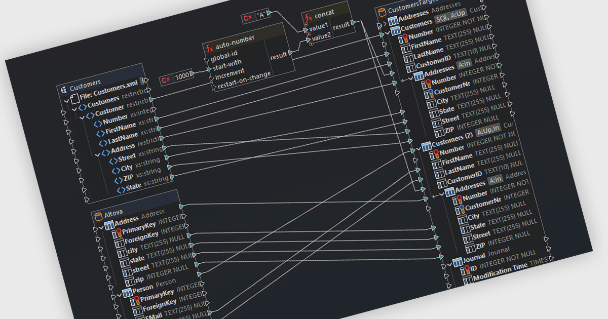
Support for Postgres in structured document tools enables integration between document-centric workflows and relational data storage. This allows developers to connect directly to a PostgreSQL database to manage, query, and transform structured content such as XML, JSON, or schema-driven documents. With capabilities like data mapping, validation, and conversion, users can work across multiple data formats while maintaining consistency and referential integrity through SQL-backed operations. This level of support enhances interoperability between document formats and databases, making it easier to automate complex data flows, enforce standards, and align structured documents with enterprise data architectures.
Several structured document tools offer support for Postgres including:
For an in-depth analysis of features and price, visit our comparison of structured document tools.
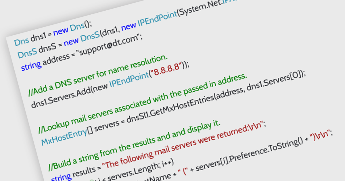
DNS support in an internet communication component refers to the ability to resolve domain names into IP addresses, enabling applications to connect to remote services using human-readable URLs rather than numeric IP addresses. This capability allows developers to build more flexible and maintainable networking features, as endpoints can be referenced by domain name even when the underlying IPs change. It simplifies configuration, supports dynamic address management, and enhances compatibility with modern infrastructure such as load balancers and cloud services. By handling domain resolution internally, the component can also offer improved performance through caching and error handling tailored to application needs.
Several .NET Core communications and messaging components offer DNS support including:
For an in-depth analysis of features and price, visit our comparison of .NET Core comms & messaging components.
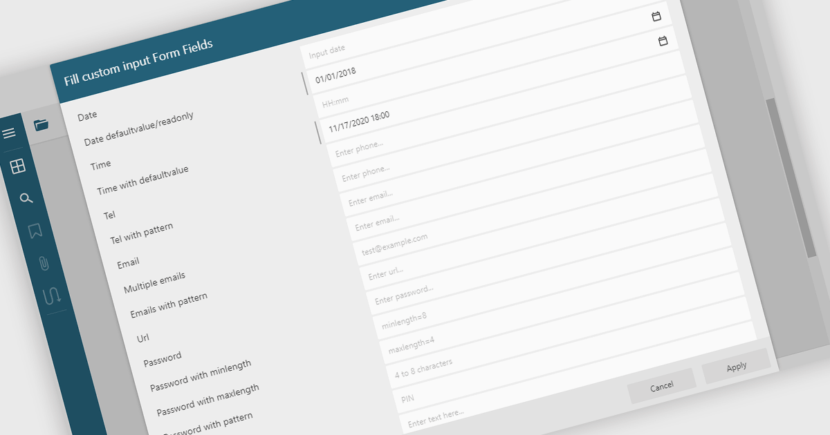
Filling out PDF form fields allows users to enter information directly into interactive elements within a PDF document such as text boxes, checkboxes, dropdowns, and signature fields. This functionality transforms static PDFs into dynamic fillable forms that can be completed digitally, reducing the need for printing or manual data entry. The ability to fill, validate, and submit forms directly within a PDF viewer improves efficiency, accuracy, and user experience while supporting accessibility and cross-platform use. Common use cases include completing applications, registration forms, surveys, contracts, and approval documents, making it an essential feature for businesses looking to streamline document-driven workflows.
Several .NET WinForms PDF Viewers feature support for form filling, including:
For an in-depth analysis of features and price, visit our comparison of .NET WinForms PDF viewers.
LightningChart Python is a high-performance visualization library designed for real-time analytics and large-scale data rendering. Utilizing GPU acceleration and WebGL, it efficiently processes millions of data points in 2D and 3D with smooth, interactive visuals. Some example chart types include Line graphs, Scatter plots, Heatmaps, Area plots, Box plots, 3D Surface graphs and Mesh plots, and it supports UI elements such as CustomTicks, interval Bands and Constant Lines. It seamlessly integrates with Python’s data ecosystem, including numpy, pandas, and GUI frameworks like PyQt and PySide, making it a powerful tool for interactive dashboards, financial analytics, scientific simulations, and engineering applications.
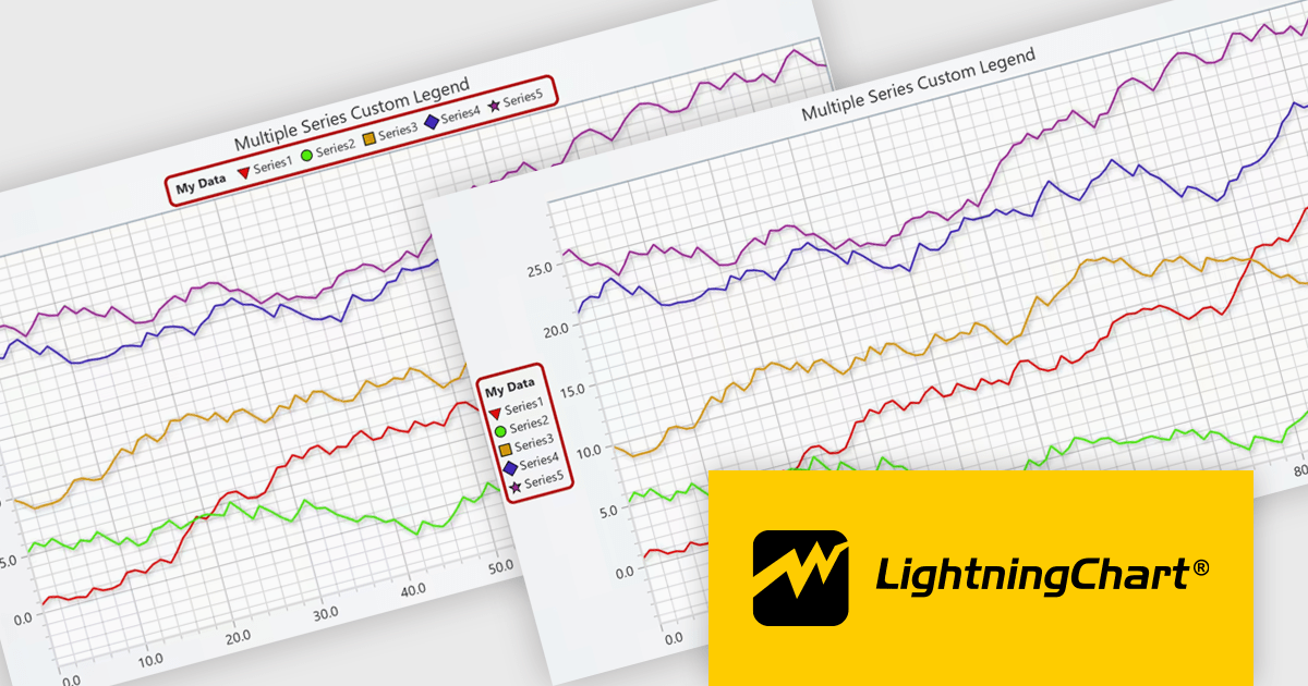
The LightningChart Python v2.0 update introduces flexible legend positioning, giving developers precise control over where legends appear within their charts. This enhancement allows legends to be placed above, below, beside, or inside the chart area, enabling better use of available space and improved readability across different layouts. By adapting legend placement to suit varying screen sizes, data densities, and design requirements, developers can create cleaner, more efficient visualizations that align seamlessly with their application’s user interface and presentation goals.
To see a full list of what's new in v2.0, see our release notes.
LightningChart Python offers two licensing options: the subscription-based Data Scientist License for internal, non-public facing usage and the perpetual, per-seat Software Developer License for commercial use with professional support and deployment keys. Both licenses allow one active session per user, with developer licenses assigned individually. See our LightningChart Python licensing page for full details.
For more information, see our LightningChart Python product page.
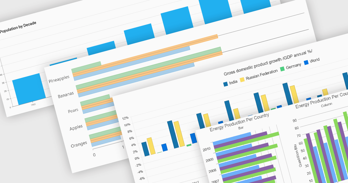
Column and bar charts form fundamental visualization tools in many charting suites. These chart types use vertical (column) or horizontal (bar) bars to represent quantitative data across categories, making them ideal for straightforward comparisons. Typically, you can display single or multiple series, stack values to show cumulative totals, or group categories to highlight differences. Their simplicity and clarity make column and bar charts a staple in dashboards, business reports, and analytics applications where rapid insight is required.
Several ASP.NET Core chart controls offer support for column & bar charts including:
For an in-depth analysis of features and price, visit our ASP.NET Core chart controls comparison.


Tel.: (888) 850 9911
Fax: +1 770 250 6199


