


Offizieller Lieferant
Als offizieller und autorisierter Distributor beliefern wir Sie mit legitimen Lizenzen direkt von mehr als 200 Softwareherstellern.
Sehen Sie alle unsere Marken.

Infragistics Ignite UI for Angular is a comprehensive suite of Angular components and UI controls designed to accelerate development of high-performance, enterprise-grade web applications. It offers a rich collection of data grids, charts, and other UI elements, along with advanced features like pivoting, docking, and hierarchical data management. Built on Angular, the toolkit integrates seamlessly into existing projects and provides a foundation for building modern, responsive, and interactive user interfaces.
Ignite UI for Angular's Pivot Grid now offers horizontal row dimension expansion, providing developers with greater flexibility in data visualization. In this mode, child elements of a row dimension are displayed horizontally within the same multi-row layout instead of vertically. This approach allows for a more compact and potentially informative representation of hierarchical data, enabling users to easily compare related data points within a single row context. Developers can dynamically toggle between horizontal and vertical expansion modes to suit their specific data analysis requirements.
To see a full list of what's new in version 24.1 (18.1.0), see our release notes.
Infragistics Ignite UI for Angular is part of Infragistics Ignite UI which is licensed per developer and is available as a Perpetual License with a 1, 2 or 3 year support and maintenance subscription. See our Infragistics Ignite UI licensing page for full details.
Infragistics Ignite UI for Angular is available in the following products:
ComponentOne Studio Enterprise by MESCIUS is a comprehensive toolkit for .NET developers, offering a vast collection of pre-built UI controls for desktop (WinForms, WPF, WinUI, UWP), web (ASP.NET MVC, ASP.NET Core, MVC, Blazor), and mobile (.NET MAUI, Xamarin) applications. It extends functionality beyond UI with data visualization tools, data grids, reporting components, and JavaScript controls through Wijmo Enterprise. This all-in-one solution streamlines development by providing pre-designed elements and functionalities, allowing developers to focus on core application logic and deliver feature-rich applications faster.
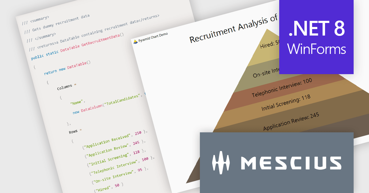
In this blog post, MESCIUS Associate Software Engineer Aastha Gupta demonstrates how to use the ComponentOne FlexChart control in C# .NET to create a pyramid chart. Steps include:
Detailed sample code is included and there is even a sample app that you can download to make it easier.
Read the complete blog to get started creating stunning visualizations of hierarchical data.
ComponentOne Studio Enterprise is licensed per developer on a perpetual basis and includes a 12 month subscription. Priority Support is also available. See our ComponentOne Studio Enterprise licensing page for full details.
Learn more on our ComponentOne Studio Enterprise product page.
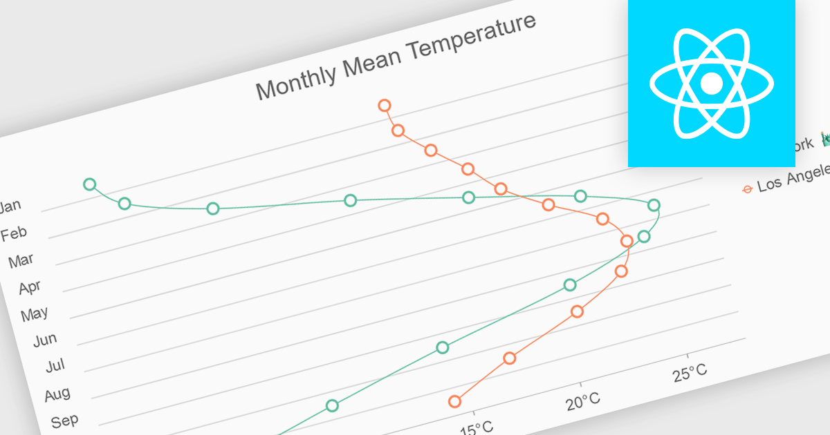
Spline charts are a type of line chart that uses smooth curves to connect data points, offering a visually appealing and intuitive representation of trends over time. Unlike traditional line charts with straight segments, spline charts emphasize the continuous nature of data, making them particularly effective for visualizing patterns, cycles, and gradual changes, commonly used in fields like finance, economics, and engineering to highlight the evolution of metrics and predict future trajectories
Several React chart controls offer spline charts including:
For an in-depth analysis of features and price, visit our React chart controls comparison.

Infragistics Ignite UI for Blazor is a comprehensive UI component library designed specifically for .NET developers building modern web applications with Blazor. It offers a rich set of over 60 components, including performant data grids, interactive charts, and essential UI elements. This allows developers to craft visually appealing, feature-packed Blazor applications with a focus on data visualization, user interaction, and a variety of design themes.
The Ignite UI for Blazor 24.1 release introduces the the 'HighlightingMode' property to the treemap control. This feature empowers developers to customize how treemap items respond to mouse-over events. The 'Brighten' options isolates the highlight to the hovered item, while the 'FadeOthers' options subtly dims all other items to accentuate the focused element. To refine the visual experience, developers have control over the animation speed, allowing for smooth and engaging transitions between highlighted and non-highlighted states.
To see a full list of what's new in version 24.1 (23.2.257), see our release notes.
Infragistics Ignite UI for Blazor is part of Infragistics Ignite UI which is licensed per developer and is available as a Perpetual License with a 1, 2 or 3 year support and maintenance subscription. See our Infragistics Ignite UI licensing page for full details.
Infragistics Ignite UI for Blazor is available in the following products:
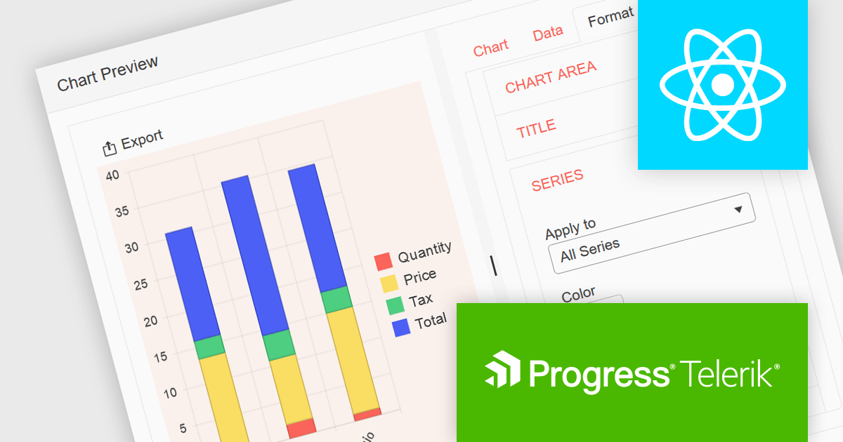
KendoReact by Telerik is a professional UI kit of more than 120 responsive and customizable native UI and data visualization components for React developers. Designed to save time building powerful high performance React applications, it helps ensure a modern, consistent look-and-feel across your application's user interface.
KendoReact v8.2.0, part of the 2024 Q3 release, adds a new chart wizard component, enhancing the developer experience by streamlining the chart creation process. This component provides a simple and intuitive interface that enables React developers to quickly create charts from a data-bound component or an external source. It guides you through a chart's configuration, allowing you to set up the chart type, title, series, legend, area, value axis, category axis and data source. This reduces the potential for errors in the chart setup whilst saving development time by reducing the complexity of building interactive data visualizations within React apps.
To see a full list of what’s new in 2024 Q3 (v8.2.0), see our release notes.
KendoReact is licensed per developer and is available as a perpetual license with a 1 year support subscription, which is available in 3 tiers: Lite, Priority or Ultimate. See our KendoReact licensing page for full details.
KendoReact is available to buy in the following products:


Tel.: (888) 850 9911
Fax: +1 770 250 6199


