Neuigkeiten zu Charts

Visualisieren von Datenbeziehungen mit Heatmaps

März 22, 2024
Erleichtern Sie Benutzern die einfache Erkennung von Trends über zwei Variablen hinweg mithilfe einer variablen Farbintensität für die Darstellung der Größe innerhalb eines Datensatzes.

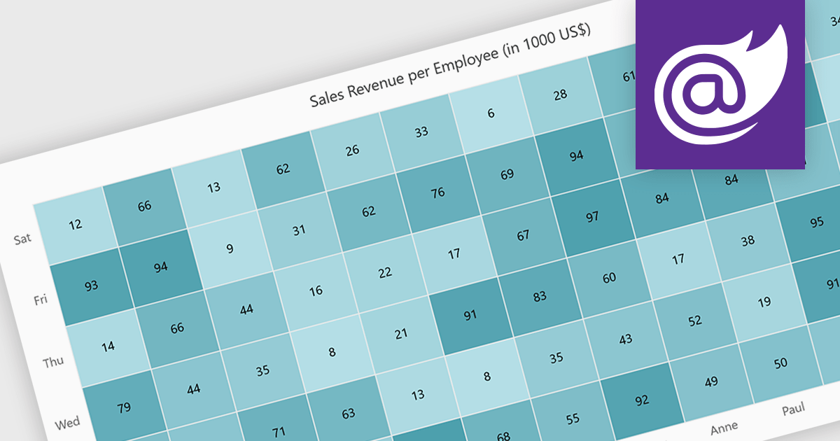
A heatmap is a data visualization tool that uses color intensity to represent magnitude within a dataset. This allows for quick identification of patterns and trends across two variables, depicted on the map's axes. Heatmaps are valuable for analyzing geographic data, user website interaction, and any other scenario where you need to visually grasp the distribution of data points.

Several Blazor chart controls offer Heatmaps including:

  • ComponentOne Charts for Blazor (part of ComponentOne Studio Blazor Edition by MESCIUS) empowers Blazor apps with interactive heatmaps for data exploration.
  • FusionCharts Blazor Suite XT provides a rich set of heatmap chart types for versatile data presentation.
  • Syncfusion Blazor Chart (part of Syncfusion Essential Studio Enterprise) offers comprehensive heatmaps with customization options for clear data visualization.
  • Infragistics Blazor Charts (part of Infragistics Ignite UI) facilitates creating heatmaps with conditional formatting to highlight specific data ranges.

For an in-depth analysis of features and price, visit our Blazor chart controls comparison.

Compare Blazor Chart Controls

Entwickeln moderner Diagrammanwendungen in .NET 8

Februar 28, 2024
Nevron Chart for .NET 2024.1 integriert die Unterstützung für .NET Core 8.0 in WinForms- und WPF-Steuerelemente und ermöglicht so hoch moderne Datenvisualisierungen in .NET 8-Apps.

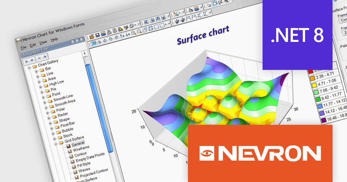
Nevron Chart for .NET is an advanced component suite designed for developers to add rich charting functionality to WinForms, WPF, ASP.NET and MVC applications. Covering any data visualization requirements it is an ideal solution for developing charting enabled presentation, business, scientific or financial applications. It boasts hardware acceleration for optimal performance, a flexible API for customization, and advanced interactivity features like zooming, panning, and tooltips to enhance user engagement with your data.

Nevron Chart for .NET 2024.1 adds support for Microsoft .NET Core 8.0 for the WinForms and WPF chart controls. This enables developers to leverage the latest features and performance improvements offered by the .NET ecosystem in their existing .NET applications, while still utilizing the comprehensive charting capabilities of Nevron Chart.

To see a full list of what's new in 2024.1, see our release notes.

Nevron Chart for .NET is licensed per developer machine and is available as a perpetual license with 1 year subscription and support. See our Nevron Chart for .NET licensing page for full details.

Nevron Chart for .NET is available to buy in the following products:

Nutzen Sie Trichterdiagramme zur Prozessoptimierung

Februar 28, 2024
Durch die Visualisierung von Daten durch Trichterdiagramme können Benutzer leicht Engpässe identifizieren, die die Effizienz behindern, und Bereiche mit Verbesserungspotenzial identifizieren.

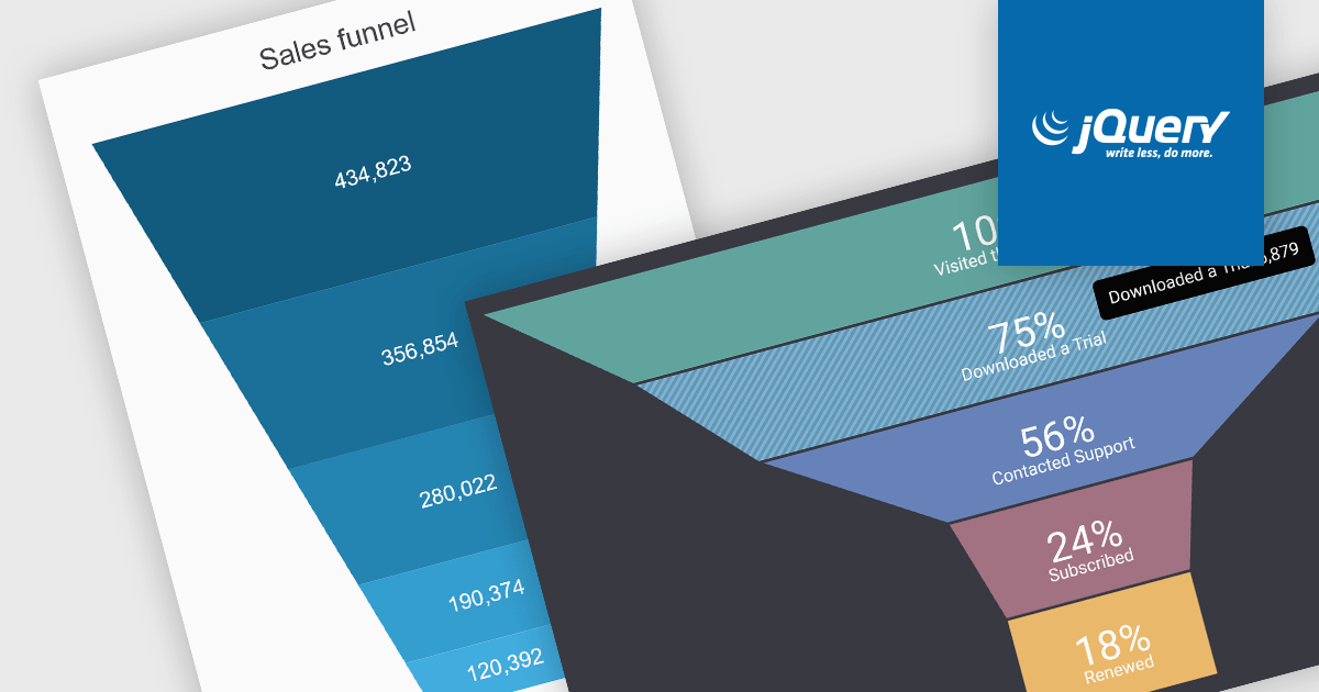
A funnel chart is a type of visualization that graphically depicts the stages of a process and the progressive flow of values through those stages. It gets its name from its shape, typically resembling a funnel with a wide top and narrow base. Funnel charts are particularly useful in sales and marketing contexts for tracking potential customers as they move through the sales pipeline, identifying bottlenecks, and pinpointing areas where performance might be improved.

Several jQuery chart controls offer Funnel charts including:

  • DevExtreme Chart (part of DevExtreme Complete by DevExpress) facilitates the creation of funnel charts with customization options for color, animation, and data labels.
  • Highcharts Core by Highsoft empowers you to design responsive funnel charts with interactive elements like tooltips and data highlighting.
  • Kendo UI for jQuery Chart (part of Kendo UI by Telerik) enables you to visualize data as funnel charts, offering customization for labels, data points, and tooltips.
  • Syncfusion JavaScript Chart (part of Syncfusion Essential Studio Enterprise) allows you to generate funnel charts with support for themes, data labels, and interactive elements.

For an in-depth analysis of features and price, visit our jQuery chart controls comparison.

Compare jQuery Chart Controls

Kommentieren Sie Diagramme, um visuelle Einblicke zu verbessern

Februar 21, 2024
Nutzen Sie Anmerkungen für Präzision und Übersichtlichkeit und verwandeln Sie Ihre .NET WPF-Diagramme in leistungsstarke Data Storytelling-Tools.

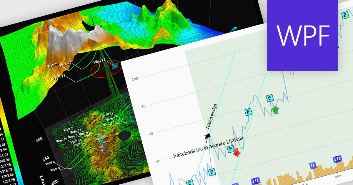
Annotations in a chart refer to additional textual or graphical elements overlaid onto the visual representation of data. They serve to provide context, explanations, or highlights within the chart, making it easier to understand. Software developers can utilize annotations to label specific data points, mark significant events, or add explanatory notes, thereby improving the clarity and insightfulness of the chart for end-users. By incorporating annotations, developers can effectively convey complex information, facilitate better data comprehension, and enable more informed decision-making processes within their applications.

Several WPF chart controls support annotations including:

  • Nevron Chart for WPF empowers data visualization with versatile annotations, enabling dynamic and interactive charting experiences in your WPF applications.
  • LightningChart .NET offers extensive customization for adding and managing annotations seamlessly within your .NET applications.
  • ProEssentials integrates robust annotation features into its WPF charts, allowing users to annotate data points with ease and enhance data interpretation effortlessly.

Many WPF suites contain chart controls with annotation support including:

  • DevExpress WPF Chart (part of DevExpress WPF) delivers sophisticated annotation capabilities, empowering users to annotate charts with rich content and customize annotations for comprehensive data representation.
  • ComponentOne Charts for WPF (part of ComponentOne Studio WPF) provides advanced annotation tools, facilitating the integration of descriptive elements into charts for clearer and more insightful data visualization.
  • Telerik WPF Chart (part of Telerik UI for WPF) offers intuitive annotation features, enabling users to add context and insights to data visualizations effortlessly, creating a compelling and informative display.

For an in-depth analysis of features and price, visit our comparison of WPF Chart Controls.

Compare .NET WPF Chart Controls

Hierarchische Beziehungen zwischen Konzepten darstellen

Februar 20, 2024
Pyramidendiagramme ermöglichen es Ihnen, komplexe hierarchische Beziehungen zu visualisieren und allgemeine Trends klar und prägnant zu vermitteln.

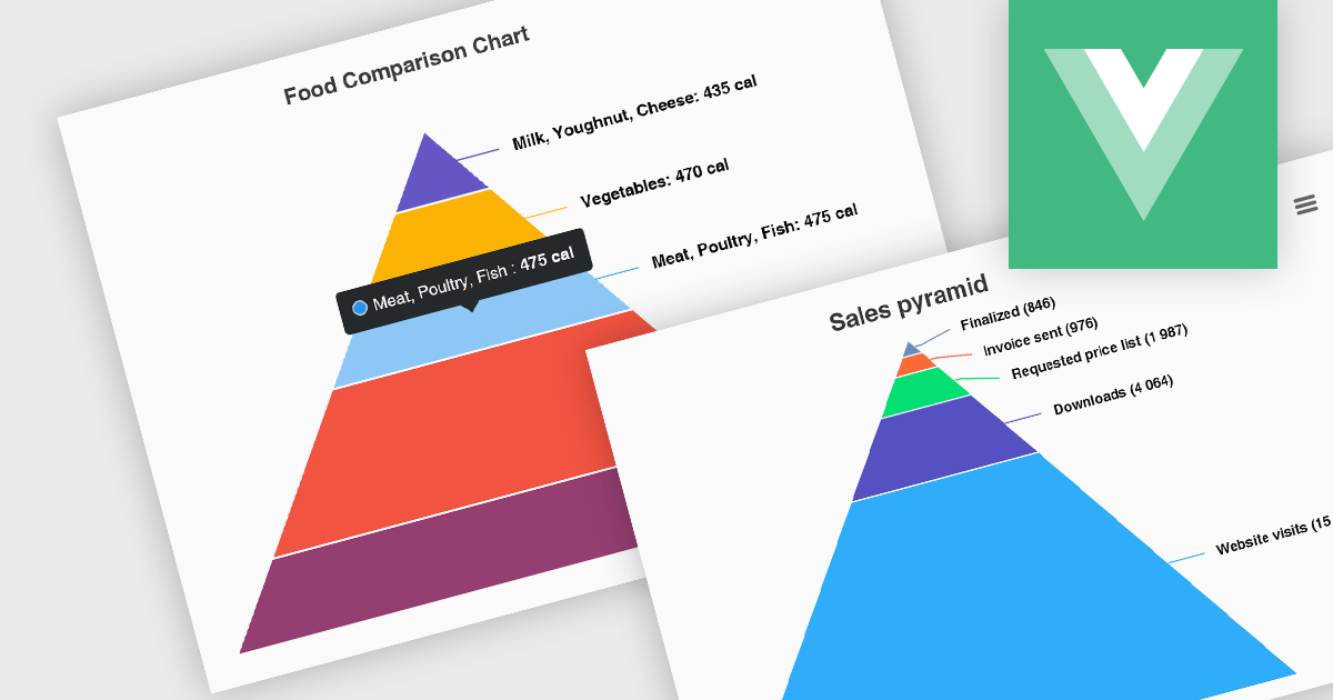
Pyramid charts, also known as triangle diagrams, utilize a triangular shape segmented into horizontal sections, each representing a level in a hierarchy, process, or simple dataset. Their strength lies in visually depicting hierarchical relationships, emphasizing the relative importance or size of each level through varying widths. The easily understood layout makes them ideal for communicating clear, singular data points in fields like sales funnels, population structures, and educational concepts.

Several Vue.js chart controls offer pyramid charts including:

  • DevExtreme Chart (part of DevExtreme Complete by DevExpress) lets you visualize complex hierarchies with intuitive pyramid charts, ideal for presentations and reports.
  • Highcharts Core allows you to craft interactive pyramid charts to showcase hierarchical structures and process flows in a user-friendly format.
  • Kendo UI for Vue Chart (part of Kendo UI by Telerik) enables you to leverage pyramid charts to effectively communicate hierarchical relationships and sequential progressions.
  • Syncfusion JavaScript Chart (part of Syncfusion Essential Studio Enterprise) offers pyramid charts to depict hierarchical data and process flows within your apps.

For an in-depth analysis of features and price, visit our Vue.js chart controls comparison.

Compare Vue.js Chart Controls