


Offizieller Lieferant
Als offizieller und autorisierter Distributor beliefern wir Sie mit legitimen Lizenzen direkt von mehr als 200 Softwareherstellern.
Sehen Sie alle unsere Marken.
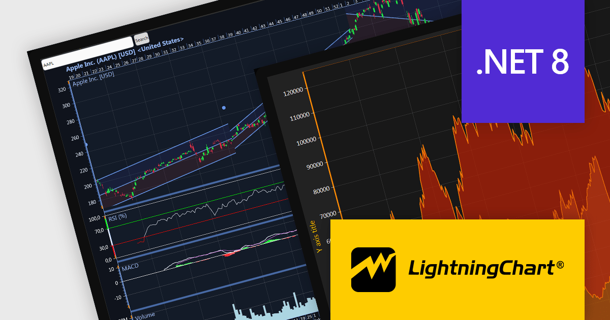
LightningChart .NET is a 2D and 3D data visualization SDK empowering developers with high-performance and flexibility. Boasting over 100 chart types, advanced technical indicators, and real-time rendering capabilities, it handles demanding scientific, financial, and engineering challenges, while its rich API and comprehensive support equip developers to craft informative and interactive dashboards.
The LightningChart .NET v10.5.1.1 release adds support for .NET 8, allowing developers to integrate advanced charts and graphs into their data visualization applications in the latest release of Microsoft's widely popular .NET ecosystem.
To see a full list of what's new in LightningChart .NET, see our release notes.
LightningChart .NET is licensed per developer and is available as a subscription, perpetual, floating, or site license with options for 1 or 2 years of support and upgrades. See our LightningChart .NET licensing page for full details.
For more information, see our LightningChart .NET product page.
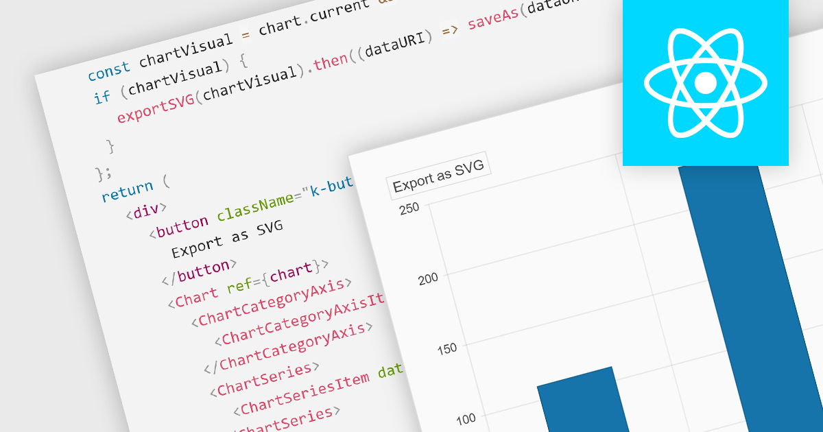
Exporting charts to SVG (Scalable Vector Graphics) format is vital for maintaining high-quality visuals in digital formats. SVGs are resolution-independent, meaning they retain their quality at any size, which is crucial for presentations or reports that might be viewed on different devices. This feature allows users to share their charts outside the chart creation tool while ensuring visual fidelity and sharpness.
Several React chart controls offer support for exporting to SVG including:
For an in-depth analysis of features and price, visit our React chart controls comparison.
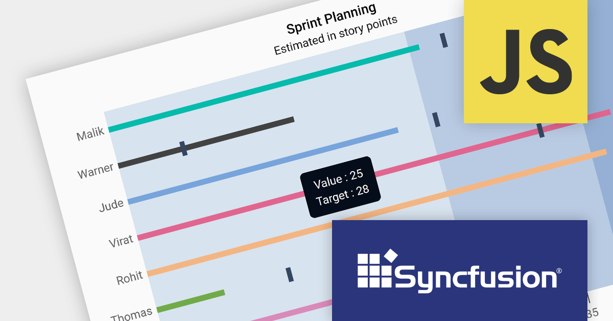
Syncfusion Essential Studio JavaScript, available as part of Syncfusion Essential Studio Enterprise, is a comprehensive UI library offering over 80 high-performance, lightweight, and responsive components to transform your web apps. Built from scratch with TypeScript, it boasts modularity and touch-friendliness, letting you pick and choose specific features while ensuring smooth mobile interaction. With rich themes, global accessibility features, and extensive documentation, it powers everything from basic buttons to interactive charts and data grids, simplifying frontend development across JavaScript, Angular, React, and Vue.
Version 2023 Volume 4 (24.1.41) adds the ability to customize your bullet charts by assigning specific colors to individual value and target bars. Bullet charts are a concise and data-rich visualization tool ideal for dashboards and performance presentations. They efficiently display several key metrics within a single bar, allowing for swift comparison between a primary measure, target values, and qualitative performance ranges. By combining visual cues like color and bar lengths, bullet charts enable rapid interpretation of data, making them perfect for decision-makers who need to grasp complex information at a glance.
To see a full list of what's new in version 2023 Volume 4 (24.1.41), see our release notes.
Syncfusion Essential Studio JavaScript is available as part of Syncfusion Essential Studio Enterprise which is licensed per developer starting with a Team License of up to five developers. It is available as a 12 Month Timed Subscription License which includes support and maintenance. See our Syncfusion Essential Studio Enterprise licensing page for full details.
For more information, visit our Syncfusion Essential Studio JavaScript product page.
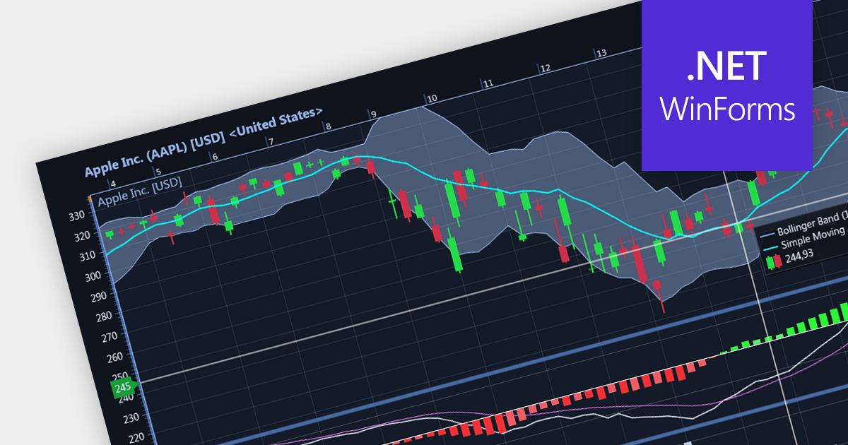
Candlestick charts are a style of financial chart used to describe price movements of a security, derivative, or currency. Each "candlestick" typically shows one day, with the central "box" representing the range between the opening and closing prices and the lines showing highs and lows. Their unique visual format helps traders to quickly understand market sentiment.
Several WinForms chart controls offer Candlestick charts including:
For an in-depth analysis of features and price, visit our WinForms chart controls comparison.

.netCHARTING provides a managed charting solution for C# and VB.NET developers working with ASP.NET or WinForms. It combines visually stunning graphics and a comprehensive interface that help add compelling charts to your apps. This high performance charting control also contains a feature rich data access and aggregation system with calculation support.
The .netCHARTING V10.6 release adds support for .NET 8. This allows developers to enjoy the performance boosts, enhanced cross-platform compatibility, and new APIs in the latest version of Microsoft's popular development framework.
.netCHARTING is licensed per site (1 web site on 1 sever), per server (unlimited web sites on 1 server) or per developer (single application) and is available as a Perpetual License with a 12 month subscription which includes major and minor upgrades and priority email support. See our .netCHARTING licensing page for full details.
For more information, visit our .netCHARTING product page.


Tel.: (888) 850 9911
Fax: +1 770 250 6199


