


Offizieller Lieferant
Als offizieller und autorisierter Distributor beliefern wir Sie mit legitimen Lizenzen direkt von mehr als 200 Softwareherstellern.
Sehen Sie alle unsere Marken.
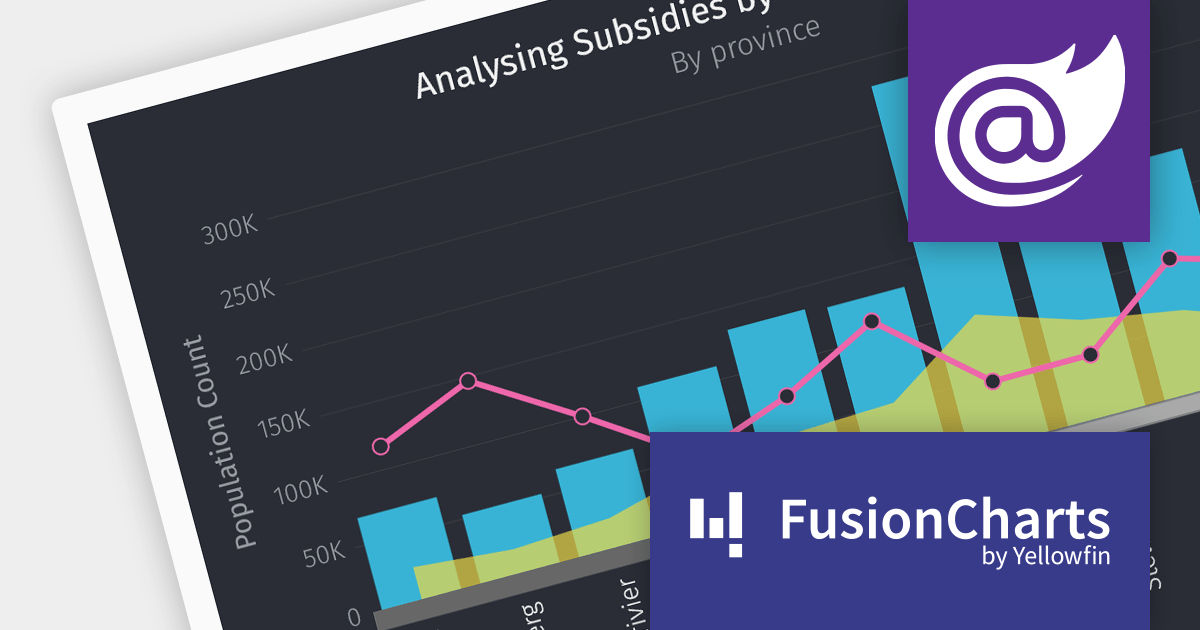
FusionCharts Suite XT is a powerful collection of charting and mapping tools that helps developers create interactive and data-driven dashboards for their web and mobile applications. It provides a wide range of features, including over 100 chart types, data-driven maps, and a variety of customization options. FusionCharts Suite XT helps you visualize and present data in a clear and engaging way.
The FusionCharts Suite XT v3.22 release introduces seamless integration with Blazor, allowing you to create visually appealing and informative data visualizations that enhance the overall user experience. These visualizations offer feature-rich configuration options that boost charting performance, enabling efficient client-side rendering and fast chart display, even with large datasets.
To see a full list of what's new in v3.22, see our release notes.
For more information, visit our FusionCharts Suite product page.
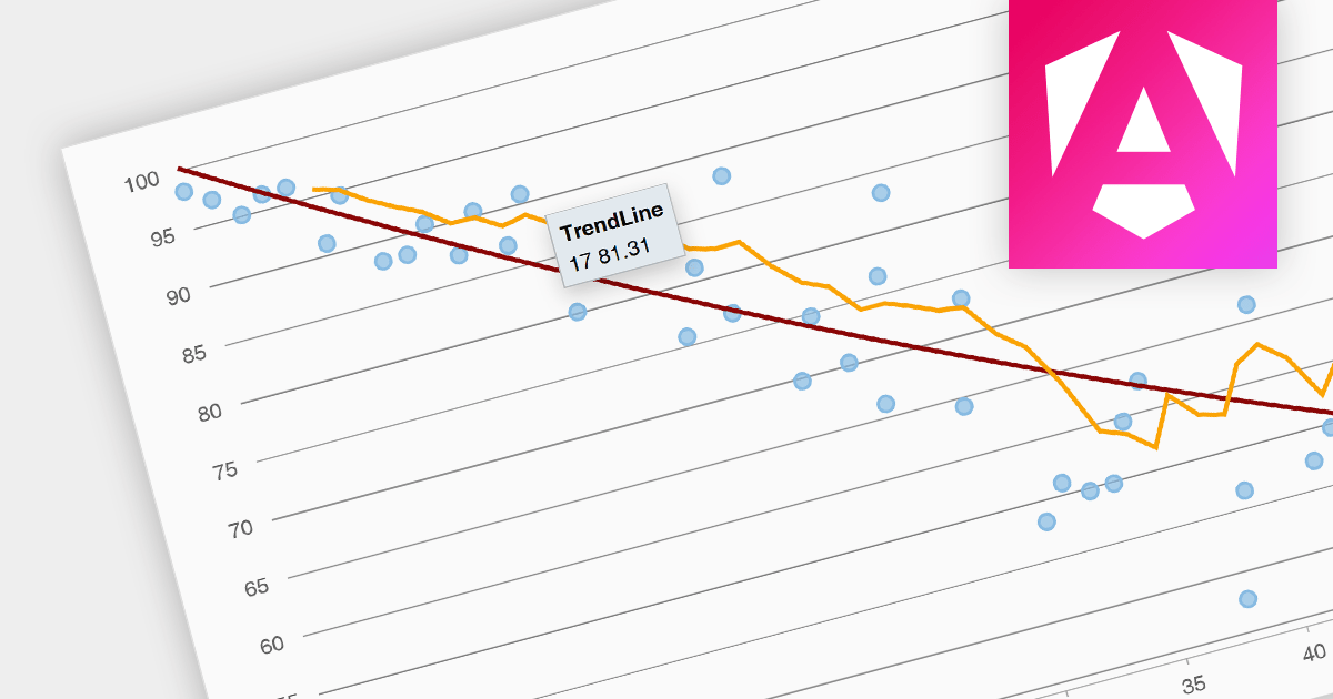
Trend lines are a chart feature used to indicate patterns or trends in data over time. Common examples include linear, exponential, polynomial, logarithmic, and moving average. Trend lines are crucial for making predictions or understanding the direction of data points in scatter plots and line charts, helping make data-driven decisions.
Several Angular chart components provide trend line support including:
For an in-depth analysis of features and price, visit our Angular Chart Component comparison.
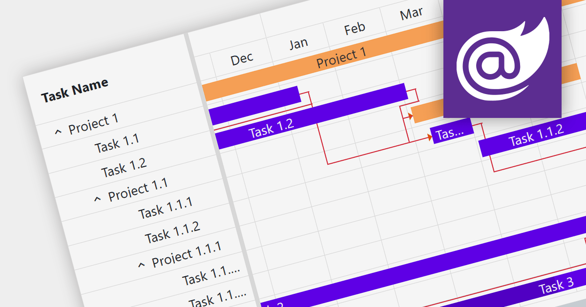
Gantt charts are a type of bar chart designed to illustrate project schedules. They display the start and end dates of different elements of a project and are essential for project management. These charts are useful for tracking project progress and for planning by showing how project tasks overlap and relate to each other.
Several Blazor chart components provide Gantt charts including:
For an in-depth analysis of features and price, visit our Blazor Charts comparison.
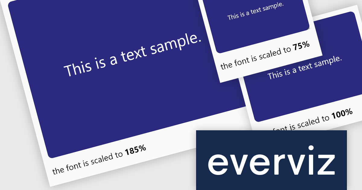
everviz is a cloud-based data visualization platform that empowers users to create visually appealing interactive charts, maps, and other visuals.
The October 2023 update of everviz adds a new dynamic font scaling feature. This allows chart text to be intelligently resized to fit your publishing destination, whether it's intended for print, video, or the web. It is particularly useful when exporting visualizations in video format, where the text size requirements are significantly different from those of an online article. Dynamic font scaling helps maintain a consistent visual quality across your visualizations.
To see a full list of what's new, see our release notes.
For more information, see our everviz product page.
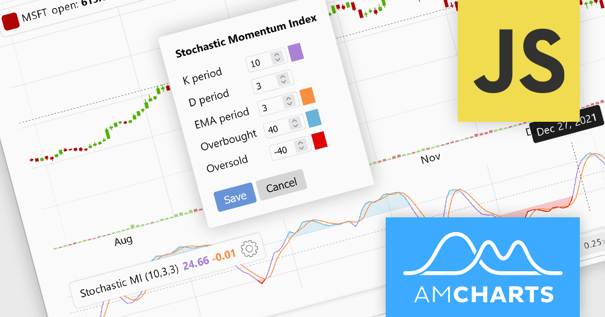
amCharts 5: Stock Chart provides analytical tools for displaying time-based data, be it financial, stock or otherwise. It is a ready-made library that allows you to add interactive financial charts to a vast array of applications.
amCharts v5.5.3 adds built-in support for the Stochastic Momentum Index (SMI) to its bundled indicator control, allowing you to add the SMI to your charts via a simple user interface. This indicator reduces false signals by measuring the distance between the current closing price and the midpoint of the high/low price range. The SMI is a valuable technical indicator that can help traders identify potential trend reversals, capture momentum shifts, and make more informed trading decisions. Adding the SMI to your stock charts can help users gain a competitive edge in the market.
To see a full list of what's new in v5.5.3, see our release notes.
For more information, see our amCharts 5: Stock Chart product page.


Tel.: (888) 850 9911
Fax: +1 770 250 6199


