


Offizieller Lieferant
Als offizieller und autorisierter Distributor beliefern wir Sie mit legitimen Lizenzen direkt von mehr als 200 Softwareherstellern.
Sehen Sie alle unsere Marken.
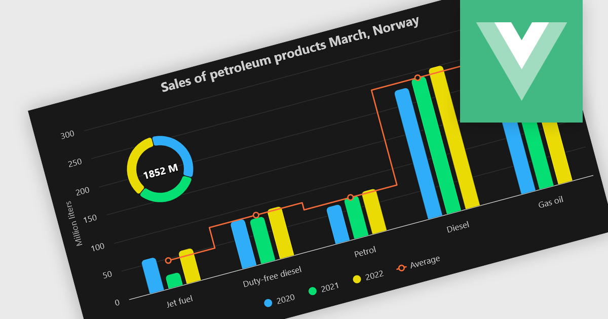
A combination chart or combo chart is a versatile type of data visualization that displays multiple chart types, such as columns, lines, or areas, to represent different data series within a single graphic. Combination charts are especially useful in scenarios where a single data type cannot fully convey the complexity of the dataset. By presenting different series types together, combination charts enhance the clarity and depth of insight available in a single view, be it on the same axis or across dual axes. This helps users to analyze complex relationships, trends and correlations between metrics more effectively than separate charts would allow.
Several Vue.js chart components allow you to combine series types on the same chart, including:
For an in-depth analysis of features and price, visit our comparison of Vue.js chart components.
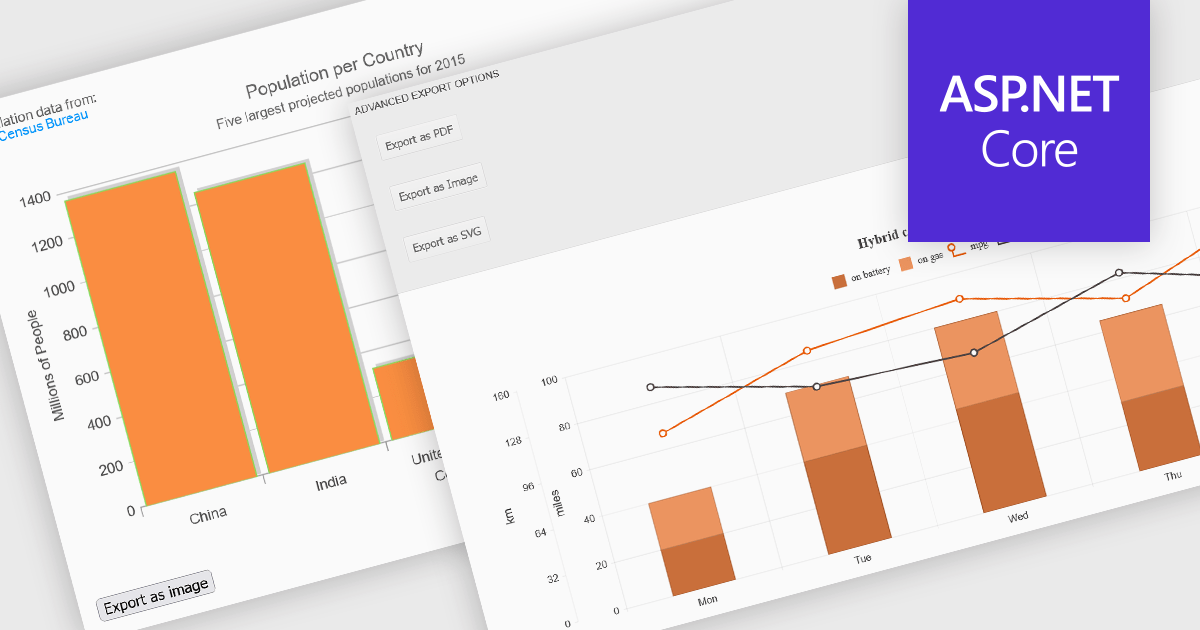
Export features in charting components allow developers and users to take visualized data beyond the browser, whether for sharing, archiving, or integrating into reports and presentations. These tools support a wide range of formats and workflows, transforming interactive charts into portable assets that can be printed, saved, or embedded in other applications. By offering export capabilities alongside dynamic charting, modern components bridge the gap between visual exploration and formal communication of data, ensuring insights can be distributed effectively in both digital and hardcopy formats.
Common features include:
For an in-depth analysis of features and price, visit our ASP.NET Core charting components comparison.
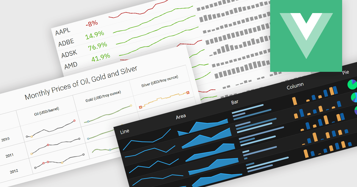
Typically embedded within text, tables/grids, or dashboards, sparklines are small-scale, data-driven graphics that present trends, patterns, or fluctuations within a dataset in a visually compact format. Unlike full-scale charts, sparklines do not include axes or labels, allowing them to present time-series or categorical data in a condensed form to deliver immediate visual cues without interrupting the flow of surrounding content. This design makes sparklines well-suited for highlighting patterns and changes over time or comparing multiple values side-by-side whilst helping users quickly identify key insights without leaving the context of the data.
Several Vue.js charting components offer sparkline functionality, including:
For an in-depth analysis of features and price, visit our comparison of Vue.js chart components.
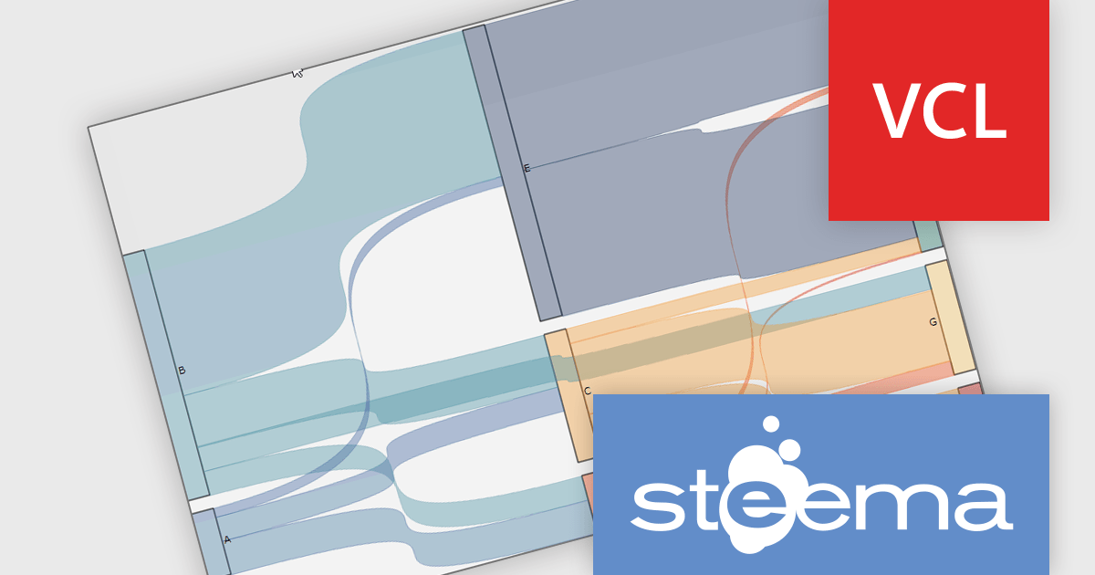
TeeChart Pro VCL/FMX by Steema Software is a comprehensive charting library designed for Embarcadero's Delphi and C++Builder environments, supporting both the VCL (Visual Component Library) and FMX (FireMonkey) frameworks. It provides developers with a rich set of chart types, advanced data visualization tools, and interactive features to build visually compelling and data-intensive applications across Windows, macOS, iOS, and Android. With support for real-time charting, custom drawing, statistical functions, and export capabilities, TeeChart Pro is tailored for high-performance applications that demand precise and dynamic chart displays.
The TeeChart Pro VCL/FMX 2025 (Build 2025.45.250910) update introduces the Sankey Series chart type, which gives developers a new tool for visualizing flows and relationships in data (e.g. movement of quantities between states, split‑paths, or aggregations). It enables rendering of nodes and links whose thickness is proportional to the magnitude of the flow, allowing you to more directly see how values distribute and split across paths. This enhances insight into complex datasets in ways that standard bar, line, or pie charts cannot, helping in diagnosing bottlenecks, tracing resource paths, or modelling multi‑stage processes with clarity.
To see a full list of what's new in 2025 (Build 2025.45.250910), see our release notes.
TeeChart Pro VCL/FMX is licensed per developer and includes a one year subscription for minor and major updates plus access to technical support. Priority support is also available. See our TeeChart Pro VCL/FMX licensing page for full details.
Learn more on our TeeChart Pro VCL/FMX product page.

Chart themes provide a simple yet powerful way to standardize the appearance of charts by applying predefined color schemes, fonts, and styling options across visualizations. Instead of manually adjusting each element, users can quickly switch between themes to achieve a consistent, professional look that aligns with brand guidelines or presentation needs. The benefits include improving readability, enhancing accessibility - with inclusive color palettes - and ensuring visual consistency across multiple charts or entire dashboards. Chart themes improve the process of creating impactful, audience-ready data visualizations.
Several .NET WPF chart components offer the ability to add themes, including:
For an in-depth analysis of features and price, visit our .NET WPF charts comparison.


Tel.: (888) 850 9911
Fax: +1 770 250 6199


