NOV UI for .NET
Vielseitige, plattformübergreifende Benutzeroberflächenelemente.
Veröffentlicht von Nevron
Wird von ComponentSource seit 1999 vertrieben
Preise ab: $ 2,740.08 Version: 2023.1 Letzte Aktualisierung: May 16, 2023
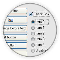
Buttons are widgets, which are typically used to perform a certain action, when clicked. NOV features a complete set of buttons that can contain arbitrary content (i.e. other widgets). Main types of buttons include: Standard buttons, Repeat buttons, Toggle buttons, Check boxes, Radio buttons, Split buttons plus others.

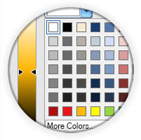
Color pickers are widgets that allow the user to pick a color by modifying one or all of its color components through a visual interface. NOV includes Palette Color Picker, Luminance Color Bar, Hue Color Bar, Saturation-Brightness Color Box, HSB Box Color Picker, HSB Wheel Color Picker and Color Box.

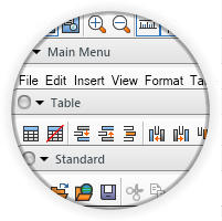
NOV implements advanced command bars that mimic the commanding logic of Microsoft Office 2003, Visual Studio etc. NOV command bars can contain any other widget, and have support for many advanced features. Specific sub types of commands bars include: Menu Bar, Tool Bar and Status Bar.

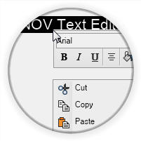
Context popups are Popup Windows opened that are opened in a context fashion. Context popups are used usually used for Context Menus and Custom Context Popups.

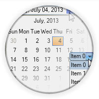
Drop down edits consist of a specific editing area and a drop down button located at the right side. When the drop down button is clicked the drop down edit opens popup window, which assists the user with the editing. Notable drop-down edits are: Combo Box, Date Time Box, Color Box & Split Buttons.

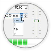
Range based widgets are widgets, which display a range and a current value. Notable range based widgets are: Scrollbar, Slider, Numeric Up Down and Progress Bar.

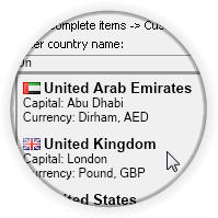
The Label and Text Box widgets allow for the visualization and editing of Unicode text. They are based on Nevron's proprietary managed Typography and as such are the only Label and Text Box in the .NET world that can guarantee you 100% identical text quality and speed in all environments.

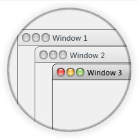
Top level windows are windows that are opened on top of other windows in the specific presentation layer windows stack. The Top Level Windows of Nevron UI Widgets are virtualized. They feature full control over the window frame and title bar, and can be opened in modal fashion. Top level windows are usually used for Popups and Dialogs.

nevron UI widgets are styled with CSS and currently include the following themes: Windows 7, Windows XP Blue, Windows Classic (with all color scheme variations) and Mac Lion.

