


Fornitore ufficiale
In qualità di distributori ufficiali e autorizzati, forniamo licenze software legittime direttamente da più di 200 autori di software.
Vedi tutte le nostre marche

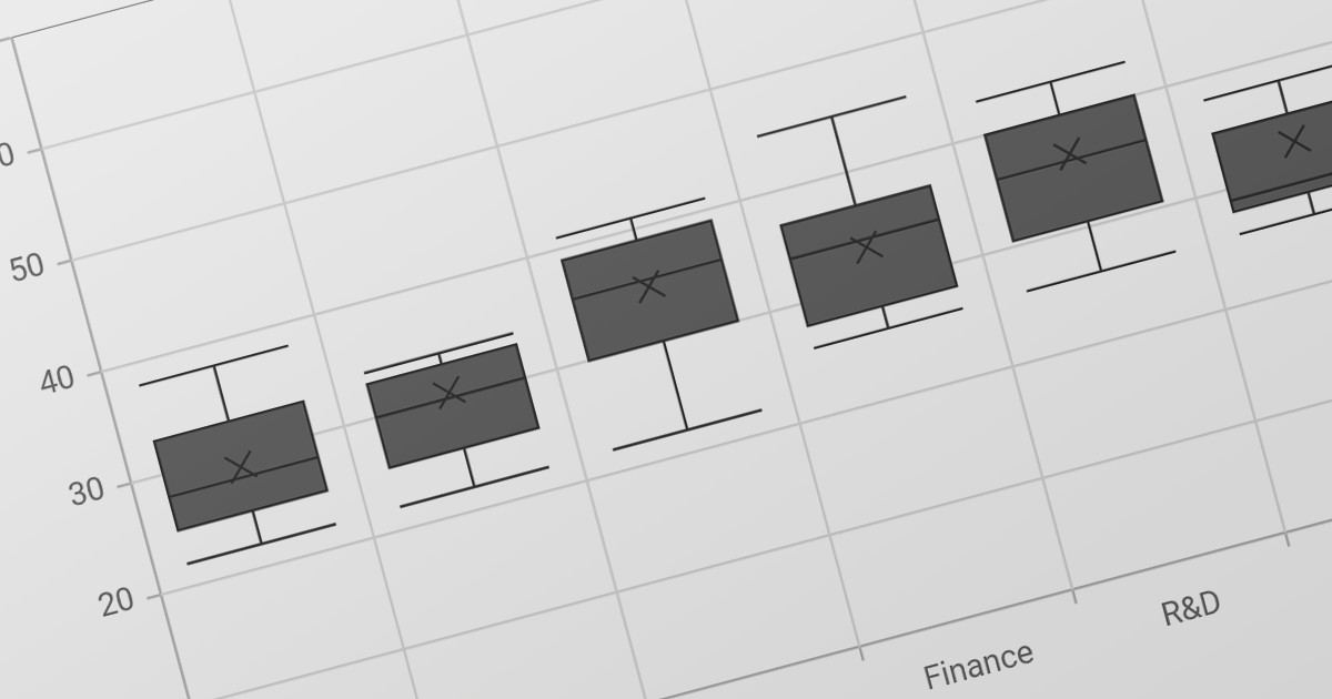
Trend lines in charts are analytical tools that represent the general direction or tendency of data over time, helping users interpret patterns that may not be immediately visible in raw data. By smoothing out short-term fluctuations, trend lines clarify long-term behavior, highlight growth or decline, and support more informed decision-making. They are commonly used in business dashboards to track performance metrics, in financial analysis to assess market trends, and in operational reporting to identify recurring patterns, forecast outcomes, and compare multiple data series with greater clarity.
Several Blazor chart components provide trend line support including:
For an in-depth analysis of features and price, visit our Blazor Chart Component comparison.
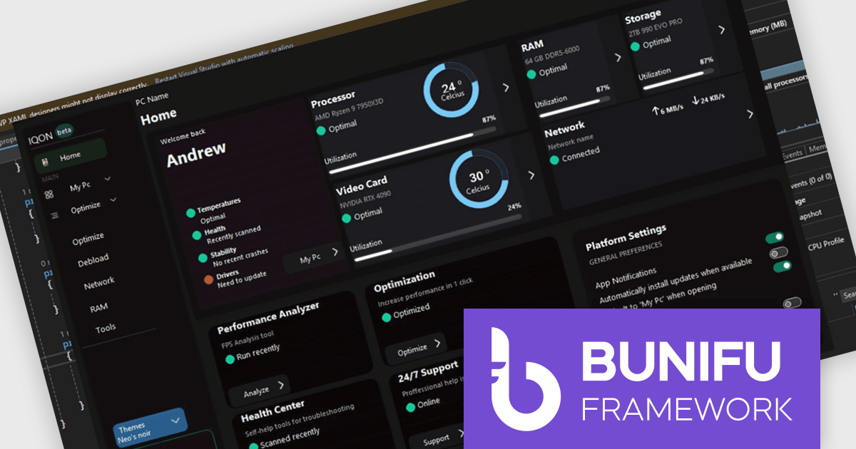
Bunifu UI WinForms is a user interface (UI) framework designed to improve the development of modern and visually appealing desktop applications using Microsoft's WinForms platform. It provides a wide array of pre-built, customizable UI components, such as charts, a data grid, gradient panel, and slider, that emphasize a minimalist aesthetic while maintaining performance efficiency. With it developers can significantly enhance the UI development process, allowing them to drag-and-drop elements and leverage extensive design properties to create professional-looking applications in less time.
Designing a system performance monitor UI using Bunifu UI WinForms allows software developers to create modern, visually clear, and responsive monitoring interfaces while continuing to work within the familiar WinForms framework. The framework provides ready-made, highly customizable controls and smooth interaction behaviors that simplify building professional dashboards for real-time system metrics, reduce reliance on custom UI rendering and styling code.
Bunifu UI WinForms is licensed per developer and are available in four plans, three of which are annual licenses while the other is perpetual. All plans come with free version updates and Premium support for the active license period. See our Bunifu UI WinForms licensing page for full details.
Bunifu UI WinForms is available in the following products:
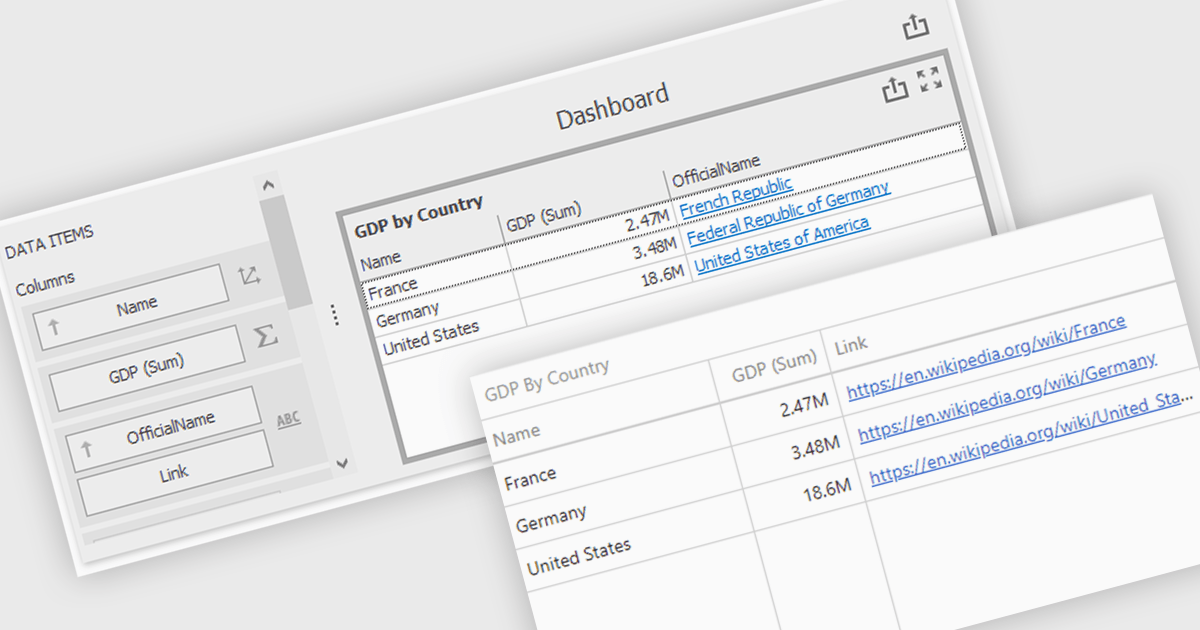
Hyperlinks in grid cells allow data within a grid to be presented as clickable links, enabling users to navigate directly to related pages, records, or actions from a single view. This reduces the need for extra navigation steps, and makes relationships between data clearer and more intuitive. Key benefits include faster access to detailed information and a more interactive user experience. Common use cases include linking order numbers to order details, customer names to profile pages, or grid entries to related documents, reports, or edit screens.
Several .NET WinForms grid controls offer hyperlink cell types, including:
For an in-depth analysis of features and price, visit our .NET WinForms grid controls comparison.

ComponentSource and Aspose have worked closely together for 20 years, building a strong partnership focused on delivering industry leading file format and document processing solutions. Aspose provides a comprehensive range of .NET and Java APIs that enable developers to create, modify, convert, and render popular business file formats such as Word, Excel, PowerPoint, PDF, and Project without relying on external applications.
A standout offering in this portfolio is Aspose.Total for .NET, the flagship product available from ComponentSource, which bundles Aspose’s full suite of file management APIs into one powerful and cost effective solution for enterprise development teams.
This long standing partnership allows ComponentSource to differentiate its offering by providing customers worldwide with trusted, best in class document processing tools, backed by expert licensing support, global reach, and a proven track record of reliability.
Learn more about Aspose.
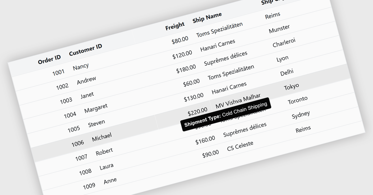
Tooltips in grid components provide contextual information that appears when users hover over or focus on a cell, column header, or row. It offers a practical way to surface additional details such as full text for truncated values, validation messages, or explanatory metadata without overcrowding the grid layout. For data-heavy interfaces, this feature improves readability and usability by keeping the primary view concise while still making secondary information readily accessible when needed.
Several Blazor grid controls offer FEATURE including:
For an in-depth analysis of features and price, visit our Blazor grid controls comparison.





Tel: (888) 850 9911
Fax: +1 770 250 6199


