


Fornitore ufficiale
In qualità di distributori ufficiali e autorizzati, forniamo licenze software legittime direttamente da più di 200 autori di software.
Vedi tutte le nostre marche
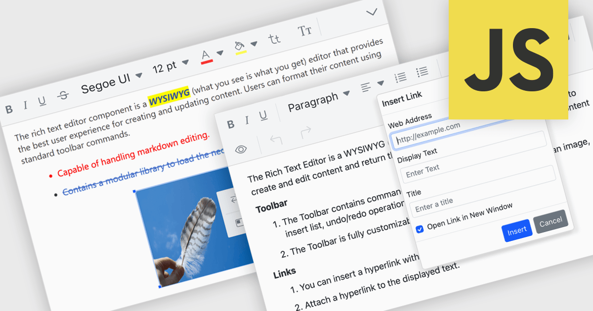
RTF editor support in a data editor component means the component can display, edit, and persist Rich Text Format (RTF) content, allowing users to work with formatted text that includes fonts, styles, alignment, and embedded elements rather than plain text. For software developers, this enables applications to store and manage rich textual data such as notes, descriptions, or documents directly within structured data processes, while relying on a standardized, well-supported format. The result is improved user input quality, consistent formatting across systems, and reduced need for custom text handling logic, while still maintaining compatibility with databases and backend services that expect structured data.
Several JavaScript data editor collections provide RTF editing capabilities including:
For an in-depth analysis of features and price, visit our comparison of JavaScript Data Editor components.
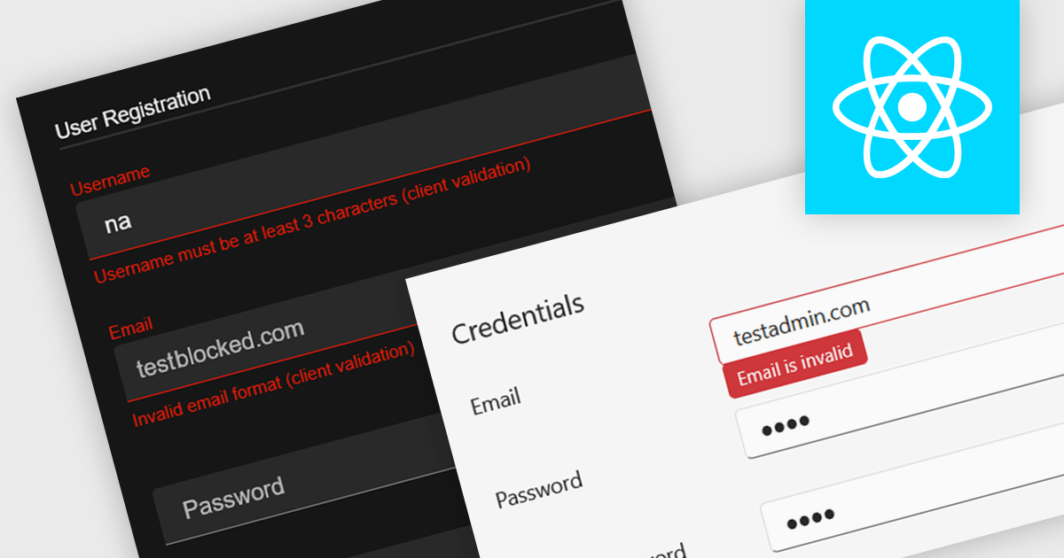
Data validation in a data editor component refers to the process of automatically checking user input against defined rules to ensure accuracy, consistency, and adherence to expected formats before the data is processed or stored. This can include checks for data types, required fields, value ranges, or pattern matching, typically enforced either on the client side for immediate feedback or on the server side for security and integrity. For software developers, incorporating data validation into a data editor improves data quality, reduces the risk of application errors, and enhances the user experience by guiding users to correct mistakes early in the input process.
Several React data editor collections provide support data validation, including:
For an in-depth analysis of features and price, visit our comparison of React data editors.
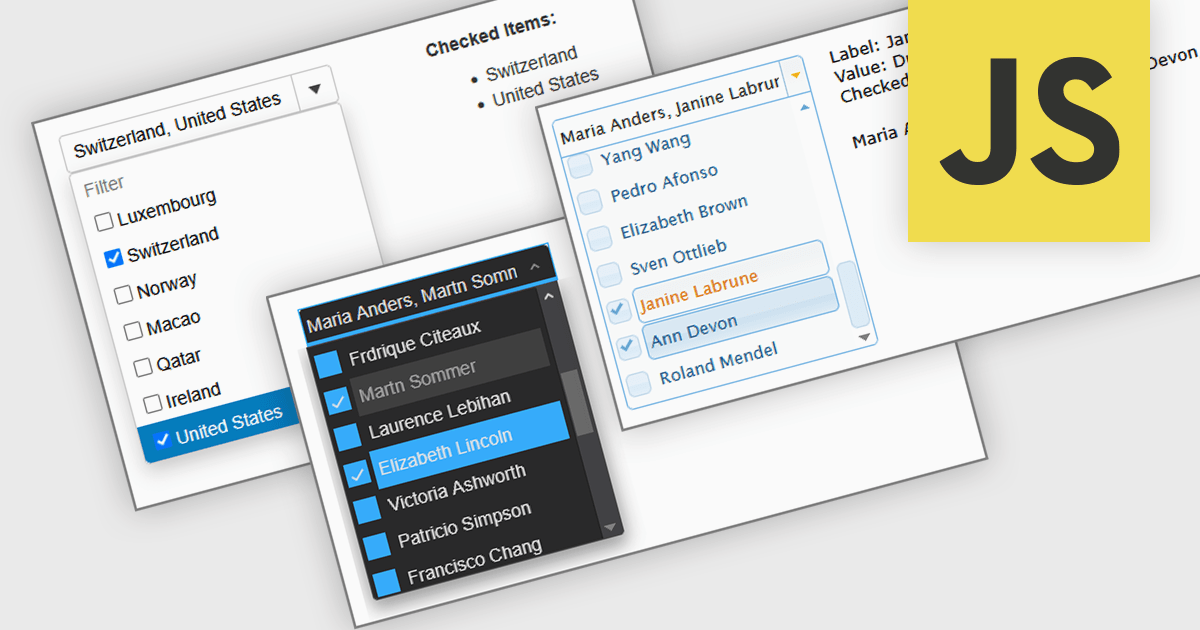
A Checked Combobox in a JavaScript Data Editor is a user interface component that allows users to select multiple options from a dropdown list using checkboxes. It combines the compact form of a combobox with the functionality of a multi-select control, helping to conserve screen space while enabling clear, granular input. This component simplifies data entry and editing workflows, particularly when working with datasets that require multiple discrete values to be associated with a single field. For developers, it offers a way to manage complex form inputs more efficiently, improving both usability and data integrity in cross-platform data management applications.
Several JavaScript data editors offer checked combobox functionality including:
For an in-depth analysis of features and price, visit our comparison of JavaScript data editors.
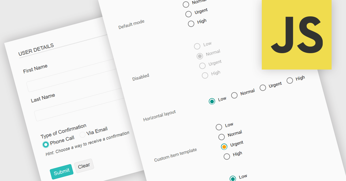
A radio group in data editing refers to a set of mutually exclusive options presented as selectable buttons, where only one option can be active at a time. It is typically used in user interfaces to enforce a single selection from a predefined set of values, which helps reduce input errors and ensures data consistency. By visually grouping related choices and clearly indicating the selected value, a radio group simplifies decision-making for users and speeds up data entry. This control is especially useful in forms and configuration settings where a user must choose one valid option from several possibilities.
Several JavaScript data editor collections provide support for radio groups, including:
For an in-depth analysis of features and price, visit our comparison of JavaScript data editors.
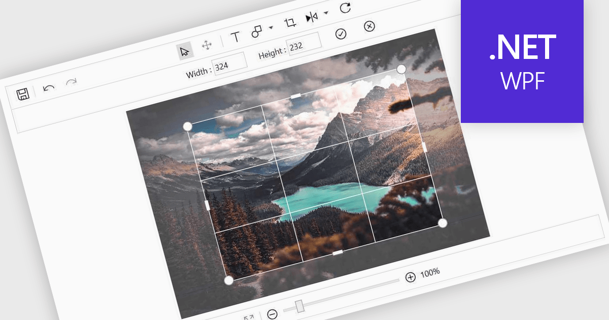
Image editing in a data editor component helps users work with images alongside other data fields. This includes basic functions like cropping, rotating, resizing, and adding annotations. It's useful for tasks such as cleaning up user-uploaded files, adjusting product photos, or marking up visual references—all without switching to another application. This keeps image handling part of the same process as your data updates.
Several .NET data editor collections provide an image editor, including:
For an in-depth analysis of features and price, visit our .NET data editors comparison.


Tel: (888) 850 9911
Fax: +1 770 250 6199


