


Fornitore ufficiale
In qualità di distributori ufficiali e autorizzati, forniamo licenze software legittime direttamente da più di 200 autori di software.
Vedi tutte le nostre marche
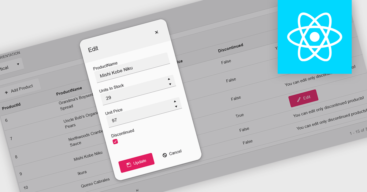
A pop-up editor in a grid provides an efficient and user-friendly way to edit data directly within a grid interface without navigating to a separate page. When a record is selected for editing, a pop-up window appears above the grid, presenting all relevant fields in a clean, structured form. This approach streamlines data management by allowing focused edits while preserving the context of the main dataset. It is particularly beneficial for complex records that contain multiple fields, nested information, or require detailed validation. Common use cases include editing customer records in CRM systems, updating inventory details in product management dashboards, or modifying entries in administrative data grids. By combining convenience, clarity, and control, a pop-up editor enhances both productivity and the overall user experience.
Many React grid controls offer popup editors including:
For an in-depth analysis of features and price, visit our comparison of React Grid Controls.
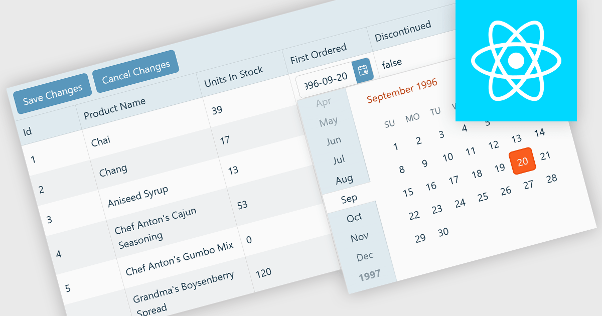
A custom grid editor allows developers to tailor how users interact with data directly within grid cells, providing a flexible and efficient editing experience. Instead of relying on standard text inputs, custom editors can include dropdowns, sliders, toggles, or calendar components to match the data type. This approach not only improves data entry and validation but also enhances accuracy and user satisfaction by ensuring inputs are contextually relevant. For example, a date field might use an inline date picker, while a status column could feature a dropdown with predefined options. Ideal for data-heavy applications such as dashboards, scheduling tools, and administrative panels, custom grid editors help users to edit complex data quickly and intuitively without leaving the main interface.
Several React Grid controls offer support for custom editing including:
For an in-depth analysis of features and price, visit our comparison of React Grid controls.
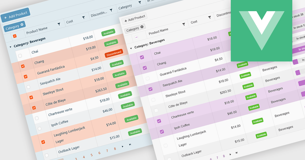
A checkbox cell type in a grid allows users to easily manage Boolean (true or false) data through a simple and visual interface. Instead of typing values manually, users can quickly toggle a checkbox to indicate states such as active or inactive, complete or incomplete, or enabled or disabled. This interaction reduces input errors and enhances data clarity, making it easy to scan and understand information at a glance. Checkbox cells improve productivity by supporting quick edits, bulk selections, and efficient filtering based on checked or unchecked values. Common use cases include task tracking, user permissions, product availability, and feature toggles where a binary choice improves workflow efficiency and usability.
Several Vue.js grid components offers checkbox cell type support, including:
For an in-depth analysis of features and price, visit our comparison of Vue.js grid components.
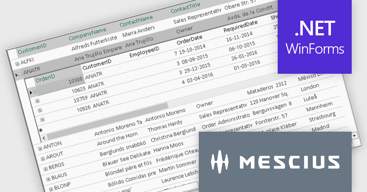
ComponentOne FlexGrid is a powerful Datagrid for your .NET WinForms applications, enabling .NET developers to display, edit, and analyze large data sets within a familiar Excel-like experience. It is optimized for high-performance and flexibility, allowing you to customize every aspect of the control.
On Wednesday, October 15th, at 11:00 AM EDT, MESCIUS (formerly GrapeCity) will be presenting a CodeClinic Live Webinar to demonstrate how you can upgrade your approach to data visualization through performance tuning, customized operations, and advanced data operations while learning practical tips and best practices. Key highlights include:
Register for the Live Webinar today and mark your calendar for October 15.
Infragistics Ignite UI for Angular is a comprehensive suite of Angular components and UI controls designed to accelerate development of high-performance, enterprise-grade web applications. It offers a rich collection of data grids, charts, and other UI elements, along with advanced features like pivoting, docking, and hierarchical data management. Built on Angular, the toolkit integrates into existing projects and provides a foundation for building modern, responsive, and interactive user interfaces.
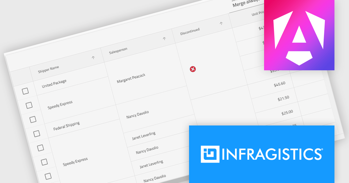
The Ignite UI for Angular 20.1 release introduces a new cell merging feature that enhances data readability by automatically combining vertically adjacent cells with identical values into a single, larger cell. This visual simplification reduces redundancy and makes it easier for users to analyze grouped or repeating information. Developers can apply merging based on default behavior that matches identical values or configure custom logic to control when cells should merge. This flexible approach ensures the feature adapts to a wide range of data presentation needs in complex enterprise applications.
To see a full list of what's new in version 20.1, see our release notes.
Infragistics Ignite UI for Angular is part of Infragistics Ignite UI which is licensed per developer and is available as a Perpetual License with a 1, 2 or 3 year support and maintenance subscription. See our Infragistics Ignite UI licensing page for full details.
Infragistics Ignite UI for Angular is available in the following products:





Tel: (888) 850 9911
Fax: +1 770 250 6199


