


Fornitore ufficiale
In qualità di distributori ufficiali e autorizzati, forniamo licenze software legittime direttamente da più di 200 autori di software.
Vedi tutte le nostre marche
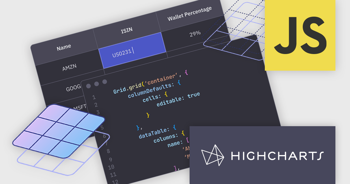
Highcharts Grid is a feature-rich data grid component developed by Highsoft, designed for use within Highcharts Dashboards or as a standalone component. Grid Lite is a free, lightweight version ideal for developers seeking a performant and accessible data grid with a basic feature set. Grid Pro is a commercial, feature-rich version built for complex applications that demand advanced data manipulation and interactivity. It includes all the capabilities of Grid Lite, along with a highly customizable and interactive interface that supports inline editing, column sorting, and event handling, enabling developers to build responsive data visualization applications.
Highcharts Grid delivers high performance when handling large datasets by employing row virtualization, a technique that renders only the rows currently visible within the viewport. This significantly reduces memory consumption and ensures fluid, responsive scrolling, even when working with thousands of records.
Highcharts Grid Pro requires a license for Highcharts Dashboards, licensed per developer as an Annual or Perpetual License with Internal, Saas, SaaS+ and OEM distribution options. The annual license includes support and all product updates for 1 year and must be renewed to continue to use the software. The perpetual license includes an "Advantage Subscription" for 1 to 5 years which provides support and updates for that period. If you do not renew Advantage then you may continue to use the software at the last release available during the active Advantage period. See our Highcharts Dashboards licensing page for full details.
Learn more on our Highcharts Dashboards product page.
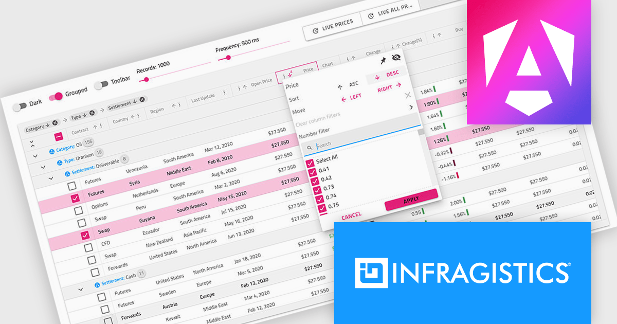
Infragistics Professional is a comprehensive toolkit for software developers, offering a wide range of pre-built, high-performance UI components for building visually appealing and feature-rich applications across Angular, React, Web Components, Blazor, ASP.NET MVC, ASP.NET Core, Windows Forms, WPF and Xamarin. It includes controls such as data grids, charts, navigation menus, and more, along with productivity tools to streamline development processes.
Infragistics Professional delivers a powerful Angular Data Grid Component that enables developers to efficiently display, manage, and interact with large datasets in modern web applications. Designed for performance and scalability, it offers advanced features such as editing, sorting, filtering, and data export, all seamlessly integrated into the Angular framework. This allows developers to build responsive, real-time data experiences that meet the demands of enterprise-grade applications.
Infragistics Professional is licensed per developer and is available as a Perpetual License with a 1, 2 or 3 year support and maintenance subscription. See our Infragistics Professional licensing page for full details.
The Ignite UI for Angular Data Grid is available in the following products:
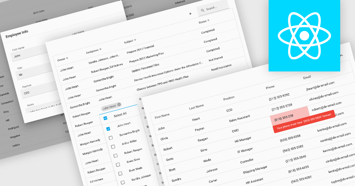
Data interaction and manipulation features in grid components enable users to engage directly with tabular data—supporting not just the display of information, but also its editing, validation, and contextual input. These capabilities are critical for creating rich, form-like experiences within data grids, particularly in applications where user input and data integrity are central to the workflow. By offering a range of editing modes and validation tools, grid components help ensure that data remains both accessible and accurate, enabling intuitive and efficient user interactions.
Common grid editing and validation features include:
For an in-depth analysis of features and price, visit our React grid components comparison.
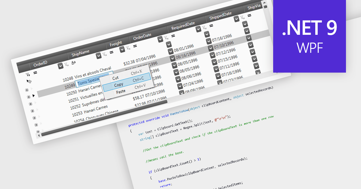
The ability to perform clipboard operations enables users to copy and paste data between the grid and external applications or within different parts of the same grid. This functionality allows users to select one or multiple cells, rows, or columns, copy their content to the system clipboard, and then paste it elsewhere. It supports efficient data manipulation by reducing manual entry, enabling quick data migration, and streamlining the transfer of structured information. Clipboard operations save time in repetitive data handling tasks, ensuring that the movement of grid data is both fast and reliable.
Several .NET 9 WPF grid components support clipboard operations, including:
For an in-depth analysis of features and price, visit our comparison of .NET 9 WPF grid components.
Kendo UI by Telerik is a comprehensive suite of JavaScript UI components designed to accelerate web application development. Offering pre-built, customizable elements for grids, charts, schedulers, and more, it streamlines UI creation across popular frameworks like jQuery, Angular, React, and Vue. Key features include responsive design, accessibility, and high performance, enhancing user experience. Developers benefit from reduced development time, consistent UI patterns, and the ability to build feature-rich applications faster.
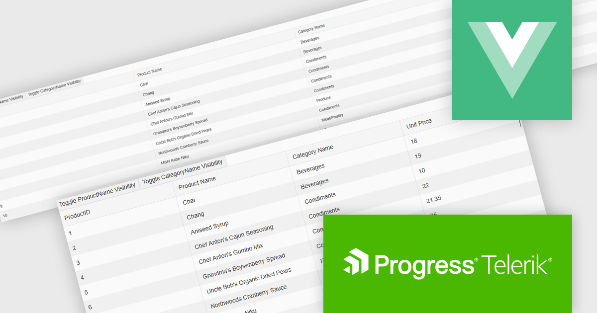
The Kendo UI for Vue 2025 Q1 update enhances grid responsive design, enabling automatic column visibility adjustments based on viewport width. This improvement ensures that data remains accessible and well-structured across different screen sizes without requiring manual configuration. By dynamically toggling columns and adapting height settings to fit their container, the grid provides a seamless and efficient user experience across desktops, tablets, and mobile devices. These enhancements help developers create more adaptive and user-friendly applications with minimal effort, ensuring consistent and optimized data presentation in any environment.
To see a full list of what's new in 2025 Q1 (v6.1.0), see our release notes.
Kendo UI is licensed per developer and has two licensing models: an annual Subscription License and a Perpetual License. The Subscription license provides access to the latest product updates, technical support, and exclusive benefits for a flat annual fee, and must be renewed to continue using the software. The Perpetual license is a one-time purchase granting access to the current released version and includes a one-year subscription for product updates and technical support. After this initial period, users can choose to renew the subscription element to continue receiving updates and support; otherwise, they may continue using the installed version available during their active subscription term but will forgo future updates and support. See our Kendo UI licensing page for full details.
Kendo UI is available individually or as part of the following products:


Tel: (888) 850 9911
Fax: +1 770 250 6199


