


공식 공급 업체
200 이상의 소프트웨어 개발처와 판매 계약을 맺은 공인 디스트리뷰터로서 합법적인 라이선스를 제공합니다.
모든 브랜드 보기.
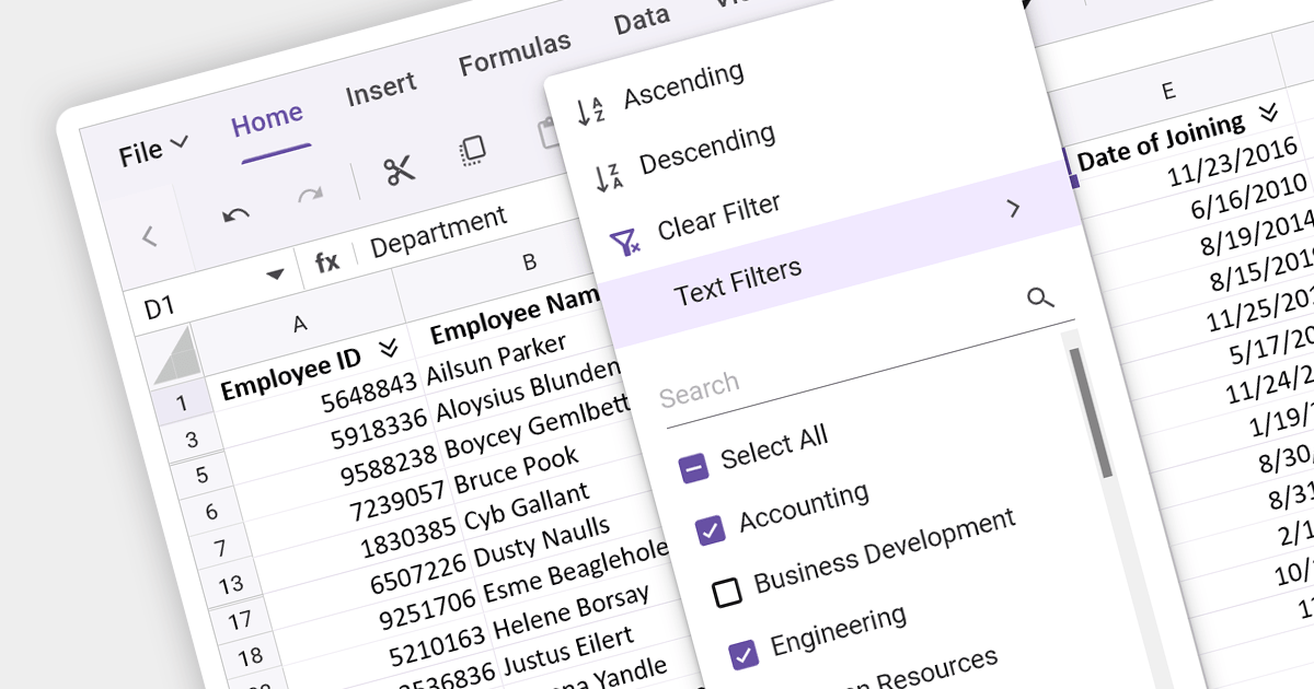
Data filtering and grouping are key spreadsheet features that allow users to manage and analyze large datasets efficiently. Filtering enables users to hide data that does not meet certain criteria, making it easier to focus on relevant information. Grouping clusters related data together, which can then be summarized with functions such as sum, average, and count. These features are vital for working with extensive spreadsheets, enabling users to simplify their view, and gain insights from specific subsets of data.
Several Angular Spreadsheet components provide data filtering and grouping support including:
For an in-depth analysis of features and price, visit our Angular Spreadsheet Component comparison.
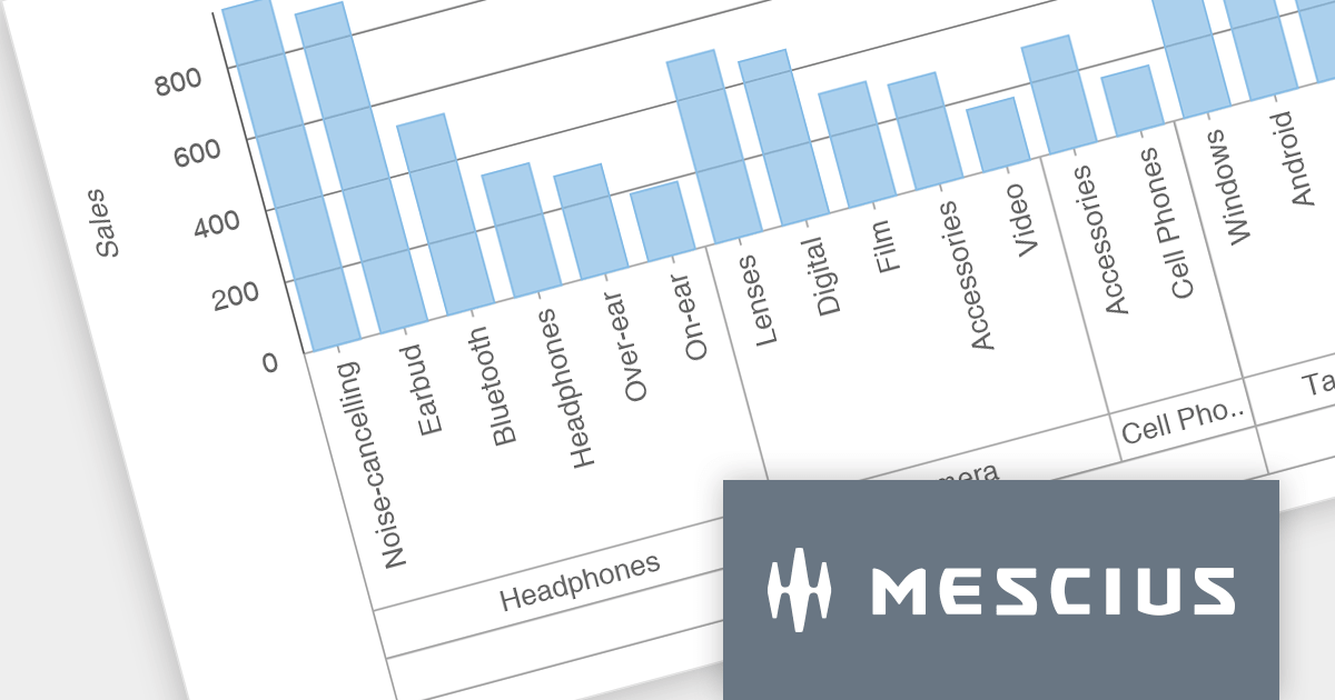
Wijmo is a cross-platform UI JavaScript library that offers a comprehensive set of controls and tools for building rich, interactive web applications. Its components have zero dependencies and are written as lean TypeScript classes. Wijmo's key components include FlexGrid for data management, FlexChart for charting and data visualization, Input Controls for user input, and Report Viewer for creating and presenting reports.
The Wijmo 2023 v2 release brings data grouping support to FlexChart. Axis grouping helps to organize complex data by visually separating it into categories or subcategories along the axis, making it easier to identify trends, patterns, and outliers within each group. While data grouping has long been a staple of Wijmo's CollectionView, users requested similar functionality in FlexChart, which MESCIUS has now incorporated. You can bind FlexChart to a grouped CollectionView and set the 'axis.groupsOptions' property to enable grouped labels in your charts.
To see a full list of what's new in version 2023 v2, see our release notes.
Wijmo is licensed per developer. Developer Licenses are perpetual and include 1 year Subscription which provides upgrades, including bug fixes and new features. See our Wijmo licensing page for full details.
For more information, visit our Wijmo product page.

Drill-down charts are a type of interactive data visualization that allow users to explore hierarchical data by navigating multiple levels of detail. This makes them a powerful tool for analyzing complex data sets and uncovering hidden insights. By clicking on specific segments or elements within a chart, users can dynamically descend through the hierarchy, revealing granular details at each level. This process of zooming into specific data points empowers users to gain a deeper understanding of the overall trends and relationships within the dataset. Drill-down charts are particularly well-suited for analyzing sales figures, customer segmentation, and comparative performance metrics. Their ability to present data at multiple scales caters to users with diverse levels of data expertise, making them an accessible tool for data exploration and analysis.
Several Angular charting components provide drill down support including:
For an in-depth analysis of features and price, visit our Angular Chart comparison.
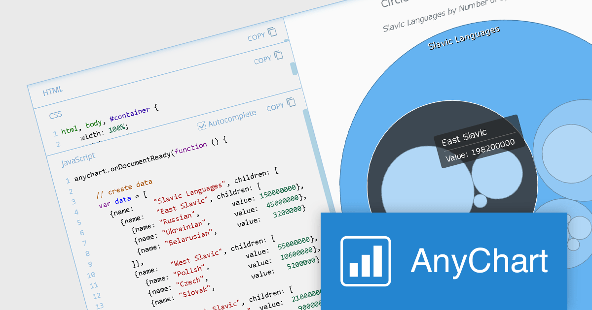
AnyChart JS is a lightweight and robust JavaScript charting library that enables you to create stunning and interactive charts, dashboards, and maps. It provides a wide range of chart types, including line charts, bar charts, pie charts, scatter plots, and more. You can also customize the appearance of your charts using a variety of options, such as colors, fonts, and themes.
The AnyChart JS 8.12 release adds a suite of interactivity events to the Circle Packing chart, allowing you to attach event listeners to any chart element and create dynamic visualizations that respond to user interactions such as mouse movements, hovers, and clicks. This new feature enables you to add or modify information and reshape chart behavior in real-time, enhancing data exploration experiences.
To see a full list of what's new in version 8.12.0, see our release notes.
AnyChart JS offers a range of Annual and Perpetual licensing options including Website, Internal, Saas, Enterprise, OEM, and Next Unicorn Licenses. For more information visit our AnyChart JS licensing page.
For more information, visit our AnyChart JS product page.
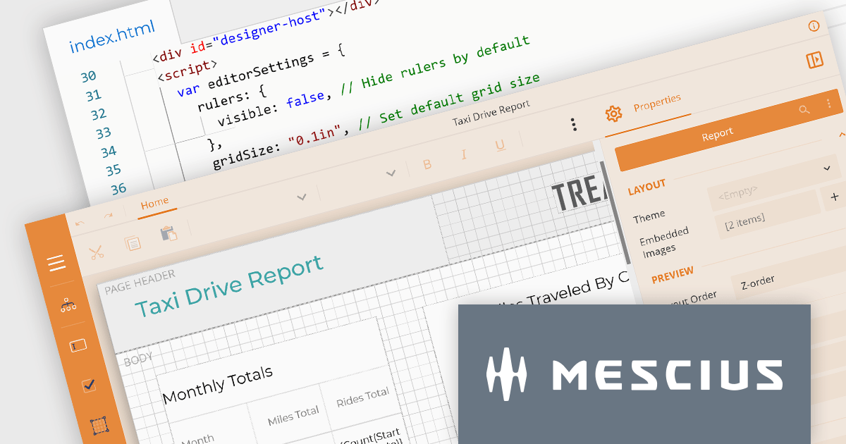
ActiveReportsJS by MESCIUS is a comprehensive JavaScript reporting solution that empowers developers to create interactive and dynamic reports within web applications. It offers a user-friendly design interface, a rich set of data visualization tools, and a flexible API, enabling the creation of reports that effectively present and analyze data for informed decision-making.
The ActiveReportsJS 4.2 release introduces a comprehensive customization API for the Report Designer which enables precise configuration of the user interface. This provides control over the visibility and layout of sidebar items, fine-tuning of menus and toolbars, and the ability to modify numerous UI elements to meet your users' needs.
To see a full list of what’s new in version 4.2, see our release notes.
ActiveReportsJS is licensed on an annual subscription or perpetual basis and is available as a Single Deployment License for non-commercial use, and as a Single Domain License or Unlimited Domain License for commercial and/or SaaS use. See our ActiveReportsJS licensing page for full details.
For more information, visit our ActiveReportsJS product page.
전화 : 00798 14 800 6332
팩스 : +1 770 250 6199


