













공식 공급 업체
200 이상의 소프트웨어 개발처와 판매 계약을 맺은 공인 디스트리뷰터로서 합법적인 라이선스를 제공합니다.
모든 브랜드 보기.
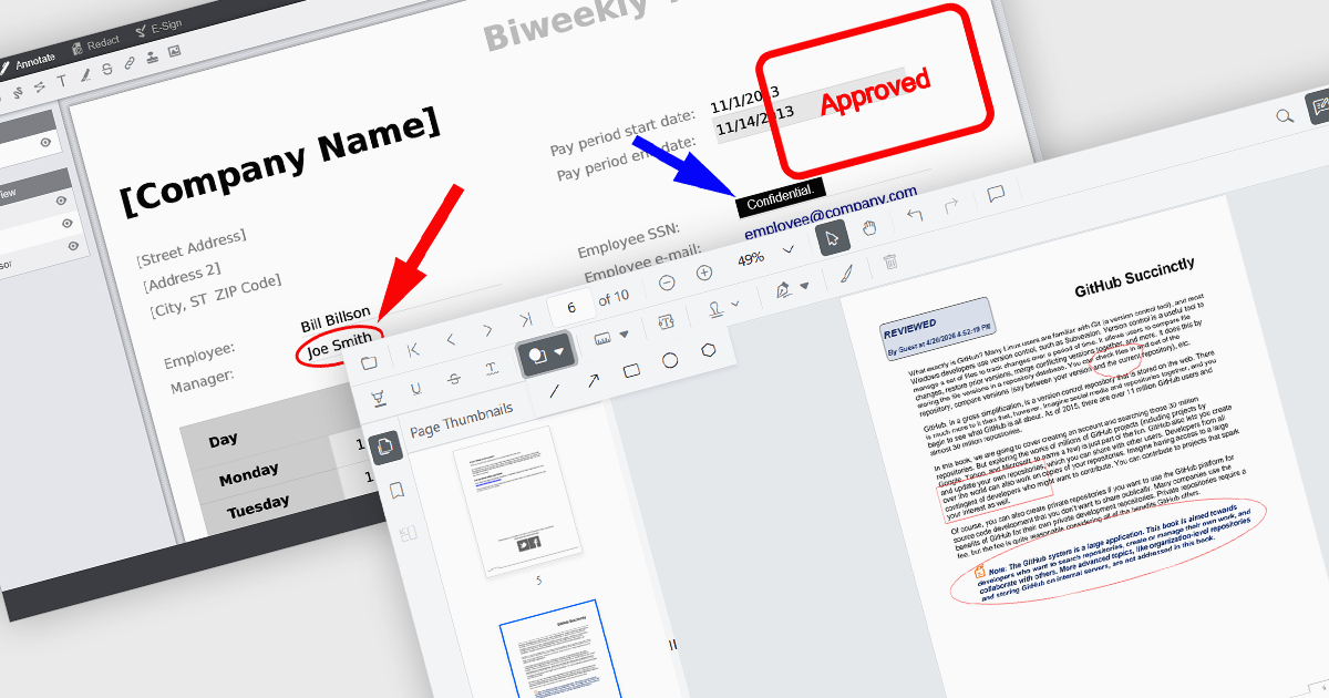
Annotation capabilities in PDF Viewer components allow users to interact with documents through visual and textual markup, supporting review, collaboration, and documentation processes. Tools such as Line, Rectangle, and Free text help highlight structure and add clarity, while Sticky note and Stamp annotations provide contextual feedback and status indicators. By embedding these capabilities directly into a viewer, applications can offer a cohesive experience for editing and reviewing PDFs without requiring external software.
Common annotations include:
For an in-depth analysis of features and price, visit our JavaScript PDF viewer components comparison.
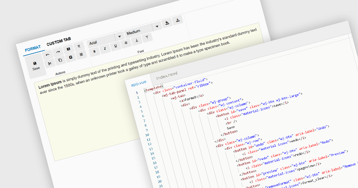
Ribbon bars are graphical user interface (GUI) patterns that organize commands and features into a series of tabs, each containing grouped controls such as buttons, dropdowns, and galleries. Widely adopted in modern software applications, ribbons present functionality in a structured and visually accessible layout to improve discoverability. This approach reduces reliance on deeply nested menus and toolbars, enabling users to locate relevant tools more quickly based on context.
Several Vue.js user interface suites provide ribbon functionality, including:
For an in-depth analysis of features and price, visit our comparison of Vue.js UI suites.
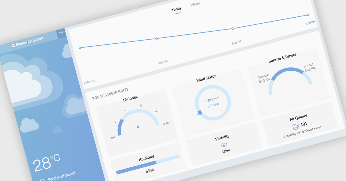
Gauge charts are data visualizations that display a single value within a defined range, making it easy to understand status or progress at a glance. Often styled like a speedometer, they show where a value sits between minimum and maximum thresholds, using color to indicate different levels. This provides clear, immediate insight without detailed analysis. Key benefits include quick understanding, intuitive design, and strong visual emphasis on limits or targets. Gauge charts are commonly used in dashboards to track KPIs, monitor targets, show completion percentages, or highlight key metrics in a simple and effective way.
Several React charting components also offer gauges, including:
For an in-depth analysis of features and price, visit our comparison of React chart components.
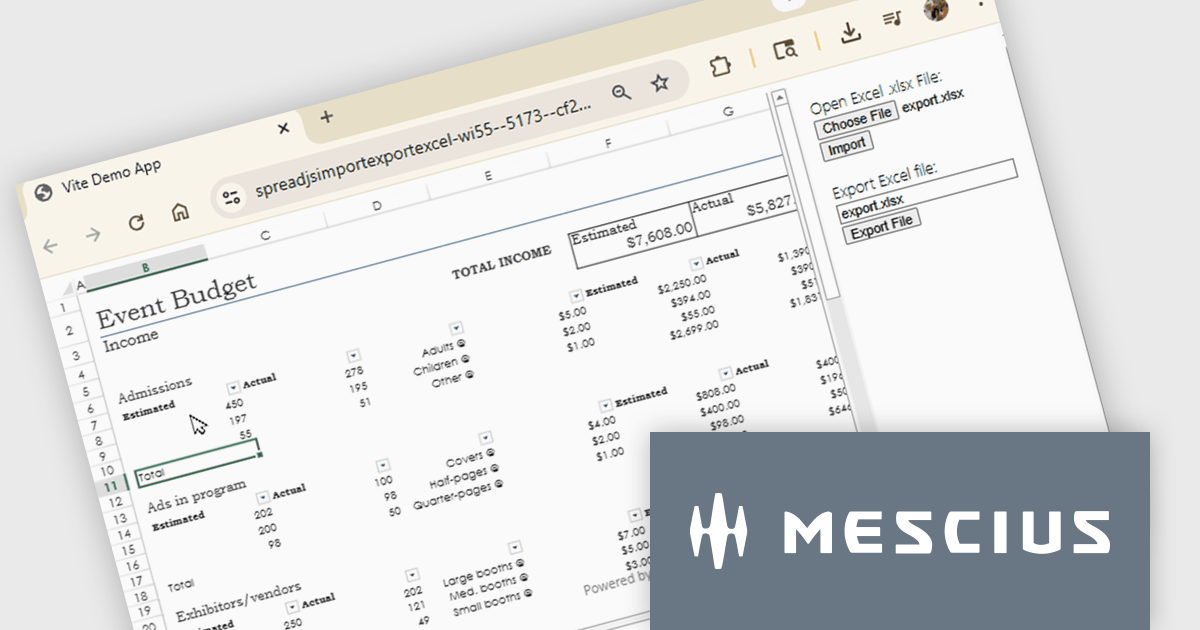
SpreadJS is a complete enterprise JavaScript spreadsheet solution used to create financial reports and dashboards, budgeting and forecasting models, scientific, engineering, healthcare, education, science lab notebooks, and other similar JavaScript business applications. Leverage the high-speed calculation engine with over 500 Excel built-in functions in 19 languages, to deliver true Excel-like spreadsheet experiences with zero dependencies on Excel.
In this online tutorial from MESCIUS, you will learn the critical steps allowing you to import/export XLSX files using JavaScript. Steps include:
Detailed sample code is included to help you along the way.
View the tutorial now and get started working with spreadsheet files in your JavaScript applications.
SpreadJS is licensed per developer and includes 1 Year Maintenance (major and minor version releases and unlimited support phone calls). SpreadJS requires an Annual or Perpetual Deployment License. The optional Add-ons are available at an additional cost, and require a SpreadJS license. See our SpreadJS licensing page for full details.
For more information, visit our SpreadJS product page.
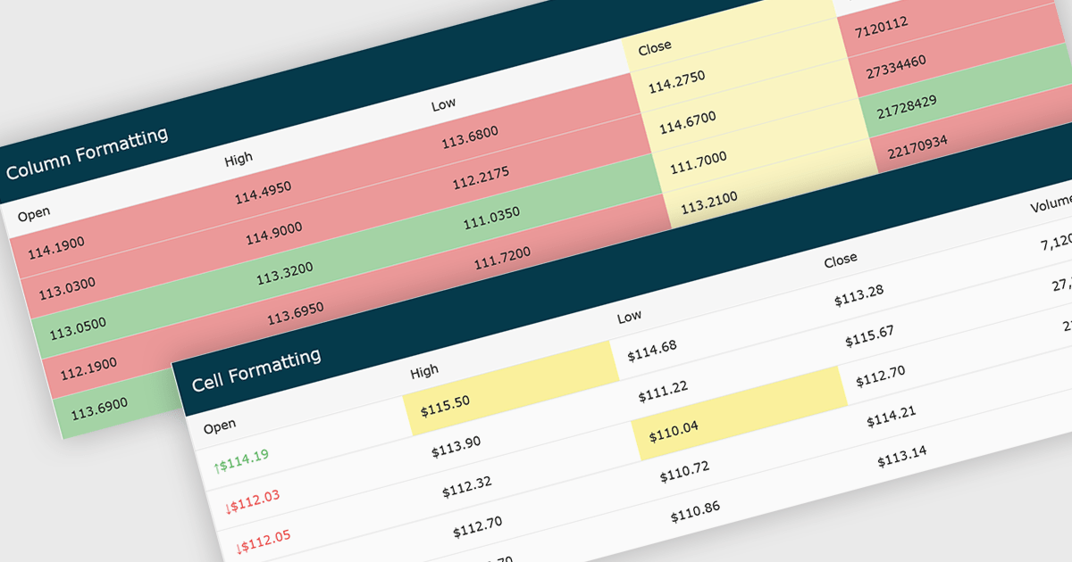
Conditional formatting in grids automatically applies visual styles such as colors or icons based on defined rules, making it easier to interpret large datasets at a glance. It improves readability, highlights patterns and outliers, and supports faster, more informed decision making by surfacing key insights in real time. Common use cases include flagging budget issues in financial reports, emphasizing top performing sales data, monitoring KPIs, and drawing attention to errors or critical statuses in operational tools.
Several JavaScript grid controls offer conditional formatting, including:
For an in-depth analysis of features and price, visit our comparison of JavaScript Grid controls.
전화 : 00798 14 800 6332
팩스 : +1 770 250 6199


