


공식 공급 업체
200 이상의 소프트웨어 개발처와 판매 계약을 맺은 공인 디스트리뷰터로서 합법적인 라이선스를 제공합니다.
모든 브랜드 보기.
DevCraft by Telerik is a comprehensive suite of more than 1,250 UI components and development tools designed for building modern web, desktop, and mobile applications using .NET and JavaScript frameworks. It includes reporting and report management solutions, automated testing and mocking tools, and document processing libraries, as well as a wide range of professionally designed user interface controls from the Telerik and Kendo UI suites. DevCraft enables developers to create feature-rich, high-performance applications with consistent design and user experience, delivering enterprise-level, scalable, and maintainable software solutions.
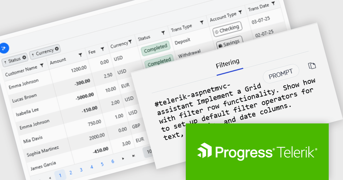
The Telerik DevCraft 2025 Q3 update introduces new AI Coding Assistants for Telerik UI for ASP.NET MVC and Kendo UI for jQuery, designed to improve developer efficiency through intelligent, context-aware code generation within supported IDEs. These assistants automate repetitive coding tasks, generate accurate framework-specific code, and deliver instant access to relevant API documentation and technical insights. By understanding the structure and capabilities of Telerik and Kendo UI components, the AI Coding Assistants enable developers to produce cleaner, more consistent code while reducing time spent on setup, configuration, and troubleshooting.
To see a full list of what's new in version 2025 Q3 (2025.3.1002), see our release notes for Telerik UI for ASP.NET MVC and Kendo UI for jQuery.
Telerik DevCraft is licensed per developer and has two licensing models: an annual Subscription License and a Perpetual License. The Subscription license provides access to the latest product updates, technical support, and exclusive benefits for a flat annual fee, and must be renewed to continue using the software. The Perpetual license is a one-time purchase granting access to the current released version and includes a one-year subscription for product updates and technical support. After this initial period, users can choose to renew the subscription element to continue receiving updates and support; otherwise, they may continue using the installed version available during their active subscription term but will forgo future updates and support. See our Telerik DevCraft Ultimate licensing page for full details.
Telerik DevCraft is available in the following editions:

Stimulsoft Reports.JS provides a robust reporting toolkit designed specifically for JavaScript applications. This library leverages a client-side architecture, offering a pure JavaScript report engine for efficient report rendering directly within web browsers. The solution includes a user-friendly report designer for building reports with various data sources and visualizations, along with a report viewer for seamless integration and display within your JavaScript applications. This eliminates the need for server-side dependencies or browser plugins, simplifying the development process for embedding powerful reporting functionalities into your web projects.
The Stimulsoft Reports.JS 2025.4.1 update introduces new 3D Surface and Area charts that enhance data visualization capabilities in reports and dashboards. These charts allow developers to represent complex data relationships with added depth and perspective, improving analytical clarity and user comprehension. By visualizing three-dimensional data and trends more effectively, developers can deliver more informative and visually engaging reporting solutions without additional complexity in implementation.
To see a full list of what's new in 2025.4.1, see our release notes.
Stimulsoft Reports.JS is licensed per developer and is available as a Perpetual license with 1 year support and maintenance. See our Stimulsoft Reports.JS licensing page for full details.
Stimulsoft Reports.JS is available individually or as part of Stimulsoft Ultimate.
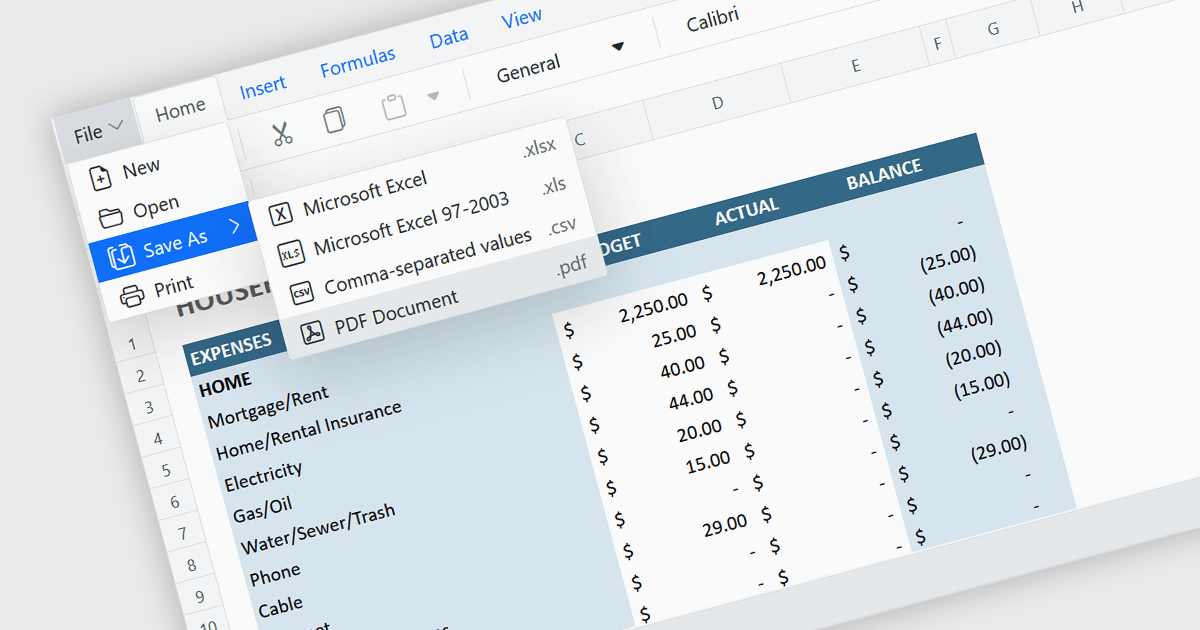
Exporting a spreadsheet to PDF is a widely used feature that allows users to generate fixed-layout, print-ready versions of their spreadsheet data, converting the contents of the spreadsheet file, into a Portable Document Format (PDF) file. This capability ensures that formatting, styling, and content of the original spreadsheet, including tables, charts, and cell styles, are preserved exactly as intended, regardless of the device or application used to open the file. It is especially useful for sharing finalized documents, such as reports or financial summaries, with stakeholders who do not need to interact with the data directly.
Several Angular spreadsheet components allow you to export to PDF, including:
For an in-depth analysis of features and price, visit our comparison of Angular spreadsheet components.
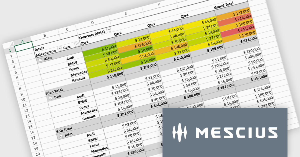
SpreadJS is a complete enterprise JavaScript spreadsheet solution used to create financial reports and dashboards, budgeting and forecasting models, scientific, engineering, healthcare, education, science lab notebooks, and other similar JavaScript business applications. Leverage the high-speed calculation engine with over 500 Excel built-in functions in 19 languages, to deliver true Excel-like spreadsheet experiences with zero dependencies on Excel.
In this blog post, MESCIUS Product Marketing Specialist Mackenzie Albitz shows you the steps for integrating a Pivot Table directly into your Vue application using the SpreadJS Vue Spreadsheet component with its optional Pivot Table add-on. Steps include:
Detailed code is included and you can even download the sample app to get started.
Read the complete blog to get started creating and customizing powerful Vue Spreadsheet Pivot Tables.
SpreadJS is licensed per developer and includes 1 Year Maintenance (major and minor version releases and unlimited support phone calls). SpreadJS requires an Annual or Perpetual Deployment License. The optional Add-ons are available at an additional cost, and require a SpreadJS license. See our SpreadJS licensing page for full details.
For more information, visit our SpreadJS product page.
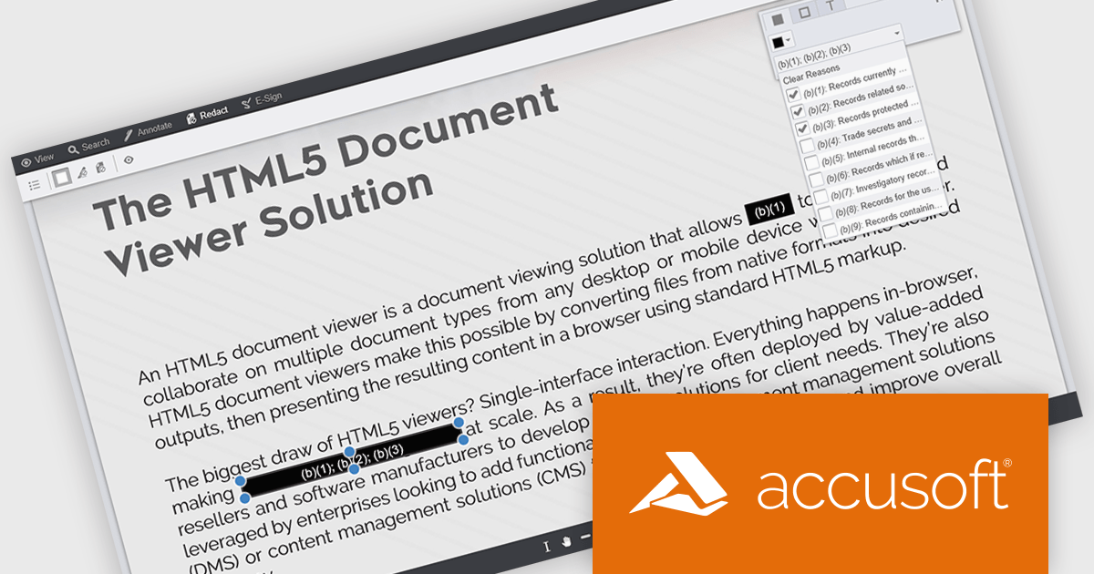
PrizmDoc Viewer by Accusoft is a web-based document viewing solution that supports over 100 file types and integrates seamlessly into applications via REST APIs. It offers secure, high-quality rendering for document collaboration, allowing users to view, annotate, redact, and convert documents without client-side installations. Designed for cross-platform compatibility, it ensures consistent document access and interaction across various devices. PrizmDoc Viewer enhances enterprise content management, legal tech, and financial services, providing a reliable, customizable interface for efficient document handling.
The PrizmDoc v14.6 update introduces enhanced Personally Identifiable Information (PII) filtering in the Viewer, allowing developers to detect, highlight, and redact sensitive data with greater control and efficiency. The update enables precise filtering by PII type, color-coded highlighting for quick visual identification, and a new PII filter panel that displays the count and categories of detected entities. Developers can now improve privacy compliance by selectively redacting or reviewing PII types and assigning redaction reasons directly within the Viewer, improving both usability and data protection processes.
To see a full list of what's new in v14.6, see our release notes.
PrizmDoc Viewer is available as Self-Hosted, Cloud-Hosted or Private Cloud-Hosted deployments. Billed on an annual subscription basis, you will need to renew your license each year to continue to use the software. The price is based on the number of servers or the number of transactions you require, depending on your deployment method. See our PrizmDoc Viewer licensing page for full details.
For more information, see our PrizmDoc Viewer product page.
전화 : 00798 14 800 6332
팩스 : +1 770 250 6199


