


공식 공급 업체
200 이상의 소프트웨어 개발처와 판매 계약을 맺은 공인 디스트리뷰터로서 합법적인 라이선스를 제공합니다.
모든 브랜드 보기.

Scheduling controls enable users to efficiently manage tasks, appointments, and resource allocation through an intuitive and interactive interface. It provides essential features like real-time updates, automated scheduling, and conflict detection, ensuring seamless coordination across teams and workflows. Personalized scheduling options allow users to tailor views, set preferences, and automate recurring events, enhancing both productivity and user experience. By integrating with backend systems and APIs, scheduling tools support dynamic data handling, making them ideal for applications such as workforce management, appointment booking and project planning, in industries like healthcare, finance, and customer service.
Several React User Interface suites offer scheduling controls including:
For an in-depth analysis of features and price, visit our React UI suites comparison.
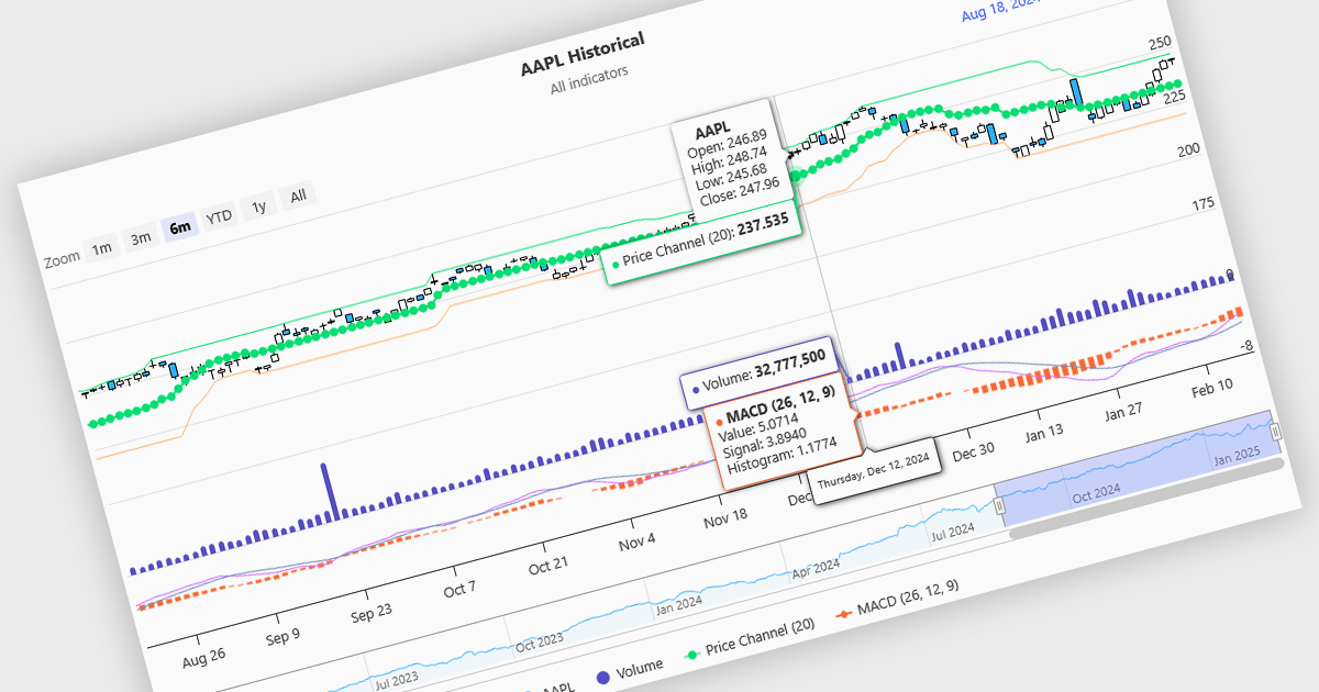
Indicators in a financial chart are mathematical formulas applied to market data, such as price and volume, to generate insights into trends, momentum, volatility, and trade opportunities. Indicators are visualized as lines, histograms, or overlays on the chart, providing dynamic analysis rather than static points. Moving averages track price trends with smooth lines, while oscillators like RSI appear as separate graphs to measure momentum. These tools help traders analyze patterns, confirm price movements, and support decision-making. For software developers, integrating indicators enhances data visualization, enables algorithmic trading strategies, and improves user experience by delivering clear, actionable insights.
Several Angular charting components provide support for indicators within financial charts, including:
For an in-depth analysis of features and price, visit our Angular chart components comparison.

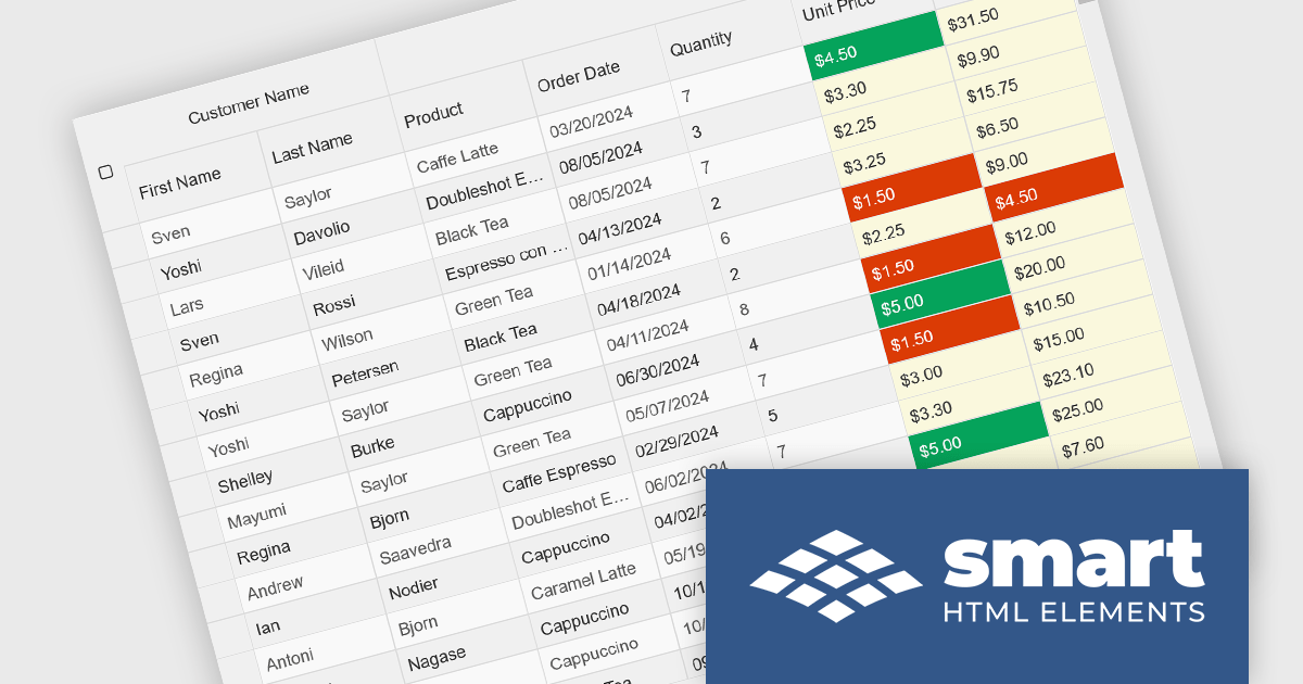
Cell types in Grid components are specialized configurations that define how data is displayed, edited, and interacted with within a grid or table structure. They allow developers to tailor the presentation and functionality of each cell to better match the type of data it contains. By specifying cell types such as text, numeric, date/time, and more, Grid components can provide intuitive controls and formatting automatically, streamlining data entry and reducing errors.
Common features include:
For an in-depth analysis of features and price, visit our jQuery grid components comparison.
Smart UI by Smart HTML Elements is an enterprise-grade UI library offering pre-built web components for developers in Angular, React, Vue, Blazor, and JavaScript. It boasts over 60 ready-to-use components like grids, charts, schedulers, and editors, all featuring two-way data binding, responsiveness, accessibility, and theming capabilities. This library helps developers rapidly build dynamic and modern web applications with consistent look-and-feel and rich functionalities, accelerating development time and ensuring professional quality.
The Smart UI v22.0.0 release adds full support for React 19, bringing several advantages to developers. React 19 introduces features such as enhanced concurrent rendering, server components, and improved hooks, which collectively enhance performance and streamline development processes. By integrating these capabilities, Smart UI ensures that its components are optimized for the latest React advancements, providing a more efficient and responsive user experience. This update allows developers to leverage React 19's improvements seamlessly within Smart UI's comprehensive suite of components, facilitating the creation of modern, high-performance web applications.
To see a full list of what's new in v22.0.0, see our release notes.
Smart UI (Smart HTML Elements) is licensed per developer and is available as a perpetual license with 1 year support and maintenance. It includes distribution to unlimited Web applications, SaaS projects, Intranets and Websites. Team, OEM and Enterprise licensing options are also available. See our Smart UI licensing page for full details.
Learn more on our Smart UI product page.
ZingGrid is a JavaScript library that simplifies the creation of interactive data tables and grids within web applications. Utilizing modern web components and focusing on performance and responsiveness, ZingGrid allows developers to implement features like searching, filtering, pagination, and in-line editing with minimal coding. This empowers efficient data visualization and manipulation for users, making it a valuable tool for web development.
The ZingGrid 2.0.0 release adds new Row Details feature that enhances data presentation by allowing users to expand individual rows and reveal supplementary information. This functionality provides a clean and organized way to display additional data without cluttering the main grid view. Whether you are editing, filtering, searching, or sorting your data, the expanded/collapsed state of each row is intelligently preserved, even across pages. This allows users to maintain context and easily access detailed information without losing their place or having to re-expand rows after interacting with other grid functionalities.
To see a full list of what's new in version 2.0.0, see our release notes.
ZingGrid is available as either a Single-Domain Website or Multi-Domain SaaS license. See our ZingGrid licensing page for full details.
For more information, visit our ZingGrid product page.
전화 : 00798 14 800 6332
팩스 : +1 770 250 6199


