


공식 공급 업체
200 이상의 소프트웨어 개발처와 판매 계약을 맺은 공인 디스트리뷰터로서 합법적인 라이선스를 제공합니다.
모든 브랜드 보기.
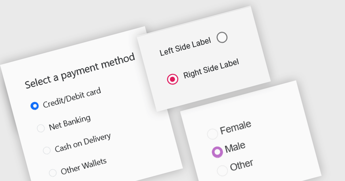
A radio group is a user interface element that presents a set of mutually exclusive options. Users can select only one option from the group at a time, visually represented by a circular button that fills with color when selected. This design pattern is commonly used to represent options like gender, payment method, or difficulty level, where a single choice is required and alternatives are clearly defined. Radio groups enhance user experience by simplifying decision-making, reducing cognitive load, and preventing errors associated with ambiguous selections.
Several React data editor collections feature a radio group, including:
For an in-depth analysis of features and price, visit our React data editors comparison.

Gantt controls are invaluable tools for project management, particularly in visualizing and tracking the timeline of tasks, dependencies, and progress. These controls are ideal for illustrating project schedules, resource allocation, and critical paths. By providing a clear and concise overview of project milestones, Gantt controls facilitate effective planning, communication, and monitoring, ultimately helping organizations achieve project goals efficiently and on time.
Several React UI suites offer Gantt controls including:
For an in-depth analysis of features and price, visit our React UI suites comparison.

Cell merging in a grid allows developers to combine adjacent cells, creating a single, unified cell that spans multiple rows or columns. This feature enhances readability by allowing headers or labels to encompass related data fields, reducing redundancy and making complex data layouts more visually coherent. It enables efficient organization, supporting custom layouts that align with specific reporting needs and enhancing the grid's overall aesthetic. Cell merging helps streamline the user experience by condensing information into easily digestible sections, enabling users to focus on key insights without distraction.
Several React grid controls offer cell merge support including:
For an in-depth analysis of features and price, visit our React grid controls comparison.

Bullet charts are efficient data visualization tools designed to display performance metrics against a target within a single, streamlined bar. Ideal for compact spaces on dashboards, bullet charts convey a KPI's current status, target, and performance range in a minimalist view, making them perfect for summarizing key data points without overwhelming the interface. They are highly customizable, supporting varied colors, labels, and thresholds, and their component-based structure in React allows developers to implement real-time updates, enabling users to monitor changing data continuously. These charts promote a responsive, interactive experience, providing powerful options for building detailed, data-rich applications.
Several React chart controls offer bullet chart support including:
For an in-depth analysis of features and price, visit our React bullet chart controls comparison.

Charts in a dashboard component transform raw data into clear, actionable visuals, making it easy to monitor trends, track performance, and spot critical insights in real time. These interactive tools support various use cases, from sales forecasting and KPI tracking to project progress monitoring and customer behavior analysis. By offering a centralized, intuitive view of essential metrics, charts help teams make faster, data-driven decisions, optimize operational efficiency, and respond proactively to emerging opportunities or issues.
Several JavaScript products offer chart components with dashboard support including:
Explore our range of JavaScript dashboard components.
Need help to find the right software license, upgrade or renewal? Call, Email, or Live Chat with our experts.
전화 : 00798 14 800 6332
팩스 : +1 770 250 6199


