













공식 공급 업체
200 이상의 소프트웨어 개발처와 판매 계약을 맺은 공인 디스트리뷰터로서 합법적인 라이선스를 제공합니다.
모든 브랜드 보기.
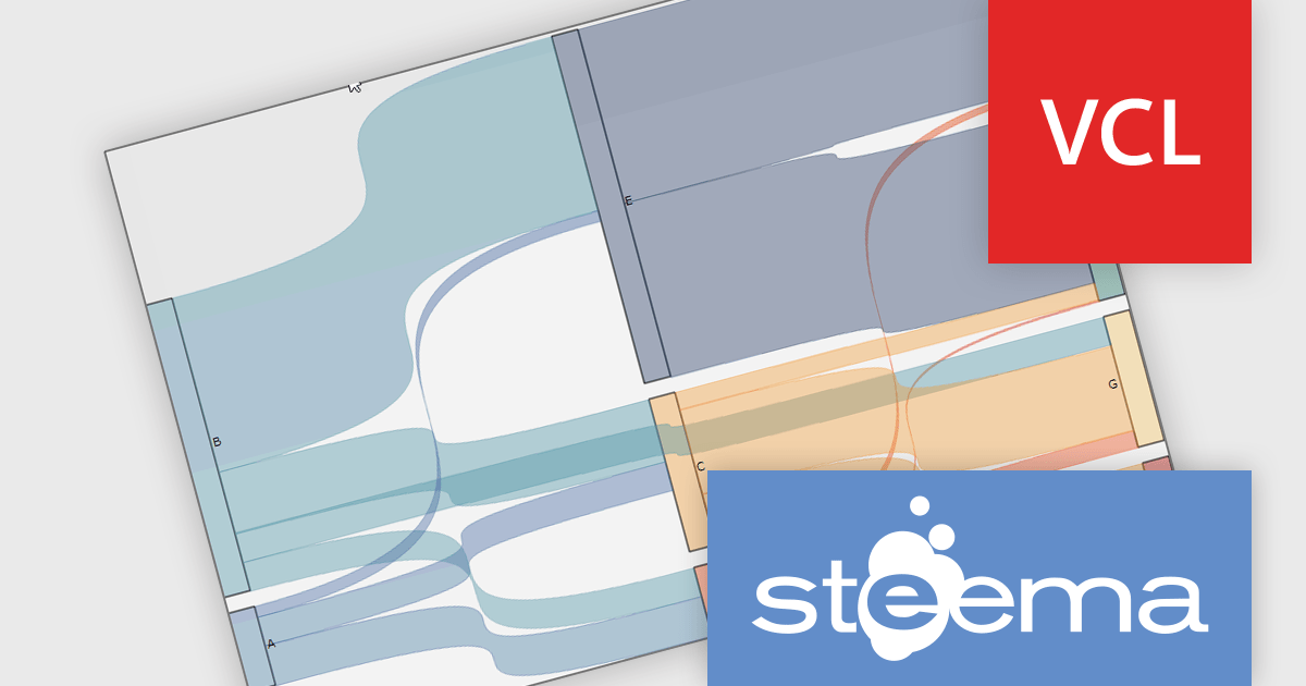
TeeChart Pro VCL/FMX by Steema Software is a comprehensive charting library designed for Embarcadero's Delphi and C++Builder environments, supporting both the VCL (Visual Component Library) and FMX (FireMonkey) frameworks. It provides developers with a rich set of chart types, advanced data visualization tools, and interactive features to build visually compelling and data-intensive applications across Windows, macOS, iOS, and Android. With support for real-time charting, custom drawing, statistical functions, and export capabilities, TeeChart Pro is tailored for high-performance applications that demand precise and dynamic chart displays.
The TeeChart Pro VCL/FMX 2025 (Build 2025.45.250910) update introduces the Sankey Series chart type, which gives developers a new tool for visualizing flows and relationships in data (e.g. movement of quantities between states, split‑paths, or aggregations). It enables rendering of nodes and links whose thickness is proportional to the magnitude of the flow, allowing you to more directly see how values distribute and split across paths. This enhances insight into complex datasets in ways that standard bar, line, or pie charts cannot, helping in diagnosing bottlenecks, tracing resource paths, or modelling multi‑stage processes with clarity.
To see a full list of what's new in 2025 (Build 2025.45.250910), see our release notes.
TeeChart Pro VCL/FMX is licensed per developer and includes a one year subscription for minor and major updates plus access to technical support. Priority support is also available. See our TeeChart Pro VCL/FMX licensing page for full details.
Learn more on our TeeChart Pro VCL/FMX product page.

Chart themes provide a simple yet powerful way to standardize the appearance of charts by applying predefined color schemes, fonts, and styling options across visualizations. Instead of manually adjusting each element, users can quickly switch between themes to achieve a consistent, professional look that aligns with brand guidelines or presentation needs. The benefits include improving readability, enhancing accessibility - with inclusive color palettes - and ensuring visual consistency across multiple charts or entire dashboards. Chart themes improve the process of creating impactful, audience-ready data visualizations.
Several .NET WPF chart components offer the ability to add themes, including:
For an in-depth analysis of features and price, visit our .NET WPF charts comparison.
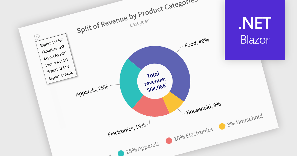
Exporting charts to XLS or XLSX formats enables developers to extract the structured underlying data from visualizations and make it available for deeper analysis or downstream processing. Rather than being confined to image or PDF exports, this approach allows for easy integration of chart data with spreadsheet tools and data workflows. By converting charts into Excel files, users gain the ability to manipulate, filter, or augment data, ideal for reporting, auditing, or business intelligence scenarios where numerical insights must be both visual and actionable.
Several Blazor charting controls offer the ability to export charts to XLS/XLSX including:
For an in-depth analysis of features and price, visit our Blazor charting controls comparison.
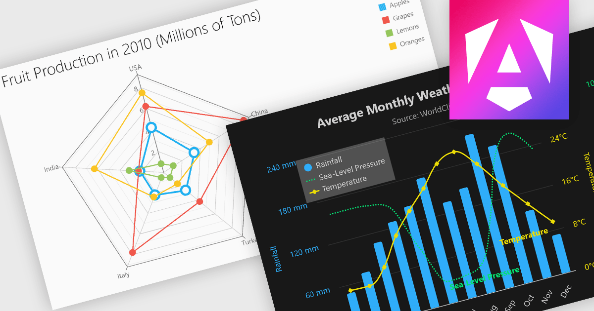
Multi-dimensional and relationship charts allow developers to present complex data structures and inter-variable relationships in a way that’s visually intuitive and analytically powerful. These chart types are essential for exploring correlations, comparing grouped metrics, and visualizing distributions across multiple dimensions. They are commonly used in statistical dashboards, performance analysis tools, and scientific applications where simple line or bar charts aren’t sufficient to capture the full context of the data.
Common charts include:
For an in-depth analysis of features and price, visit our Angular Chart components comparison.
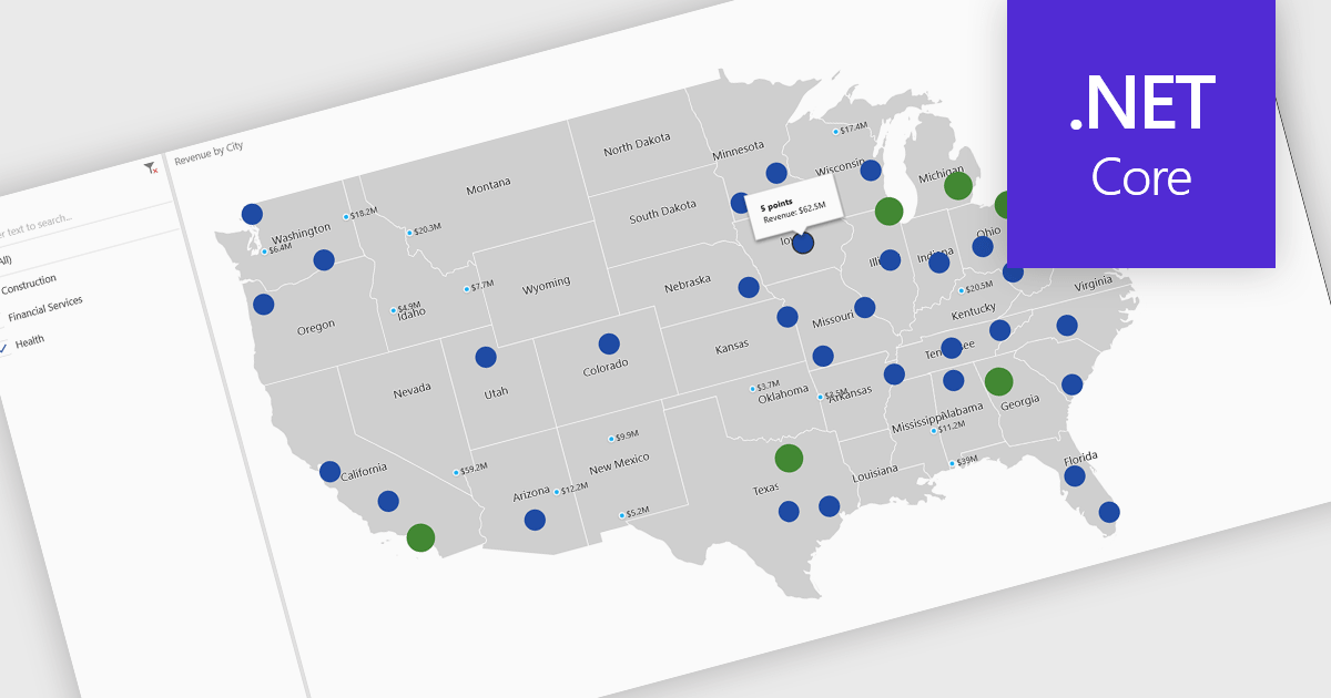
A map chart is a visual representation of data that displays values across geographic regions using colors, shading, or markers, making complex information easier to interpret. By placing data in a spatial context, map charts help users quickly identify regional patterns, trends, and outliers that might be overlooked in traditional tables or graphs. They are particularly useful for comparing values across countries, states, or counties, enabling clearer insights into geographically distributed data. Common use cases include illustrating population density, highlighting election results, analyzing sales performance by region, and presenting economic indicators. The key benefits of map charts include their ability to simplify complex datasets, provide intuitive comparisons, and support data-driven decision-making by visually connecting numbers with real-world locations.
Several .NET Core chart controls offer map charts including:
For an in-depth analysis of features and price, visit our .NET Core chart controls comparison.
전화 : 00798 14 800 6332
팩스 : +1 770 250 6199


