


공식 공급 업체
200 이상의 소프트웨어 개발처와 판매 계약을 맺은 공인 디스트리뷰터로서 합법적인 라이선스를 제공합니다.
모든 브랜드 보기.
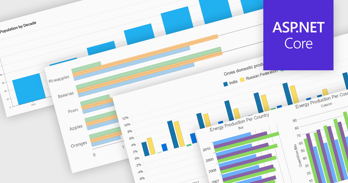
Column and bar charts form fundamental visualization tools in many charting suites. These chart types use vertical (column) or horizontal (bar) bars to represent quantitative data across categories, making them ideal for straightforward comparisons. Typically, you can display single or multiple series, stack values to show cumulative totals, or group categories to highlight differences. Their simplicity and clarity make column and bar charts a staple in dashboards, business reports, and analytics applications where rapid insight is required.
Several ASP.NET Core chart controls offer support for column & bar charts including:
For an in-depth analysis of features and price, visit our ASP.NET Core chart controls comparison.
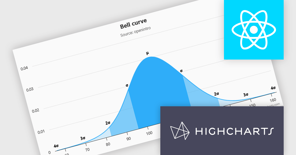
Highcharts is a JavaScript charting framework that allows web developers and data analysts to generate dynamic, visually appealing charts and graphs for websites and web applications. It can display a variety of chart types, including line, spline, area, column, bar, pie, scatter, and many more. Highcharts is well-known for its ease of use, rich documentation, and ability to handle huge datasets efficiently. Features include responsive design, accessibility support, and cross-browser compatibility. Its customization capabilities allow users to create bespoke data visualizations that increase engagement and provide insightful data presentations.
Highcharts has introduced a major update for React developers, focusing on a smoother and more natural experience when working with charts in React applications. The newly refined API now mirrors common React patterns, allowing developers to write less boilerplate and avoid workarounds. Integration is more seamless too - custom React components can be passed directly into chart configurations, enabling dynamic, reusable elements like tooltips and data-fetching containers without resorting to hacks. The update also brings full support for ECMAScript Modules (ESM), aligning with modern JavaScript standards and enabling better build optimization. With this release, Highcharts continues to provide a comprehensive set of chart types, from basic line graphs to advanced stock visualizations, all within a React-friendly environment.
Highcharts Core is licensed on an annual or perpetual basis, OEM licenses, and Advantage Renewals. It is licensed per Developer and has several license options including Internal, SaaS, SaaS+, and Self Hosted. See our Highcharts Core licensing page for full details.
Learn more on our Highcharts Core product page.
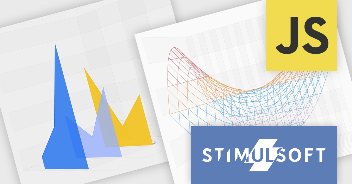
Stimulsoft Reports.JS provides a robust reporting toolkit designed specifically for JavaScript applications. This library leverages a client-side architecture, offering a pure JavaScript report engine for efficient report rendering directly within web browsers. The solution includes a user-friendly report designer for building reports with various data sources and visualizations, along with a report viewer for seamless integration and display within your JavaScript applications. This eliminates the need for server-side dependencies or browser plugins, simplifying the development process for embedding powerful reporting functionalities into your web projects.
The Stimulsoft Reports.JS 2025.4.1 update introduces new 3D Surface and Area charts that enhance data visualization capabilities in reports and dashboards. These charts allow developers to represent complex data relationships with added depth and perspective, improving analytical clarity and user comprehension. By visualizing three-dimensional data and trends more effectively, developers can deliver more informative and visually engaging reporting solutions without additional complexity in implementation.
To see a full list of what's new in 2025.4.1, see our release notes.
Stimulsoft Reports.JS is licensed per developer and is available as a Perpetual license with 1 year support and maintenance. See our Stimulsoft Reports.JS licensing page for full details.
Stimulsoft Reports.JS is available individually or as part of Stimulsoft Ultimate.
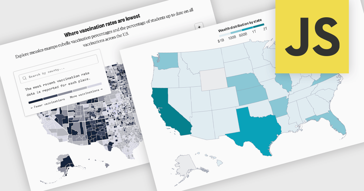
A map chart is a data visualization tool that displays information across geographic regions, helping users uncover spatial patterns, trends, and relationships. By plotting values onto countries, states, or custom areas, it transforms complex datasets into clear, location-based insights. Features like color-coding, zooming, and drill-down navigation allow for interactive exploration and comparison across regions. Common use cases include analyzing sales performance by region, tracking market coverage, visualizing customer distribution, or monitoring demographic trends, all of which support data-driven decision-making with a strong geographic context.
Several JavaScript chart controls offer map charts including:
For an in-depth analysis of features and price, visit our JavaScript chart controls comparison.
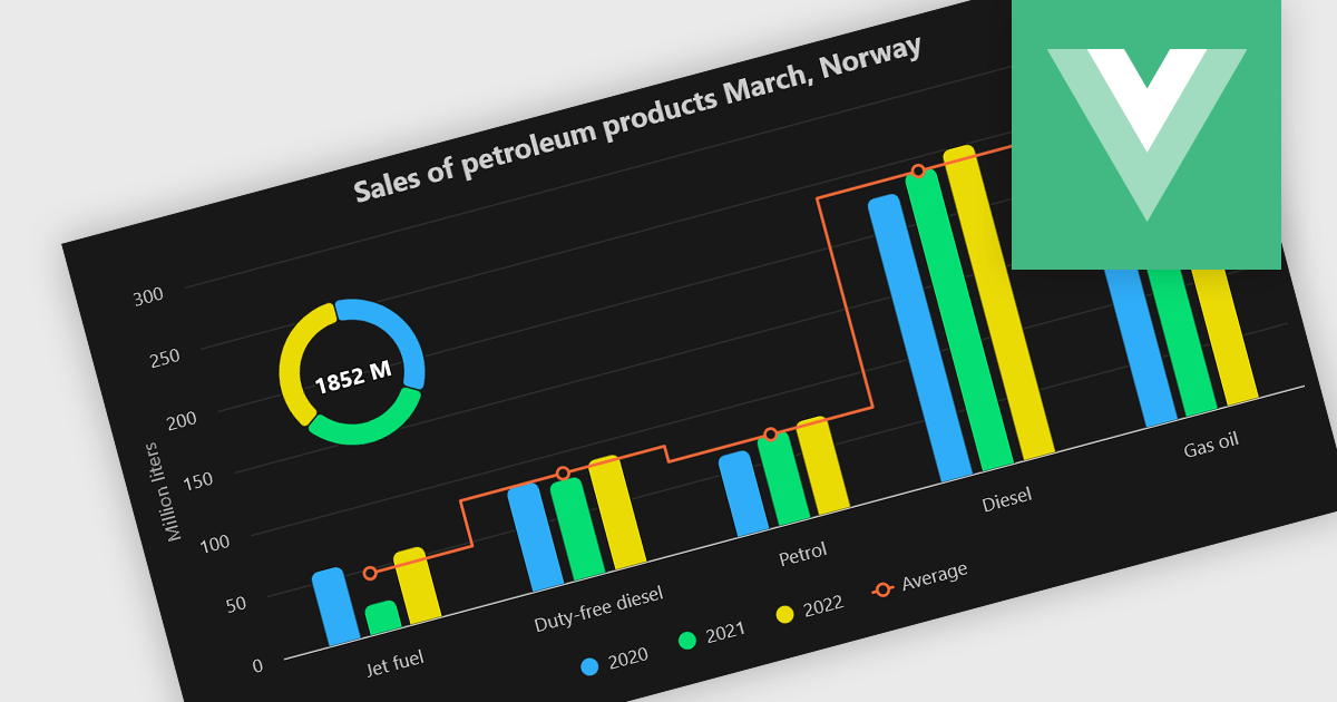
A combination chart or combo chart is a versatile type of data visualization that displays multiple chart types, such as columns, lines, or areas, to represent different data series within a single graphic. Combination charts are especially useful in scenarios where a single data type cannot fully convey the complexity of the dataset. By presenting different series types together, combination charts enhance the clarity and depth of insight available in a single view, be it on the same axis or across dual axes. This helps users to analyze complex relationships, trends and correlations between metrics more effectively than separate charts would allow.
Several Vue.js chart components allow you to combine series types on the same chart, including:
For an in-depth analysis of features and price, visit our comparison of Vue.js chart components.
전화 : 00798 14 800 6332
팩스 : +1 770 250 6199


