


공식 공급 업체
200 이상의 소프트웨어 개발처와 판매 계약을 맺은 공인 디스트리뷰터로서 합법적인 라이선스를 제공합니다.
모든 브랜드 보기.
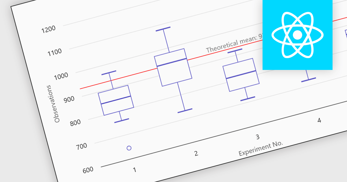
Box plots in React chart controls are statistical visualizations used to present the distribution of a dataset by highlighting key summary values, including the minimum, first quartile (Q1), median, third quartile (Q3), and maximum. In React applications, chart components render this information as a rectangular box representing the interquartile range, with lines known as whiskers extending to the minimum and maximum values, and optional markers indicating outliers. This visualization allows developers and analysts to quickly understand data spread, central tendency, and variability within a dataset. Box plots are commonly used in analytical dashboards, financial analysis tools, and scientific applications built with React, where comparing distributions and identifying anomalies across multiple data groups is important.
Many React chart controls support box plots including:
For an in-depth analysis of features and price, visit our comparison of React chart controls.
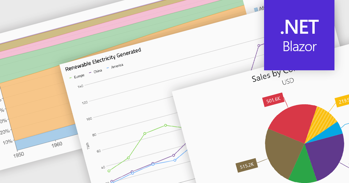
Standard chart types form the foundation of most charting components, providing widely recognized visual formats for representing numerical and categorical data. These charts help developers present trends, comparisons, distributions, and relationships in ways that are immediately understandable to end users. Because these visualizations are familiar across industries, they are commonly included as built-in options in charting libraries and dashboards, allowing applications to communicate insights clearly while supporting interactive features such as tooltips, legends, and dynamic data updates.
Common chart types include:
For an in-depth analysis of features and price, visit our Blazor charts components comparison.
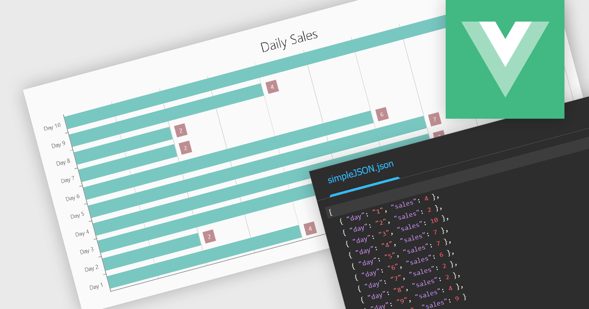
Using JSON (JavaScript Object Notation) as a data source for charts allows applications to bind structured, lightweight data directly to visualization components. JSON represents data as objects and arrays, making it well suited to defining categories, series, and individual data points in a format that aligns naturally with modern web development practices. Its widespread use in RESTful APIs and web services enables charts to consume live or remote datasets efficiently, while reducing the need for complex data transformation before rendering.
Several Vue.js chart components allow you to use JSON as a data source, including:
For an in-depth analysis of features and price, visit our comparison of Vue.js charting components.
TeeChart for .NET is a comprehensive charting solution that enables developers to create informative, visually compelling charts for financial, scientific, statistical, and business applications. It manages complex data and delivers interactive visualizations. With optional source code and enterprise editions that include mobile and JavaScript components, TeeChart for .NET provides flexibility, customization, and consistent charting across desktop, web, and mobile platforms.
The TeeChart for .NET 2006 update introduces a Tornado Chart series type that enables developers to present structured side-by-side comparisons and perform sensitivity analysis. This chart type is particularly effective for highlighting the relative impact of multiple variables, making it well suited for financial modeling, risk assessment, and analytical dashboards. By offering built-in support within the existing TeeChart framework, it reduces the need for custom visualization logic, accelerates development time, and ensures consistent integration across reporting, analytics, and business applications.
To see a full list of what's new in version 2026, see our release notes.
TeeChart for .NET is licensed per developer and is available as a perpetual license. Each license includes one year of updates and upgrades. See our TeeChart for .NET Pro Edition licensing page for full details.
This update for TeeChart for .NET is available is available in the following products:
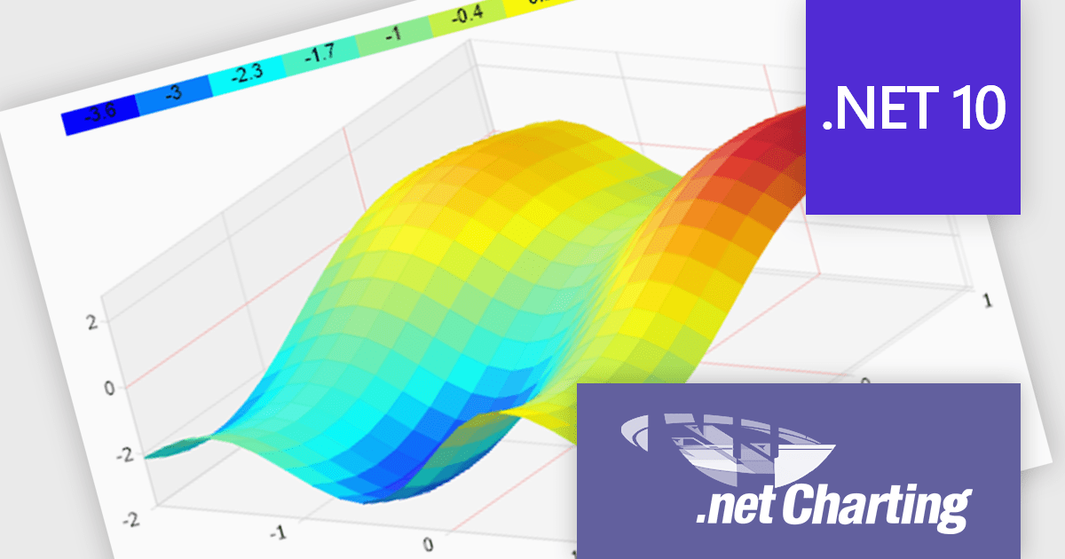
.netCHARTING is a comprehensive charting solution designed for C# and VB.NET developers working with ASP.NET or WinForms. It enables the rapid creation of dynamic, data-driven charts with minimal coding effort. Built entirely with managed C# code, .netCHARTING seamlessly integrates data access, aggregation, and visualization, allowing developers to generate interactive and visually compelling charts from various data sources, including SQL Server, Oracle, and MySQL. The platform supports a wide array of chart types - such as bar, line, pie, and geographic maps - and offers features like JavaScript and HTML5 charting for enhanced interactivity across devices, including mobile platforms. By automating complex tasks like date handling and data aggregation, .netCHARTING simplifies the development process, enabling professionals to deliver insightful data visualizations efficiently.
The .netCHARTING 10.8 release introduces official .NET 10 support with a dedicated NuGet package and sample bundle that run on the latest Microsoft tooling, enabling developers to build and optimize visualizations on the newest cross-platform .NET platform. This update ensures compatibility with the latest Visual Studio 2026 and Windows Server environments, letting teams leverage the performance and productivity improvements of .NET 10 in their charting solutions while continuing to benefit from a mature, feature-rich chart control.
.netCHARTING is licensed per site (1 web site on 1 server), per server (unlimited web sites on 1 server) or per developer (single application) and is available as a perpetual license with a 12 month subscription which includes major and minor upgrades and priority email support. See our .netCHARTING licensing page for full details.
For more information, visit our .netCHARTING product page.
전화 : 00798 14 800 6332
팩스 : +1 770 250 6199


