


공식 공급 업체
200 이상의 소프트웨어 개발처와 판매 계약을 맺은 공인 디스트리뷰터로서 합법적인 라이선스를 제공합니다.
모든 브랜드 보기.
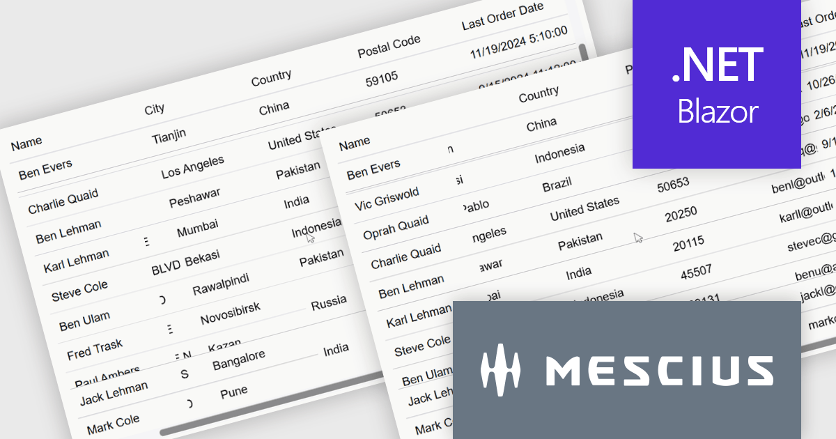
ComponentOne Studio Blazor Edition by MESCIUS allows developers to leverage their existing C# skills to build rich web applications. This comprehensive suite includes high-performance, native Blazor UI controls like FlexGrid, a powerful datagrid with data virtualization, and 50+ chart types for data visualization. It also offers essential input controls like Autocomplete and Combobox, improving development efficiency and creating a seamless experience for both developers and users.
The ComponentOne Studio Blazor Edition 2025 v1 update introduces support for freezing columns to the right and rows to the bottom in FlexGrid, giving developers greater control over data presentation in complex UI scenarios. This enhancement allows critical data such as totals or summary rows and columns to remain visible as users scroll through the grid, improving usability and reducing the need for redundant navigation. It aligns with common spreadsheet behavior and enables developers to deliver a more intuitive and efficient user experience within their Blazor applications.
To see a full list of what's new in 2025 v1, see our release notes.
ComponentOne Studio Blazor Edition is licensed per developer on a perpetual basis and includes a 12 month subscription. See our ComponentOne Studio Blazor Edition licensing page for full details.
ComponentOne Studio Blazor Edition is available individually or as part of ComponentOne Studio Enterprise.
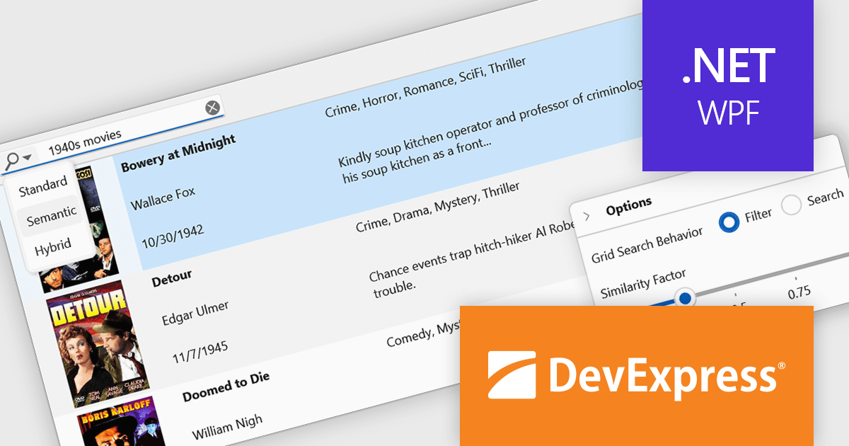
DevExpress WPF is a powerful suite of controls that enhances your WPF development toolkit. It offers data grids, ribbon menus, rich text editors, spreadsheets, charts, and more – all with beautiful themes and touch-friendly interfaces. DevExpress WPF empowers you to build professional-looking, responsive applications that meet modern user expectations, saving you time and effort while adding polish and functionality.
The DevExpress WPF v25.1 update introduces a new semantic search capability for the Data Grid that leverages Natural Language Processing (NLP). Rather than depending solely on exact keyword matches, it converts user input into vector representations. These representations are then analyzed through a similarity algorithm, allowing the system to identify and rank results based on contextual meaning. This update significantly improves the quality of search results, especially in datasets where users may phrase queries in varied or imprecise ways. It’s particularly beneficial in applications that deal with complex or user-generated content, offering developers a more natural and adaptive search mechanism.
To see a full list of what's new in version 25.1, see our release notes.
DevExpress WPF is licensed per developer and is available as a Perpetual License with a 12 month support and maintenance subscription. We can supply new subscriptions, subscription renewals, and additional licenses. See our DevExpress WPF licensing page for full details.
DevExpress WPF is available to buy in the following products:
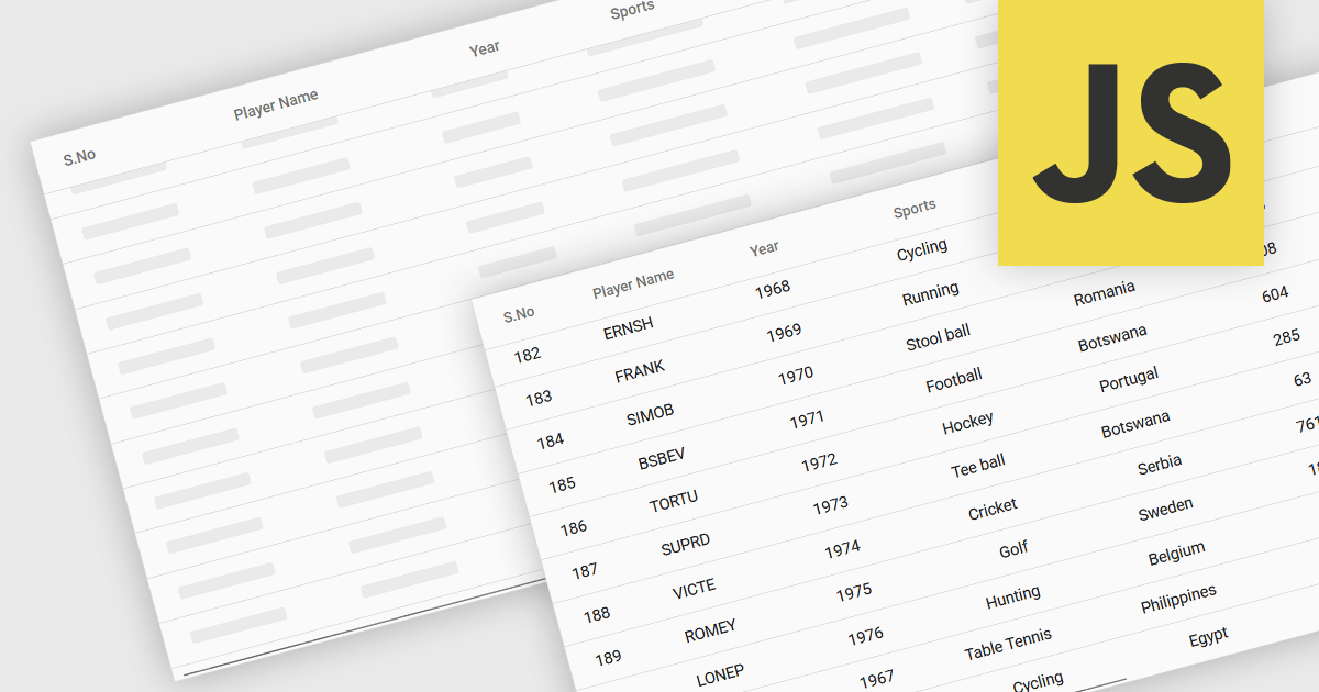
The ability to load items in a data grid as you scroll is a technique where content is rendered or fetched dynamically based on the user’s scroll position. Its purpose is to improve performance, and ultimately the user experience, when dealing with large datasets. This includes virtual scrolling, where the grid only renders rows that are currently visible in the viewport and reuses those same DOM elements as the user scrolls, and infinite scrolling (also known as endless scrolling), where additional data is loaded from a remote source in response to reaching the end of the currently displayed dataset. By minimizing the amount of data rendered or retrieved at any one time, this approach significantly reduces initial load times, improves responsiveness, and allows applications to scale efficiently.
Several JavaScript grid components allow you to load items as the user scrolls, including:
For an in-depth analysis of features and price, visit our comparison of JavaScript grid components.

Telerik UI for .NET MAUI is a robust suite of user interface components designed to simplify the creation of cross-platform applications using .NET Multi-platform App UI (MAUI). It offers a wide range of pre-built controls, including charts, grids, and navigation elements, enabling developers to build visually appealing, high-performance apps for Android, iOS, Windows, and macOS from a shared codebase. By ensuring a consistent user experience across platforms, it accelerates development and allows a focus on functionality, making it ideal for business applications, dashboards, and data-driven projects.
The Telerik UI for .NET MAUI 2025 Q2 update introduces the TreeDataGrid component, providing users with a powerful tool for presenting complex, hierarchical data in a structured, grid-based layout. By combining the features of a TreeView and a DataGrid, the TreeDataGrid enables efficient display and interaction with nested data using multiple columns, expandable rows, and customizable indentation. It supports dynamic operations such as adding or removing child items, auto-expanding nodes, and conditionally rendering expandable sections, providing precise control over data presentation and user experience.
To see a full list of what's new in 2025 Q2 (v11.0.0), see our release notes.
Telerik UI for .NET MAUI is licensed per developer and has two licensing models: an annual Subscription License and a Perpetual License. The Subscription license provides access to the latest product updates, technical support, and exclusive benefits for a flat annual fee, and must be renewed to continue using the software. The Perpetual license is a one-time purchase granting access to the current released version and includes a one-year subscription for product updates and technical support. After this initial period, users can choose to renew the subscription element to continue receiving updates and support; otherwise, they may continue using the installed version available during their active subscription term but will forgo future updates and support. See our Telerik UI for .NET MAUI licensing page for full details.
Telerik UI for .NET MAUI is available individually or as part of the following products:
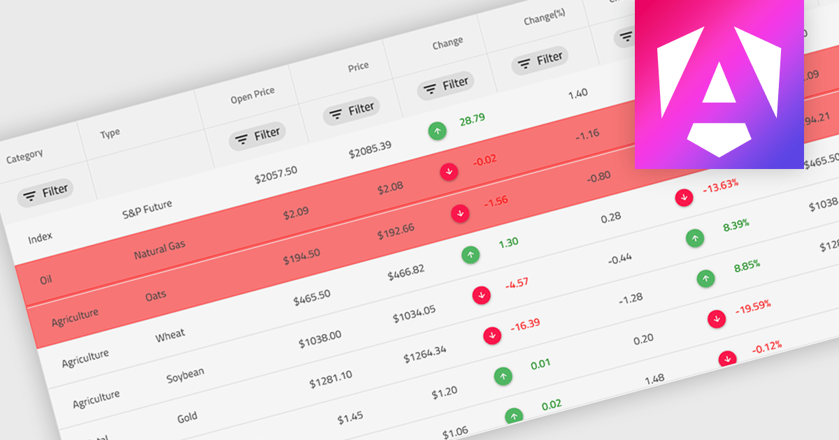
Conditional formatting in a grid refers to the dynamic application of visual styles—such as colors, icons, or font changes—to cells based on the values they contain or rules defined by the developer. This feature enables developers to visually differentiate data patterns, identify anomalies, or highlight critical values directly within a data grid without additional processing or user interaction. By presenting real-time visual cues tied to data content, conditional formatting enhances readability, supports quick analysis, and improves user decision-making, particularly in data-heavy applications where clarity and immediacy are essential.
Several Angular grid controls offer conditional formatting, including:
For an in-depth analysis of features and price, visit our comparison of Angular Grid controls.
전화 : 00798 14 800 6332
팩스 : +1 770 250 6199


