


공식 공급 업체
200 이상의 소프트웨어 개발처와 판매 계약을 맺은 공인 디스트리뷰터로서 합법적인 라이선스를 제공합니다.
모든 브랜드 보기.

Fixed headers in a grid component refer to the user interface feature where the header row (or rows) of the grid remains visible at the top of the viewport while the user scrolls through the content vertically. This functionality is particularly useful in data-intensive applications, as it ensures that column labels stay in view, maintaining context and readability even with large datasets. For software developers, implementing fixed headers improves usability, enhances data navigation, and supports better comprehension by eliminating the need to repeatedly scroll back to the top to interpret column values.
Several Blazor Grids offer support for fixed headers including:
For an in-depth analysis of features and price, visit our Blazor Grids comparison.
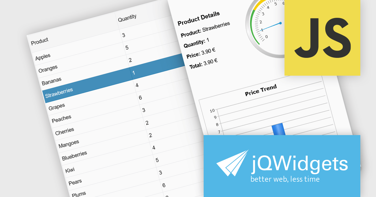
jQWidgets is a comprehensive JavaScript UI framework offering a robust collection of over 60 widgets, themes, and utilities for building professional-grade, cross-platform web applications. Built on jQuery, HTML5, and CSS, it provides extensive functionality including data grids, charts, navigation, input validation, and more. jQWidgets simplifies web development, ensuring your applications work seamlessly across desktop browsers, tablets, and smartphones.
The jQWidgets v23.0.0 release adds a new side panel feature in jqxGrid, allowing developers to add custom HTML elements directly into side panels positioned next to the grid. Whether you want to include filters, charts, summaries, help text, or interactive widgets, the side panel supports any type of content.
To see a full list of what's new in v23.0.0, see our release notes.
jQWidgets is licensed per developer and is available as a Perpetual license 1 year support and maintenance. See our jQWidgets licensing page for full details.
Learn more on our jQWidgets product page.
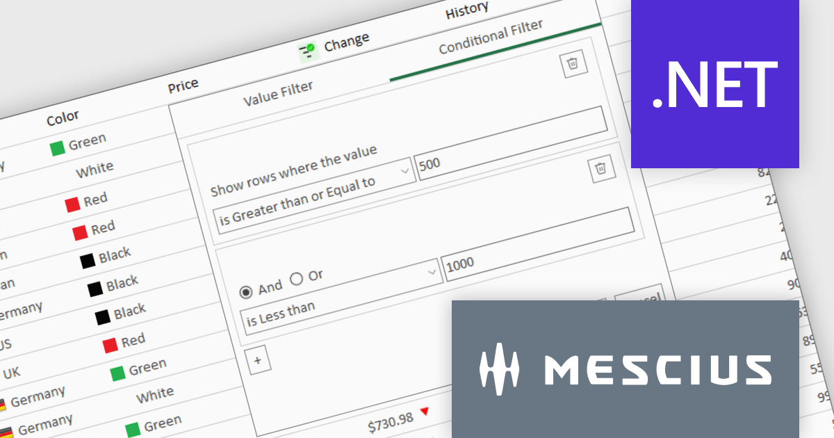
ComponentOne Studio Enterprise is a comprehensive suite of .NET UI controls developed by MESCIUS (formerly GrapeCity) designed for building rich, interactive desktop, web, and mobile applications. It provides developers with a broad range of tools and components—including data grids, charts, reports, input controls, and advanced data visualization features—for platforms such as WinForms, WPF, ASP.NET Core, Blazor, WinUI, and .NET MAUI. The suite emphasizes performance, flexibility, and ease of integration, helping teams create consistent, feature-rich user experiences across multiple application types while maintaining a unified development approach.
The ComponentOne Studio Enterprise 2025 v1 update introduces a redesigned column filter UI for FlexGrid in WinForms that enhances filtering precision and developer control. It supports a wider range of filter conditions, such as numeric and date ranges, duplicates, and null values, allowing for more refined data manipulation. The new interface aligns visually with modern application themes and remains backward compatible, ensuring that existing codebases can adopt the update without disruption. This improvement enables developers to implement more robust and flexible data grids in their WinForms applications.
To see a full list of what's new in 2025 v1, see our release notes.
ComponentOne Studio Enterprise is licensed per developer on a perpetual basis and includes a 12 month subscription. Priority Support is also available. See our ComponentOne Studio Enterprise licensing page for full details.
Learn more on our ComponentOne Studio Enterprise product page.
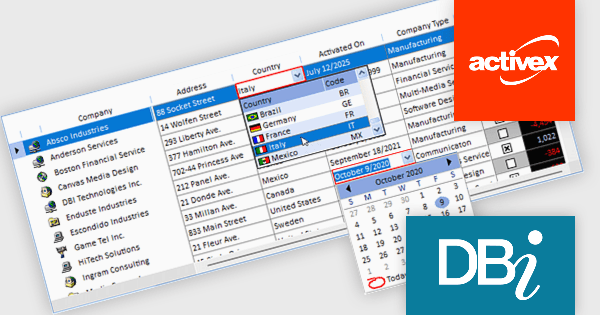
Studio Controls for COM and Studio Controls COM 64 by DBI Technologies are a set of 32-bit and 64-bit ActiveX components for building data-driven Windows applications. Both suites include controls for grids, scheduling, calendars, and UI elements, designed to integrate with environments like Microsoft Access and Visual Basic. The suite supports Windows styling and XML configuration, helping developers create professional, interactive applications across legacy and modern platforms.
The Studio Controls for COM v7.5 update introduces ctxGrid, a high performance 32 bit and 64 bit ActiveX data grid that integrates seamlessly into any ActiveX supported IDE and provides developers with formatted input controls including combo boxes and validation rules for robust data entry. It supports dynamic column manipulation such as locking, sorting and auto sizing and leverages XML driven styling and theming to ensure a consistent Windows compliant user interface while exposing a fully extensible API for implementing custom behaviors. Its lightweight architecture delivers a minimal memory footprint and rapid rendering of large datasets, enabling developers to add interactive data presentation and input functionality quickly without compromising overall application responsiveness.
To see a full list of what's new, see our Studio Controls for COM release notes and Studio Controls COM 64 release notes.
Studio Controls for COM/COM 64 is licensed per developer, royalty-free for runtime use. A one-year subscription includes support, updates, upgrades and any new controls. See our Studio Controls for COM licensing page and Studio Controls COM 64 licensing page for full details.
For more information, see our Studio Controls for COM product page and Studio Controls COM 64 product page.
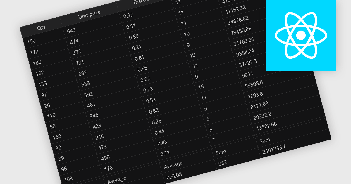
Aggregation in grid components allows users to automatically compute and display summary values, such as totals, averages, minimums, and maximums, across rows or columns of data. This feature enhances the analytical capability of a data grid by offering quick insights directly within the interface, reducing the need to export data for external processing. It is particularly valuable in business intelligence dashboards, financial applications, and administrative tools where on-the-fly data synthesis is essential.
Several React grid controls offer aggregation including:
For an in-depth analysis of features and price, visit our React grid controls comparison.
전화 : 00798 14 800 6332
팩스 : +1 770 250 6199


