


공식 공급 업체
200 이상의 소프트웨어 개발처와 판매 계약을 맺은 공인 디스트리뷰터로서 합법적인 라이선스를 제공합니다.
모든 브랜드 보기.

Conditional formatting in a grid allows you to dynamically alter the visual style of cells based on specific criteria within your data. This functionality enhances readability and user experience by highlighting important information. For instance, negative values can be displayed in red, exceeding values in bold, and empty cells with a light gray background, all within the grid itself. This reduces the need for users to manually scan through data and immediately draws attention to critical elements.
Several React grid controls offer conditional formatting, including:
For an in-depth analysis of features and price, visit our comparison of React Grid controls.
jQWidgets is a comprehensive JavaScript UI framework offering a robust collection of over 60 widgets, themes, and utilities for building professional-grade, cross-platform web applications. Built on jQuery, HTML5, and CSS, it provides extensive functionality including data grids, charts, navigation, input validation, and more. jQWidgets simplifies web development, ensuring your applications work seamlessly across desktop browsers, tablets, and smartphones.
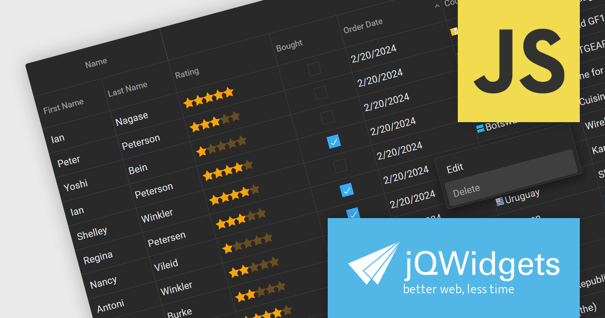
The jQWidgets v19 release introduces a built-in context menu. This menu appears upon right-clicking within the grid, offering users context-specific options relevant to their current selection or interaction. This eliminates the need to navigate to separate menus or tools, streamlining user interactions and significantly improving usability. By providing immediate access to relevant actions within the grid itself, users can work more efficiently and productively. This new addition enhances the overall user experience for anyone working with jqxGrid.
To see a full list of what's new in v19.0.0, see our release notes.
jQWidgets is licensed per developer and is available as a Perpetual license 1 year support and maintenance. See our jQWidgets licensing page for full details.
Learn more on our jQWidgets product page.
jQWidgets is a comprehensive JavaScript UI framework offering a robust collection of over 60 widgets, themes, and utilities for building professional-grade, cross-platform web applications. Built on jQuery, HTML5, and CSS, it provides extensive functionality including data grids, charts, navigation, input validation, and more. jQWidgets simplifies web development, ensuring your applications work seamlessly across desktop browsers, tablets, and smartphones.
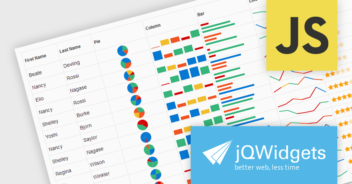
The jQWidgets v19 release introduces support for integrating sparklines directly into jqxGrid. These miniature charts, plotted directly within grid cells, provide a quick and insightful way to visualize trends and patterns in your data without requiring additional charting libraries. This enhancement significantly bolsters jqxGrid's data visualization capabilities, allowing you to create more informative and engaging data presentations.
To see a full list of what's new in v19.0.0, see our release notes.
jQWidgets is licensed per developer and is available as a Perpetual license 1 year support and maintenance. See our jQWidgets licensing page for full details.
Learn more on our jQWidgets product page.
Offloading sorting tasks to a server (known as remote server sorting or server-side sorting) enables large datasets to be handled efficiently without overwhelming the client. This minimizes data transmission and leads to snappier web applications. Moreover, server-side sorting boosts scalability by ensuring processing happens on the server, freeing up client resources. This translates to faster response times, especially for large datasets, making the user experience smoother. This approach empowers developers to build responsive and scalable web applications that excel at managing and presenting sorted data.
Several Angular grid controls offer sorting on the remote server, including:
For an in-depth analysis of features and price, visit our comparison of Angular Grid controls.
DevExpress ASP.NET and Blazor includes 110+ UI controls for ASP.NET (including Reporting), server-side MVC extensions or client-side controls with everything you need to build Office-inspired applications, over 70 high-performance ASP.NET Core UI controls, ASP.NET Bootstrap Controls for Office-inspired and Data Visualization apps, Blazor Components (including a Data Grid and Pivot Grid) so you can design rich user experiences for both server-side (Razor Components) and client-side (Blazor) platforms and the DevExtreme JavaScript component suite for responsive web development.
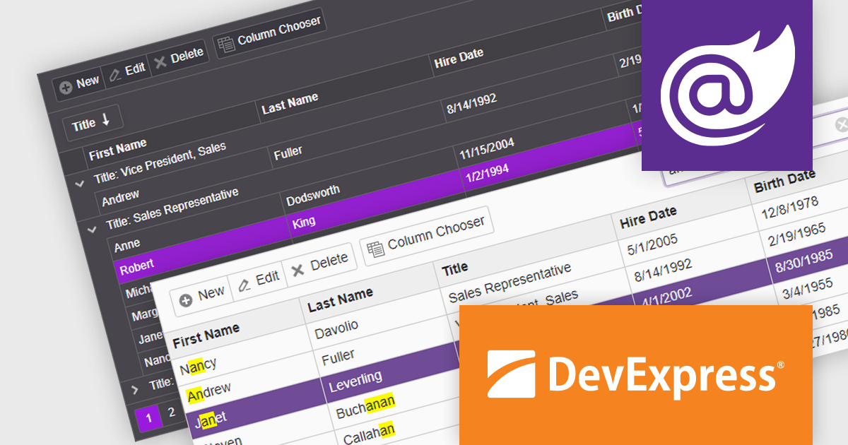
The DevExpress Blazor Grid UI component includes a new toolbar section for displaying custom content. In this blog post, DevExpress's Svetlana Mikheeva describes how to use this powerful component to create rich UIs displaying icons, text, or both. Steps include:
Read the complete blog and get started creating rich Blazor Grid applications.
DevExpress ASP.NET and Blazor is licensed per developer and includes a 12 month subscription for minor and major updates. Subscription renewals are also available. See our DevExpress ASP.NET and Blazor licensing page for full details.
Learn more about DevExpress ASP.NET and Blazor.
전화 : 00798 14 800 6332
팩스 : +1 770 250 6199


