


공식 공급 업체
200 이상의 소프트웨어 개발처와 판매 계약을 맺은 공인 디스트리뷰터로서 합법적인 라이선스를 제공합니다.
모든 브랜드 보기.
Document Solutions for Excel, .NET Edition by MESCIUS is designed to enable developers to create and manipulate Microsoft Excel documents programmatically within .NET applications. It provides a robust API for interacting with Excel spreadsheets, allowing developers to automate tasks such as data extraction, formatting, and generation of reports. The framework offers comprehensive support for various Excel features, including formulas, charts, conditional formatting, and data validation. It also provides tools for handling large datasets and optimizing performance, making it suitable for both small-scale and enterprise-level applications.
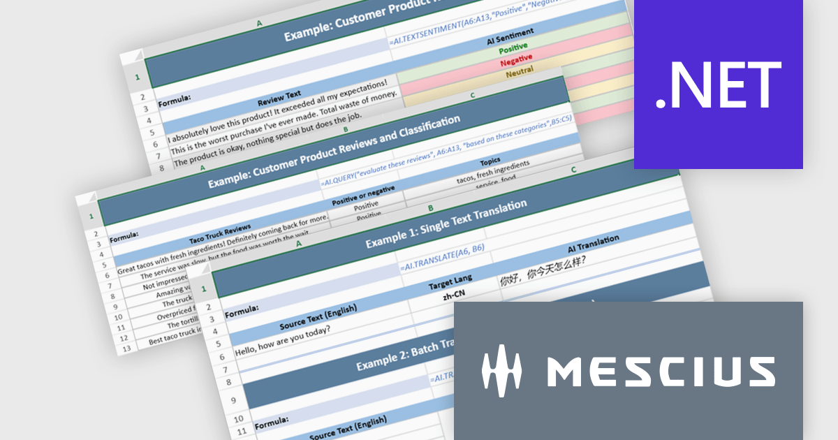
The Document Solutions for Excel, .NET Edition v9.0.0 update introduces a major new capability: AI-powered functions that integrate large language models directly into the spreadsheet formula engine. Developers can now use AI.QUERY to build dynamic prompts from cell values, AI.TRANSLATE to localize ranges into target languages, and AI.TEXTSENTIMENT to classify text as positive, negative, or neutral, all within formula syntax. These functions support both template use and automation scenarios, enabling more intelligent document workflows.
To see a full list of what's new in v9.0.0, see our release notes.
Document Solutions for Excel is licensed per developer and is available in several license options for differing distribution needs. Team licenses are also available for multiple developers within the same organization. See our Document Solutions for Excel, .NET Edition licensing page for full details.
Document Solutions for Excel, .NET Edition is available to buy in the following products:
EPPlus is a powerful and versatile .NET library for managing and manipulating Microsoft Excel files using the Office Open XML (OOXML) format. It is a lightweight and efficient library that is easy to use and can be integrated into a wide range of applications. It allows developers to create, read and modify spreadsheets without dependencies on any other library. Features include pivot tables, styling, VBA/Form controls, conditional formatting, charts, tables, formula calculation, data validation, pictures/shapes, and more.
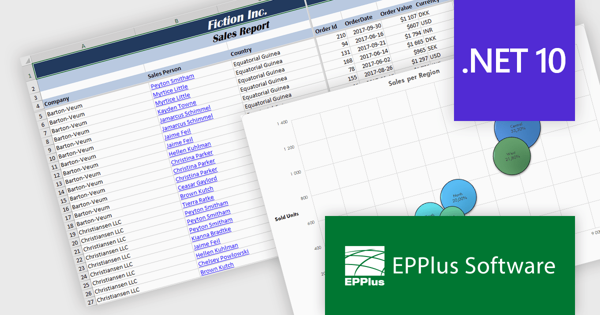
The EPPlus v8.4 update adds support for targeting Microsoft's .NET 10, allowing developers to use a version of the library that is compatible with the latest .NET runtime. This update ensures that EPPlus can be directly referenced in projects built on .NET 10 without relying on compatibility with earlier framework targets, helping maintain consistency with current development environments and tooling.
To see a full list of what's new in v8.4, see our release notes.
EPPlus is licensed per developer and is available as both perpetual licenses and subscription based licenses with periods of 1 year and 2 years, which include support and upgrades. See our EPPlus licensing page for full details.
For more information, see our EPPlus product page.
Spread.NET by MESCIUS is a tool for building Excel-like applications in your .NET projects. It lets you create interactive spreadsheets, grids, dashboards, and even forms within WinForms, ASP.NET, and WPF applications. With its rich feature set, including a robust calculation engine, formula support, and Excel compatibility, Spread.NET helps developers to build data analysis tools, budgeting apps, scientific dashboards, and more, all within the familiar .NET environment.
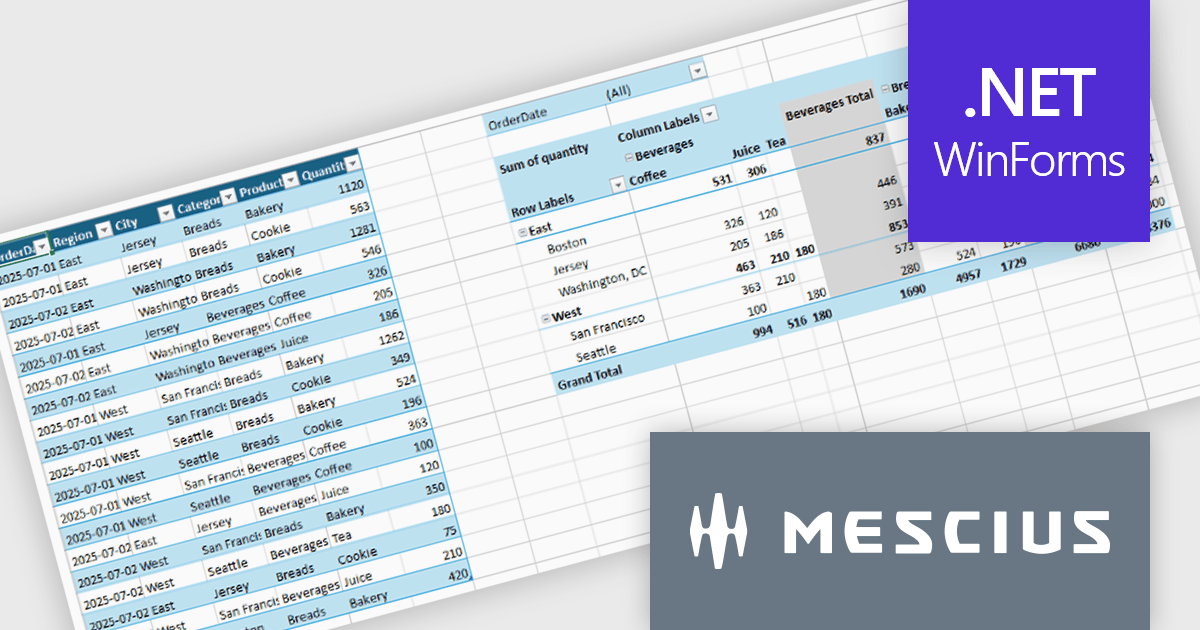
The Spread.NET v19 update introduces a new pivot table engine that enables software developers to summarize, analyze, and explore large datasets directly within WinForms applications. This built-in capability supports interactive grouping, filtering, and multidimensional analysis inside the spreadsheet, allowing users to work with complex data without exporting it to external reporting or business intelligence tools. By delivering Excel-like pivot table functionality with high performance and programmatic control, the pivot engine helps developers simplify application architecture, reduce dependencies, and provide a more integrated and responsive data analysis experience for end users.
To see a full list of what's new in v19, see our release notes.
Spread.NET is licensed per developer and is available as a Perpetual License with a 12 month support and maintenance subscription. We can supply any Spread.NET license including new licenses, maintenance renewals, and upgrade licenses. See our Spread.NET licensing page for full details.
For more information, visit our Spread.NET product page.
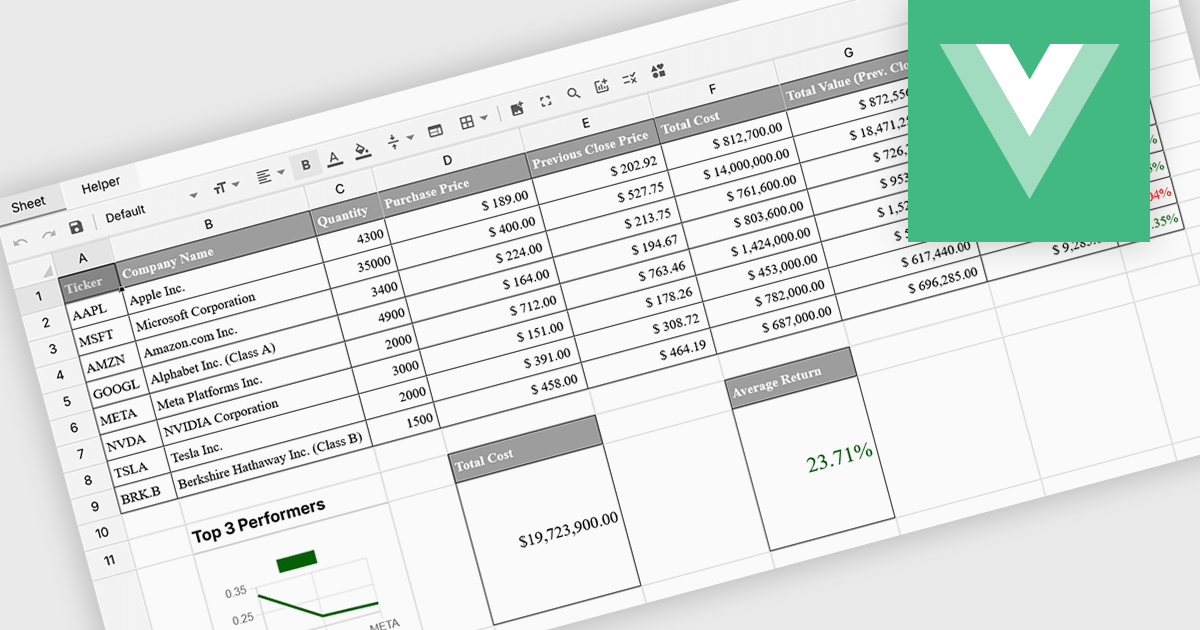
Formula and function support in spreadsheets enables users to perform mathematical, statistical, financial, and logical calculations directly within cells, transforming raw data into meaningful results. By automating calculations and ensuring consistent logic across datasets, this capability improves accuracy, saves time, and supports real-time updates as data changes. It allows users to analyze trends, validate data, and model scenarios without relying on external tools. Common use cases include financial forecasting, budgeting, statistical analysis, performance reporting, and operational planning, making spreadsheets a powerful and flexible platform for data-driven decision-making across business, finance, and technical teams.
Several Vue spreadsheet controls offer formula and function support including:
For an in-depth analysis of features and price, visit our Vue spreadsheet controls comparison.
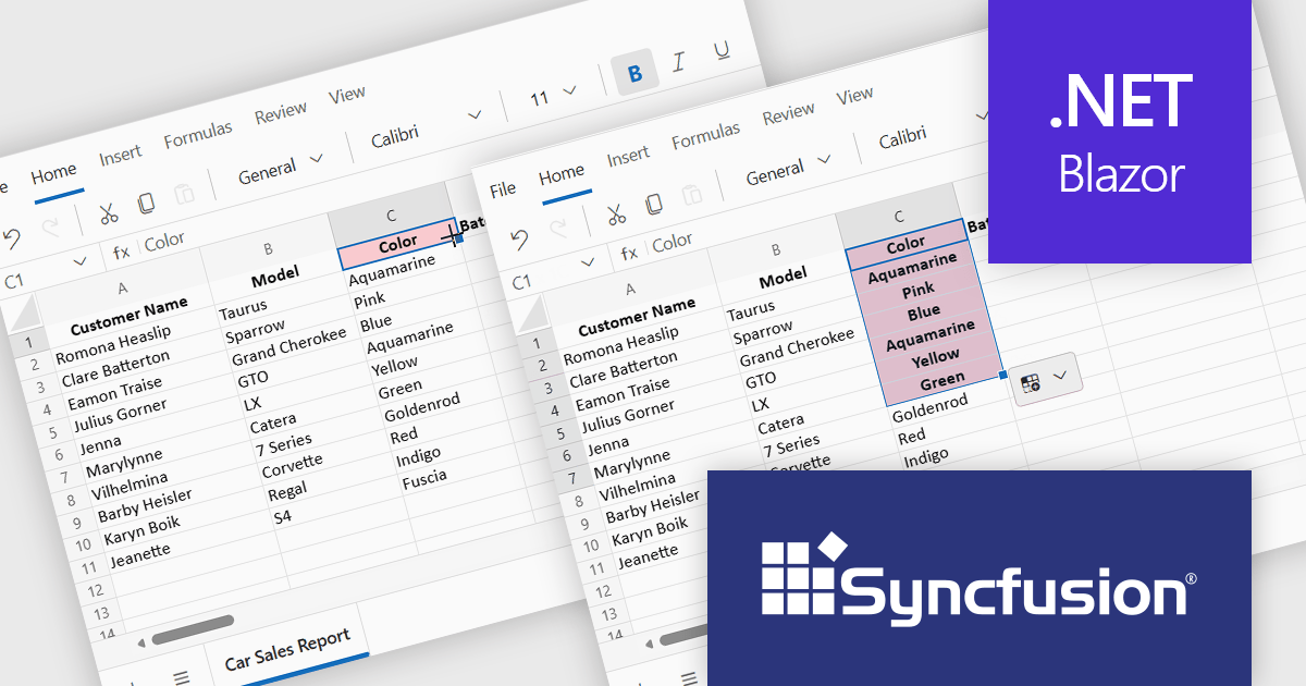
Syncfusion Essential Studio Spreadsheet Editor SDK is a library that lets developers embed spreadsheet functionality into web and desktop applications without requiring Microsoft Excel. It supports editing, formatting, and data analysis features such as cross sheet formula calculation, data binding to local and remote sources including JSON and REST, conditional cell styling, charts, data validation, worksheet protection, and workbook permissions. Available across frameworks including Blazor, React, Angular, Vue, JavaScript, ASP.NET Core and MVC, WPF, WinForms, and UWP, it helps teams deliver a familiar spreadsheet experience for use cases like reporting, budgeting, forecasting, and operational data entry directly within their applications.
The Syncfusion Essential Studio Spreadsheet Editor SDK 2025 Volume 4 update adds Blazor Autofill series support, allowing users to quickly extend numeric, date-based, and custom list patterns across cells in a predictable manner. This capability preserves existing cell formatting where applicable and provides flexible behavior for copying values versus generating sequences, reducing the need for custom implementation logic. As a result, developers can deliver more intuitive, Excel-like spreadsheet experiences with improved data consistency, reduced input errors, and faster interaction for end users.
To see a full list of what's new in Syncfusion Essential Studio Spreadsheet Editor SDK 2025 Volume 4 (32.1.19), see our release notes.
Syncfusion Essential Studio Spreadsheet Editor SDK is licensed per developer on a one year timed subscription basis, with runtime royalty free redistribution included when the subscription is current, and includes one year of unlimited technical support and updates. See our Syncfusion Essential Studio Spreadsheet Editor SDK licensing page for full details.
Learn more on our Syncfusion Essential Studio Spreadsheet Editor SDK product page.
전화 : 00798 14 800 6332
팩스 : +1 770 250 6199


