


공식 공급 업체
200 이상의 소프트웨어 개발처와 판매 계약을 맺은 공인 디스트리뷰터로서 합법적인 라이선스를 제공합니다.
모든 브랜드 보기.
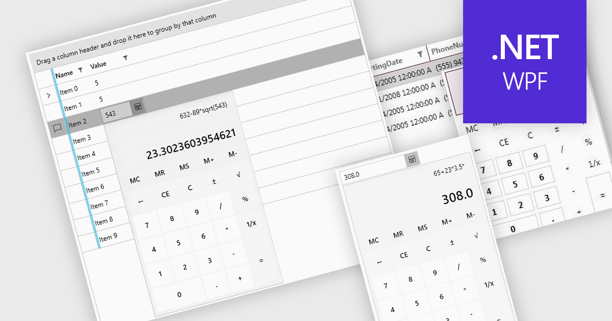
Dropdown calculators are interactive user interface components that integrate a compact calculator directly into a standard dropdown control, allowing users to perform quick calculations or adjust numerical values without navigating away from the current input field. This interaction pattern is particularly useful in data-heavy applications where users frequently need to input or modify numerical data, such as e-commerce pricing, financial tools, form-based systems, or configuration panels. By integrating calculation capabilities directly into the dropdown, these components reduce the need for external tools, help maintain focus, and improve the overall speed and accuracy of user input.
Several WPF data editor collections offer a dropdown calculator, including:
For an in-depth analysis of features and price, visit our comparison of WPF data editors collections.
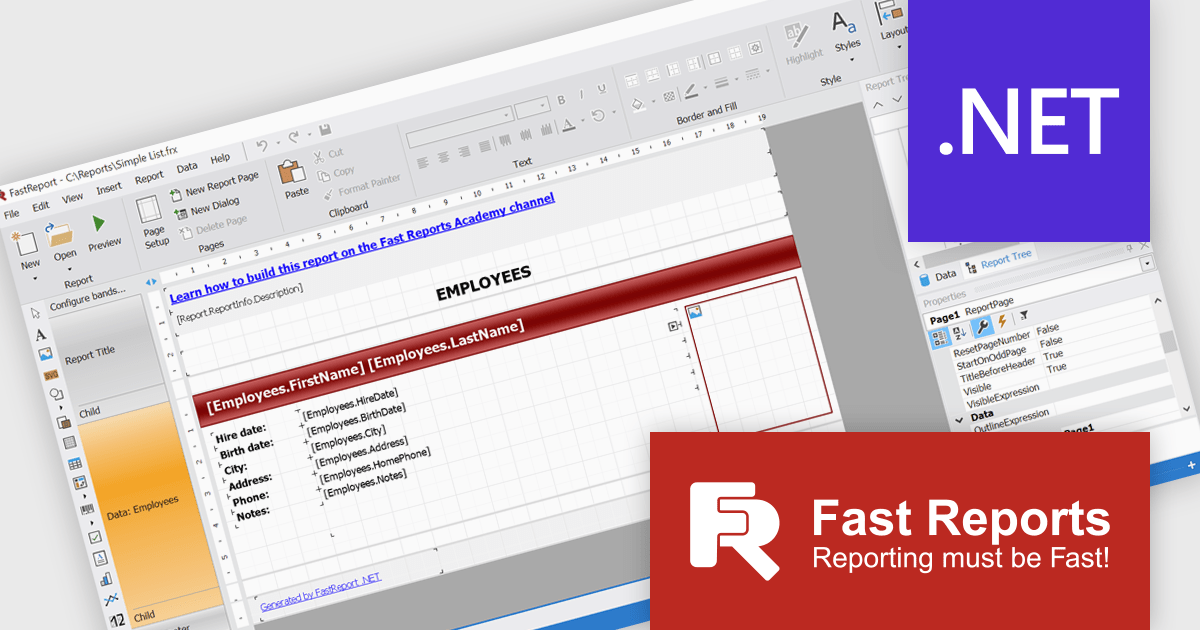
FastReport .NET Ultimate is a comprehensive reporting solution for developers working within the Microsoft .NET ecosystem. It supports the creation, design, and delivery of rich, interactive reports across Windows Forms, ASP.NET, MVC, and .NET Core applications. The Ultimate edition includes server deployment capabilities and extensive export options, such as PDF, Excel, Word, and HTML. It connects to various data sources, including SQL databases and business objects, providing flexibility for enterprise-level reporting. With the integrated FastReport Online Designer, users can edit reports directly in their browsers, enabling efficient collaboration and modern, full-featured report design across both desktop and web platforms.
The FastReport .NET Ultimate 2026.1 update introduces an improved Ribbon interface and a new 'RibbonDesignerControl', giving developers a more intuitive and efficient report design experience. The redesigned Ribbon UI offers a cleaner, more structured layout that simplifies access to tools and settings, improving usability and reducing development time. This addition allows developers to integrate the same modern Ribbon interface directly into their own applications, providing a consistent and familiar design environment for end users. This enhancement supports smoother workflows, greater customization, and a more professional user experience across both desktop and web reporting solutions.
To see a full list of what's new in version 2026.1, see our release notes.
FastReport .NET Ultimate is licensed per named user and is available as a perpetual license with a one-year subscription for updates and support. See our FastReport .NET Ultimate licensing page for full details.
For more information, visit our FastReport .NET Ultimate product page.
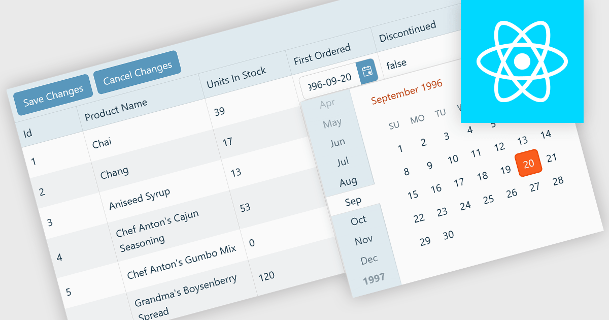
A custom grid editor allows developers to tailor how users interact with data directly within grid cells, providing a flexible and efficient editing experience. Instead of relying on standard text inputs, custom editors can include dropdowns, sliders, toggles, or calendar components to match the data type. This approach not only improves data entry and validation but also enhances accuracy and user satisfaction by ensuring inputs are contextually relevant. For example, a date field might use an inline date picker, while a status column could feature a dropdown with predefined options. Ideal for data-heavy applications such as dashboards, scheduling tools, and administrative panels, custom grid editors help users to edit complex data quickly and intuitively without leaving the main interface.
Several React Grid controls offer support for custom editing including:
For an in-depth analysis of features and price, visit our comparison of React Grid controls.
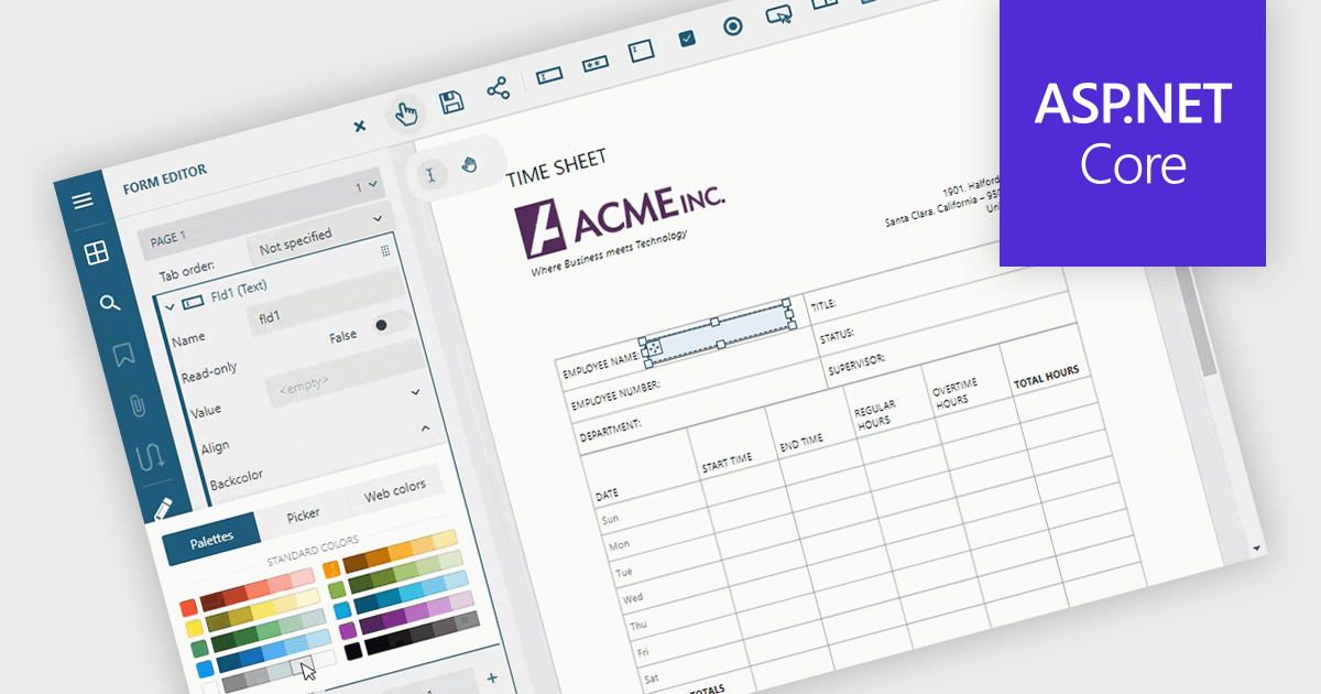
Adding and modifying form fields in PDF editing provides full control over form design and content. It lets users insert, modify, delete, or rename interactive fields such as text boxes, checkboxes, and signature areas to keep forms accurate and up to date. Visual customization, including adjusting field colors and layouts, helps create professional, branded documents. Common uses include updating HR application forms, refining finance templates, and simplifying legal agreements for faster completion.
Several ASP.NET Core PDF components allow you to add, edit and remove form fields from PDF forms, including:
For an in-depth analysis of features and price, visit our comparison of ASP.NET Core PDF components.
DevCraft by Telerik is a comprehensive suite of more than 1,250 UI components and development tools designed for building modern web, desktop, and mobile applications using .NET and JavaScript frameworks. It includes reporting and report management solutions, automated testing and mocking tools, and document processing libraries, as well as a wide range of professionally designed user interface controls from the Telerik and Kendo UI suites. DevCraft enables developers to create feature-rich, high-performance applications with consistent design and user experience, delivering enterprise-level, scalable, and maintainable software solutions.
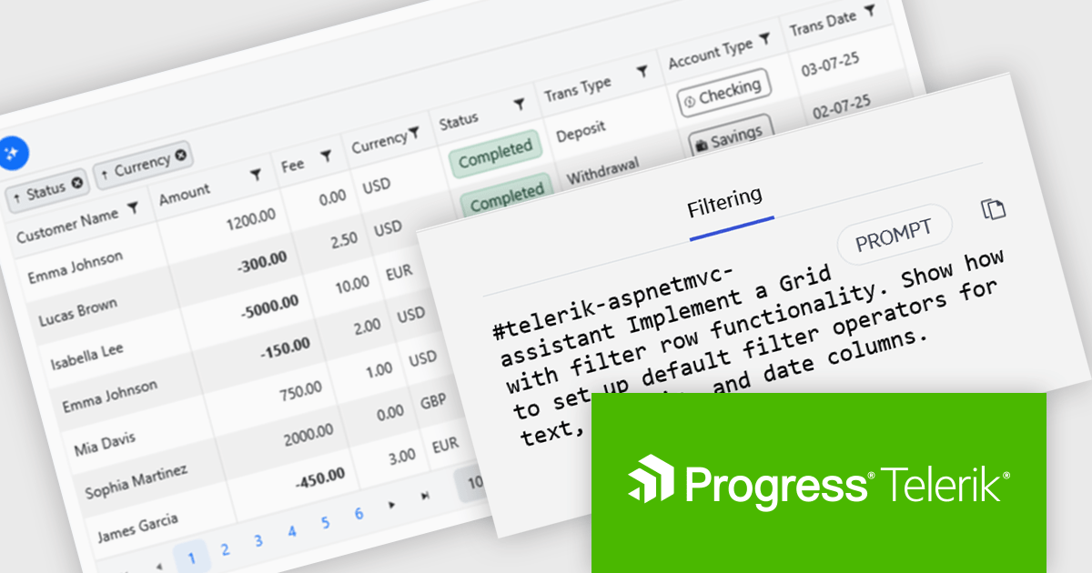
The Telerik DevCraft 2025 Q3 update introduces new AI Coding Assistants for Telerik UI for ASP.NET MVC and Kendo UI for jQuery, designed to improve developer efficiency through intelligent, context-aware code generation within supported IDEs. These assistants automate repetitive coding tasks, generate accurate framework-specific code, and deliver instant access to relevant API documentation and technical insights. By understanding the structure and capabilities of Telerik and Kendo UI components, the AI Coding Assistants enable developers to produce cleaner, more consistent code while reducing time spent on setup, configuration, and troubleshooting.
To see a full list of what's new in version 2025 Q3 (2025.3.1002), see our release notes for Telerik UI for ASP.NET MVC and Kendo UI for jQuery.
Telerik DevCraft is licensed per developer and has two licensing models: an annual Subscription License and a Perpetual License. The Subscription license provides access to the latest product updates, technical support, and exclusive benefits for a flat annual fee, and must be renewed to continue using the software. The Perpetual license is a one-time purchase granting access to the current released version and includes a one-year subscription for product updates and technical support. After this initial period, users can choose to renew the subscription element to continue receiving updates and support; otherwise, they may continue using the installed version available during their active subscription term but will forgo future updates and support. See our Telerik DevCraft Ultimate licensing page for full details.
Telerik DevCraft is available in the following editions:
전화 : 00798 14 800 6332
팩스 : +1 770 250 6199


