


Fornecedor oficial
Como distribuidores oficiais e autorizados, nós fornecemos licenças legítimas diretamente de mais de 200 editores de software.
Ver todas as nossas marcas.
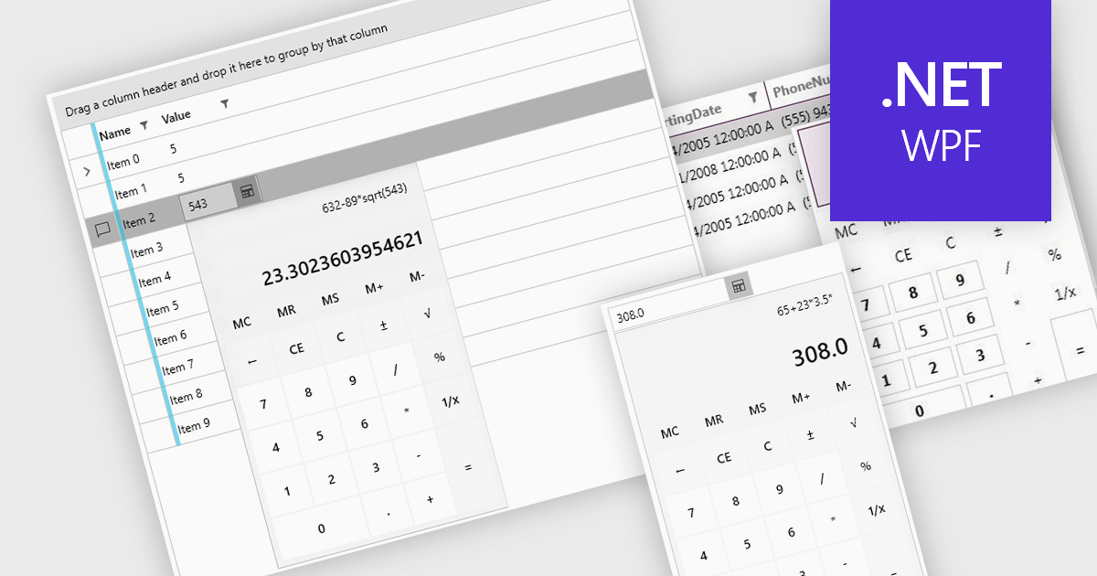
Dropdown calculators are interactive user interface components that integrate a compact calculator directly into a standard dropdown control, allowing users to perform quick calculations or adjust numerical values without navigating away from the current input field. This interaction pattern is particularly useful in data-heavy applications where users frequently need to input or modify numerical data, such as e-commerce pricing, financial tools, form-based systems, or configuration panels. By integrating calculation capabilities directly into the dropdown, these components reduce the need for external tools, help maintain focus, and improve the overall speed and accuracy of user input.
Several WPF data editor collections offer a dropdown calculator, including:
For an in-depth analysis of features and price, visit our comparison of WPF data editors collections.
Syncfusion Essential Studio Enterprise provides a comprehensive collection of UI components and frameworks for building modern cross-platform applications. It offers over 1,800 components compatible with .NET WinForms, WPF, ASP.NET Core & MVC, WinUI, MAUI, JavaScript, Blazor, and more, enabling seamless application development across diverse devices and operating systems.
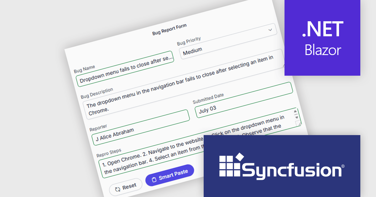
The Syncfusion Essential Studio Enterprise 2025 Volume 3 (31.1.17) release adds new Blazor Smart Paste Button and Smart TextArea components, embedding AI‑assisted intelligence directly in data entry workflows. The Smart Paste Button component analyzes clipboard content, such as structured forms, text snippets, or multi-field data, and pastes it intelligently into relevant form fields with proper formatting and mapping. Meanwhile, the Smart TextArea offers context-aware sentence‑level autocompletion, suggesting text continuations as users type to reduce keystrokes and improve writing consistency. Together, these components reduce user friction, speed up form filling, minimize input errors, and help developers deliver more polished, intelligent interfaces with less custom logic.
To see a full list of what's new in 2025 Volume 3 (31.1.17), see our release notes.
Syncfusion Essential Studio Enterprise is licensed per developer and is available as a 12 Month Timed Subscription License which includes support and maintenance. See our Syncfusion Essential Studio Enterprise licensing page for full details.
Learn more on our Syncfusion Essential Studio Enterprise product page.
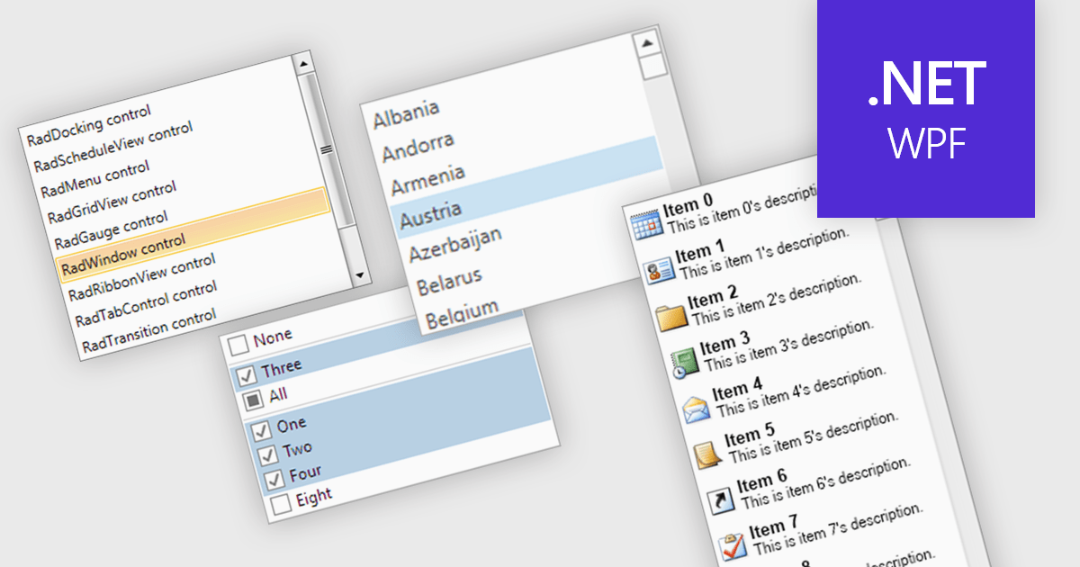
A listbox is a user interface component that displays a collection of items from which a user can select one or more options. It is commonly used in forms, settings panels, or data entry screens to present predefined values in a scrollable format. For developers, a listbox offers a simple way to enforce valid input by limiting user choices, reduces the need for manual data entry, and improves UI consistency across applications. It also supports keyboard and mouse interaction, which helps enhance accessibility and usability without requiring complex custom controls.
Several .NET WPF data editor collections provide listbox controls including:
For an in-depth analysis of features and price, visit our .NET WPF Data Editors comparison.
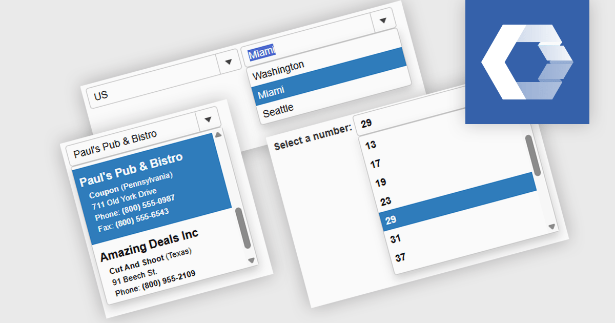
A combobox Web Components control is a user interface element that combines an input field with a dropdown list, allowing users to either type a value directly or select from predefined options. It is commonly used to simplify data entry, particularly when the input must match a set of known values. By supporting features such as filtering, autocomplete, and keyboard navigation, a combobox enhances accessibility and improves the user experience in forms or interactive components. It also helps maintain consistency and validation in data-driven applications by reducing the likelihood of input errors.
Several Web Components Data Editors offer a combobox including:
For an in-depth analysis of features and price, visit our comparison of Web Components Data Editors.
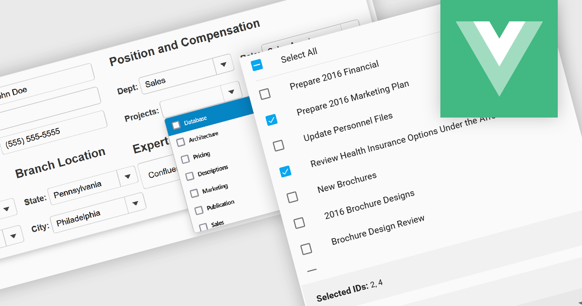
Checked listboxes provide users with a convenient interface for selecting multiple items within data editor controls. They enhance user workflows by combining the visual clarity of list presentations with the functionality of checkboxes, enabling intuitive multi-selection capabilities. Typically data-bound, these controls support both manual and programmatic manipulation of items, including checking, unchecking, and layout customization, facilitating dynamic and interactive list management in enterprise-grade applications.
Several Vue.js data editor collections include a checked listbox, including:
For an in-depth analysis of features and price, visit our Vue.js data editors comparison.
Tel: (888) 850 9911
Fax: +1 770 250 6199


