


Fornecedor oficial
Como distribuidores oficiais e autorizados, nós fornecemos licenças legítimas diretamente de mais de 200 editores de software.
Ver todas as nossas marcas.
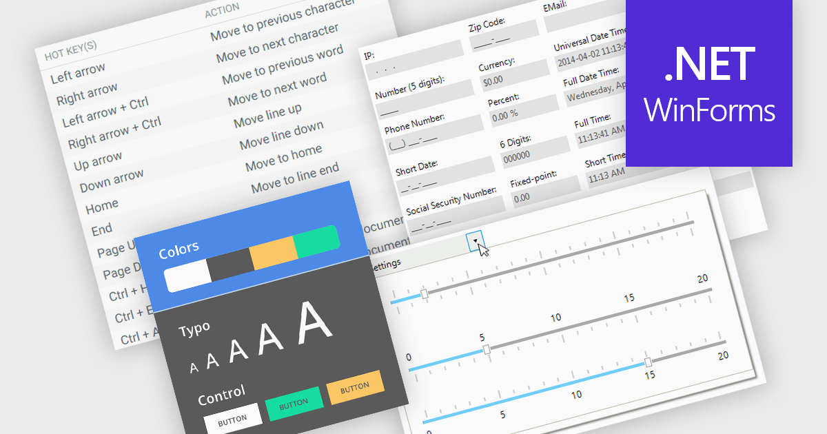
Data input controls with accessibility support are user interface components designed to capture user input, such as text fields, checkboxes, dropdowns, date pickers, and numeric fields, that can be used by anyone, regardless of physical or cognitive limitations. With assistive technologies like screen readers, voice input systems, and keyboard navigation, they ensure that individuals with disabilities or impairments can enter and manipulate data without obstruction. By adhering to accessibility standards like the Web Content Accessibility Guidelines (WCAG) and supporting technologies, these controls help developers deliver user-friendly interfaces that improve user experience for all, and help organizations meet legal and ethical accessibility obligations.
Several WinForms data editor collections include accessibility support, such as:
For an in-depth analysis of features and price, visit our comparison of .NET WinForms data editor collections.
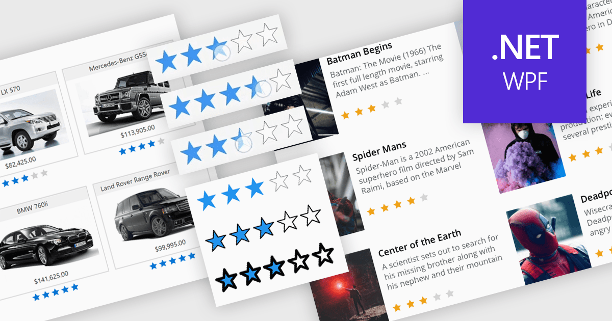
Rating controls in data editors provide a visually intuitive and standardized method for capturing subjective assessments. Users can interact with visual scales like stars, sliders, or thumbs to express opinions or evaluations on a predefined spectrum. These controls can also be precisely tailored with options like half-star ratings or continuous sliders, allowing for nuanced feedback beyond basic scales and providing a clearer understanding of sentiment that leads to more insightful analysis and better decision-making.
Several .NET WPF data editor collections provide rating controls including:
For an in-depth analysis of features and price, visit our .NET WPF Data Editors comparison.
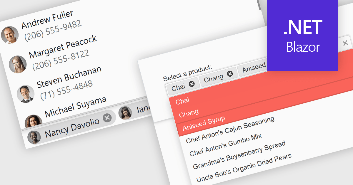
Token or tag boxes provide a user-friendly interface for selecting multiple items from a list. These controls present each selected item as a visually distinct "tag" or "token" within the input area, allowing for quick recognition and easy removal. Ideal for scenarios like multi-category selection or user input of discrete values such as emails or keywords, token boxes enhance both the user experience and data clarity, particularly in web applications that require dynamic form entry or filtering.
Several Blazor Data Editors offer support for token boxes including:
For an in-depth analysis of features and price, visit our Blazor data editors comparison.
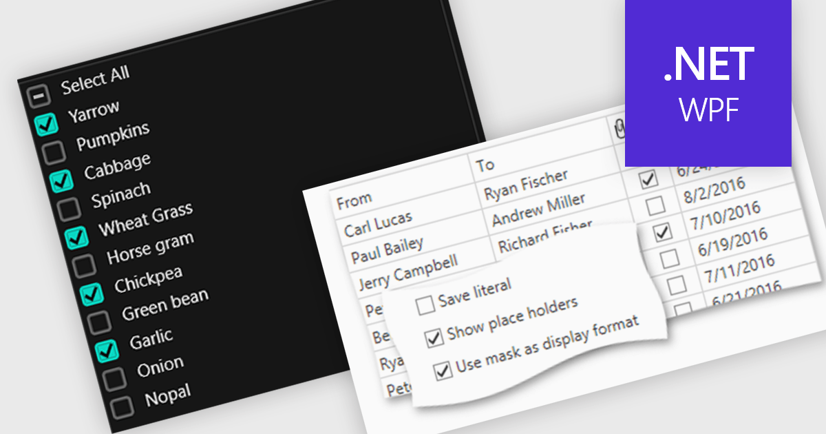
Checkboxes enable user manipulation of boolean values within a data interface. This feature improves user interactions by allowing quick toggling of options without the need for dropdowns or manual entry, reducing the risk of data entry errors. It is especially valuable in scenarios where multiple items need to be selected, enabled, or flagged, such as managing settings, permissions, or multi-select workflows.
Several .NET WPF components offer checkbox data editors, including:
For an in-depth analysis of features and price, visit our comparison of .NET WPF data editors.
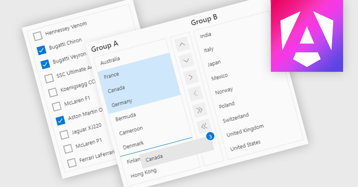
ListBoxes are user interface components in data editors that enable users to select one or more values from a predefined list. They help improve data entry by reducing manual input, ensuring consistent data, and minimizing errors. Commonly used in forms, data grids, and configuration panels, ListBoxes support both static and dynamic data sources, allowing for context-aware filtering and responsive interfaces that adapt to user selections.
Several Angular data editors support listboxes, including:
For an in-depth analysis of features and price, visit our Angular data editors comparison.
Tel: (888) 850 9911
Fax: +1 770 250 6199


