


Fornecedor oficial
Como distribuidores oficiais e autorizados, nós fornecemos licenças legítimas diretamente de mais de 200 editores de software.
Ver todas as nossas marcas.

Syncfusion Essential Studio Blazor (available as part of Syncfusion Essential Studio Enterprise) is a comprehensive UI component library designed to accelerate the development of high-performance, modern web applications using the Blazor framework. It boasts over 85+ responsive, lightweight, and modular components spanning various categories like data visualization, data editing, document processing, and interactive UI elements. This rich repertoire empowers developers to rapidly build user-friendly, feature-rich web interfaces, all with the advantage of seamless integration with both server-side and client-side Blazor applications.
The Syncfusion Essential Studio Blazor 2024 Volume 1 (25.1.35) release introduces a new operator for its search and filter functionality. This addition empowers users with the ability to conduct more precise and targeted searches on their data. This enhanced functionality expands filtering capabilities to include options like "Does Not Contain," "Is Null," and "Does Not Start With," granting users greater flexibility and control over how they search and filter data within the DataGrid.
To see a full list of what's new in version 2024 Volume 1 (25.1.35), see our release notes.
Syncfusion Essential Studio Blazor is available as part of Syncfusion Essential Studio Enterprise which is licensed per developer starting with a Team License of up to five developers. It is available as a 12 Month Timed Subscription License which includes support and maintenance. See our Syncfusion Essential Studio Enterprise licensing page for full details.
For more information, visit our Syncfusion Essential Studio Blazor product page.
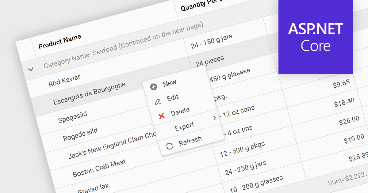
Context menus in grids are user-activated dropdown menus that appear when the users right-clicks a cell. They provide quick access to relevant actions for the selected data, like copying cells, editing rows, or performing custom operations specific to the grid's content. This functionality enhances user experience by offering contextual options without having to navigate away from the grid.
Several ASP.NET Core Grid controls offer context menus including:
For an in-depth analysis of features and price, visit our ASP.NET Core Grid controls comparison.
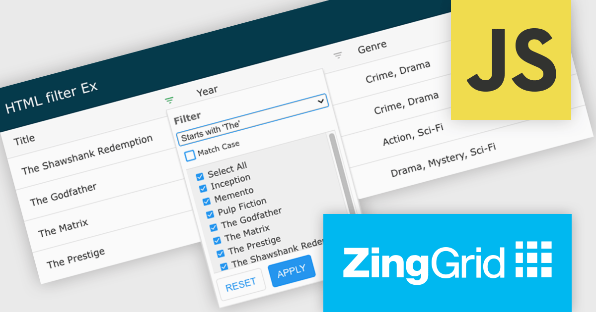
ZingGrid is a JavaScript library that simplifies the creation of interactive data tables and grids within web applications. Utilizing modern web components and focusing on performance and responsiveness, ZingGrid allows developers to implement features like searching, filtering, pagination, and in-line editing with minimal coding. This empowers efficient data visualization and manipulation for users, making it a valuable tool for web development.
Version 1.7.0 adds a rich set of filter conditions, including "contains," "notContains," "equal," "beginsWith," "endsWith," and many more, to pinpoint exactly the information you need. It also empowers you to create custom conditions, ensuring your filtering capabilities perfectly match your data and use case.
To see a full list of what's new in version 1.7.0, see our release notes.
ZingGrid is available as either a Single-Domain Website or Multi-Domain SaaS license. See our ZingGrid licensing page for full details.
For more information, visit our ZingGrid product page.
Infragistics Ultimate offers a comprehensive library of enterprise-grade, high-performance grids, charts, and other UI controls, plus visual configuration tooling, rapid prototyping, and usability testing. It comes with controls for Angular, React, jQuery, Web Components, Blazor, ASP.NET MVC, ASP.NET Core, ASP.NET Web Forms, Windows Forms, WPF and Xamarin.
Infragistics Ultimate 23.2 includes the updated Ignite UI for Blazor Data Grid and Blazor Table which are specifically crafted to effectively manage substantial datasets while maintaining essential interactive capabilities. They offer features such as virtualization for enhanced performance, row grouping and pinning, built-in columns with functionalities like filtering, moving, resizing, and sorting, as well as responsive layout support and collapsible group headers. These components are designed to cater to the practical needs of developers working with Blazor, providing them with reliable tools for efficiently handling large volumes of data within their applications.
Infragistics Ultimate is licensed per developer and is available as a Perpetual License with a 1, 2 or 3 year support and maintenance subscription. See our Infragistics Ultimate licensing page for full details.
The Ignite UI for Blazor Data Grid is available in the following products:
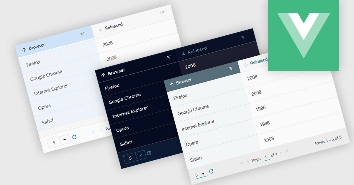
Customizable themes allow users to easily modify the visual appearance of a grid. This typically encompasses aspects like background colors, font styles, cell borders, and hover effects. These themes offer numerous benefits including improving the grid's readability and user experience by aligning it with the application's overall design aesthetic, enhancing data visualization by using color-coding or conditional formatting, and supporting accessibility needs by incorporating high-contrast themes.
Several Vue.js grid controls offer customizable theme support, including:
For an in-depth analysis of features and price, visit our comparison of Vue.js Grid controls.
Tel: (888) 850 9911
Fax: +1 770 250 6199


