


官方供应商
我们作为官方授权经销商,直接提供超过200家开发厂家所发行超过1000个的产品授权给您。
查看我们的所有品牌。
继续用英语阅读:
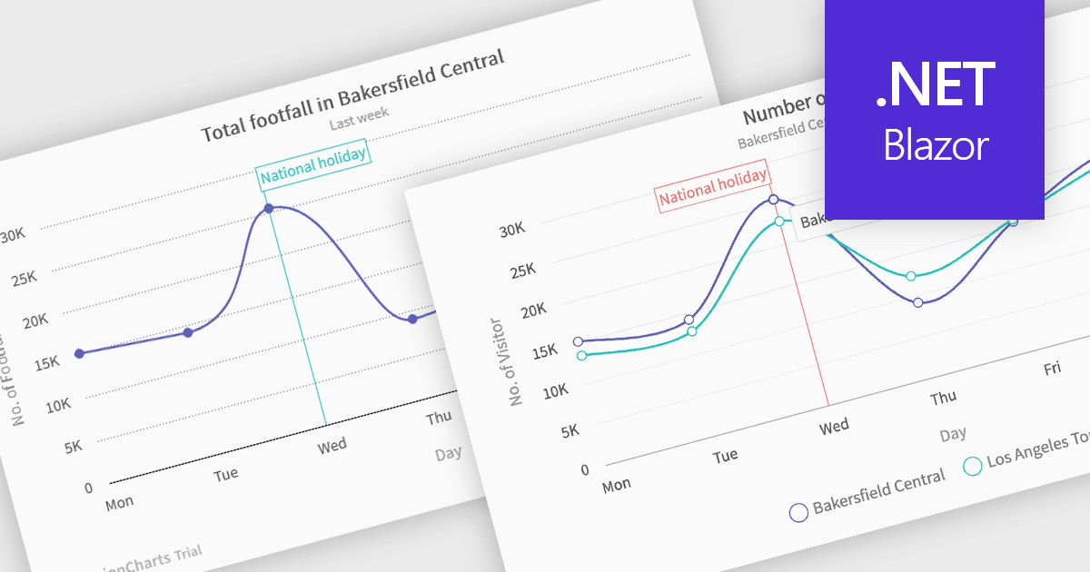
Spline charts are a type of line graph that displays continuous data points connected by smooth, curved lines, offering a visually fluid representation of trends and changes over time. This smoothing effect helps to highlight the overall trajectory of the data and can provide estimations of values between plotted points. Multi-Series Spline Charts extend this functionality by plotting multiple related datasets on the same graph, enabling direct visual comparison of their trends and the identification of correlations or divergences.
Several .NET Blazor chart controls offer spline charts including:
For an in-depth analysis of features and price, visit our .NET Blazor chart controls comparison.
联系电话: (888) 850 9911
传真: +1 770 250 6199


