






官方供应商
我们作为官方授权经销商,直接提供超过200家开发厂家所发行超过1000个的产品授权给您。
查看我们的所有品牌。
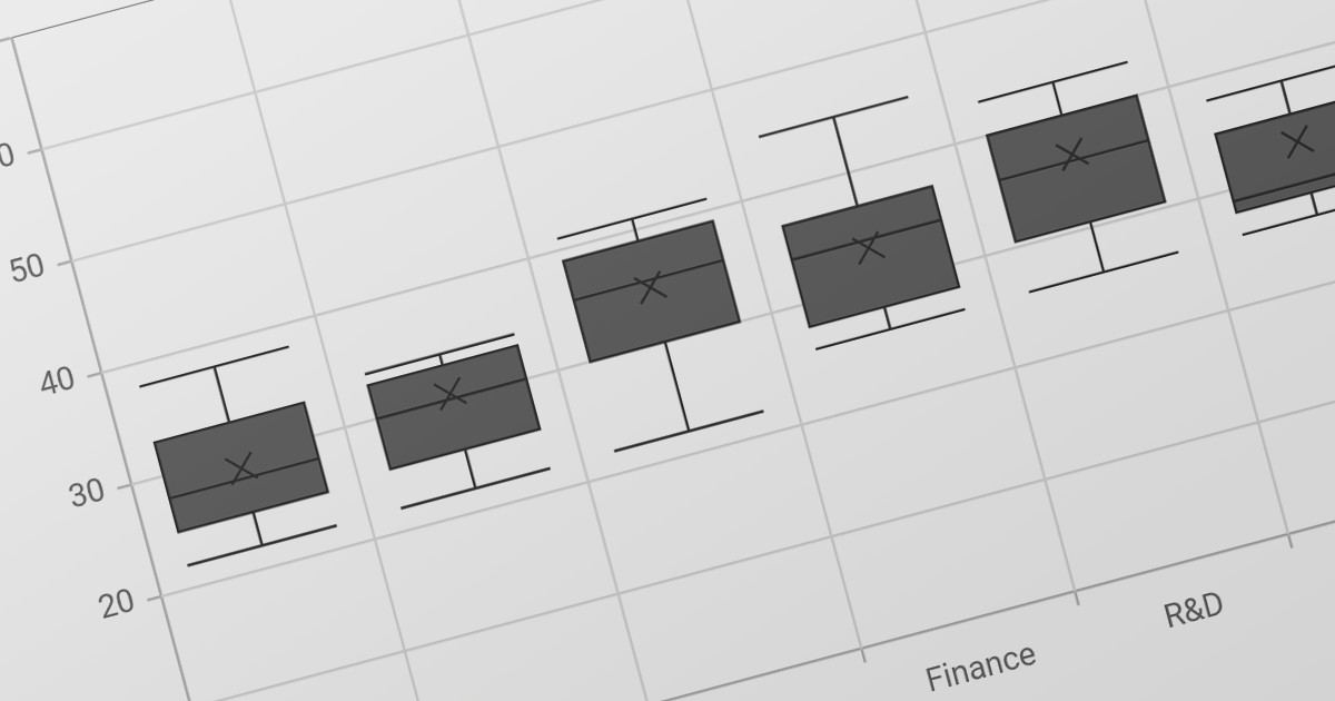
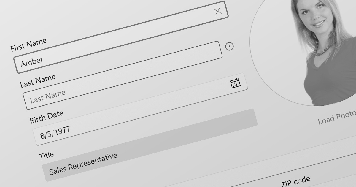
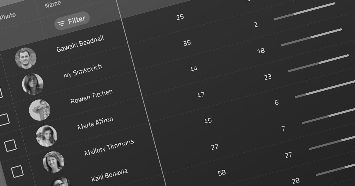
DevExpress WPF is a powerful suite of controls that enhances your WPF development toolkit. It offers data grids, ribbon menus, rich text editors, spreadsheets, charts, and more, all with beautiful themes and touch-friendly interfaces. DevExpress WPF helps you to build professional-looking, responsive applications that meet modern user expectations, saving you time and effort while adding polish and functionality.
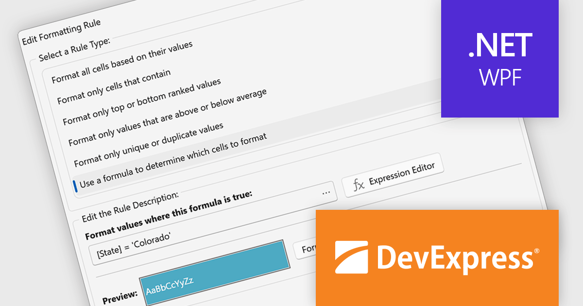
The WPF Data Grid Expression Editor for TableView and TreeListView now supports custom conditional formatting rules. Beyond the predefined formatting options, developers can define complex logical expressions to control how grid data is highlighted. This makes it easier to draw attention to critical values, implement sophisticated business rules, and present data in a way that is more meaningful to end users.
To see a full list of what's new in version 26.1, see our release notes.
DevExpress WPF is licensed per developer and is available as a Perpetual License with a 12 month support and maintenance subscription. We can supply new subscriptions, subscription renewals, and additional licenses. See our DevExpress WPF licensing page for full details.
DevExpress WPF is available to buy in the following products:
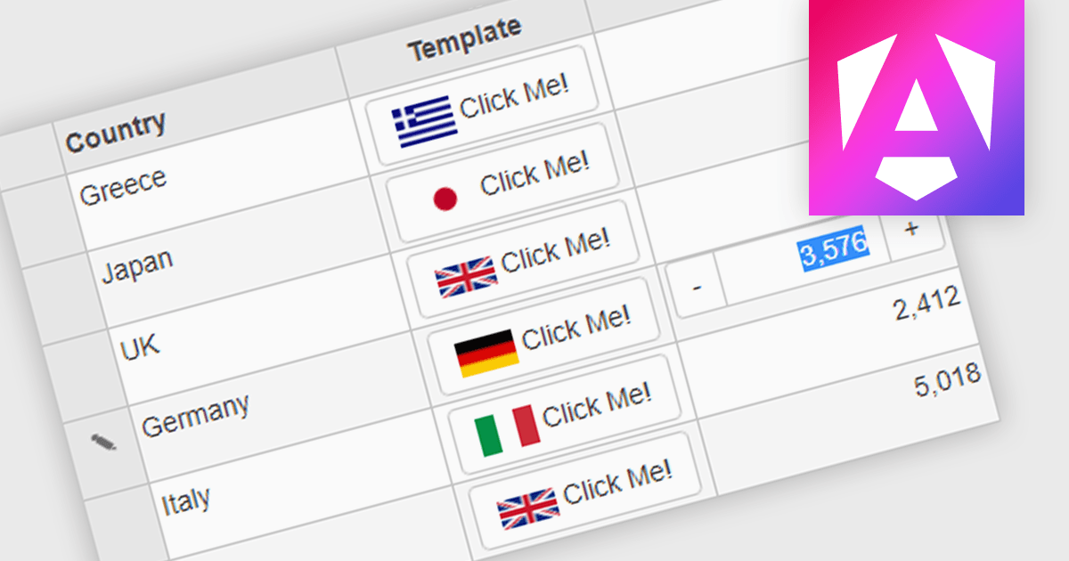
Button cell types allow developers to embed interactive buttons directly within grid cells, enabling users to perform actions such as editing, deleting, viewing details, launching dialogs, or executing custom commands without leaving the grid. By keeping actions closely associated with the relevant data, button cell types reduce unnecessary navigation, and improve usability. This makes them well suited to business applications such as customer relationship management systems, inventory management, financial dashboards, and administrative tools, where users frequently perform row-level actions on large datasets.
Several Angular grid controls offer support for button cell types, including:
For an in-depth analysis of features and price, visit our Angular Grid controls comparison.
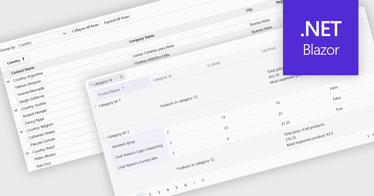
Grouping allows users to organize data by one or more columns, making large datasets easier to navigate and analyze. By collecting related records into expandable groups, it becomes simpler to identify patterns, compare values, and focus on relevant information without manually filtering or sorting the data.
Several Blazor grid controls offer support for grouping including:
For an in-depth analysis of features and price, visit our Blazor grid controls comparison.
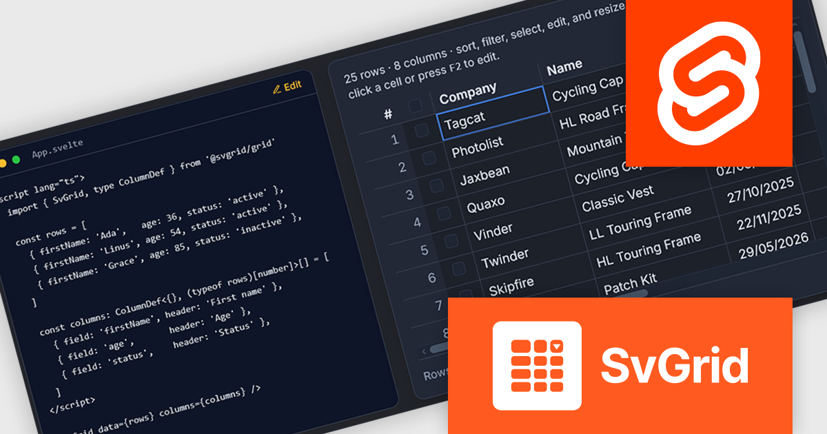
SvGrid is a modern data grid built specifically for Svelte, combining a headless data engine with a production-ready render component. Rather than adapting technology from another framework, it is designed around Svelte's native runes and reactivity model, giving developers an API that feels natural within Svelte applications. The grid supports a broad range of enterprise features, including sorting, Excel-style filtering, grouping, aggregation, inline editing, row and column virtualization, tree data, master-detail views, and server-side data integration, while remaining lightweight and easy to get started with.
SvGrid is intended for applications ranging from simple data tables to large-scale business systems handling hundreds of thousands of rows. Developers can choose the headless API for complete control over rendering or use the ready-made
SvGrid is licensed per developer and per app, and is available as a Perpetual License with one year of updates and support. See our SvGrid licensing page for full details.
For more information, visit our SvGrid product page.
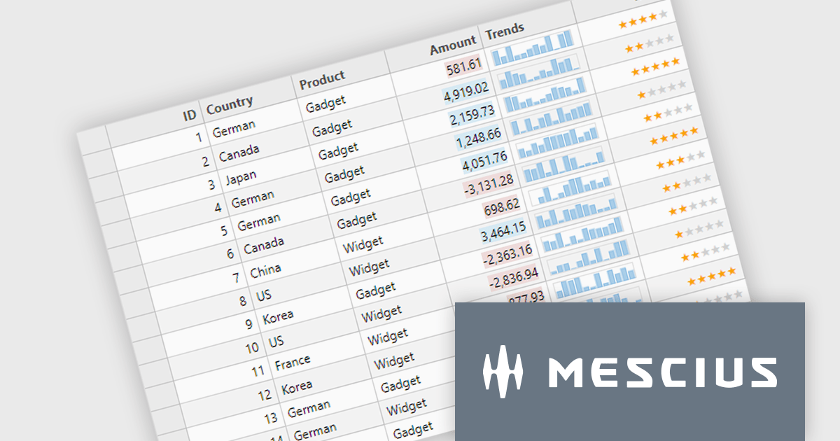
ComponentOne Studio Enterprise is a comprehensive collection of .NET UI controls, data components, and Wijmo Enterprise JavaScript controls for building desktop, web, and mobile applications. It helps developers create responsive, data driven applications with consistent functionality across platforms while reducing development time through flexible, extensible components. Common use cases include enterprise business software, dashboards, reporting solutions, and line of business applications, with one year of updates, upgrades, new releases, and technical support included.
The ComponentOne 2026 v1 update makes unbound FlexGrid rows use text rendered cells by default, reducing the configuration required to create custom row scenarios. This simplifies grid development, speeds implementation, and provides a more intuitive out of the box experience while preserving the flexibility to customize cell rendering when needed.
ComponentOne Studio products are licensed per developer on a perpetual basis and include a 12 month subscription. Priority Support is also available. See our ComponentOne Studio Enterprise licensing page for full details.
For more information, visit our ComponentOne Studio product pages:
联系电话: (888) 850 9911
传真: +1 770 250 6199


