


官方供应商
我们作为官方授权经销商,直接提供超过200家开发厂家所发行超过1000个的产品授权给您。
查看我们的所有品牌。
继续用英语阅读:
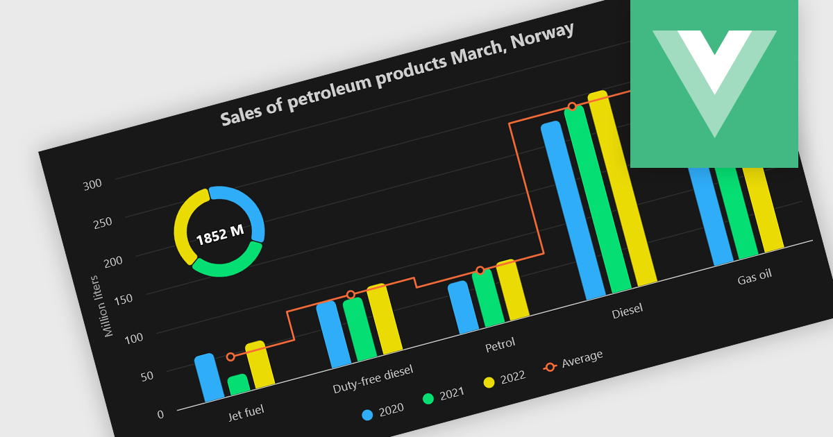
A combination chart or combo chart is a versatile type of data visualization that displays multiple chart types, such as columns, lines, or areas, to represent different data series within a single graphic. Combination charts are especially useful in scenarios where a single data type cannot fully convey the complexity of the dataset. By presenting different series types together, combination charts enhance the clarity and depth of insight available in a single view, be it on the same axis or across dual axes. This helps users to analyze complex relationships, trends and correlations between metrics more effectively than separate charts would allow.
Several Vue.js chart components allow you to combine series types on the same chart, including:
For an in-depth analysis of features and price, visit our comparison of Vue.js chart components.
联系电话: (888) 850 9911
传真: +1 770 250 6199


