


官方供应商
我们作为官方授权经销商,直接提供超过200家开发厂家所发行超过1000个的产品授权给您。
查看我们的所有品牌。
继续用英语阅读:
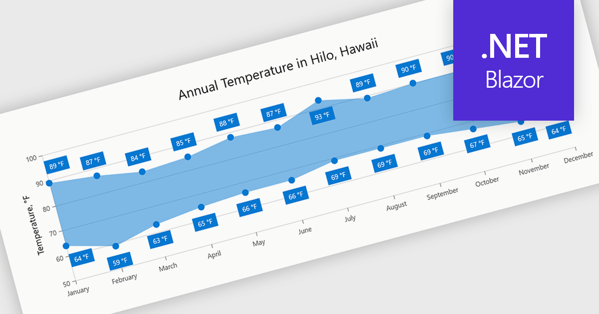
Range charts visualize the difference between minimum and maximum values for each data point using a filled area to represent variation. This makes it easier to understand fluctuations, compare ranges and identify patterns without the clutter of multiple lines. By focusing on value distribution rather than individual points, they improve readability and highlight trends and inconsistencies at a glance. They are useful for scenarios such as tracking temperature ranges, monitoring performance thresholds or comparing variations across datasets.
Several .NET Blazor charting components provide you with range charts, including:
For an in-depth analysis of features and price, visit our .NET Blazor chart controls comparison.
联系电话: (888) 850 9911
传真: +1 770 250 6199


