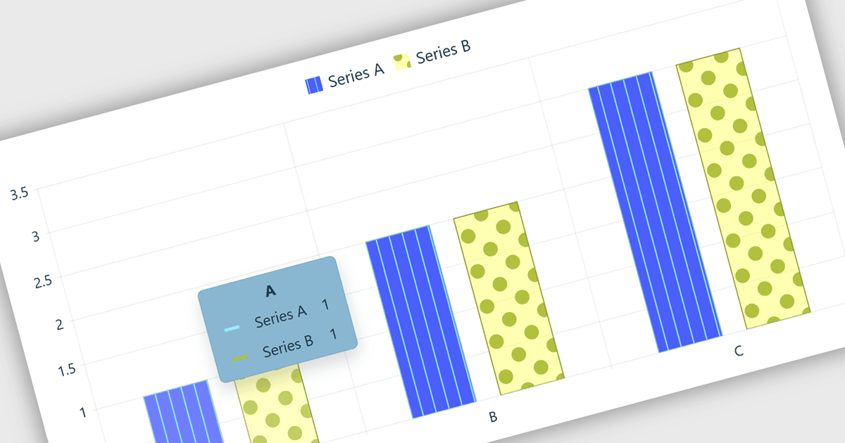
用图表工具提示嵌入交互式洞察

6月 18, 2026
提供对详细、上下文图表数据的即时访问,该数据有助于用户探索洞察、比较数值并做出明智决策。

继续用英语阅读:

Chart tooltips in a charting component are interactive elements that display additional information about data points when users hover over or interact with a chart. They help software developers enhance data visualizations by providing detailed values, contextual insights, and comparisons on demand without cluttering the chart itself, improving usability, supporting more effective data analysis, and creating a more engaging user experience.

Several React chart controls offer tooltip support including:

  • DevExtreme React Chart lets you display detailed data point information on hover, improving analysis, comparisons, and chart usability without visual clutter.
  • KendoReact Charts allows you to surface contextual values and insights through customizable tooltips that enhance data exploration and user engagement.
  • AnyChart JS facilitates interactive data analysis by presenting precise chart information on demand, helping users interpret trends efficiently.
  • Syncfusion React Charts lets you reveal rich data details through configurable tooltips, enabling clearer visualizations and more informed decision making.

For an in-depth analysis of features and price, visit our React chart controls comparison:

Compare React Chart Controls