


官方供应商
我们作为官方授权经销商,直接提供超过200家开发厂家所发行超过1000个的产品授权给您。
查看我们的所有品牌。
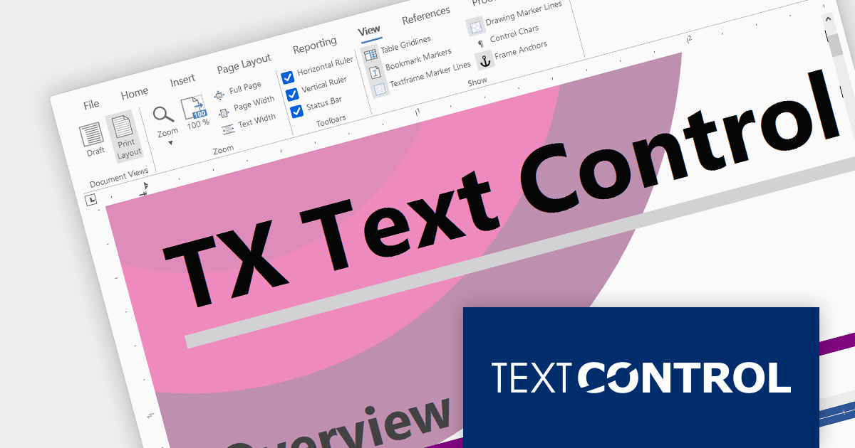
Text Control DS Server is an on-premise document services back-end for document processing. It includes a Microsoft Word compatible document editor, a lightweight document viewer, and a powerful document processing API.
Version 3.2.0 adds support for a new SVG rendering mode within the online document editor, improving performance in scenarios such as limited bandwidth or elevated ping times. By default the editor automatically determines the most suitable rendering method based on factors such as bandwidth availability.
To see a full list of what's new in version 3.2.0, see our release notes.
For more information, visit our Text Control DS Server product page.
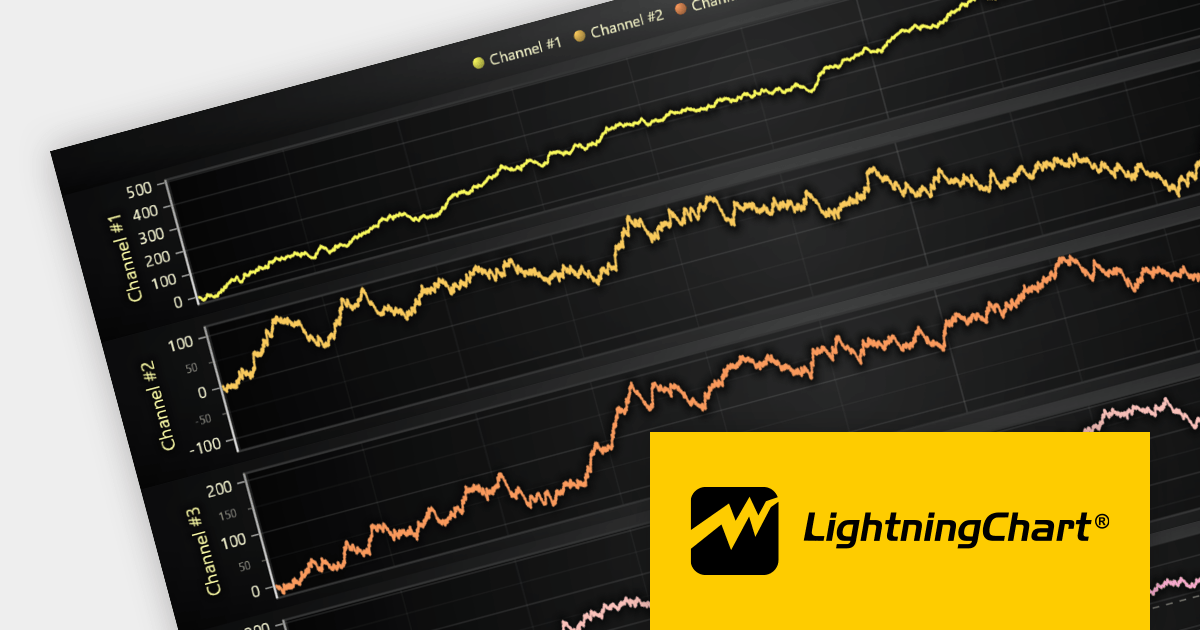
LightningChart JS is a high-performance JavaScript charting library that utilizes WebGL rendering and GPU acceleration to deliver exceptional performance for a wide range of data visualization needs. It is designed to handle large datasets and complex visualizations with ease, enabling developers to create interactive and visually appealing charts for various applications.
The LightningChart JS v5.0 release introduces WebGL context sharing, enabling the sharing of WebGL resources (e.g. textures, shaders, and buffers) across multiple WebGL contexts. This enhances the performance of multi-chart displays, minimizes memory consumption, and simplifies resource management. It optimizes the rendering of each chart, regardless of their arrangement or quantity. Developers can now employ HTML <div> elements to define chart layouts and use CSS for precise control over positioning.
To see a full list of what's new in v5.0.0, see our release notes.
For more information, see our LightningChart JS product page.
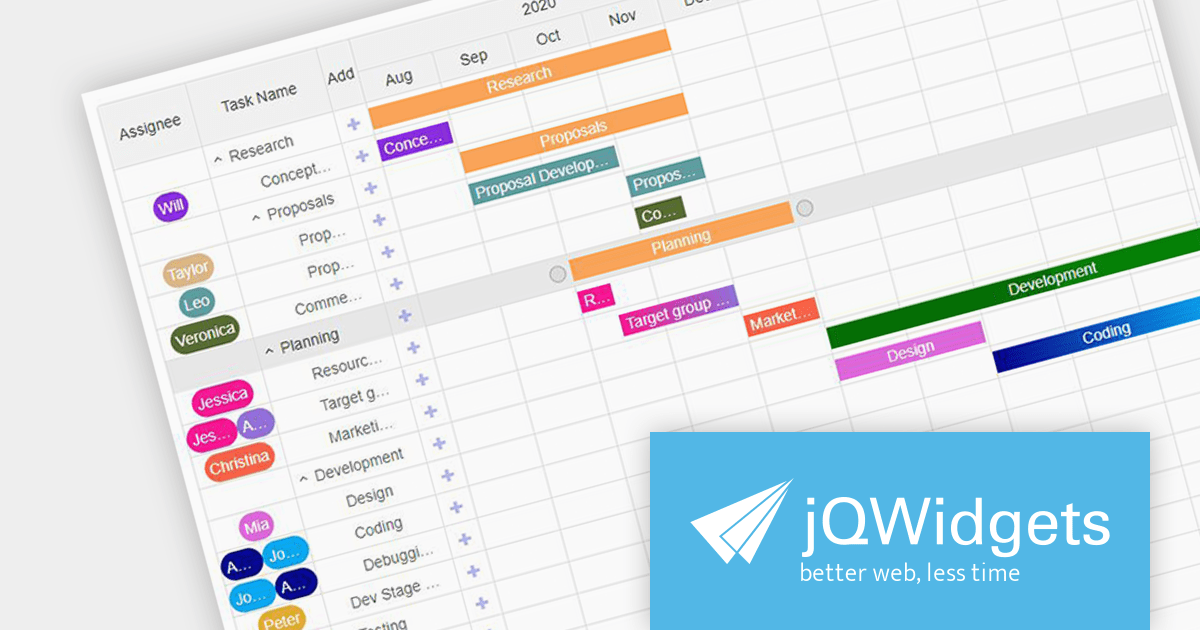
jQWidgets is a comprehensive JavaScript library that provides a wide range of UI widgets for building web applications. It includes over 60 widgets, including grids, charts, calendars, and editors, which are highly customizable and can easily be styled to match any application.
Version 18.0.0 includes a new Gantt component for Angular and JavaScript. jqxGantt is a project planning and management tool which provides a Microsoft Project-like interface, empowering developers to create interactive and responsive Gantt charts. This powerful new component helps users to visualize and manage project timelines, dependencies, and resources.
To see a full list of what's new in version 18.0.0, see our release notes.
For more information, visit our jQWidgets product page.

Highcharts Maps provides a standards-compliant method for creating schematic maps in web-based projects. It extends the user-friendly Highcharts JavaScript API to allow web developers to create interactive maps that display sales, election results, or any other geographically related information.
The Highchartts Maps v11.2.0 release adds support for interpolation in geographic heatmaps. The geoheatmap.interpolation feature allows the heatmap to render its data points as an interpolated image, estimating values between known data points. For example, you may have a have a table of temperature data that shows the temperature at specific points within a region. You can use interpolation to estimate the temperature in areas between the known data points. This new feature helps to create more easily understandable and visually appealing heatmaps, even with limited data sets.
To see a full list of what's new in version 11.2.0, see our release notes.
For more information, visit our Highcharts Maps product page.
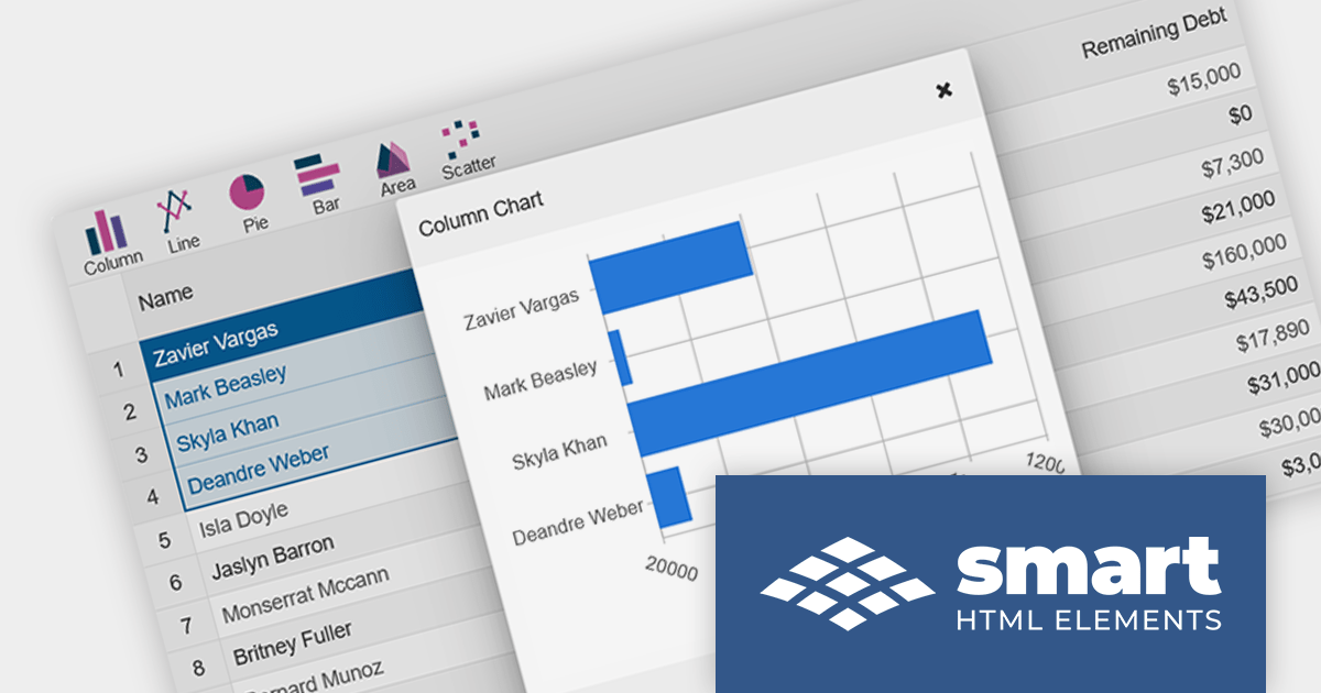
Smart HTML Elements is a JavaScript and Blazor web components UI library that provides over 50 components, including charts, grids, schedulers, Gantt charts, Kanban boards, docking layouts and pivot tables.
Version 17.1.0 adds support for Angular 17, a new release which takes advantage of deferrable views to improve performance, built-in control flow for a more intuitive syntax, and faster builds for hybrid and client-side rendering.
For more information, visit our Smart HTML Elements product page.
联系电话: (888) 850 9911
传真: +1 770 250 6199


