


官方供应商
我们作为官方授权经销商,直接提供超过200家开发厂家所发行超过1000个的产品授权给您。
查看我们的所有品牌。
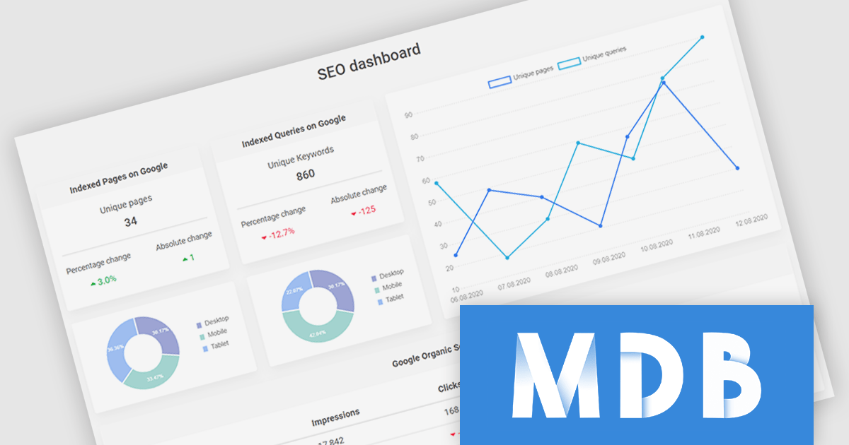
MDB Pro Vue by MDBootstrap is a premium front-end UI toolkit designed for Vue.js, offering a comprehensive collection of over 5,000 components, templates and plug-ins such as charts and advanced forms, to create responsive and visually appealing interfaces. With built-in design consistency, customization options, and seamless integration with Vue.js, MDB Pro Vue enables developers to build professional-grade web applications efficiently. Ideal for e-commerce sites, dashboards, and corporate projects, it empowers teams to enhance user experience while saving time and development costs.
MDB Pro Vue provides responsive, interactive, and customizable charts, enabling effective data visualization across various use cases. It offers an extensive range of chart types to suit diverse requirements, including bar and line charts for trends, pie and donut charts for proportions, polar area charts for variations in magnitude, and radar charts for multivariate data. Bubble charts add depth with size-based values, while scatter plots visualize data relationships. Fully customizable with options for colors, labels, tooltips, and animations, these charts integrate seamlessly into any design. Ideal for dashboards, analytics tools, and reporting interfaces, they deliver a polished, engaging user experience.
MDB Pro Vue is licensed per developer, per project/domain with packages for individual developers, development teams and Enterprises. See our MDB Pro Vue licensing page for full details.
MDB Pro Vue is available individually or as part of MDB Pro Bundle.
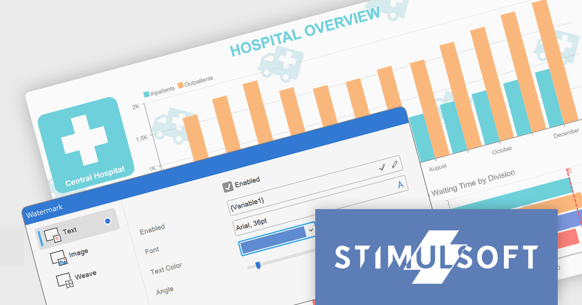
Stimulsoft Dashboards.JS is a JavaScript-based tool for creating interactive dashboards within web applications. Designed for developers and businesses, it provides customizable charts, graphs, and tables to visualize complex data from various sources. It supports popular JavaScript frameworks such as React, Vue.js, and Node.js, enabling seamless integration into modern web projects. With an intuitive interface and responsive design, it suits use cases like business intelligence, performance monitoring, and data-driven decision-making. Stimulsoft Dashboards.JS enhances user engagement and simplifies data analysis for industries such as finance, marketing, and logistics.
The Stimulsoft Dashboards.JS 2025.1.1 update introduces the ability to use expressions in dashboard watermarks, providing developers with enhanced flexibility to create dynamic and context-aware visual elements. This feature allows watermarks to adapt based on data or user-defined expressions, enabling the seamless integration of real-time information, branding, or contextual details directly into dashboards. By supporting Text, Image, Weave, and combined elements, the update streamlines customization and ensures that watermarks can align with specific design or functional requirements, helping developers deliver more polished and responsive dashboards.
To see a full list of what's new in 2025.1.1, see our release notes.
Stimulsoft Dashboards.JS is licensed per developer and is available as a Perpetual license with 1 year support and maintenance. See our Stimulsoft Dashboards.JS licensing page for full details.
Stimulsoft Dashboards.JS is available individually or as part of Stimulsoft Ultimate.
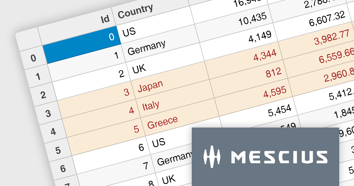
Wijmo by MESCIUS is a comprehensive suite of JavaScript UI components designed for building high-performance, enterprise-grade applications. With its lightweight, modular architecture, Wijmo provides developers with a rich set of tools, including data grids, charts, input controls, and advanced features such as PivotGrid and FinancialChart. Optimized for modern frameworks like React, Angular, and Vue, Wijmo offers seamless integration, flexibility, and extensive customization options.
The Wijmo 2024 v2 Build 5.20242.30 update introduces a new API for cell styling in FlexGrid, providing developers with greater control and precision in customizing grid appearance. This enhancement allows developers to dynamically apply styles at the cell level based on data or state, ensuring a tailored and context-aware presentation of grid content. The API streamlines the process of defining and managing styles, reducing complexity and enabling cleaner, more maintainable code. By leveraging this capability, developers can create visually engaging and functionally responsive grids that align with specific application requirements, enhancing both user experience and application performance.
To see a full list of what's new in 2024 v2 Build 5.20242.30, see our release notes.
Wijmo is licensed per developer. Developer licenses are perpetual and include 1 year subscription which provides upgrades, including bug fixes and new features. See our Wijmo licensing page for full details.
Learn more on our Wijmo product page.
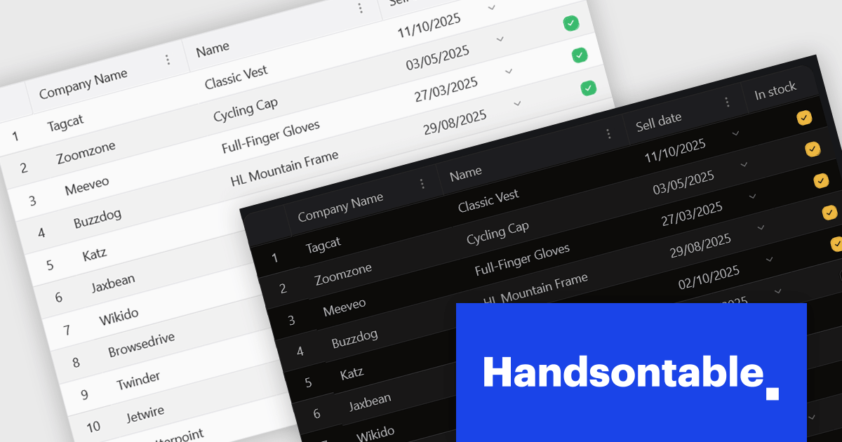
Handsontable is a JavaScript library designed to help developers build interactive data grids into their web applications. Offering a familiar spreadsheet-like interface, it allows users to edit, sort, and filter data with ease. Highly customizable and compatible with popular frameworks like React and Angular, Handsontable empowers developers to build robust data manipulation features into their web applications.
The 15.0.0 release introduces a significant enhancement in terms of styling flexibility. The underlying CSS framework has been entirely overhauled, granting developers unprecedented control over the visual presentation of their grids. This update boasts a comprehensive library of over 180 CSS variables, allowing for meticulous customization of every visual aspect. From subtle adjustments to font sizes and colors to more radical transformations of borders, cell padding, and overall layout, users can seamlessly align the table's appearance with their specific design preferences and branding guidelines. This level of granular control empowers designers and developers to create truly unique and visually compelling data tables that seamlessly integrate with their existing user interfaces.
To see a full list of what's new in version 15.0.0, see our release notes.
Handsontable is licensed per developer and is available as an Annual or Perpetual license with 1 year support and maintenance. See our Handsontable licensing page for full details.
For more information, visit our Handsontable product page.
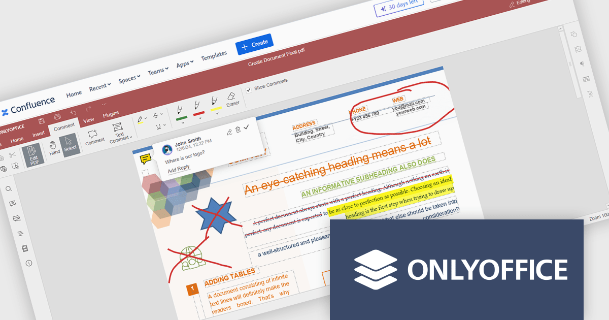
The ONLYOFFICE Connector for Confluence Cloud seamlessly integrates professional document editing and collaboration tools into the Atlassian Confluence ecosystem. It allows users to create, edit, and co-author documents, spreadsheets, and presentations in real-time without leaving their Confluence workspace. Designed to support a variety of file formats, the connector provides robust tools for team collaboration, including simultaneous editing, version control, and advanced formatting options. With its intuitive interface and integration capabilities, the ONLYOFFICE Connector streamlines workflows, enhances communication, and boosts productivity for teams managing projects, sharing knowledge, or collaborating on documents.
The ONLYOFFICE Connector for Confluence Cloud v1.2.0 update introduces powerful PDF annotation features designed to enhance document collaboration within development teams. These features enable precise feedback and efficient reviews by allowing users to highlight, underline, and strike through text, add comments, and create freehand drawings directly within PDFs. By centralizing annotation capabilities in Confluence, the update eliminates the need for external tools, streamlining workflows and maintaining version control. This functionality is particularly valuable for developers working with technical documentation, contracts, or design specifications, as it ensures clarity, fosters collaboration, and accelerates project timelines.
To see a full list of what's new in ONLYOFFICE Docs Enterprise Edition v8.0.1 with Confluence Connector v8.2.2 (1.2.0), see our release notes.
ONLYOFFICE Docs Enterprise Edition with Confluence Connector is licensed per server and is available as an annual license with 1 year of support and updates, or as a perpetual license with 3 years of support and updates. See our ONLYOFFICE Confluence connector licensing page for full details.
For more information, see our ONLYOFFICE Confluence Connector product page.
联系电话: (888) 850 9911
传真: +1 770 250 6199


