


공식 공급 업체
200 이상의 소프트웨어 개발처와 판매 계약을 맺은 공인 디스트리뷰터로서 합법적인 라이선스를 제공합니다.
모든 브랜드 보기.
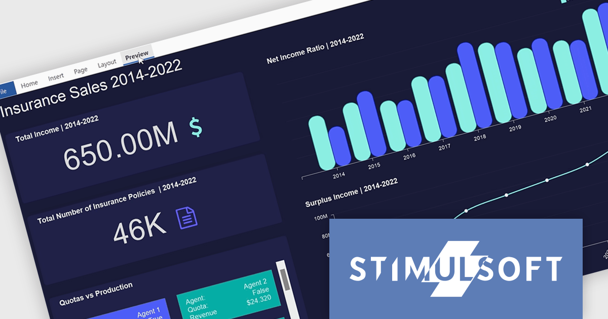
Stimulsoft Dashboards.PYTHON is a new data visualization tool specifically designed for building interactive dashboards within Python applications. It combines a client-side JavaScript engine for data processing with a designer component to craft dashboards and a viewer for displaying them. This empowers developers to create clear and informative visual representations of data directly within their Python projects.
Developers can leverage a rich set of pre-built widgets to construct dashboards that display data through charts, gauges, and other informative elements. These dashboards can be interactive, enabling users to filter data, drill down into specific details, and gain a deeper understanding of the information at hand. This makes Stimulsoft Dashboards.PYTHON a valuable tool for a wide range of use cases, from business intelligence and financial analysis to scientific data visualization and project management.
Stimulsoft Dashboards.PYTHON is licensed per developer and is available as a perpetual license with 1 year support and maintenance. See our Stimulsoft Dashboards.PYTHON licensing page for full details.
Stimulsoft Dashboards.PYTHON is available in the following products:
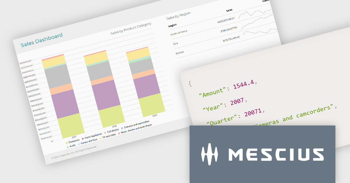
ActiveReportsJS is a reporting tool for web applications that allows developers and report authors to easily design and display reports within their applications. With a wide range of features, such as drill-down, runtime data filtering, and parameter-driven reports, as well as compatibility with popular frameworks, ActiveReportsJS simplifies the process of creating and managing reports.
In this blog post, MESCIUS Product Engineer Sergey Abakumoff demonstrates five performance tips that you can use when, for example, you need to bind a report to large volumes of data to display summary reports in a dashboard:
A demo project is included to demonstrate each tip in action.
Read the full blog to learn these performance-boosting tips.
ActiveReportsJS is licensed on an annual subscription or perpetual basis and is available as a Single Deployment License for non-commercial use, and as a Single Domain License or Unlimited Domain License for commercial and/or SaaS use. See our ActiveReportsJS licensing page for full details.
For more information, visit our ActiveReportsJS product page.
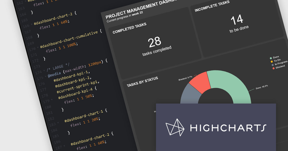
Highcharts Dashboards by Highsoft is a comprehensive platform tailored for software developers seeking efficient data visualization solutions. It offers a robust toolkit for creating interactive dashboards and charts, leveraging the Highcharts library renowned for its flexibility and performance. With support for various data formats and extensive customization options, developers can seamlessly integrate dynamic visualizations into their applications. Highsoft's dashboards empower developers to convey complex data insights effectively, enhancing user experience and decision-making capabilities within their software projects.
The Highcharts Dashboards 2.0 update brings significant advancements in customization and layout flexibility. With the introduction of 100% CSS styling, users now have complete control over the visual appearance of their dashboards and charts. This release also allows developers to construct their own HTML layouts, foregoing the default layout engine and leveraging custom HTML alongside the new CSS capabilities. This empowers users to tailor their dashboards to their unique use cases while retaining the robust data handling and synchronization functionality. Compatibility with CSS libraries like Tailwind and Bootstrap further enhances the customization possibilities without compromising on performance or functionality.
To see a full list of what's new in 2.0.0, see our release notes.
Highcharts Dashboards is licensed per developer as an Annual or Perpetual License with Internal, Saas, SaaS+ and OEM distribution options. The annual license includes support and all product updates for 1 year and must be renewed to continue to use the software. The perpetual license includes an "Advantage Subscription" for 1 to 5 years which provides support and updates for that period. If you do not renew Advantage then you may continue to use the software at the last release available during the active Advantage period. See our Highcharts Dashboards licensing page for full details.
Learn more on our Highcharts Dashboards product page.
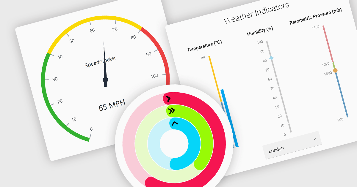
Gauge controls are visual tools used to display important metrics in an easily understood format, such as linear or radial layouts. These controls are ideal for dashboards and monitoring systems because they provide a clear snapshot of data in real-time, enhancing user decision-making and efficiency. Their simplicity and immediate data representation make them essential for applications where quick and accurate interpretations are crucial. Many gauges can be customized with various ranges, colors, and styles to effectively communicate data like speed, temperature, or progress, making them valuable tools for building informative user interfaces.
Several React UI suites feature a gauge component including:
For an in-depth analysis of features and price, visit our React UI Suites comparison.
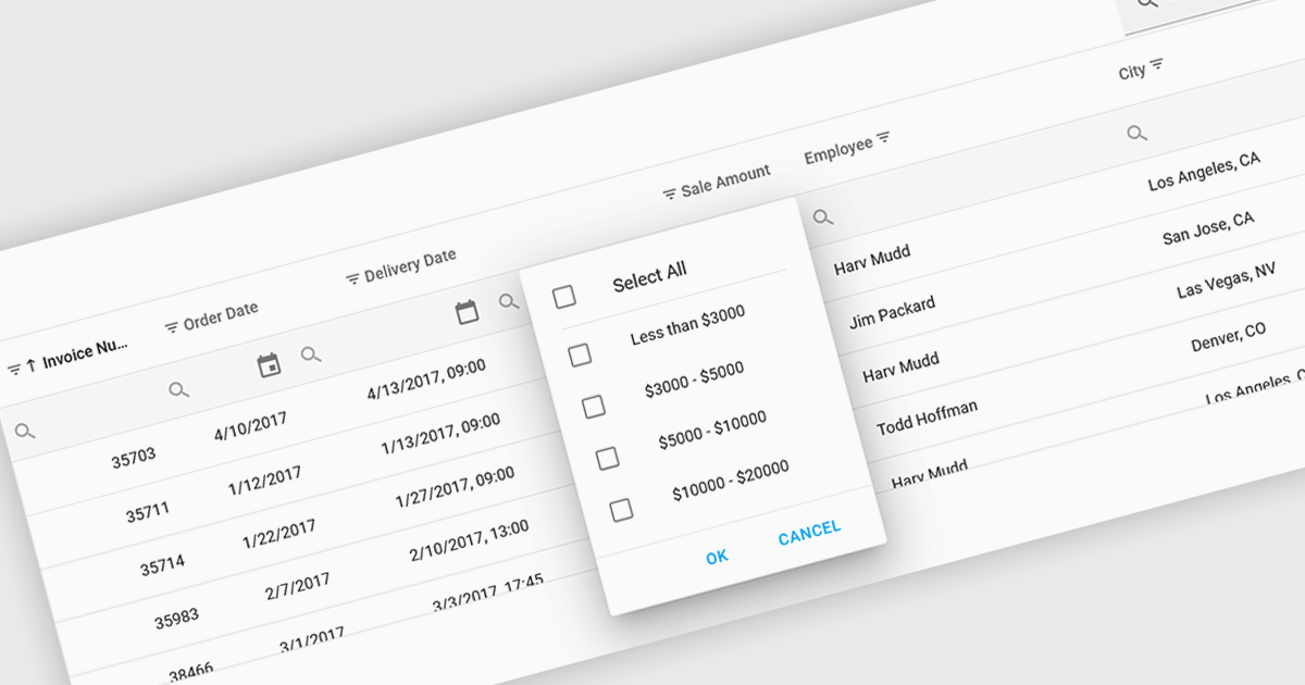
Using a grid control with support for filters enables users to dynamically narrow the displayed data based on specific criteria. This functionality helps users focus on relevant subsets of information by filtering individual columns using operators, keywords, or pre-defined options. Filtering improves data exploration efficiency and reduces cognitive load by presenting only the data that aligns with the user's current analysis.
Several React grid controls offer filtering functionality including:
For an in-depth analysis of features and price, visit our React Grid controls comparison.
전화 : 00798 14 800 6332
팩스 : +1 770 250 6199


