













공식 공급 업체
200 이상의 소프트웨어 개발처와 판매 계약을 맺은 공인 디스트리뷰터로서 합법적인 라이선스를 제공합니다.
모든 브랜드 보기.
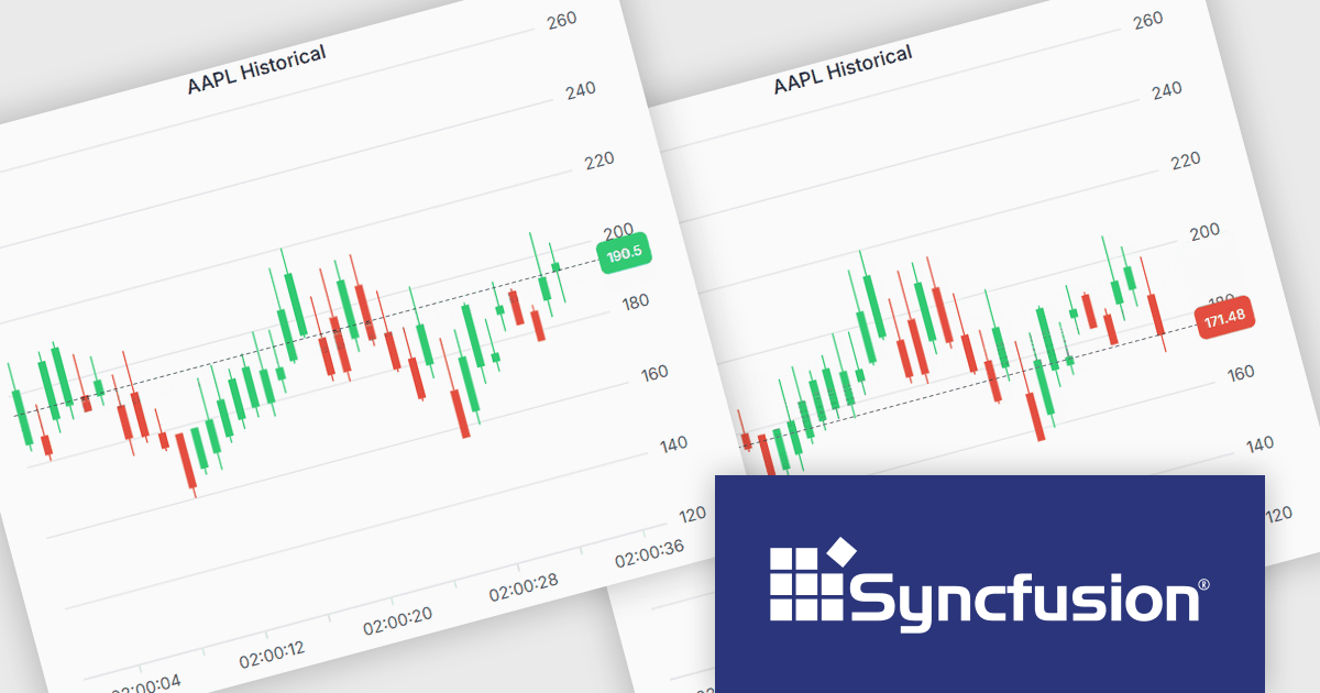
Syncfusion Essential Studio JavaScript is a comprehensive UI library offering over 80 high-performance, lightweight, and responsive components to transform your web apps. Built from scratch with TypeScript, it boasts modularity and touch-friendliness, letting you pick and choose specific features while ensuring smooth mobile interaction. With rich themes, global accessibility features, and extensive documentation, it powers everything from basic buttons to interactive charts and data grids, simplifying frontend development across JavaScript, Angular, React, and Vue.
The Syncfusion Essential Studio JavaScript 2025 Volume 2 update introduces support for highlighting the last value of a series in the Chart component with a label and a grid line indicator. This makes it easier for users to identify the most recent data point at a glance, improving chart readability without requiring interaction. It’s especially useful in scenarios like financial dashboards or performance tracking where the latest value is the key focus.
To see a full list of what's new in 2025 Volume 2 (30.1.37), see our release notes.
Syncfusion Essential Studio JavaScript is available as part of Syncfusion Essential Studio Enterprise which is licensed per developer starting with a Team License of up to five developers. It is available as a 12 Month Timed Subscription License which includes support and maintenance. See our Syncfusion Essential Studio Enterprise licensing page for full details.
Learn more on our Syncfusion Essential Studio JavaScript product page.
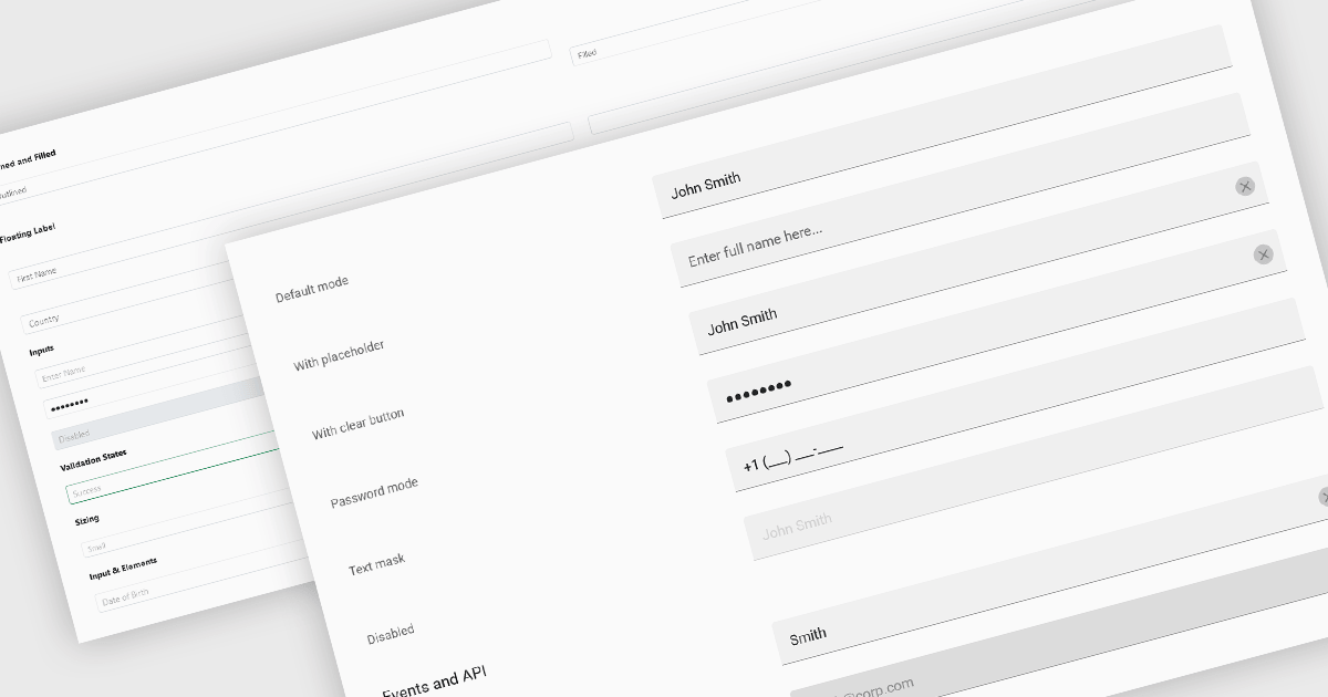
Text Box components in React Data Editors are interactive controls that allow users to input, edit, and manage textual data within a web interface. Designed to handle everything from single-line entries like names and titles to multi-line content such as comments or descriptions, these components are a core part of form-driven applications. They often include features like placeholder text, character limits, validation hooks, and integration with state management tools, which help ensure data quality and user-friendly interactions. Text Boxes are widely used in settings such as user registration forms, feedback systems, and content management interfaces, where accurate and flexible text input is essential to the application's functionality.
Several React data editor collections offer text box components including:
For an in-depth analysis of features and price, visit our React data editors comparison.
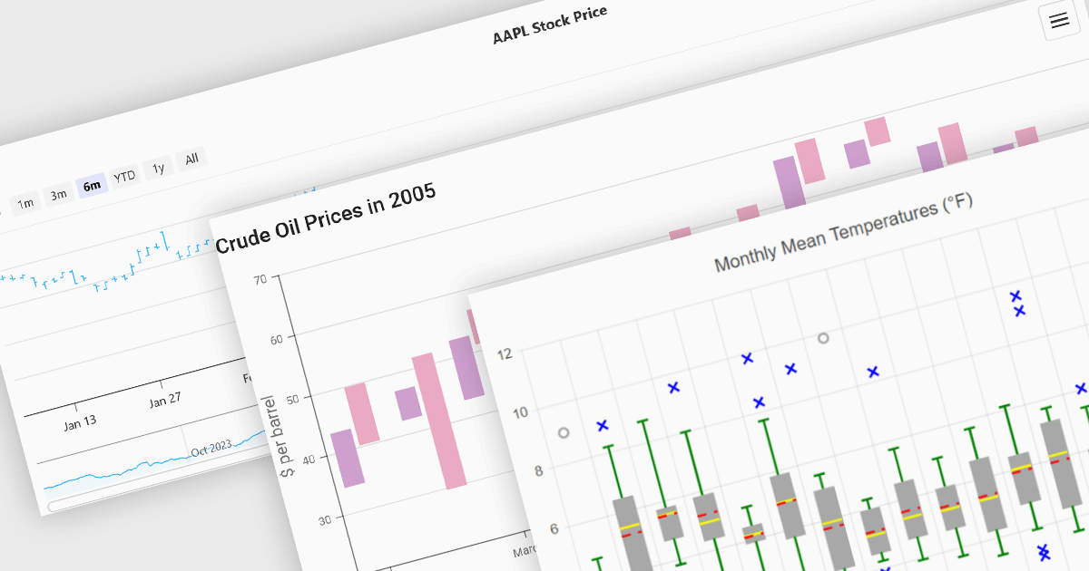
Financial chart components are used within software applications to visually represent complex financial data over time. They enable users, particularly those in trading, investment, and financial analysis, to interpret trends, compare performance, and make data-driven decisions more effectively. These components typically support a variety of chart types tailored to the unique requirements of financial datasets, allowing for granular analysis of price movements, market trends, and volatility.
Common features include:
For an in-depth analysis of features and price, visit our Vue.js Chart components comparison.
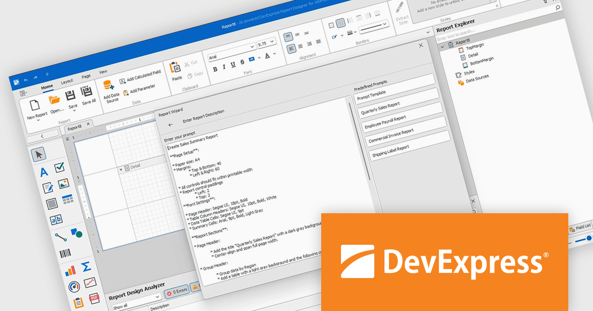
DevExpress Reporting is a comprehensive suite of reporting tools that empowers developers to create visually stunning and highly customizable reports for various applications. With its rich feature set, including data binding, layout design, printing, and exporting capabilities, DevExpress Reporting enables the efficient creation of reports that meet the most demanding business requirements.
The DevExpress Reporting v25.1 update introduces a new AI-powered Report Wizard (currently in Community Technology Preview), bringing natural language capabilities directly into the report design workflow. By allowing users to describe the report they need in plain text, the wizard interprets this input and automatically generates a matching report layout. This greatly reduces the time and expertise required to design reports, particularly for users who may not be familiar with the underlying report schema or expression syntax. It’s especially useful for quickly prototyping reports or enabling non-technical users to contribute to report design without writing code or manually configuring elements.
To see a full list of what's new in version 25.1, see our release notes.
DevExpress Reporting is licensed per developer and is available as a Perpetual License with a 12 month support and maintenance subscription. See our DevExpress Reporting licensing page for full details.
DevExpress Reporting is available to buy in the following products:
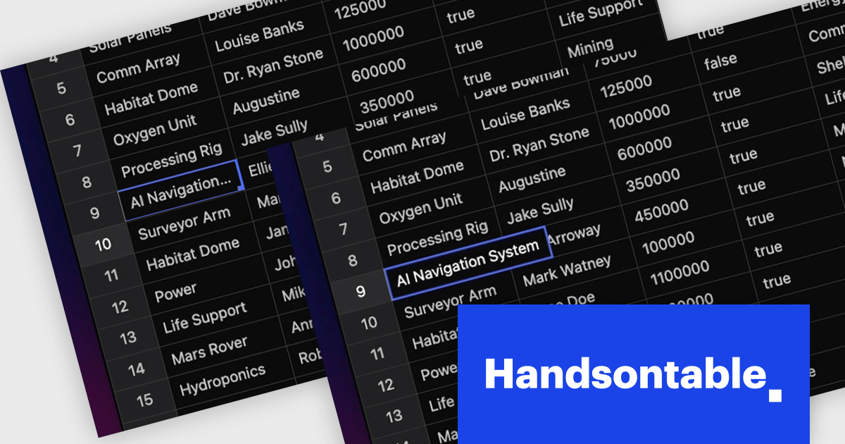
Handsontable is a JavaScript library designed to help developers build interactive data grids into their web applications. Offering a familiar spreadsheet-like interface, it allows users to edit, sort, and filter data with ease. Highly customizable and compatible with popular frameworks like React and Angular, Handsontable empowers developers to build robust data manipulation features into their web applications.
The Handsontable 16.0.0 update adds a new feature called 'textEllipsis' which improves the readability and layout of tables. When activated, this feature automatically replaces any overflowing text in a cell with an ellipsis (…), ensuring that excessive content does not spill over and disrupt the alignment of the table. This approach keeps tables visually clean while clearly signaling that additional content exists, making it easier for users to scan data-heavy views without distraction.
To see a full list of what's new in version 16.0.0, see our release notes.
Handsontable is licensed per developer and is available as an Annual or Perpetual license with 1 year support and maintenance. See our Handsontable licensing page for full details.
For more information, visit our Handsontable product page.
전화 : 00798 14 800 6332
팩스 : +1 770 250 6199


