













공식 공급 업체
200 이상의 소프트웨어 개발처와 판매 계약을 맺은 공인 디스트리뷰터로서 합법적인 라이선스를 제공합니다.
모든 브랜드 보기.
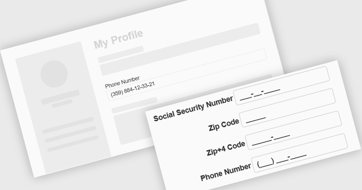
Input masking is a technique used in data editor components to format and restrict user input to specific patterns. By defining a predefined structure with placeholders, input masks guide users to enter data in a consistent and accurate manner. This approach significantly reduces data entry errors, improves data quality, and streamlines data processing. Input masks also enhance user experience by providing clear visual cues and automatically formatting input as it is typed, reducing the cognitive load on the user.
Several Angular data editors offer support for input masking including:
For an in-depth analysis of features and price, visit our Angular data editors comparison.
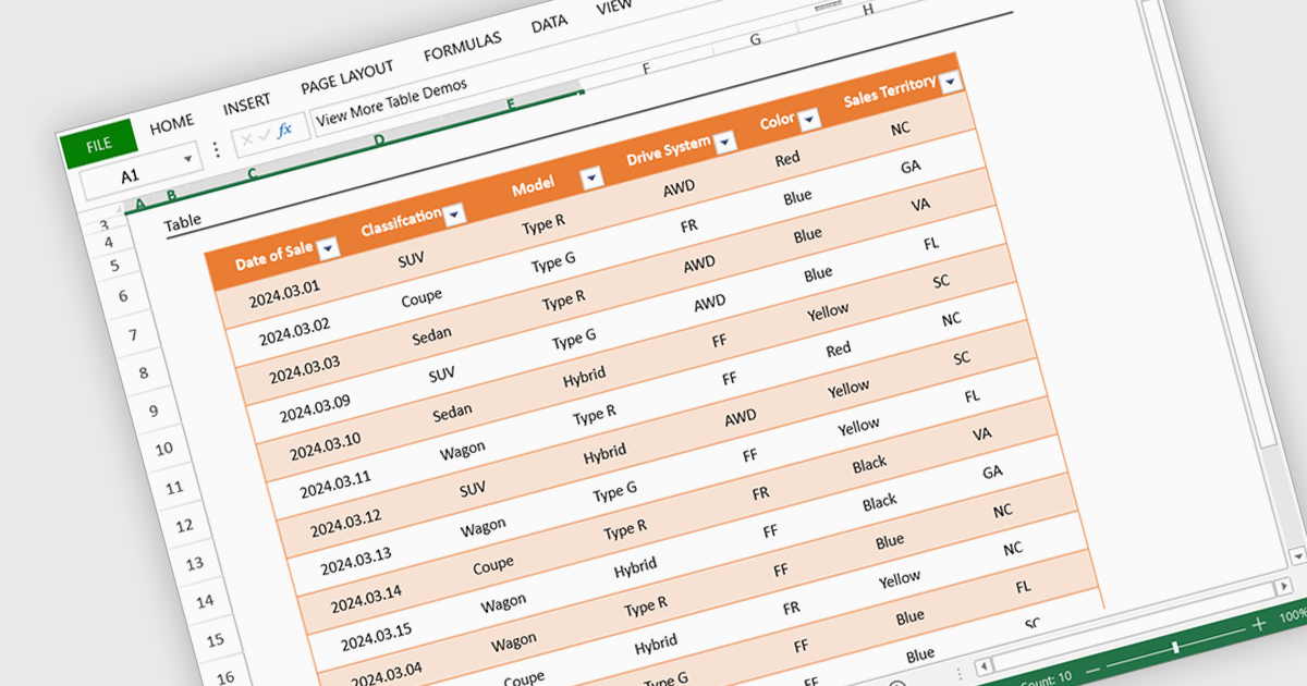
Spreadsheet display functionality allows developers to seamlessly integrate dynamic, tabular data into their applications. This capability enables users to visualize, analyze, and manipulate data directly within the application's interface, streamlining workflows and enhancing user experience. By providing a familiar and intuitive spreadsheet environment, developers can significantly improve data accessibility, comprehension, and productivity for their users.
Several Vue.js spreadsheet controls offer the ability to display spreadsheets including:
For an in-depth analysis of features and price, visit our Vue.js spreadsheet controls comparison.
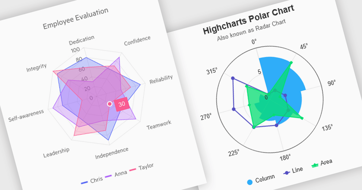
Polar and radar charts provide an intuitive way to visualize multidimensional and circular data. These chart types plot data points relative to a central axis, with polar charts ideal for showcasing proportional relationships, such as seasonal trends or directional metrics, and radar charts excelling at comparing multiple variables, such as performance metrics or skill assessments. Angular’s interactivity enhances engagement with features like tooltips, zooming and real-time updates, making these charts ideal for dashboards and reports. Use cases include analyzing skill assessments, market segmentation, and cyclic trends, delivering clear, actionable insights in a visually compelling format.
Several Angular chart controls offer visual polar and radar chart support including:
For an in-depth analysis of features and price, visit our Angular chart controls comparison:
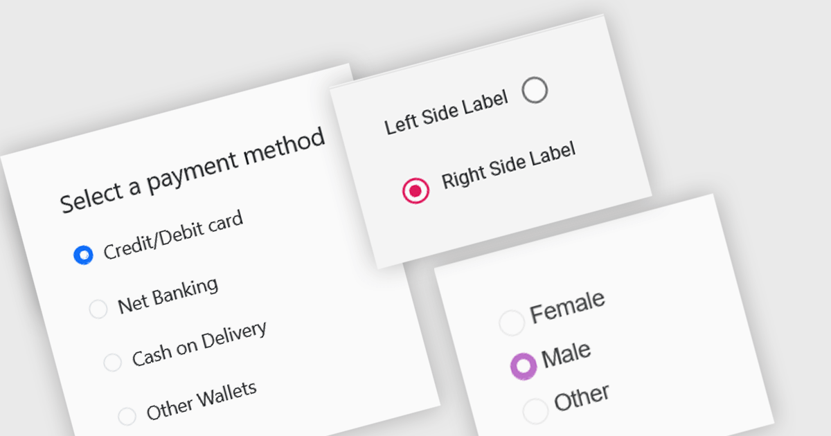
A radio group is a user interface element that presents a set of mutually exclusive options. Users can select only one option from the group at a time, visually represented by a circular button that fills with color when selected. This design pattern is commonly used to represent options like gender, payment method, or difficulty level, where a single choice is required and alternatives are clearly defined. Radio groups enhance user experience by simplifying decision-making, reducing cognitive load, and preventing errors associated with ambiguous selections.
Several React data editor collections feature a radio group, including:
For an in-depth analysis of features and price, visit our React data editors comparison.
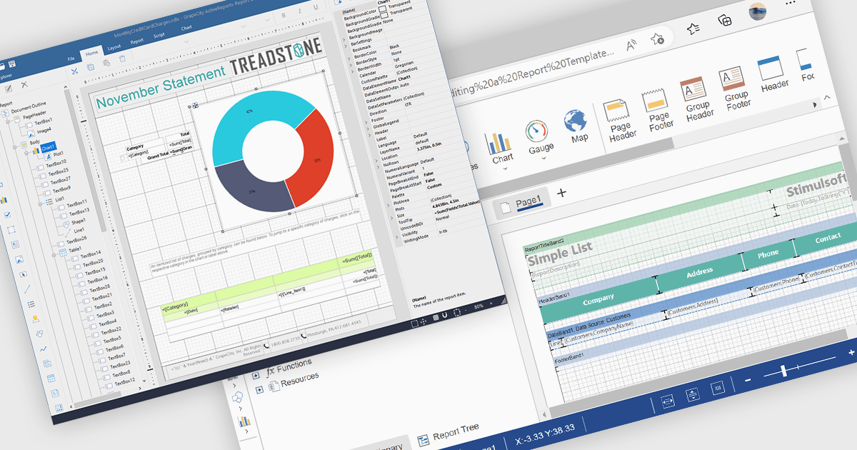
A Visual Report Designer in a reporting control enables users to create and customize data-rich reports through an intuitive, drag-and-drop interface. With ready-to-use templates, interactive elements, and direct data binding, it simplifies report creation while maintaining professional quality. Key benefits include real-time data updates, brand customization, and interactive filters, making it ideal for business intelligence tasks like financial dashboards, performance reports, and analytics summaries. This feature empowers teams to generate insights quickly and make data-driven decisions with ease.
Several Angular reporting controls offer visual report designer support including:
For an in-depth analysis of features and price, visit our Angular Reporting Controls comparison.
전화 : 00798 14 800 6332
팩스 : +1 770 250 6199


