


공식 공급 업체
200 이상의 소프트웨어 개발처와 판매 계약을 맺은 공인 디스트리뷰터로서 합법적인 라이선스를 제공합니다.
모든 브랜드 보기.
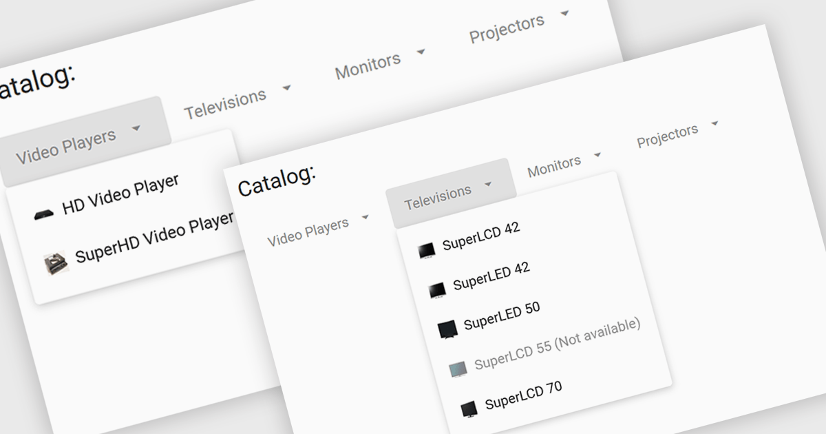
Menu controls are interactive elements within a user interface that allow users to access additional options or functions. These controls typically appear as buttons, drop-down lists, or context menus. They are widely used to organize and present complex functionalities in a structured and efficient manner, improving user experience and navigation.
Several Angular UI suites offer menu controls including:
For an in-depth analysis of features and price, visit our Angular UI suites comparison.
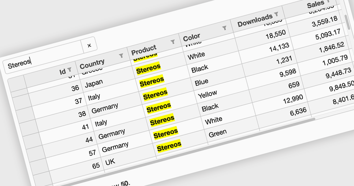
Searching in a grid component refers to the ability for users to quickly locate specific data within a table or grid-like structure. It involves filtering the displayed data based on user-defined criteria, such as text strings or numerical values. This functionality significantly enhances user experience by allowing users to efficiently find relevant information without having to manually scan through large datasets. By implementing search functionality, developers can improve the usability and overall effectiveness of their grid applications.
Several Vue.js grid controls offer searching functionality including:
For an in-depth analysis of features and price, visit our comparison of Vue.js grid controls.
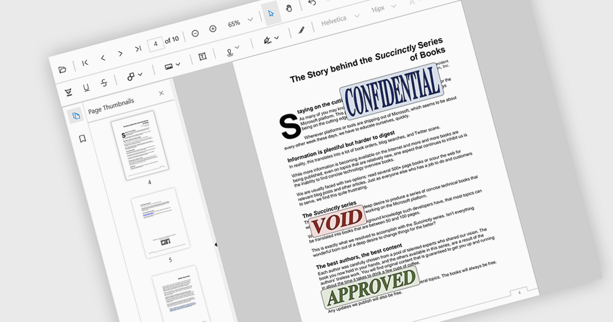
Stamp annotations are digital markers or labels that can be added to PDF documents to indicate various actions or statuses. They are commonly used in business processes, legal documents, and other contexts where tracking and verification are important.
Several React PDF viewer controls offer support for stamp annotations including:
For an in-depth analysis of features and price, visit our React PDF viewer controls comparison.
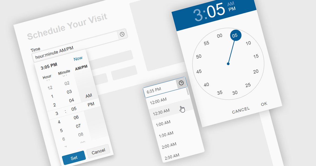
A time picker is an input component that provides users with the ability to edit or select a specific time value from a visual dropdown or input field, typically presented in the form of a clock face or a digital time display. This user interface element provides a standardized and intuitive method for capturing time input, ensuring that the data is consistent, accurate and correctly formatted. Particularly valuable in applications involving scheduling tools, booking systems or simply managing time-based data, it enhances the overall user experience and helps to ensure accurate and efficient data entry.
Several Angular data editor collections provide time picker components, including:
For an in-depth analysis of features and price, visit our comparison of Angular data editors.
Infragistics Ignite UI for Web Components is a comprehensive library of pre-built, reusable UI components designed for constructing modern web applications using the Web Components standard. It offers a diverse collection of data grids, charts, and interactive elements, enabling developers to rapidly create high-performance, cross-platform applications without dependency complexities.
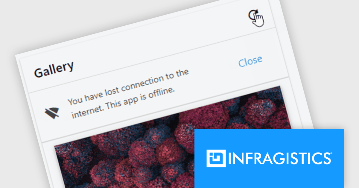
The Ignite UI for Web Components 24.1 update now includes a Banner component, offering developers a versatile tool for displaying prominent, persistent messages within applications. Positioned between the transient Snackbar and the modal Dialog, the Banner provides a non-intrusive way to convey crucial information to users. Its customizable features, including support for custom action buttons and icons, allow for tailored messaging and user interaction, enhancing application usability and user experience.
To see a full list of what's new in version 24.1 (4.10.0), see our release notes.
Infragistics Ignite UI for Web Componentsis part of Infragistics Ignite UI which is licensed per developer and is available as a Perpetual License with a 1, 2 or 3 year support and maintenance subscription. See our Infragistics Ignite UI licensing page for full details.
Ignite UI for Web Components is available to buy in the following products:
전화 : 00798 14 800 6332
팩스 : +1 770 250 6199


