













공식 공급 업체
200 이상의 소프트웨어 개발처와 판매 계약을 맺은 공인 디스트리뷰터로서 합법적인 라이선스를 제공합니다.
모든 브랜드 보기.
LightningChart JS is a high-performance JavaScript charting library that utilizes WebGL rendering and GPU acceleration to deliver exceptional performance for a wide range of data visualization needs. It is designed to handle large datasets and complex visualizations with ease, enabling developers to create interactive and visually appealing charts for various applications.
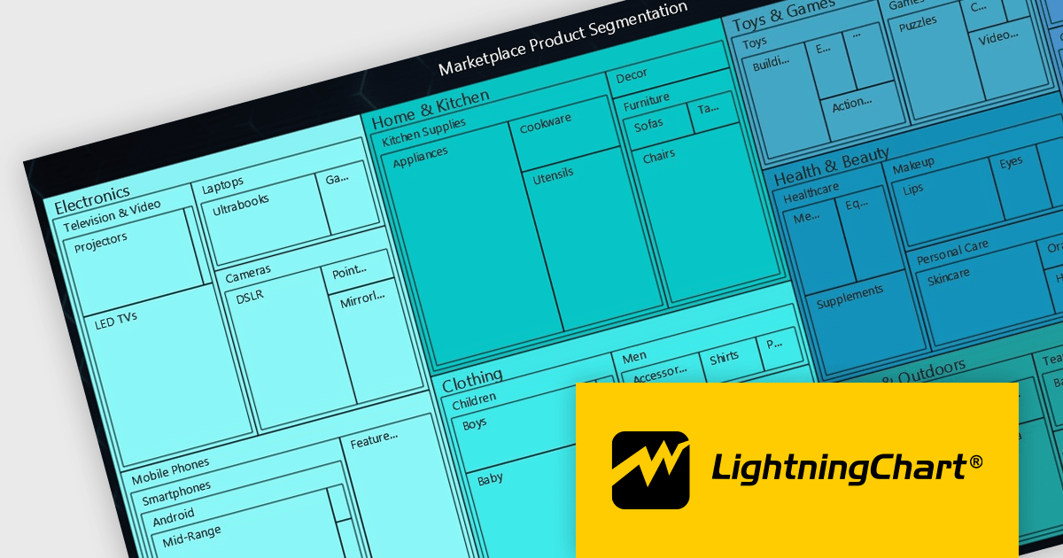
The LightningChart JS v5.2.0 update adds Treemap charts with built-in drill-down functionality, enabling developers to visualize hierarchical data within nested rectangles representing larger or smaller values, depending on their size. This simplifies the complexities involved in understanding large datasets by providing a clear and immediate visual hierarchy of data categories and their relative importance, with the ability to display more depth. This is particularly useful in scenarios such as financial analysis, asset distribution, and organizational structure mapping, where understanding the proportionate distribution of data elements is crucial.
To see a full list of what's new in v5.2.0, see our release notes.
LightningChart JS is licensed based on method of deployment with options including SaaS Developer Licenses, Application Developer Licenses, and Publisher Developer Licenses. Each license is perpetual and includes 1 year subscription for technical support and software updates. See our LightningChart JS licensing page for full details.
Learn more on our LightningChart JS product page.
Smart HTML Elements is an enterprise-grade UI library offering pre-built web components for developers in Angular, React, Vue, Blazor, and JavaScript. It boasts over 60 ready-to-use components like grids, charts, schedulers, and editors, all featuring two-way data binding, responsiveness, accessibility, and theming capabilities. This library helps developers rapidly build dynamic and modern web applications with consistent look-and-feel and rich functionalities, accelerating development time and ensuring professional quality.
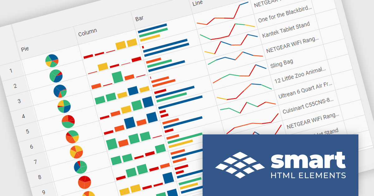
The Smart HTML Elements v19.0.0 release adds support for Grid Sparklines. These are small, data-intense, design simple charts that fit into a single cell of a grid and provide a visual representation of data trends. They are typically used to show trends in a series of values, such as seasonal increases or decreases, economic cycles, or to highlight maximum and minimum values. Grid Sparklines help users to quickly understand patterns and trends in their data without having to create separate charts or graphs.
To see a full list of what's new in v19.0.0, see our release notes.
Smart HTML Elements is licensed per developer and is available as a Perpetual license with 1 year support and maintenance. It includes distribution to Unlimited Web applications, SaaS projects, Intranets and Websites. See our Smart HTML Elements licensing page for full details.
Learn more on our Smart HTML Elements product page.
ONLYOFFICE Docs Enterprise Edition with Alfresco Connector combines an online document editor with a seamless integration for Alfresco Share, which is a content management platform that allows users to store, organize, and collaborate on documents and other digital assets. This integration allows teams to create, view, edit, and collaborate on spreadsheets, presentations, and text files online, directly within Alfresco Share using ONLYOFFICE editors, boosting efficiency and eliminating the need for file switching.
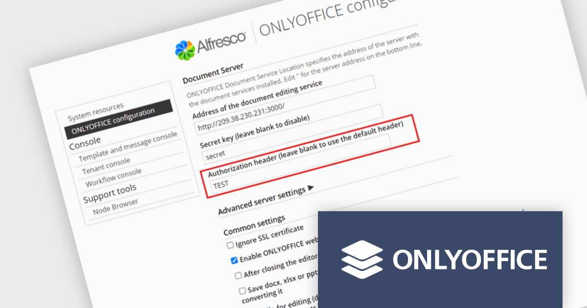
The ONLYOFFICE Alfresco Connector 7.0 update (available as part of ONLYOFFICE Docs Enterprise Edition with Alfresco Connector v8.0.1) adds advanced security options. It now uses JSON Web Token Secret and JSON Web Token Header to safeguard against unauthorized access, providing a higher level of protection. This release also gives administrators the flexibility to configure their own authorization headers directly on the editor's settings page, thereby offering a more tailored and secure document management experience.
To see a full list of what's new in ONLYOFFICE Docs Enterprise Edition v8.0.1 with Alfresco Connector 7.0, see our release notes.
ONLYOFFICE Docs Enterprise Edition with Alfresco Connector is licensed per server and is available as an annual license with 1 year of support and updates, or as a perpetual license with 3 years of support and updates. See our ONLYOFFICE Alfresco connector licensing page for full details.
For more information, see our ONLYOFFICE Alfresco connector product page.

Barcode functionality in Vue.js UI suites offers software developers an easy way to integrate barcode generation and scanning capabilities into their Vue.js applications. By leveraging barcode components, developers can quickly implement features like product lookups, inventory management, and asset tracking, without needing to delve into the complexities of low-level barcode processing. This ensures consistent data accuracy and integrity, as barcodes minimize human errors common in manual data entry. It also simplifies data management and boosts operational efficiency by facilitating rapid data processing and access.
Several Vue.js UI suites offer barcode functionality, including:
For an in-depth analysis of features and price, visit our comparison of Vue.js UI suites.
ONLYOFFICE Docs Enterprise Edition with WordPress Connector combines an online document editor with a seamless integration for WordPress, which is a content management system for creating and managing websites. This allows teams to create, view, edit, and collaborate on spreadsheets, presentations, and text files online, directly within WordPress, boosting efficiency and eliminating the need for file switching.
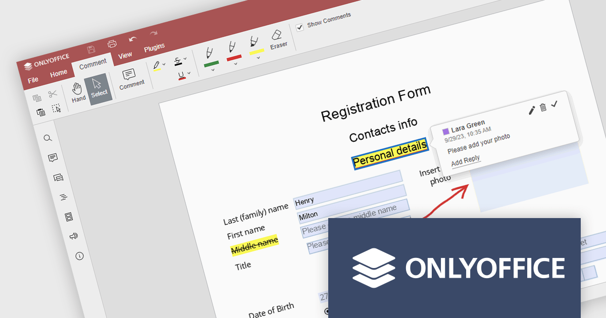
The ONLYOFFICE WordPress Connector 2.0.0 release (available as part of ONLYOFFICE Docs Enterprise Edition with WordPress Connector v8.0.1) brings the ability to open PDF files uploaded to your WordPress site directly within the admin dashboard for form filling and annotating using ONLYOFFICE Docs. You can fill out interactive fields, highlight, underline and strikethrough text, leave comments, and draw different objects and lines with the built-in drawing tools. By enabling seamless interactions with PDF documents directly within the platform and reducing the steps needed to edit or comment on PDF files, this capability streamlines document management workflows, optimizes productivity and eliminates the need for external software solutions.
To see a full list of what's new in ONLYOFFICE Docs Enterprise Edition v8.0.1 with WordPress Connector 2.0.0, see our release notes.
ONLYOFFICE Docs Enterprise Edition with WordPress Connector is licensed per server and is available as an annual license with 1 year of support and updates, or as a perpetual license with 3 years of support and updates. See our ONLYOFFICE WordPress connector licensing page for full details.
For more information, see our ONLYOFFICE WordPress connector product page.
전화 : 00798 14 800 6332
팩스 : +1 770 250 6199


