


공식 공급 업체
200 이상의 소프트웨어 개발처와 판매 계약을 맺은 공인 디스트리뷰터로서 합법적인 라이선스를 제공합니다.
모든 브랜드 보기.
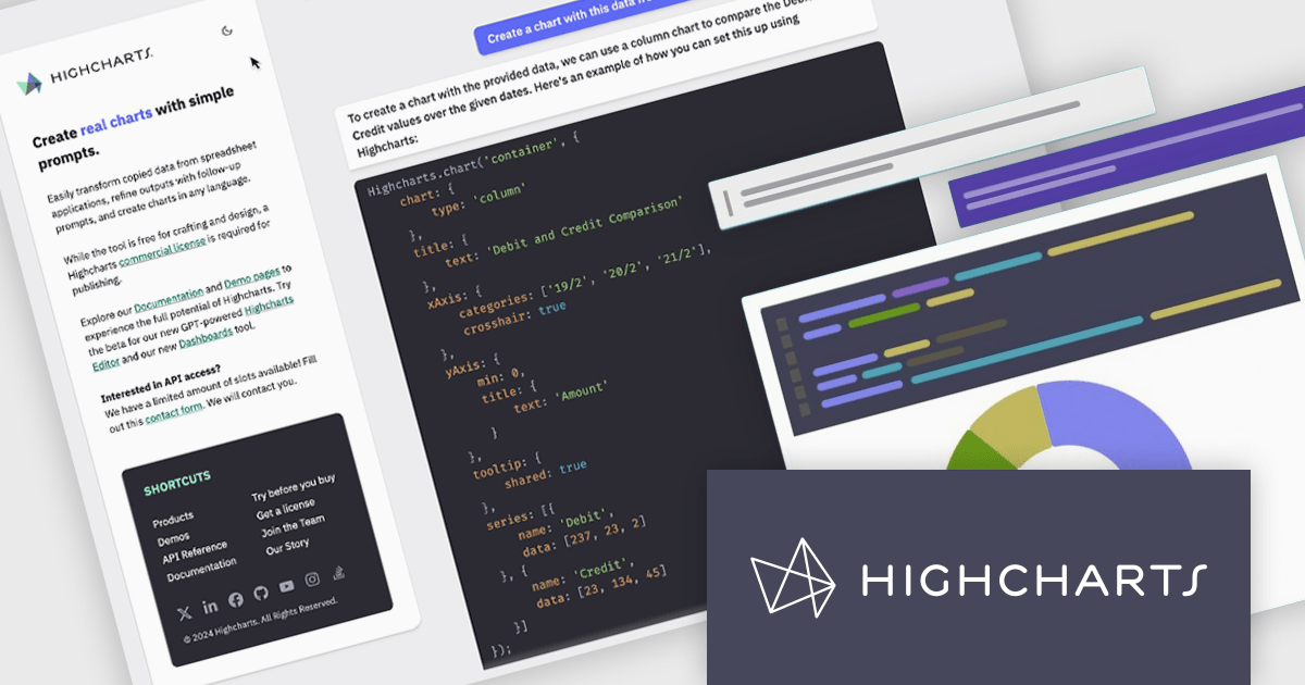
Highcharts is a JavaScript charting framework that allows web developers and data analysts to generate dynamic, visually appealing charts and graphs for websites and web applications. It can display a variety of chart types, including line, spline, area, column, bar, pie, scatter, and many more. Highcharts is well-known for its ease of use, rich documentation, and ability to handle huge datasets efficiently. Features include responsive design, accessibility support, and cross-browser compatibility. Its customization capabilities allow users to create bespoke data visualizations that increase engagement and provide insightful data presentations.
Highcharts GPT has been renamed Highcharts Assist to represent its evolution from an AI assistant associated with a single language model to a universal assistant for the Highcharts platform. Highcharts Assist provides software developers with support across implementation, debugging, licensing, product guidance, and best practices, while its model-agnostic approach allows the underlying AI technology to evolve over time without changing the user experience.
Highcharts Core is licensed on an annual or perpetual basis, OEM licenses, and Advantage Renewals. It is licensed per Developer and has several license options including Internal, SaaS, SaaS+, and Self Hosted. See our Highcharts Core licensing page for full details.
Learn more on our Highcharts Core product page.
Integrated Development Environments (IDEs) that include support for the Android framework help developers build applications for phones, tablets and other Android-powered devices using a single, integrated workspace. By providing project templates, intelligent code editing, debugging tools and deployment options designed for Android development, these IDEs reduce the effort required to create and maintain mobile applications. Support for the Android Software Development Kit (SDK), emulators and modern programming languages helps development teams deliver reliable Android applications while working with the latest platform capabilities.
Several Integrated Development Environments (IDEs) contain support for the Android framework including:
For an in-depth analysis of features and price, visit our comparison of Integrated Development Environments (IDEs).
ActiveReportsJS is a powerful, lightweight reporting tool designed to integrate advanced reporting capabilities into any JavaScript application. ActiveReportsJS enables developers to create, view, export, and print richly formatted reports entirely on the client side - with zero server dependencies.
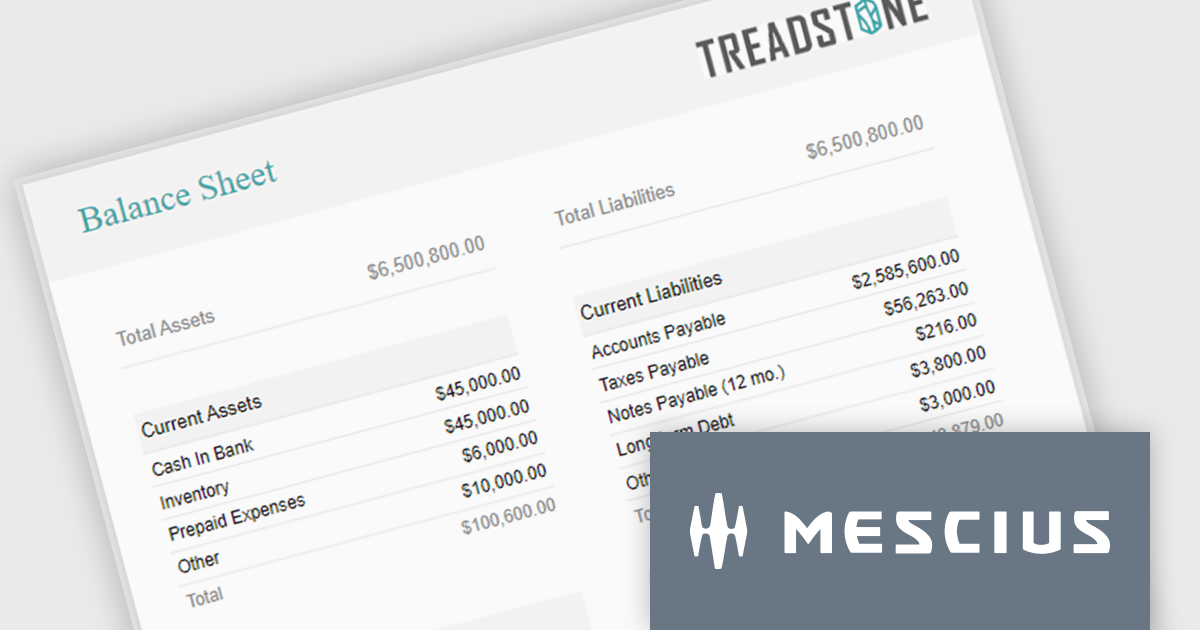
Balance sheets provide a snapshot of an organization's financial position at a specific point in time. By summarizing assets, liabilities, and equity, these reports help creditors, investors, and stakeholders evaluate a company's financial health. In this blog post, MESCIUS Product Manager Joel Parks demonstrates how to use the Angular Report Designer to give users the ability to design, view, and interact with reports directly from within your web application. Steps include:
Read the complete blog to get started creating polished, interactive balance sheets within your web applications.
ActiveReportsJS is licensed on an annual subscription or perpetual basis and is available as a Single Deployment License for non-commercial use, and as a Single Domain License or Unlimited Domain License for commercial and/or SaaS use. See our ActiveReportsJS licensing page for full details.
For more information, visit our ActiveReportsJS product page.
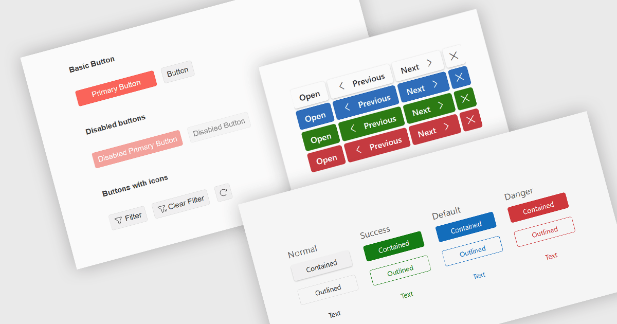
Button editors are user interface (UI) components that enable users to initiate actions within an application, such as submitting data, opening dialogs, clearing input, or executing custom commands. Modern button components often provide options for customizing appearance, icons, size, placement, and behavior, helping developers create consistent, accessible interfaces while supporting application-specific workflows and improving the overall user experience.
Several jQuery data editor collections provide you with button editor controls, including:
For an in-depth analysis of features and price, visit our comparison of jQuery data editors.
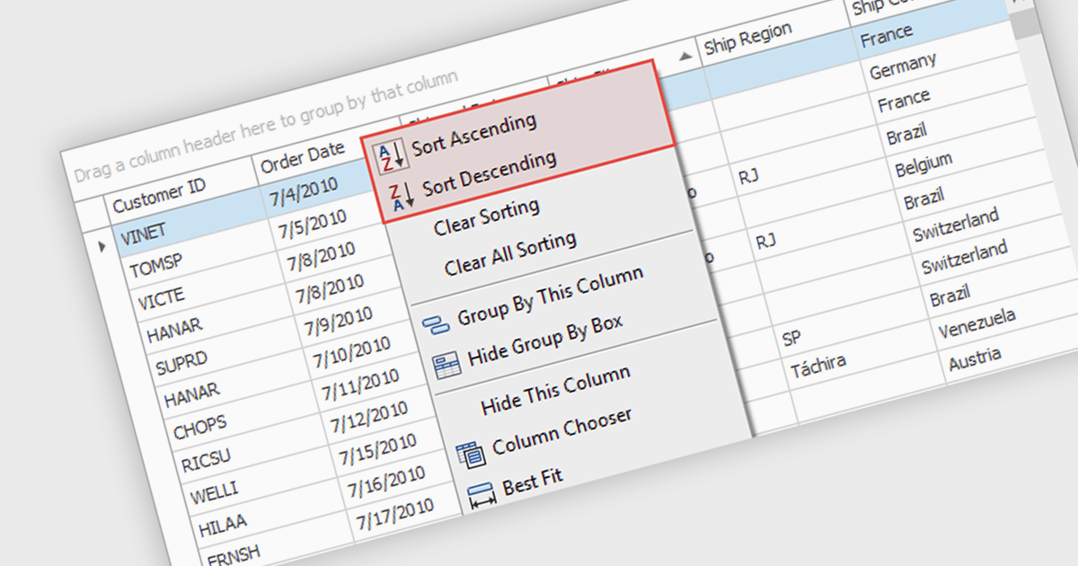
Sorting (local) is a feature in .NET WinForms Grid controls that orders the data currently loaded into the grid on the client, without requesting a new sorted result from a database or remote data source. It enables users to quickly sort rows by one or more columns using the data already available in memory, providing immediate visual feedback and a responsive user experience. For developers, local sorting can reduce unnecessary network requests, improve the perceived performance of data exploration, and simplify interactive scenarios where users need to reorganize and compare displayed data without affecting the underlying data source.
Several .NET WinForms Grid controls offer Sorting (Local) including:
For an in-depth analysis of features and price, visit our comparison of .NET WinForms Grid controls.
전화 : 00798 14 800 6332
팩스 : +1 770 250 6199


