













공식 공급 업체
200 이상의 소프트웨어 개발처와 판매 계약을 맺은 공인 디스트리뷰터로서 합법적인 라이선스를 제공합니다.
모든 브랜드 보기.
Effective January 6, 2025, Highcharts has streamlined its licensing model to enhance clarity, simplify compliance, and improve the overall user experience. The updates include unified definitions, revised license grants, and an upgraded ADV+ support offering.
Streamlined Definitions
The terms “SaaS application” and “web application” have been replaced with a unified term: "External Application". This new terminology clarifies the distinction between applications covered under the Internal License and those requiring additional licensing.
Updated License Grants
Public websites, previously covered under the Internal License grant, are now under the SaaS License grant. This ensures consistency across applications for public access.
Video Call Support for ADV+ Subscribers
Users subscribed to the Highcharts Advantage Plus (ADV+) tier now benefit from video call support, providing more robust communication options for troubleshooting and guidance.
For existing customers using the Internal License to deploy on public websites, these updates reclassify such use under the SaaS License grant. The updated Highsoft license terms mean that customers currently using an Internal License for an external Public Web site or for an “External Application” will need to upgrade to a SaaS License to ensure compliance. For more information see our updated Highcharts Core licensing page.
If you have questions about Highcharts licensing, our experts are here to assist. Whether you need guidance on selecting the right license, moving to a new agreement, or ensuring compliance, we’re ready to help via toll-free phone, live chat or email.
ComponentOne WinUI and MAUI Edition is a comprehensive suite of UI components designed for cross-platform .NET development, supporting WinUI, MAUI, UWP, and Xamarin with a single license. It empowers developers to create modern and high-performance applications for business and enterprise use. With versatile controls and seamless integration, the suite simplifies the development process, enhances productivity, and ensures compatibility with the latest .NET platforms, making it an essential tool for delivering exceptional user experiences.
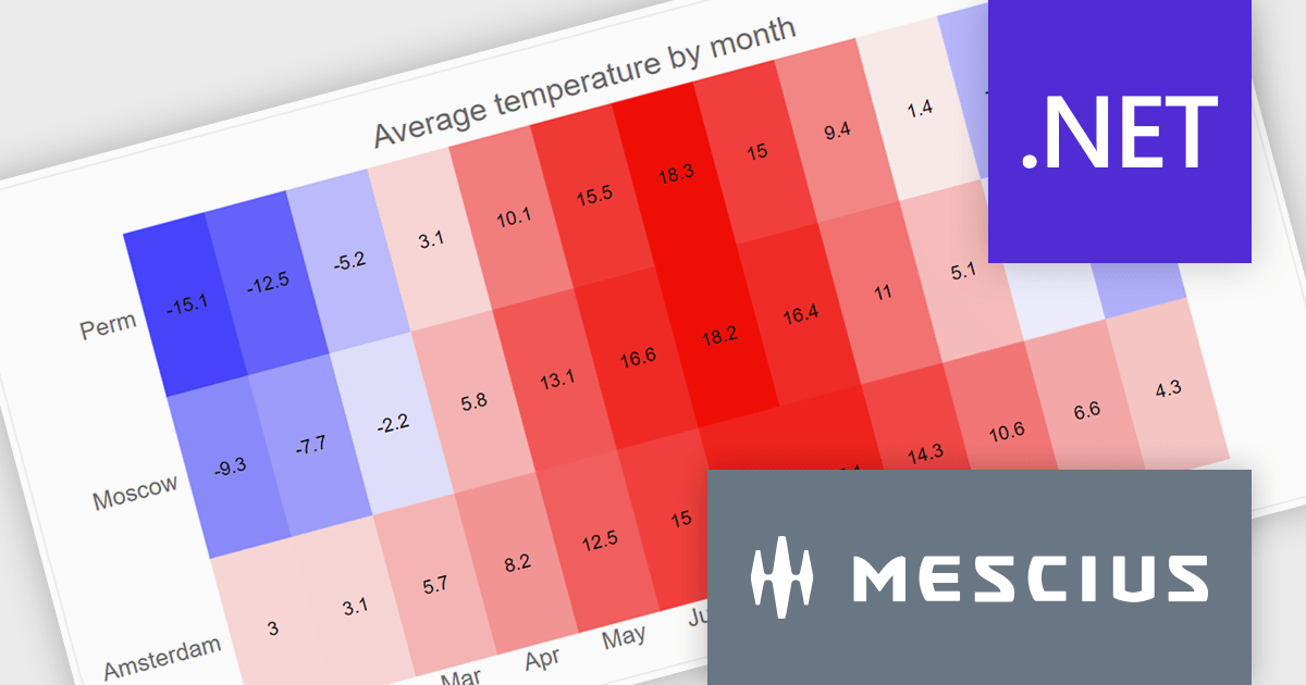
The ComponentOne Studio WinUI & MAUI Edition 2024 v2 update introduces new heatmap charts, providing developers with a robust tool for visualizing dense datasets in a clear and structured manner. With support for both discrete and gradient color options, along with the ability to display data labels, these charts enhance the readability of complex information. This feature is ideal for scenarios requiring quick data analysis, offering developers a versatile and efficient way to present large volumes of data in visually impactful 2D layouts.
To see a full list of what's new in 2024 v2, see our release notes.
ComponentOne Studio WinUI and MAUI is licensed per developer on a perpetual basis and includes a 12 month subscription. See our ComponentOne Studio WinUI and MAUI licensing page for full details.
Learn more on our ComponentOne Studio WinUI and MAUI product page.
Syncfusion Essential Studio Blazor (available as part of Syncfusion Essential Studio Enterprise) is a comprehensive UI component library designed to accelerate the development of high-performance, modern web applications using the Blazor framework. It boasts over 85+ responsive, lightweight, and modular components spanning various categories such as data visualization, data editing, document processing, and interactive UI elements. This rich repertoire empowers developers to rapidly build user-friendly, feature-rich web interfaces, with seamless integration of both server-side and client-side Blazor applications.
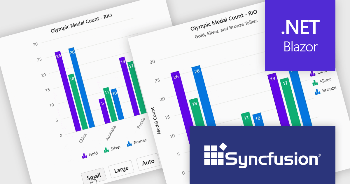
The Syncfusion Essential Studio Blazor 2024 Volume 4 release introduces adaptive layout support for charts, enhancing their responsiveness across various screen sizes. This feature ensures that chart elements, including axis labels, titles, legends, and data labels, dynamically adjust their design and positioning to maintain clarity and readability on different devices. By automatically optimizing the arrangement of these components, the adaptive layout improves user experience, making data visualization more effective and accessible across desktops, tablets, and smartphones.
To see a full list of what's new in 2024 Volume 4, see our release notes.
Syncfusion Essential Studio Blazor is available as part of Syncfusion Essential Studio Enterprise which is licensed per developer starting with a Team License of up to five developers. It is available as a 12 Month Timed Subscription License which includes support and maintenance. See our Syncfusion Essential Studio Enterprise licensing page for full details.
Learn more on our Syncfusion Essential Studio Blazor product page.
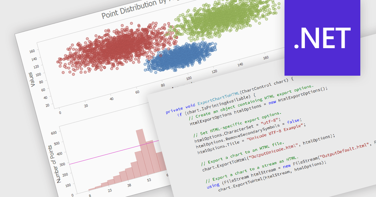
Exporting a chart to HTML transforms it into a format that can be embedded in web pages or applications as either an interactive or static element. This approach enhances accessibility, allowing charts to be viewed on any device without specialized software. HTML export often includes dynamic features like zooming, tooltips, and interactivity, making data more engaging and easier to understand. It also supports seamless integration with web applications, offering a scalable and user-friendly solution for sharing and analyzing visual data online.
Several .NET charting components allow you to export charts to HTML, including:
For an in-depth analysis of features and price, visit our .NET chart controls comparison.
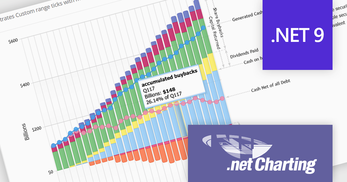
.netCHARTING is a comprehensive charting solution designed for C# and VB.NET developers working with ASP.NET or WinForms. It enables the rapid creation of dynamic, data-driven charts with minimal coding effort. Built entirely with managed C# code, .netCHARTING seamlessly integrates data access, aggregation, and visualization, allowing developers to generate interactive and visually compelling charts from various data sources, including SQL Server, Oracle, and MySQL. The platform supports a wide array of chart types—such as bar, line, pie, and geographic maps—and offers features like JavaScript and HTML5 charting for enhanced interactivity across devices, including mobile platforms. By automating complex tasks like date handling and data aggregation, .netCHARTING simplifies the development process, enabling professionals to deliver insightful data visualizations efficiently.
The .netCHARTING 10.7 release adds support for Microsoft .NET 9. This enables developers to create modern, high-performance data visualizations using the latest .NET framework. This allows for the creation of more sophisticated and interactive charts, taking advantage of the new features and performance improvements offered by .NET 9. Additionally, it ensures compatibility with the latest development tools and operating systems, making it easier for developers to integrate .netCHARTING into their projects and maintain their applications.
.netCHARTING is licensed per site (1 web site on 1 server), per server (unlimited web sites on 1 server) or per developer (single application) and is available as a perpetual license with a 12 month subscription which includes major and minor upgrades and priority email support. See our .netCHARTING licensing page for full details.
For more information, visit our .netCHARTING product page.
전화 : 00798 14 800 6332
팩스 : +1 770 250 6199


