













공식 공급 업체
200 이상의 소프트웨어 개발처와 판매 계약을 맺은 공인 디스트리뷰터로서 합법적인 라이선스를 제공합니다.
모든 브랜드 보기.
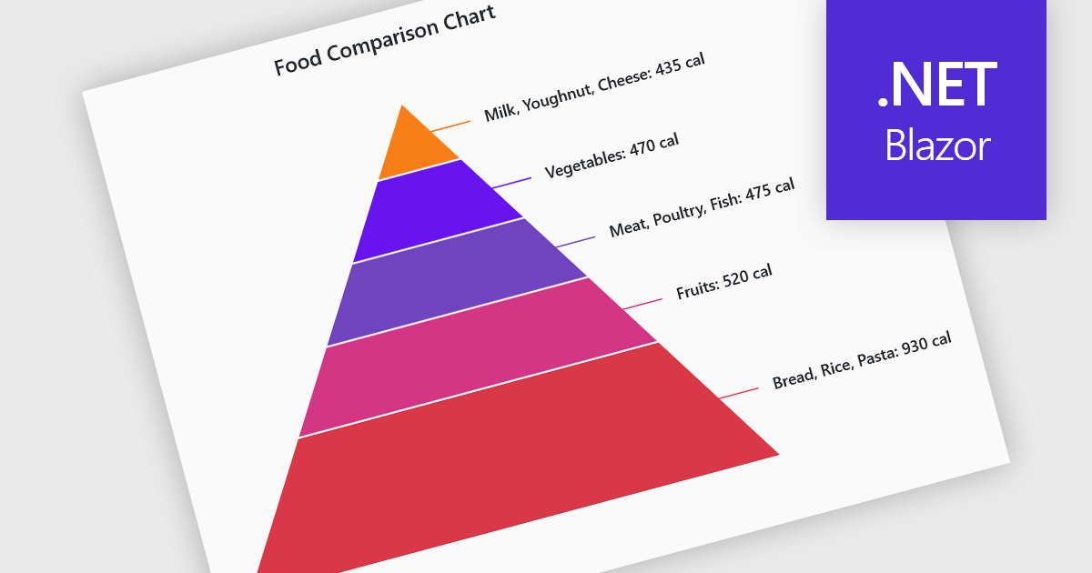
Pyramid charts are a type of graphical representation that organizes data hierarchically, with each layer of the pyramid representing a category or level within the dataset. These charts are particularly useful for displaying proportions, relationships, or workflows where data is segmented into tiers, such as organizational structures, population distributions, or sales funnels. Their clear visual hierarchy makes it easy to compare the relative size of categories or levels at a glance. Pyramid charts are beneficial in highlighting the relative contribution of parts to a whole, visualizing attrition or progression across stages, and presenting data in an intuitive and compact format. Popular use cases include illustrating business sales funnels, demographic distributions in marketing, and resource allocation in project management, making them a versatile tool in both strategic planning and data analysis.
Several Blazor chart controls offer pyramid charts including:
For an in-depth analysis of features and price, visit our Blazor chart controls comparison.
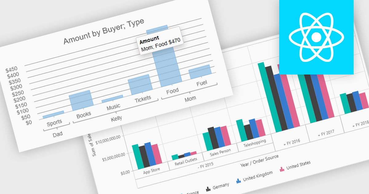
Pivot charts are dynamic visualization tools that enable users to interact with and analyze data in a highly flexible manner. They extend the capabilities of pivot tables by providing visual representations of aggregated data, making it easier to identify trends, patterns, and outliers. Key benefits include real-time updates, intuitive interactivity, and support for multi-dimensional data analysis, which simplifies complex datasets into actionable insights. Integrating pivot charts into your applications empowers end-users to explore and present data in a way that is both visually compelling and deeply informative.
Several React UI suites offer pivot chart components including:
For an in-depth analysis of features and price, visit our comparison of React UI Suites.
LightningChart JS is a high-performance JavaScript charting library optimized for real-time data visualization. Leveraging WebGL and GPU acceleration, it enables developers to create interactive, complex charts capable of handling massive datasets with high refresh rates. Ideal for applications demanding rapid data updates and smooth interactions, LightningChart JS provides a robust API for customization and integration into web-based projects.
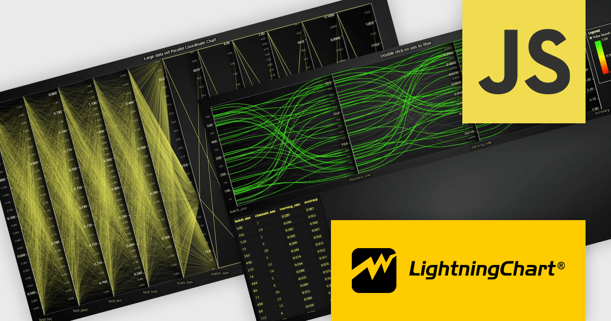
The LightningChart JS v6.1 update introduces the Parallel Coordinate Chart, a powerful tool designed for advanced data visualization and exploration. It allows developers to work with large-scale datasets, supporting over 100,000 series and multiple axes while maintaining high performance. This chart type is optimized for real-time data input, enabling smooth updates at high stream rates. With features like value-based coloring, range-based highlighting, and interactive cursors, it provides an intuitive way to analyze and interpret complex data relationships, making it an essential addition for creating data-driven applications.
To see a full list of what's new in v6.1, see our release notes.
LightningChart JS is licensed based on method of deployment with options including SaaS Developer Licenses, Application Developer Licenses, and Publisher Developer Licenses. Each license is perpetual and includes 1 year subscription for technical support and software updates. See our LightningChart JS licensing page for full details.
Learn more on our LightningChart JS product page.
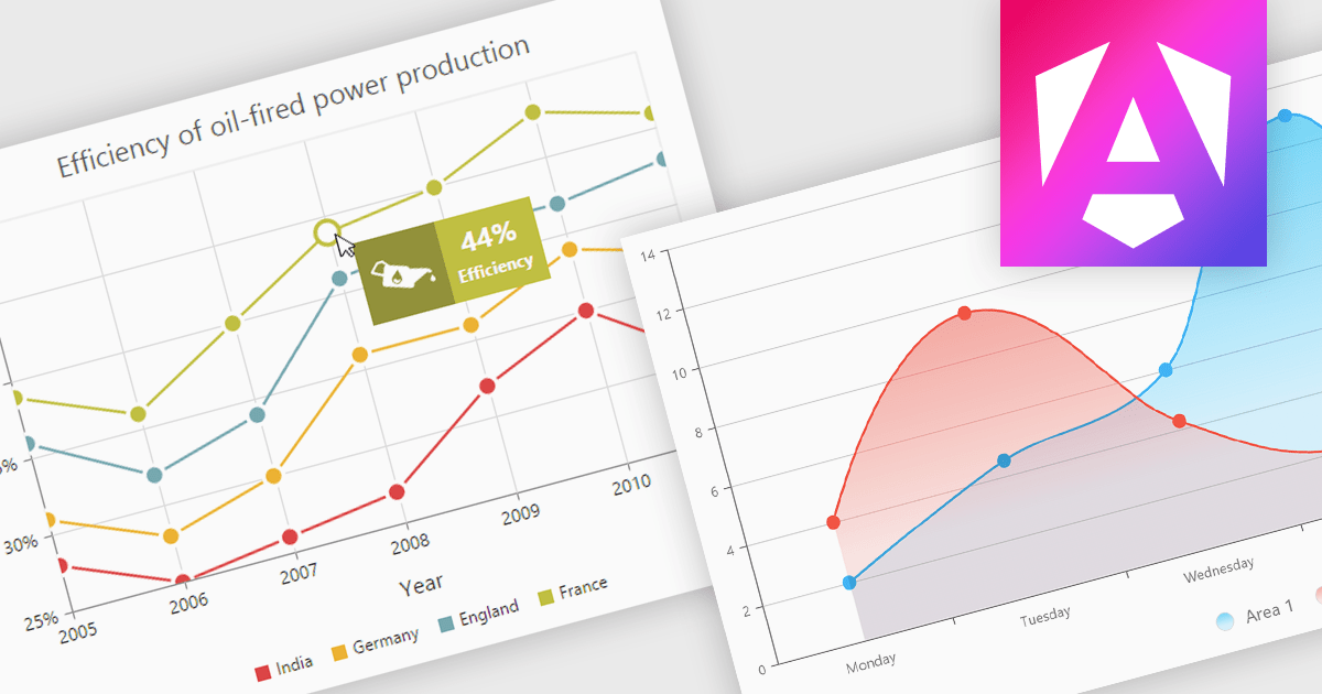
Chart tooltips provide interactive, on-demand insights by displaying detailed information about specific data points when users hover or click on them. They play a crucial role in improving data clarity, enhancing user engagement, and maintaining a clean, uncluttered chart layout. The benefits of tooltips include simplifying the exploration of complex datasets and offering customizable content, such as values, comparisons, or additional context. For example, tooltips can display product sales figures on a business dashboard or detailed stock breakdowns in financial reports. This functionality makes tooltips an indispensable feature for creating intuitive, data-driven applications that empower users to make informed decisions.
Several Angular chart controls offer tooltip support including:
For an in-depth analysis of features and price, visit our Angular chart controls comparison:
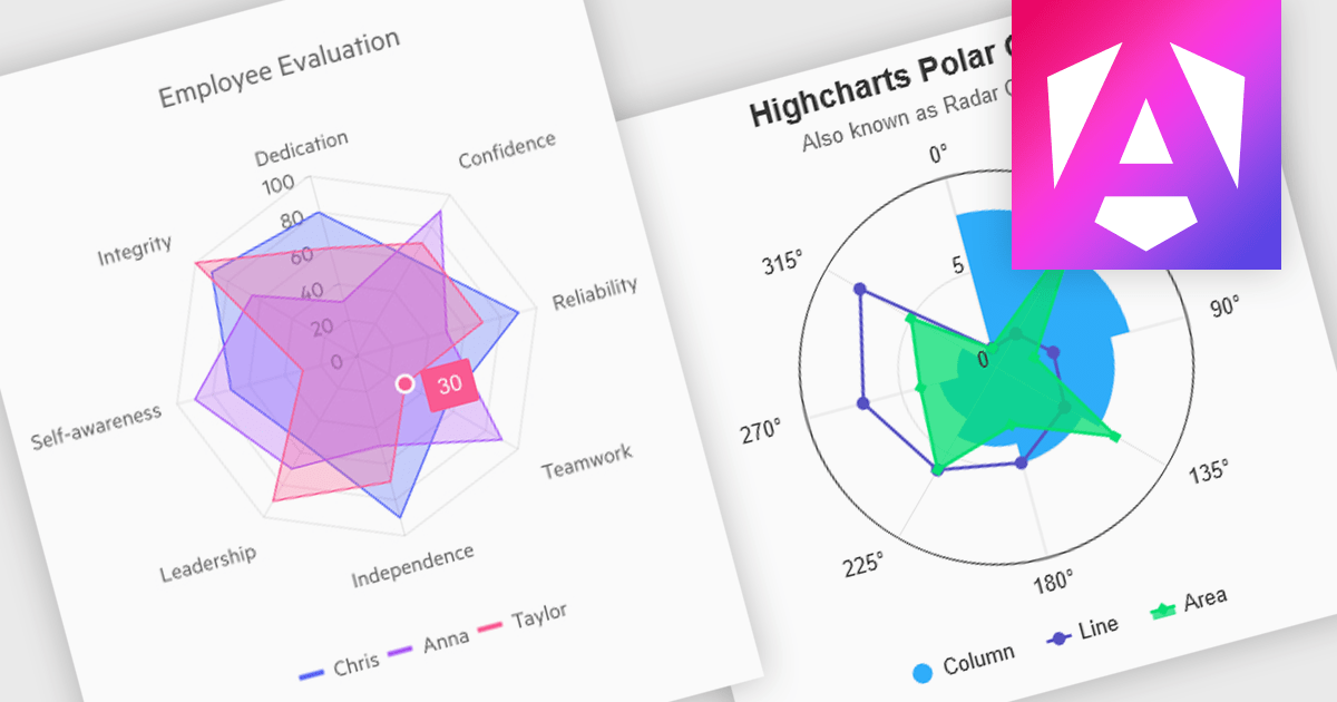
Polar and radar charts provide an intuitive way to visualize multidimensional and circular data. These chart types plot data points relative to a central axis, with polar charts ideal for showcasing proportional relationships, such as seasonal trends or directional metrics, and radar charts excelling at comparing multiple variables, such as performance metrics or skill assessments. Angular’s interactivity enhances engagement with features like tooltips, zooming and real-time updates, making these charts ideal for dashboards and reports. Use cases include analyzing skill assessments, market segmentation, and cyclic trends, delivering clear, actionable insights in a visually compelling format.
Several Angular chart controls offer visual polar and radar chart support including:
For an in-depth analysis of features and price, visit our Angular chart controls comparison:
전화 : 00798 14 800 6332
팩스 : +1 770 250 6199


