


공식 공급 업체
200 이상의 소프트웨어 개발처와 판매 계약을 맺은 공인 디스트리뷰터로서 합법적인 라이선스를 제공합니다.
모든 브랜드 보기.
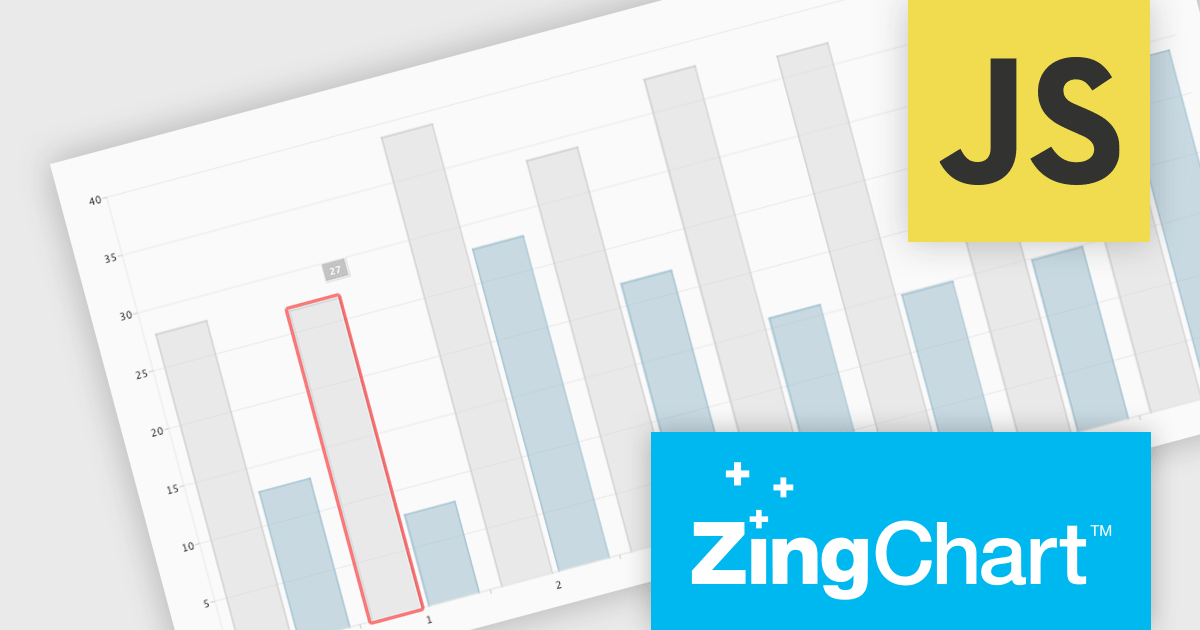
ZingChart is a powerful data visualization tool that empowers businesses to transform raw data into actionable insights. With its extensive library of customizable charts and graphs, ZingChart allows users to create visually stunning and interactive visualizations. Key features include real-time updates, data binding, and integration with popular programming languages and frameworks. By leveraging ZingChart, organizations can gain deeper understanding of their data, identify trends, and make data-driven decisions to improve efficiency and achieve business objectives.
The ZingChart 2.9.15 release improves inclusivity and accessibility. With the addition of robust keyboard navigation and speech support, users can now interact with charts effortlessly, regardless of their visual or motor abilities. By simply using their keyboard or screen reader, individuals can explore, analyze, and understand data visualization elements with ease. This significant enhancement ensures that ZingChart is a valuable tool for everyone, promoting inclusivity and accessibility in data visualization.
To see a full list of what's new in 2.9.15, see our release notes.
ZingChart is licensed on an annual or perpetual basis. It has several license options including Website, Internal, Service (SaaS), Enterprise and OEM. See our ZingChart licensing page for full details.
Learn more on our ZingChart product page.
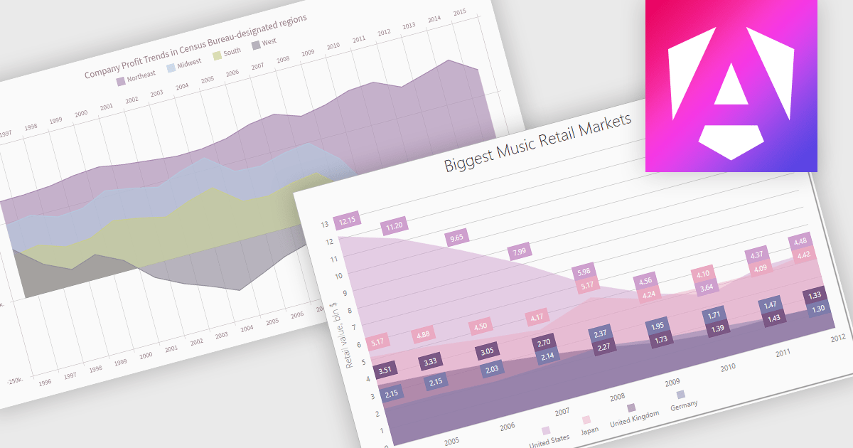
An area chart is a visualization tool that displays data as a filled area bounded by a line and the x-axis. It's particularly effective for illustrating trends and changes in data over time. By filling the area beneath the line, it visually represents the cumulative value of the data, making it easier to understand overall trends. This makes area charts ideal for visualizing metrics like sales over time, inventory levels, or stock prices.
Several Angular chart controls offer area charts including:
For an in-depth analysis of features and price, visit our Angular chart controls comparison.
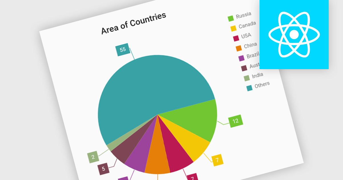
Pie charts are circular diagrams that visually represent data as slices of a whole. Each slice represents a category, with its size proportional to its share of the total. They are particularly effective for illustrating categorical data, such as market shares, demographics, or budget allocations. Pie charts offer a clear and intuitive way to compare relative quantities, making it easy to identify the dominant categories and their contributions to the overall composition.
Several React chart controls offer pie charts including:
For an in-depth analysis of features and price, visit our React chart controls comparison.
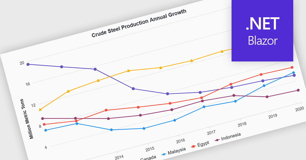
Line charts are visual representations of data points connected by lines, often used to illustrate trends, patterns, or changes over time. They are particularly effective for displaying continuous data sets, such as stock prices, temperature variations, or sales figures. By connecting data points, line charts provide a clear and intuitive understanding of how values evolve over a specific period. This visual representation aids in identifying trends, making comparisons, and predicting future outcomes.
Several Blazor chart controls offer line charts including:
For an in-depth analysis of features and price, visit our Blazor chart controls comparison.
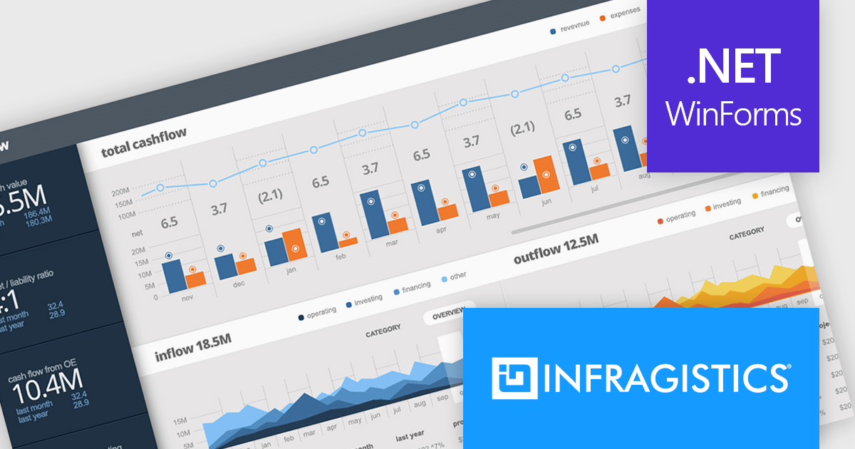
Infragistics Ultimate UI for Windows Forms is a comprehensive suite of over 100 pre-built UI controls and components designed to accelerate Windows Forms application development. It offers a rich feature set including grids, charts, dashboards, reports, and Microsoft Office-style UI elements, enabling developers to create visually appealing, high-performing, and touch-enabled applications with minimal coding effort.
The Infragistics Ultimate UI for Windows Forms 24.1 release introduces a powerful new feature for the UltraDataChart: Data Legend and Data Tooltip Grouping. This innovative enhancement allows users to effectively categorize and organize large datasets by grouping related series together. When multiple series share the same group text, they are visually clustered together within both the data legend and tooltips, providing a clear and intuitive representation of the data. This feature significantly improves data comprehension and analysis, making it easier for users to extract meaningful insights from complex datasets.
To see a full list of what's new in 24.1, see our release notes for Infragistics Ultimate UI for Windows Forms.
Infragistics Ultimate UI for Windows Forms is licensed per developer and is available as a perpetual license with 1, 2 or 3 year support and maintenance subscription. See our Infragistics Ultimate UI for Windows Forms licensing page for full details.
Infragistics Ultimate UI for Windows Forms is available to buy in the following products:
전화 : 00798 14 800 6332
팩스 : +1 770 250 6199


