


공식 공급 업체
200 이상의 소프트웨어 개발처와 판매 계약을 맺은 공인 디스트리뷰터로서 합법적인 라이선스를 제공합니다.
모든 브랜드 보기.
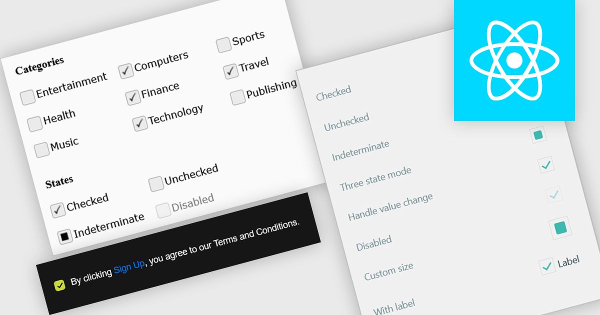
A check box is a user interface element that represents a Boolean field, allowing users to toggle between two states such as true and false directly within a form or data grid. It provides a clear and efficient way to edit logical values without requiring manual text input, reducing the risk of invalid entries and improving data consistency. For software developers, integrating check boxes into data-bound controls simplifies validation logic, and ensures that binary options are presented in a predictable and accessible format across applications.
Several React data editor collections provide check box editing capabilities including:
For an in-depth analysis of features and price, visit our comparison of React Data Editor components.
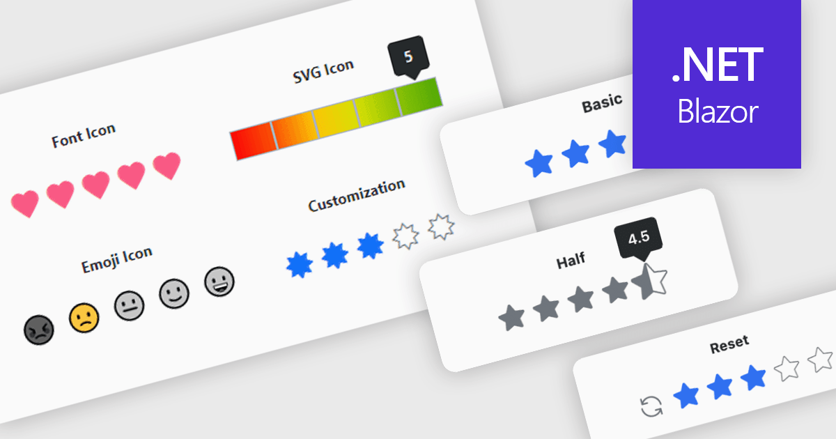
A rating feature in a data editor allows users to assign a value, typically through icon based controls such as stars or similar symbols, directly within a grid or form to evaluate related content. By transforming subjective opinions into structured, quantifiable data, rating components make feedback easy to capture, analyze, and display. This enhances user engagement and supports more informed decision making based on aggregated insights. Common use cases include rating products in ecommerce dashboards, evaluating service performance in internal business systems, scoring support tickets by priority or satisfaction, and assessing content quality within content management platforms.
Several Blazor data editor collections provide rating controls including:
For an in-depth analysis of features and price, visit our Blazor Data Editors comparison.
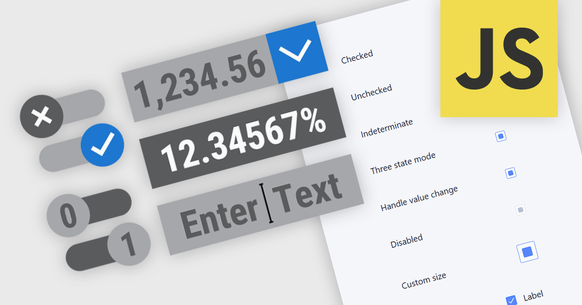
Text, numeric, and boolean data editor components for JavaScript provide the fundamental building blocks for capturing and validating user input in web applications. These editors are designed to handle a wide range of data types and interaction patterns, helping developers present consistent, accessible, and predictable input experiences across forms, grids, and dialogs while integrating cleanly with application logic and data models.
Common editors include:
For an in-depth analysis of features and price, visit our JavaScript data editors comparison.
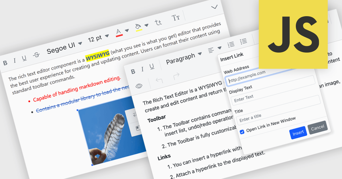
RTF editor support in a data editor component means the component can display, edit, and persist Rich Text Format (RTF) content, allowing users to work with formatted text that includes fonts, styles, alignment, and embedded elements rather than plain text. For software developers, this enables applications to store and manage rich textual data such as notes, descriptions, or documents directly within structured data processes, while relying on a standardized, well-supported format. The result is improved user input quality, consistent formatting across systems, and reduced need for custom text handling logic, while still maintaining compatibility with databases and backend services that expect structured data.
Several JavaScript data editor collections provide RTF editing capabilities including:
For an in-depth analysis of features and price, visit our comparison of JavaScript Data Editor components.
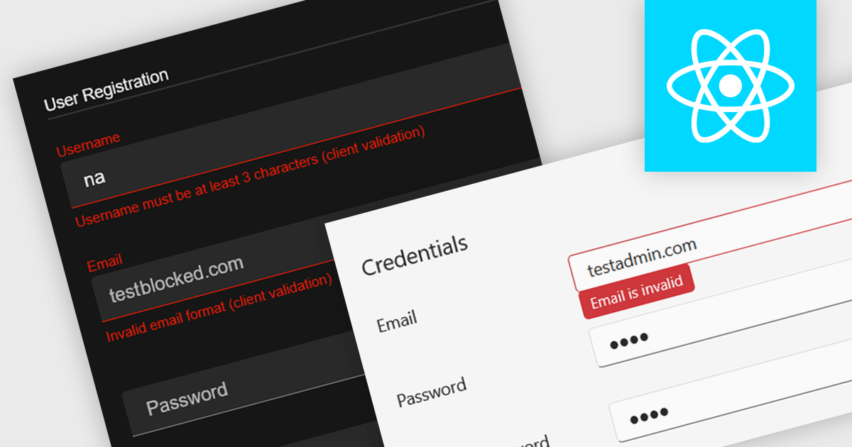
Data validation in a data editor component refers to the process of automatically checking user input against defined rules to ensure accuracy, consistency, and adherence to expected formats before the data is processed or stored. This can include checks for data types, required fields, value ranges, or pattern matching, typically enforced either on the client side for immediate feedback or on the server side for security and integrity. For software developers, incorporating data validation into a data editor improves data quality, reduces the risk of application errors, and enhances the user experience by guiding users to correct mistakes early in the input process.
Several React data editor collections provide support data validation, including:
For an in-depth analysis of features and price, visit our comparison of React data editors.
전화 : 00798 14 800 6332
팩스 : +1 770 250 6199


