


공식 공급 업체
200 이상의 소프트웨어 개발처와 판매 계약을 맺은 공인 디스트리뷰터로서 합법적인 라이선스를 제공합니다.
모든 브랜드 보기.
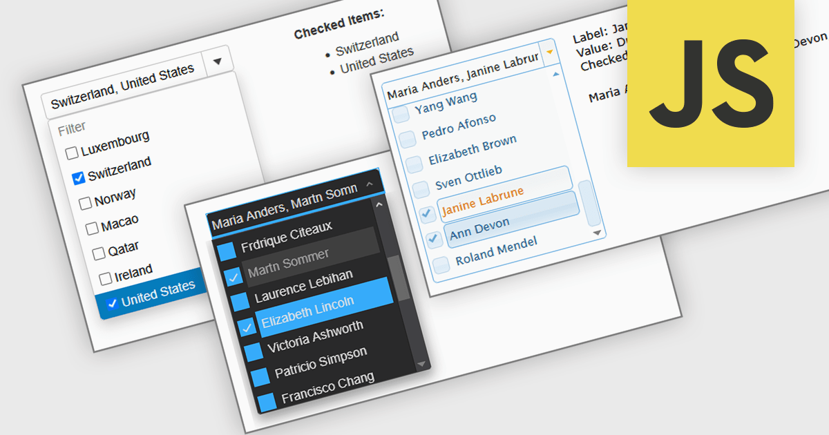
A Checked Combobox in a JavaScript Data Editor is a user interface component that allows users to select multiple options from a dropdown list using checkboxes. It combines the compact form of a combobox with the functionality of a multi-select control, helping to conserve screen space while enabling clear, granular input. This component simplifies data entry and editing workflows, particularly when working with datasets that require multiple discrete values to be associated with a single field. For developers, it offers a way to manage complex form inputs more efficiently, improving both usability and data integrity in cross-platform data management applications.
Several JavaScript data editors offer checked combobox functionality including:
For an in-depth analysis of features and price, visit our comparison of JavaScript data editors.
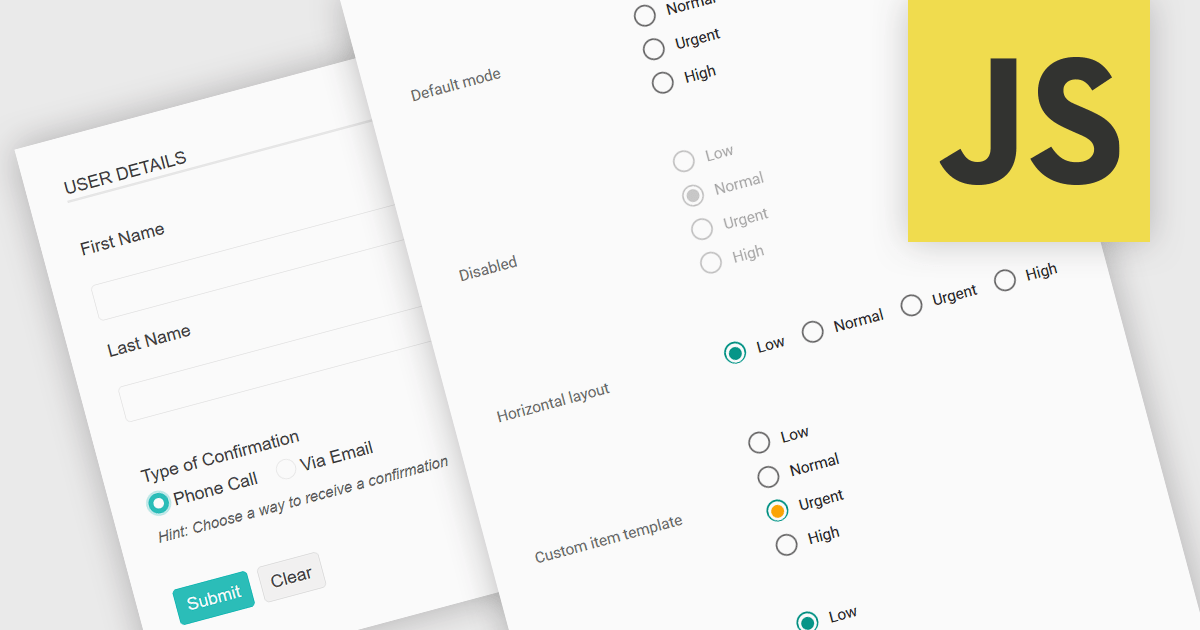
A radio group in data editing refers to a set of mutually exclusive options presented as selectable buttons, where only one option can be active at a time. It is typically used in user interfaces to enforce a single selection from a predefined set of values, which helps reduce input errors and ensures data consistency. By visually grouping related choices and clearly indicating the selected value, a radio group simplifies decision-making for users and speeds up data entry. This control is especially useful in forms and configuration settings where a user must choose one valid option from several possibilities.
Several JavaScript data editor collections provide support for radio groups, including:
For an in-depth analysis of features and price, visit our comparison of JavaScript data editors.
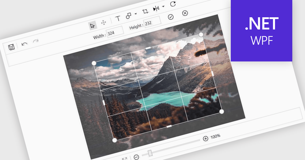
Image editing in a data editor component helps users work with images alongside other data fields. This includes basic functions like cropping, rotating, resizing, and adding annotations. It's useful for tasks such as cleaning up user-uploaded files, adjusting product photos, or marking up visual references—all without switching to another application. This keeps image handling part of the same process as your data updates.
Several .NET data editor collections provide an image editor, including:
For an in-depth analysis of features and price, visit our .NET data editors comparison.
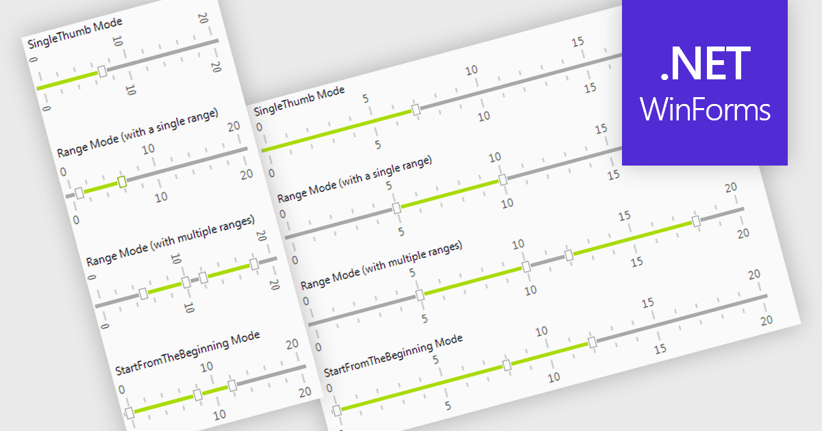
A trackbar in data editors provides a sliding control that allows users to adjust numeric values within a defined range through an interactive visual interface. It reduces the need for manual text entry, prevents invalid inputs by enforcing minimums, maximums and step increments, and offers immediate feedback as values change. Trackbars are especially useful in scenarios where users need to fine tune settings such as selecting volume levels, adjusting brightness, setting filter thresholds or choosing time or price ranges, making them ideal for applications that benefit from quick, intuitive and precise value selection.
Several .NET WinForms components offer Trackbar Data Editors including:
For an in-depth analysis of features and price, visit our comparison of .NET WinForms Data Editors.
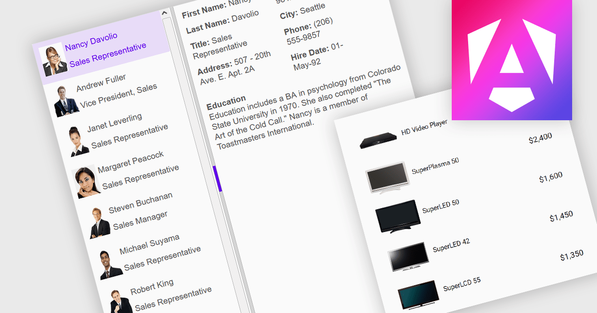
An image listbox is a type of data editor and user interface component that, like the standard listbox, presents a list of selectable items but with the ability to display images alongside or instead of the textual items. By using an associated icon, thumbnail or other graphic for improved visual recognition, this format provides a visual reference for each item, allowing users to browse and select their input more efficiently when the items are more easily identified by appearance than by label. The combination of images with text in a structured, selectable list makes the image listbox valuable in applications that involve data selection, as visually enriched items are well suited in scenarios where users must choose from items that are better identified via imagery (such as product catalogs, avatars, icons, or file previews) rather than by text alone.
Several Angular data editor collections provide image listbox support, including:
For an in-depth analysis of features and price, visit our comparison of Angular data editor components.
전화 : 00798 14 800 6332
팩스 : +1 770 250 6199


