


공식 공급 업체
200 이상의 소프트웨어 개발처와 판매 계약을 맺은 공인 디스트리뷰터로서 합법적인 라이선스를 제공합니다.
모든 브랜드 보기.
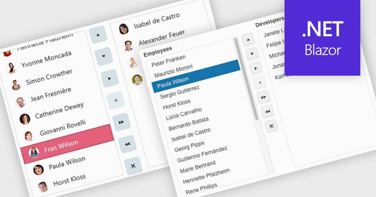
Listboxes are interactive controls that present users with a scrollable list of predefined options, allowing single or multiple selections without manual entry. By constraining inputs to valid choices and offering keyboard navigation, real-time filtering, and drag-and-drop reordering, they reduce errors and help maintain data integrity. Additionally, customizable templates let developers incorporate icons, colors, or detailed item descriptions, making complex data sets easier to scan. Overall, listboxes offer a compact, intuitive interface that balances flexibility with consistency, boosting productivity wherever structured data selection is needed.
Several .NET Blazor data editor collections can provide you with a listbox including:
For an in-depth analysis of features and price, visit our .NET Blazor data editors comparison.
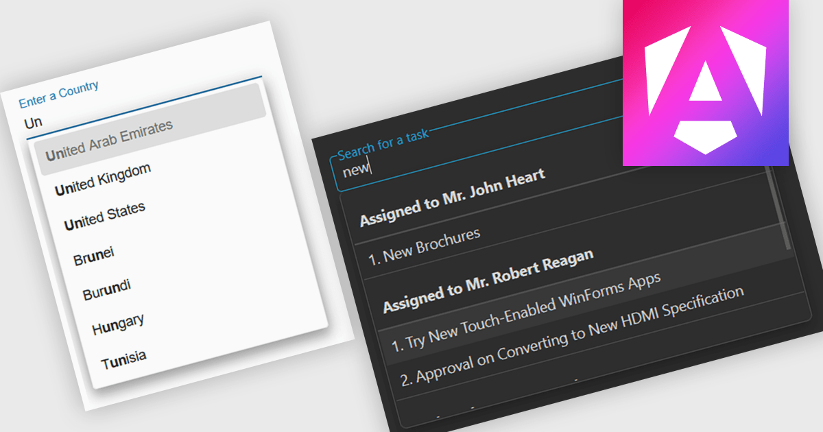
Autocomplete is a feature that dynamically suggests valid inputs as the user types, based on the current context or previously entered values. It enhances productivity by reducing the amount of typing needed and helps prevent errors or invalid entries by guiding users towards acceptable inputs. Ultimately, it enhances the overall user experience by making interfaces more intuitive and efficient for both technical and non-technical users.
Several Angular data editor collections include autocomplete features, such as:
For an in-depth analysis of features and price, visit our comparison of Angular data editor collections.
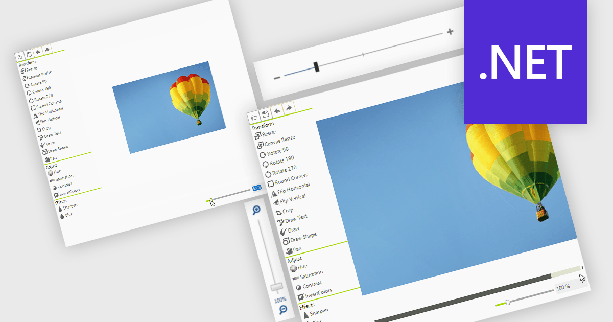
A zoom trackbar in a user interface (UI) is a visual control element that allows users to dynamically adjust the zoom level of content or a display area. They are typically represented as a slider, a linear bar with a draggable thumb, which can be oriented both horizontally or vertically. It provides real-time visual feedback and fine-grained control and is a quick and intuitive way to scale content such as images, documents, or data visualizations without relying on keyboard shortcuts or complex menus. This makes it a valuable feature in applications that handle large or complex visual data, where users need to alternate quickly between detailed inspection and broader overviews, such as graphic design tools, map interfaces, and analytical dashboards.
Several data editor collections for .NET provide zoom trackbars, including:
For an in-depth analysis of features and price, visit our comparison of .NET data editor collections.
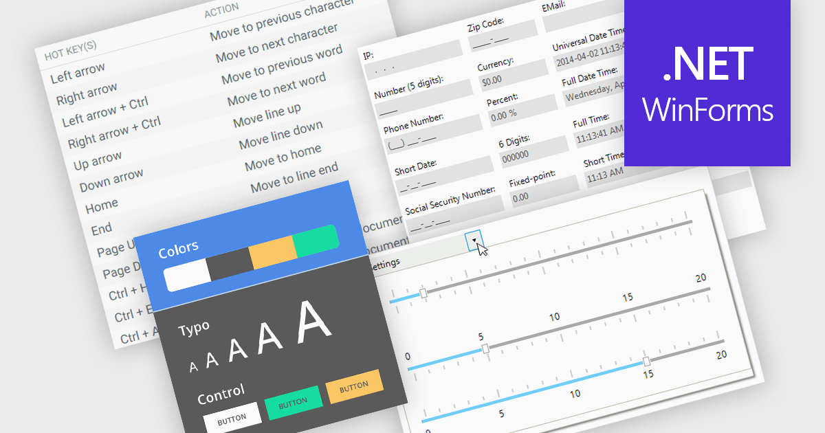
Data input controls with accessibility support are user interface components designed to capture user input, such as text fields, checkboxes, dropdowns, date pickers, and numeric fields, that can be used by anyone, regardless of physical or cognitive limitations. With assistive technologies like screen readers, voice input systems, and keyboard navigation, they ensure that individuals with disabilities or impairments can enter and manipulate data without obstruction. By adhering to accessibility standards like the Web Content Accessibility Guidelines (WCAG) and supporting technologies, these controls help developers deliver user-friendly interfaces that improve user experience for all, and help organizations meet legal and ethical accessibility obligations.
Several WinForms data editor collections include accessibility support, such as:
For an in-depth analysis of features and price, visit our comparison of .NET WinForms data editor collections.
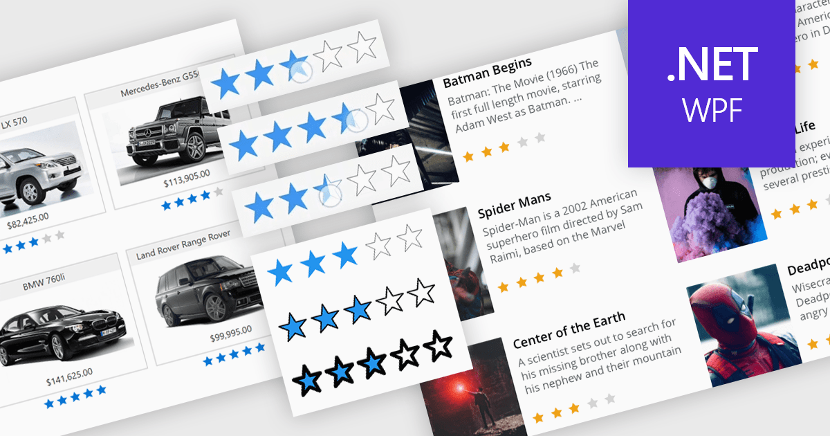
Rating controls in data editors provide a visually intuitive and standardized method for capturing subjective assessments. Users can interact with visual scales like stars, sliders, or thumbs to express opinions or evaluations on a predefined spectrum. These controls can also be precisely tailored with options like half-star ratings or continuous sliders, allowing for nuanced feedback beyond basic scales and providing a clearer understanding of sentiment that leads to more insightful analysis and better decision-making.
Several .NET WPF data editor collections provide rating controls including:
For an in-depth analysis of features and price, visit our .NET WPF Data Editors comparison.
전화 : 00798 14 800 6332
팩스 : +1 770 250 6199


