


공식 공급 업체
200 이상의 소프트웨어 개발처와 판매 계약을 맺은 공인 디스트리뷰터로서 합법적인 라이선스를 제공합니다.
모든 브랜드 보기.
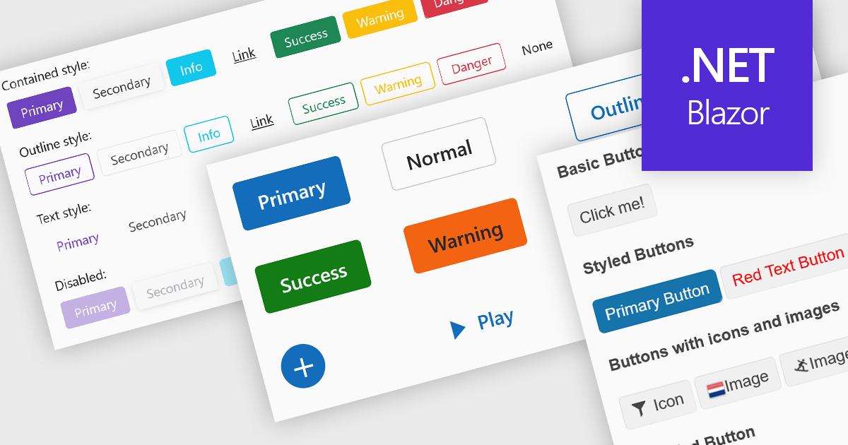
Buttons embedded in data editors enhance user interactions by providing inline command triggers such as clearing input, opening dropdowns, or submitting data. These buttons can be integrated directly into form fields or data grids, enabling more intuitive and compact interfaces. Developers benefit from customization options like icons, styles, behaviors, and events, allowing button functionality to be tailored to application-specific workflows. The inclusion of command buttons in editors simplifies interactions without the need for external UI elements.
Several Blazor data editor collections offer button editor components including:
For an in-depth analysis of features and price, visit our Blazor data editors comparison.
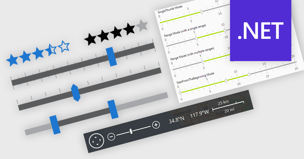
In .NET applications that require data editing, visual UI elements play a vital role in improving how users input and adjust data. For data entry such data visualization components as trackbars, range sliders, zoom controls, and rating elements offer an interactive alternative to text fields or dropdowns, making data input and feedback mechanisms more intuitive and precise. Whether it's setting numerical thresholds or filtering data sets based on user-defined limits, adjusting the view scale of charts, timelines, or graphical data displays, or quickly capturing feedback, these controls contribute to a more responsive and user-friendly interface. These components are especially valuable in scenarios that require fine-tuned input or subjective scoring, helping users make quick adjustments without disrupting the end-user's workflow.
Common features include:
For an in-depth analysis of features and price, visit our .NET data editors comparison.
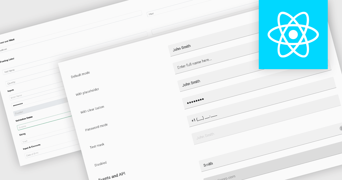
Text Box components in React Data Editors are interactive controls that allow users to input, edit, and manage textual data within a web interface. Designed to handle everything from single-line entries like names and titles to multi-line content such as comments or descriptions, these components are a core part of form-driven applications. They often include features like placeholder text, character limits, validation hooks, and integration with state management tools, which help ensure data quality and user-friendly interactions. Text Boxes are widely used in settings such as user registration forms, feedback systems, and content management interfaces, where accurate and flexible text input is essential to the application's functionality.
Several React data editor collections offer text box components including:
For an in-depth analysis of features and price, visit our React data editors comparison.
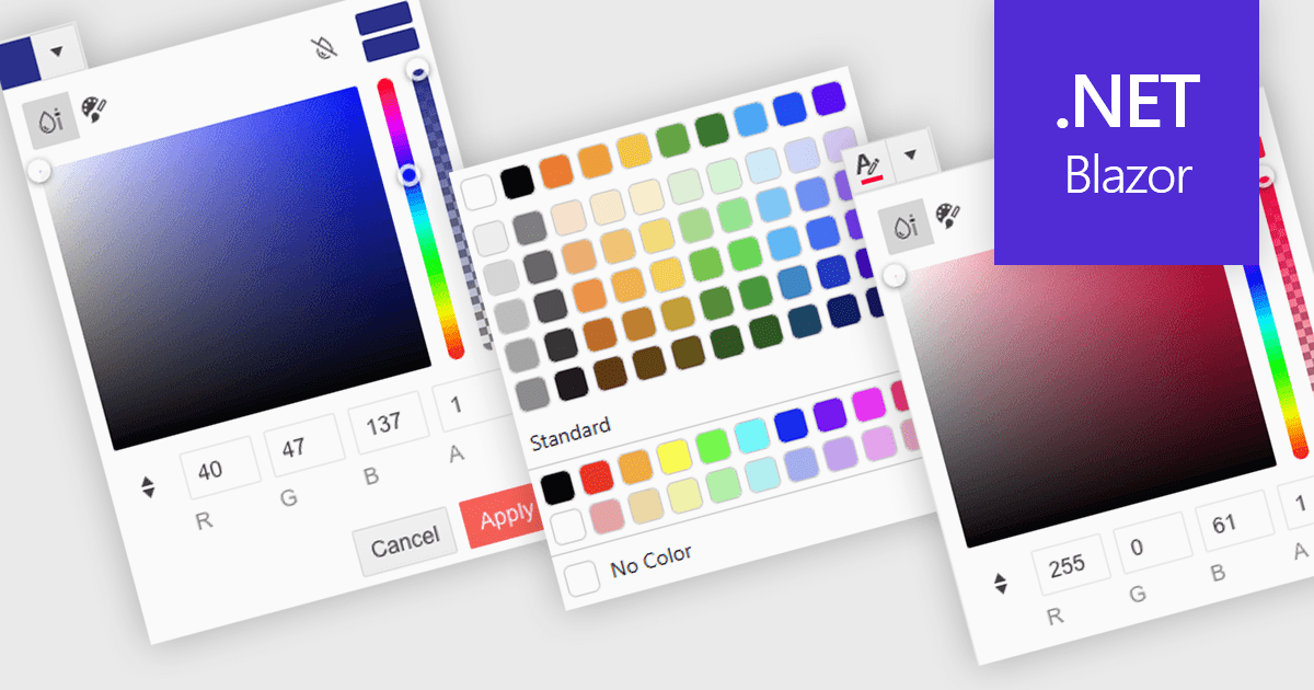
A color picker is a user interface element that allows users to choose and apply colors to specific parts of their data without writing any code. It typically appears as a small palette or input box that, when clicked, opens a panel with color options like swatches, sliders, or hex code fields. This feature supports intuitive visual customization, enabling users to highlight patterns, mark important values, or align with corporate color schemes. In advanced editors, color pickers also support themes or accessibility settings, such as high-contrast palettes.
Several .NET Blazor data editors can provide you with a color picker, including:
For an in-depth analysis of features and price, visit our .NET Blazor data editors comparison.
Codejock Toolkit Pro is a comprehensive suite of UI components designed to enhance the development process and create visually appealing, feature-rich applications. The toolkit offers a wide range of controls, including calendars, charts, docking windows and more, each meticulously crafted to provide exceptional performance and customization options. With features like data binding, theming and localization, developers can easily integrate the toolkit into their projects and tailor the interface to meet specific requirements. The toolkit's versatility makes it suitable for various applications, from desktop software to web-based solutions, empowering developers to deliver professional-grade user experiences.
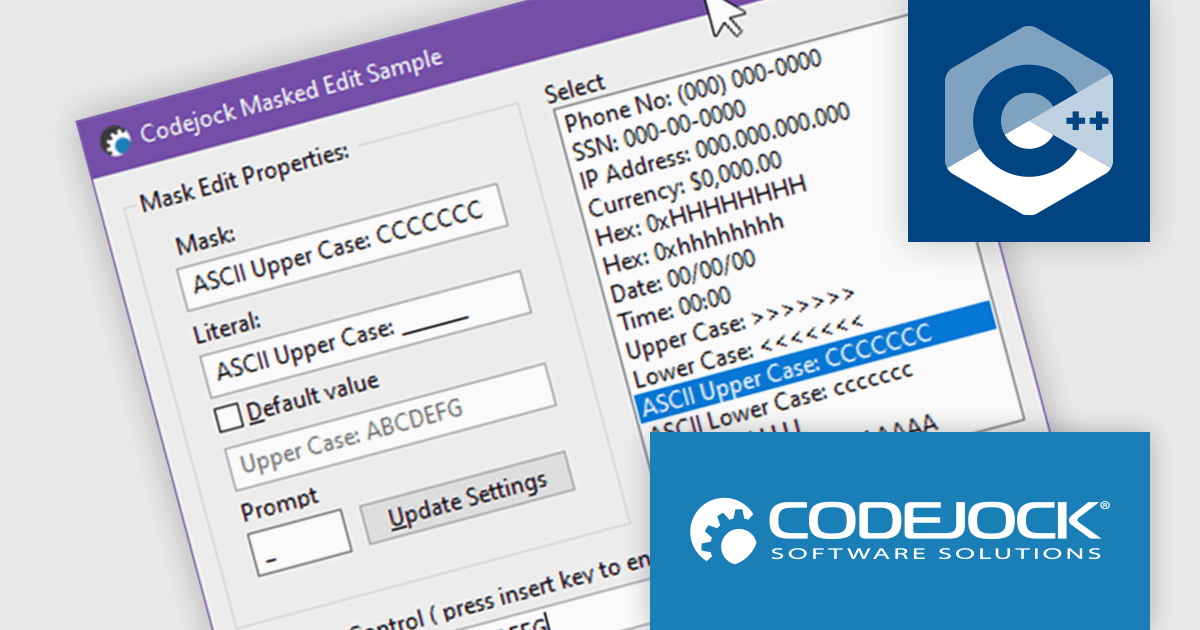
In the Codejock Toolkit Pro 24.2.0 release, the MaskEdit control has been updated to offer expanded support for ASCII characters, allowing for broader and more accurate input validation. Developers can now take advantage of new automatic case conversion options to enforce lowercase or uppercase input without additional scripting. The inclusion of two new modes further improves control over hexadecimal and alphanumeric inputs, making the control more versatile for form fields, serial input, and other structured data entry scenarios.
To see a full list of what's new in the 24.2.0 release, see our release notes.
Codejock Toolkit Pro is licensed per developer and is available as a perpetual license with 30 days or 1 year subscription (product updates and phone/email technical support). See our Codejock Toolkit Pro licensing page for full details.
For more information, visit our Codejock Toolkit Pro product page.
전화 : 00798 14 800 6332
팩스 : +1 770 250 6199


