


공식 공급 업체
200 이상의 소프트웨어 개발처와 판매 계약을 맺은 공인 디스트리뷰터로서 합법적인 라이선스를 제공합니다.
모든 브랜드 보기.
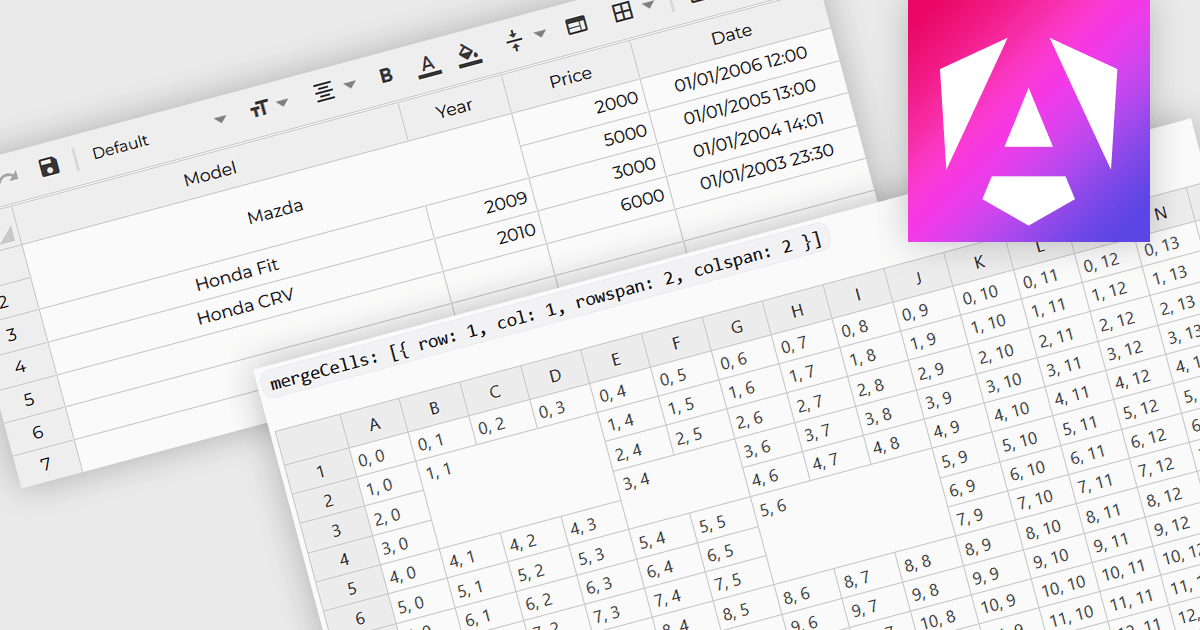
Cell merging in a grid allows developers to combine adjacent cells, creating a single, unified cell that spans multiple rows or columns. This feature enhances readability by allowing headers or labels to encompass related data fields, reducing redundancy and making complex data layouts more visually coherent. It enables efficient organization, supporting custom layouts that align with specific reporting needs and enhancing the grid's overall aesthetic. Cell merging helps streamline the user experience by condensing information into easily digestible sections, enabling users to focus on key insights without distraction.
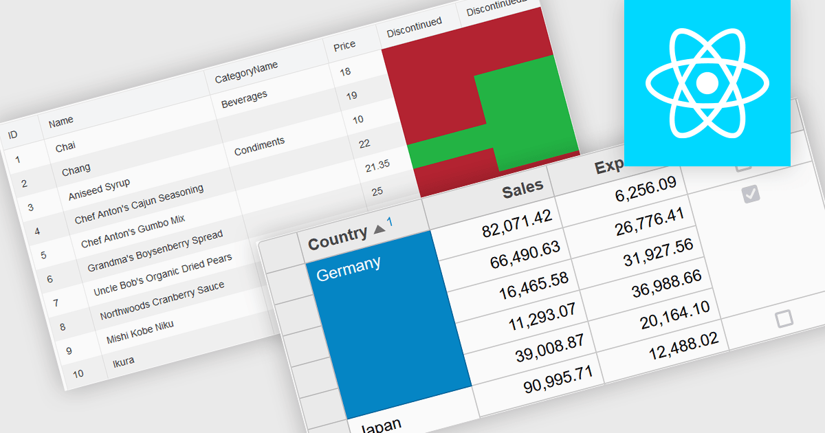
Several React grid controls offer cell merge support including:
For an in-depth analysis of features and price, visit our React grid controls comparison.
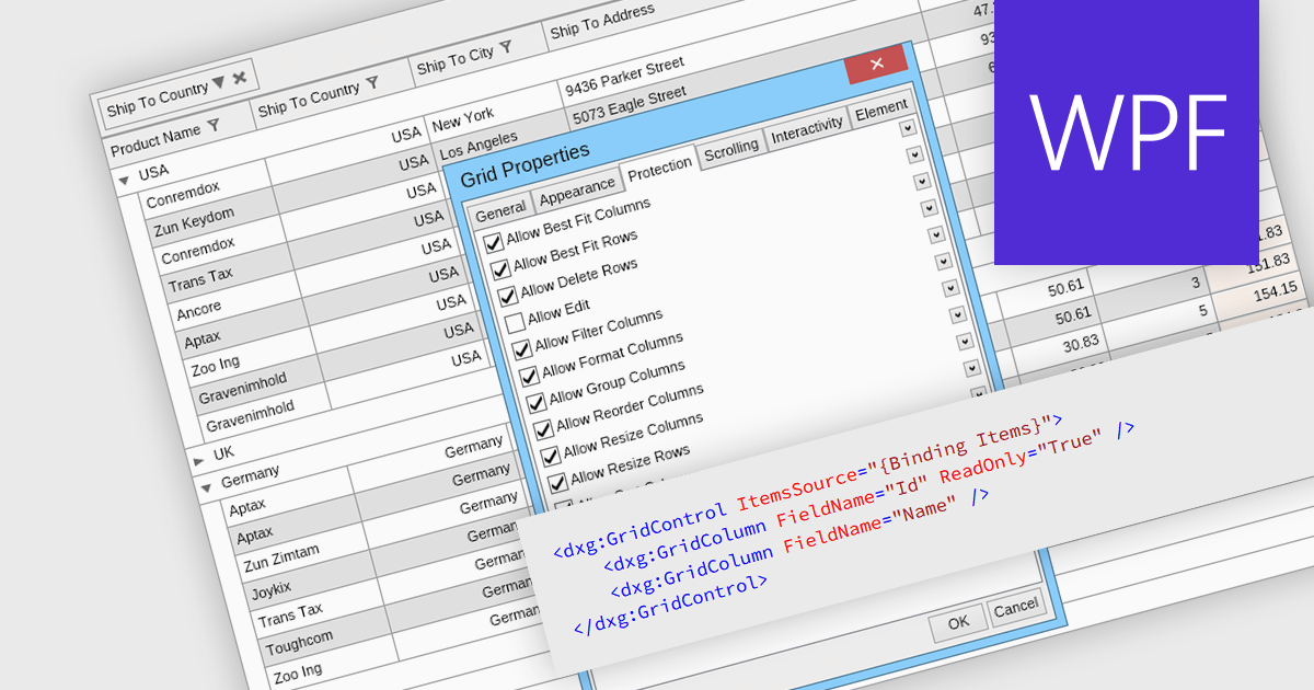
Read-only columns in a data grid are vertically displayed fields that are not editable by users, but can still be viewed. These columns typically display information that is derived from other data or is considered static and should not be altered. By stopping users from directly modifying certain content, developers can ensure data integrity and consistency while still providing full visibility. This feature prevents accidental or intentional changes that might disrupt the system's functionality. Such restrictions streamline workflows by distinguishing between editable and non-editable data, reducing the risk of errors and improving overall system reliability.
Several WPF grid components allow you to display read-only columns, including:
For an in-depth analysis of features and price, visit our comparison of .NET WPF grid components.
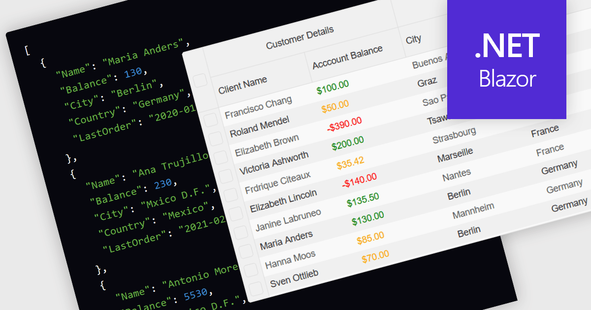
Support for JSON as a data source in .NET Blazor Grid controls allows developers to efficiently populate grid components with structured data, leveraging JSON's lightweight and easy-to-parse format. This approach enhances flexibility and scalability, as JSON is widely used for data interchange in web applications and can seamlessly integrate with various back-end services and APIs. By utilizing JSON, developers can dynamically bind data to the grid, enabling real-time updates and responsive user interactions. Moreover, JSON's hierarchical structure supports complex data representations, which simplifies the manipulation of nested objects and arrays, ultimately improving data handling within the Blazor framework.
Several .NET Blazor Grid controls offer JSON data source support including:
For an in-depth analysis of features and price, visit our comparison of NET Blazor Grid controls.
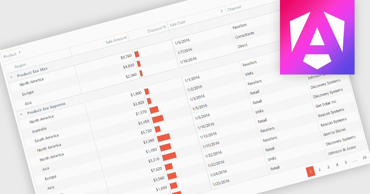
Cell merging refers to a grid component's ability to combine adjacent cells, either horizontally or vertically, to create a single unified cell. This is often used to display related data more efficiently by avoiding redundancy and improving the visual organization of complex datasets. For software developers, the benefit of cell merging lies in enhancing readability and clarity when representing hierarchical or grouped information. By merging cells, developers can present data in a more structured way, reducing clutter and allowing users to focus on key information without the distraction of repeated values.
Several Angular grid controls offer support for merging cells including:
For an in-depth analysis of features and price, visit our Angular grid controls comparison.
Grouping grid data organizes the data into distinct groups within a grid-like structure. It involves visually clustering related data points together, often using color, shading, or borders, to enhance pattern recognition and make complex datasets more understandable. This method is useful for identifying trends, outliers, and correlations within large amounts of information.
Several Angular grid controls offer support for grouping including:
For an in-depth analysis of features and price, visit our Angular grid controls comparison.
전화 : 00798 14 800 6332
팩스 : +1 770 250 6199


