


공식 공급 업체
200 이상의 소프트웨어 개발처와 판매 계약을 맺은 공인 디스트리뷰터로서 합법적인 라이선스를 제공합니다.
모든 브랜드 보기.

Docking controls are a user interface element that allows users to organize and customize the layout of an application's windows. These controls typically function by enabling users to drag-and-drop windows or panes to different positions on the screen, or to attach them to the edges of the main application window. This functionality provides several benefits, including increased efficiency by allowing users to arrange windows in a way that suits their workflow, improved organization by keeping relevant windows grouped together, and better screen real estate utilization by enabling users to resize and position windows for optimal viewing.
Several React UI suites feature a docking component including:
For an in-depth analysis of features and price, visit our React UI Suites comparison.
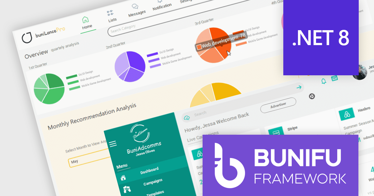
Bunifu UI WinForms is a user interface (UI) framework designed to streamline the development of modern and visually appealing desktop applications using Microsoft's WinForms platform. It provides a wide array of pre-built, customizable UI components, such as charts, a data grid, gradient panel, and slider, that emphasize a minimalist aesthetic while maintaining performance efficiency. With it developers can significantly streamline the UI development process, allowing them to drag-and-drop elements and leverage extensive design properties to create professional-looking applications in less time.
Bunifu UI WinForms v7.0 embraces the future of .NET development by adding support for Microsoft .NET 8. This unlocks a range of productivity and performance enhancements for developers, alongside an improved overall experience. By seamlessly integrating with modern software architectures and .NET components, Bunifu UI WinForms empowers you to craft responsive and visually stunning applications with greater ease.
To see a full list of what's new in v7.0.0, see our release notes.
Bunifu UI WinForms is licensed per developer and is available in four plans; three plans are an annual license while the other is a perpetual license. Annual licenses come with free updates and Premium support for the active license period. See our Bunifu UI WinForms licensing page for full details.
Bunifu UI WinForms is available in the following products:
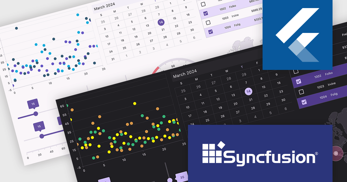
Syncfusion Essential Studio Flutter, available as part of Syncfusion Essential Studio Enterprise, is a powerful UI toolkit that enables you to build beautiful and performant mobile apps for Android and iOS using Flutter. It provides a rich suite of pre-built widgets for common design elements like charts, data grids, calendars, and PDF viewers. These widgets are highly customizable and allow you to quickly implement stunning visuals and advanced functionalities without spending time on repetitive coding.
The Syncfusion Essential Studio Flutter 2024 Volume 1 (25.1.35) release adds a new Material 3 theme. Based on the latest update to Google's design language, the theme offers both light and dark variants. This addition allows developers to create modern, visually appealing, and future-proof applications that adhere to consistent design language, reducing development time and improving user experience.
To see a full list of what's new in version 2024 Volume 1 (25.1.35), see our release notes.
Syncfusion Essential Studio Flutter is available as part of Syncfusion Essential Studio Enterprise which is licensed per developer starting with a Team License of up to five developers. It is available as a 12 month Timed Subscription License which includes support and maintenance. See our Syncfusion Essential Studio Enterprise licensing page for full details.
For more information, visit our Syncfusion Essential Studio Flutter product page.
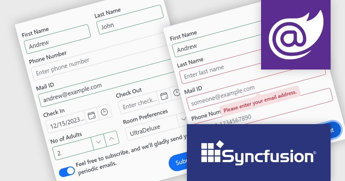
Syncfusion Essential Studio Blazor (available as part of Syncfusion Essential Studio Enterprise) is a comprehensive UI component library designed to accelerate the development of high-performance, modern web applications using the Blazor framework. It boasts over 85+ responsive, lightweight, and modular components spanning various categories such as data visualization, data editing, document processing, and interactive UI elements. This rich repertoire empowers developers to rapidly build user-friendly, feature-rich web interfaces, with seamless integration of both server-side and client-side Blazor applications.
The Syncfusion Essential Studio Blazor Version 2024 Volume 1 (25.1.35) release introduces the production-ready Blazor Data Form component, which is designed to streamline form creation within Blazor applications. It offers features such as automatic field generation based on your data model, seamless data binding for easy integration with your application's logic, and layout customization for a polished user experience. The Blazor Data Form component allows you to build complex or simple forms with minimal coding effort.
To see a full list of what's new in version 2024 Volume 1 (25.1.35), see our release notes.
Syncfusion Essential Studio Blazor is available as part of Syncfusion Essential Studio Enterprise which is licensed per developer starting with a Team License of up to five developers. It is available as a 12 Month Timed Subscription License which includes support and maintenance. See our Syncfusion Essential Studio Enterprise licensing page for full details.
For more information, visit our Syncfusion Essential Studio Blazor product page.
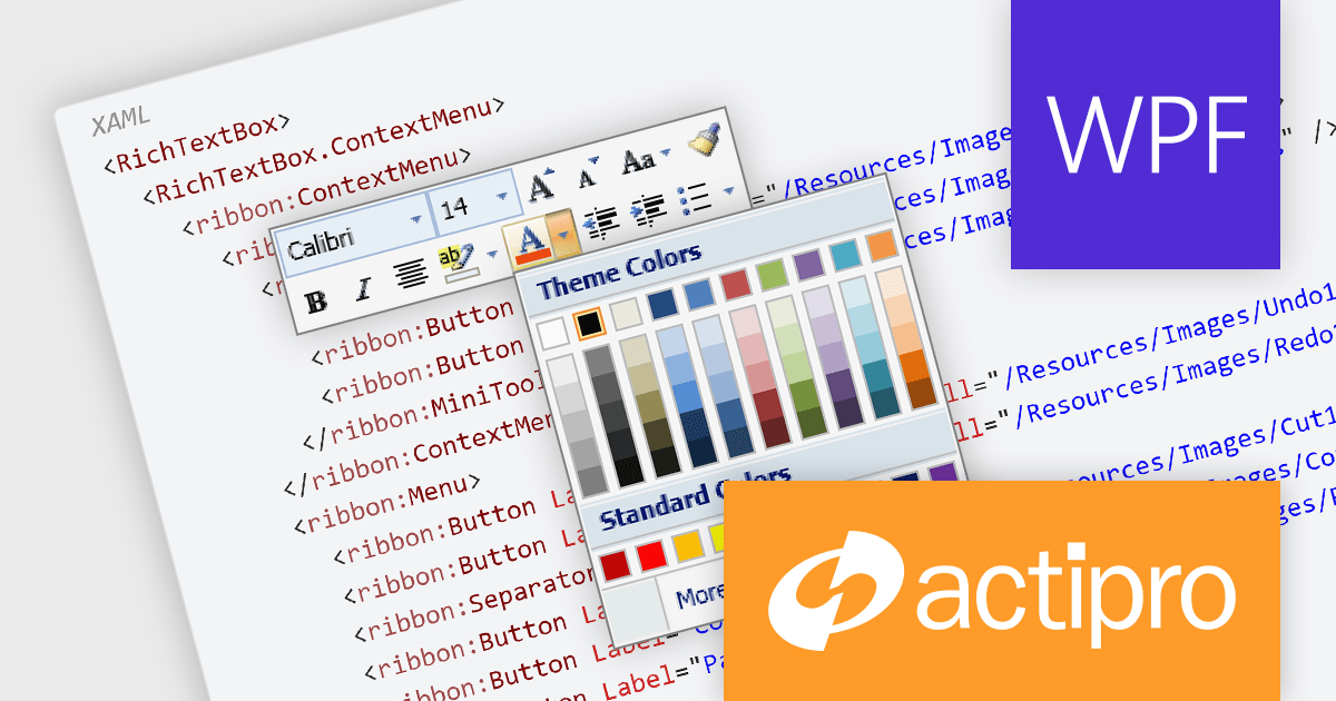
Actipro Bars for WPF is a UI component library that equips developers with the tools to build advanced ribbons, toolbars, and menus within their WPF applications. It offers an "Office-like" ribbon experience with customization options, supports MVVM design patterns, and includes a rich set of controls specifically designed for use within these elements, allowing for a cohesive and user-friendly interface.
The Actipro Bars for WPF V24.1.1 release introduces the MiniToolBar, a new control designed to improve user experience and productivity. This context-sensitive toolbar appears next to highlighted text or alongside context menus, offering quick access to relevant formatting and editing functions. By eliminating the need to navigate through text-based menus or cluttered toolbars, the MiniToolBar streamlines workflows and keeps the workspace clean, allowing users to focus on completing tasks efficiently.
To see a full list of what's new in 24.1.1, see our release notes.
Actipro Bars for WPF is licensed per developer and is available as a Perpetual license with 1 year support and maintenance. See our Actipro Bars for WPF licensing page for full details.
Actipro Bars for WPF is available in the following products:
전화 : 00798 14 800 6332
팩스 : +1 770 250 6199


