


공식 공급 업체
200 이상의 소프트웨어 개발처와 판매 계약을 맺은 공인 디스트리뷰터로서 합법적인 라이선스를 제공합니다.
모든 브랜드 보기.
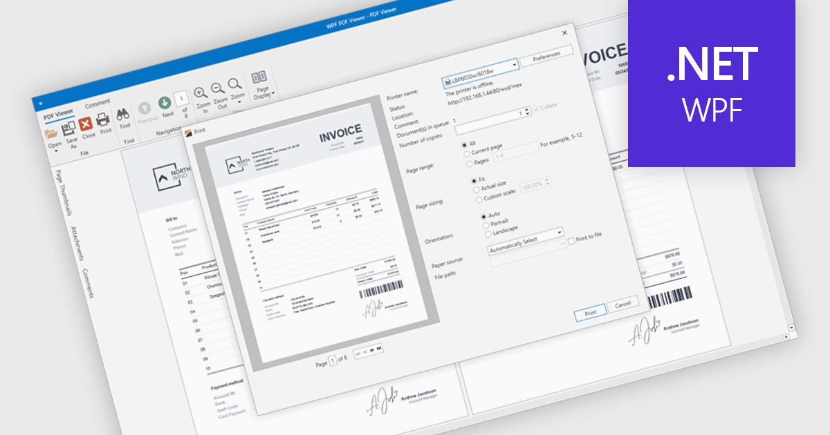
PDF printing within a PDF Viewer allows users to print documents directly from the viewing interface without needing to open external applications. This built-in functionality provides quick access to print options such as paper size, orientation, and scaling while maintaining the document’s original layout, fonts, and graphics. It ensures professional, high-quality output and a consistent user experience across different printers and devices. Common use cases include printing invoices, reports, forms, and technical documentation directly from desktop or embedded applications, helping users save time, reduce complexity, and improve productivity in document-heavy environments.
Several .NET WPF PDF viewer components include support for printing, including:
For an in-depth analysis of features and price, visit our comparison of .NET WPF PDF viewer components.
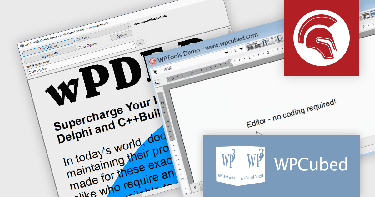
WPCubed offers a range of development components aimed at integrating word processing and PDF generation capabilities into applications built with Embarcadero's Delphi and C++Builder, as well as .NET. The primary product is WPTools, which is a VCL component suite that equips Delphi applications with word processing functionality, including a multitude of features you would expect from a word processing application, such as text property dialogs, mail merge, editors, hyperlinks, paragraph styles, tables and graphics. Additionally, wPDF is a high‑performance PDF creation engine for VCL applications and is used to convert output from your program to PDF files, featuring Unicode support, PDF/A compliance, and it works well in conjunction with WPTools. It uses "Canvas" methods as well as GDI API calls that require a device handle as a parameter, making it versatile and easy to integrate.
WPCubed adds support for Embarcadero Delphi 13 Florence to its WPTools and wPDF products. This compatibility allows developers to build and deploy applications with integrated word processing and PDF generation features in the latest Delphi development environment. The update maintains full functionality of WPTools and wPDF in Delphi 13, minimizing upgrade risks and simplifying adoption of the new platform.
WPTools and wPDF are licensed per developer and are available as perpetual licenses with 1 year support. See our licensing pages for full details:
WPTools is available to buy in the following products:
For more information about wPDF, see our product page.
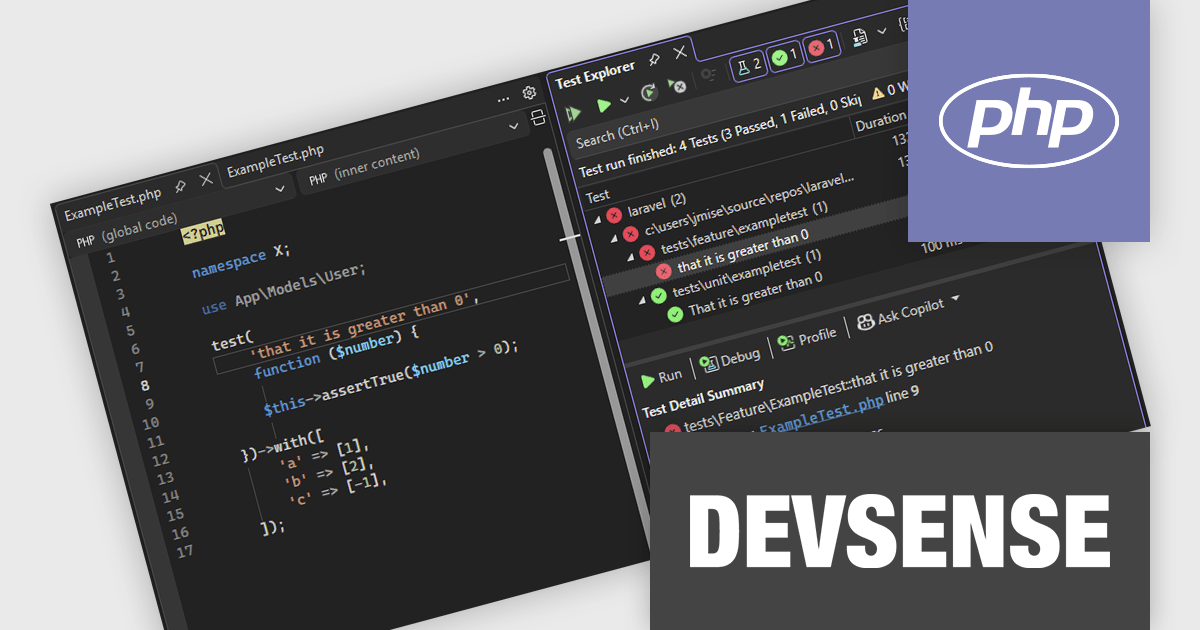
PHP Tools for Visual Studio converts Microsoft's IDE into a complete PHP development environment, increasing productivity with features such as smart code analysis, preemptive code completion, integrated debugging, and project management. This single package combines Visual Studio's familiar interface with industry-standard capabilities, allowing you to easily develop PHP applications and websites.
The PHP Tools for Visual Studio v1.88 update enhances the PHP testing experience by adding full support for PHPUnit versions 10 through 12 and the Pest framework, ensuring compatibility with the latest testing standards. This update improves the accuracy of test discovery by correctly recognizing data set–based tests and displaying their individual executions in the Test Explorer for clearer visibility. It also strengthens the reliability and consistency of test execution, providing developers with a more efficient and stable environment for running and debugging their PHP tests directly within Visual Studio.
To see a full list of what's new in v1.88.18040, see our release notes.
PHP Tools for Visual Studio is licensed per developer and is available as a perpetual license with 1 year of upgrades and support. See our PHP Tools for Visual Studio licensing page for full details.
For more information, see our PHP Tools for Visual Studio product page.
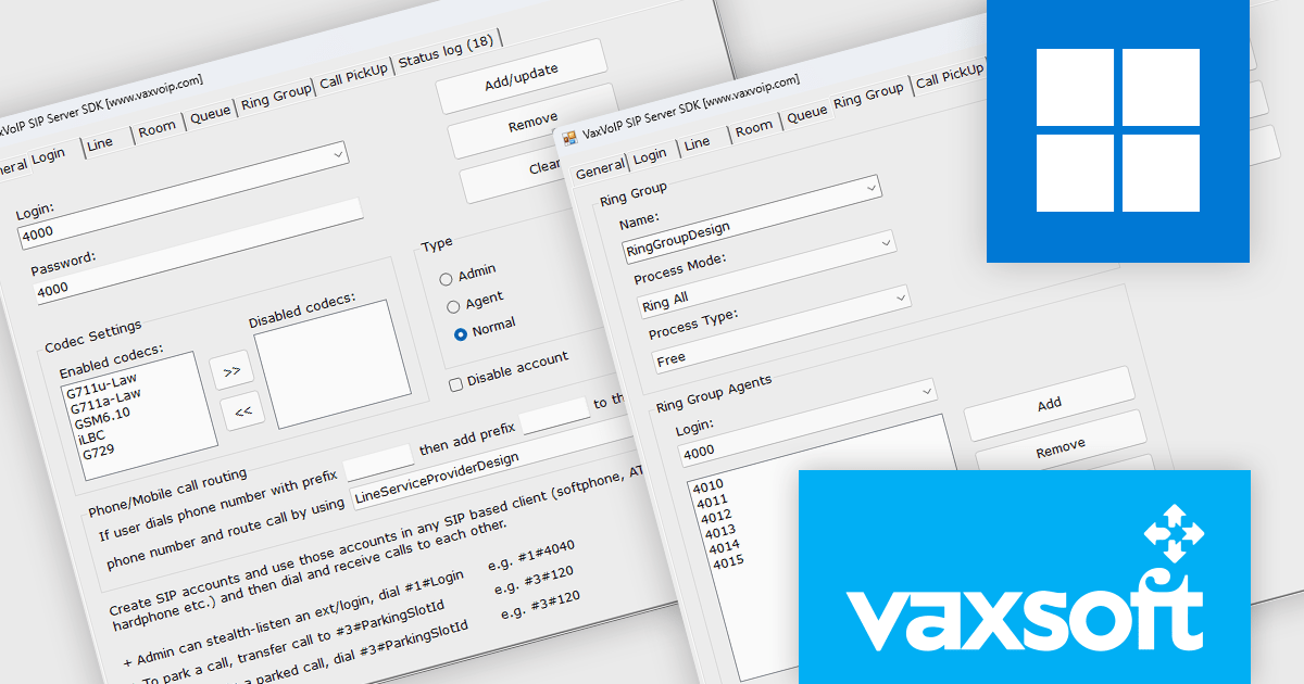
VaxVoIP SIP Server SDK by VaxSoft is a comprehensive software development kit designed for building secure, high-performance VoIP communication systems. It provides all the core functionality needed to develop SIP-based servers, IP-PBX systems, IVRs, auto-dialers, and call center solutions. The SDK supports real-time audio access, making it suitable for advanced integrations such as AI-driven voice agents, speech analytics, and automated call handling. With its well-documented API and scalable architecture, it enables developers to create reliable communication platforms tailored to their specific business or technical requirements.
The VaxVoIP SIP Server SDK offers significant advantages for developers seeking to reduce complexity and time-to-market when creating VoIP applications. Its built-in protection against SIP attacks enhances system security, while its scalability ensures stable performance under heavy workloads. Developers can use the SDK to deploy cloud-based or on-premises communication solutions that support voice automation, customer engagement systems, and enterprise-grade telephony services. By combining flexibility, performance, and ease of integration, it empowers teams to build modern, cost-efficient voice communication solutions.
VaxVoIP SIP Server SDK is licensed per service, per year, under a single software, single server license that allows one production deployment on one computer or server. See our VaxVoIP SIP Server SDK licensing page for full details.
For more information, visit our VaxVoIP SIP Server SDK product page.
See other related products available:
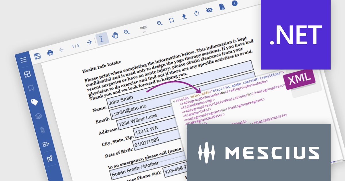
Document Solutions for PDF (DsPdf, formerly GcPdf) is a high-speed, feature-rich, server-side PDF API Library for .NET with no dependencies on Adobe Acrobat. DsPdf allows developers to programmatically create, manipulate, import/export, and deploy PDF documents, including AcroForms, across desktop and web applications at scale. With full .NET support, you can generate, load, modify, and convert PDFs in your app for .NET, Mono, Xamarin.iOS, and Xamarin.Android.
In this blog post, MESCIUS Product Marketing Specialist Mackenzie Albitz demonstrates how to use Document Solutions for PDF to extract and convert PDF Form data using just a few lines of code. The steps include:
Detailed source code and examples are included to get you started.
Read the complete blog to learn how to automate the processing and storage of PDF Form data.
Document Solutions for PDF is licensed per developer and is available in several license options for differing distribution needs. Team licenses are also available for multiple developers within the same organization. See our Document Solutions for PDF licensing page for full details.
Document Solutions for PDF is available to buy individually or as part of Document Solutions .NET Bundle.
전화 : 00798 14 800 6332
팩스 : +1 770 250 6199


